


Xander_Lyon
-
Posts
76 -
Joined
-
Last visited
Posts posted by Xander_Lyon
-
-
I'm finally back with a new, decent picture, but first, the props . . .
@Welshblue - The image reminds me of something out of FarCry with the guns and crates and beach scene.
 It's funny how the little details impress the most. I could picture putting together the crates but the little moldy part on the bottom was slick. Definitely a nice, noteworthy touch . . . you know, other than the guns and the dolphins and the water effects.
@EscapistAngel - We seem to have a nice subgroup of artists here who are striving to create better and better blood effects.
Yours are excellent along with the blade and the gliph on the blade was a nice touch as well. @Goonfella - I'm preparing to counter your guitars with my own.
 I started working on one and soon enough saw you had a pair posted. Grr, still, excellent post. My only critique would be on the dimensions of the guitars themselves. The soundholes seem a little large for the size of the guitar and the sides of the body that push inward too much, or if not too much then too high. Otherwise, the other parts look great as well as the music background.
@Possum - Clearly, I'm too slow on the draw here. I start a guitar and Goonfella makes 2. I make a flag and you've got two impressive curtains in your Arabian Nights scene. I was reminded of the story of the woman in the "1001 Arabian Nights" who was forced to continually come up with new stories. I imagined she thought of this when she was nearly out of ideas. "I know! Robot spiders!"
I do like the darker version since it fits with the twilight setting. However, I'd love to see a light source, like a torch inside the room throwing some light around. My only other critique is on the spiders themselves. I think you could stand to drop one of the red spiders because it stands out that they're the same. I'd say either drop one, or if you can, adjust even one or two legs of say, the closest spider so it looks different. Oh, the marble effect on the floor and fountain were spectacular. Polished and beautiful.Okay, so here's mine in honor of our club's foray into the online RPG today:
I may have to add another light source so the direction of the shadow behind the flag makes sense.
-
I'm finally back with a new, decent picture, but first, the props . . .
@Welshblue - The image reminds me of something out of FarCry with the guns and crates and beach scene.
It's funny how the little details impress the most. I could picture putting together the crates but the little moldy part on the bottom was slick. Definitely a nice, noteworthy touch . . . you know, other than the guns and the dolphins and the water effects.@EscapistAngel - We seem to have a nice subgroup of artists here who are striving to create better and better blood effects.
Yours are excellent along with the blade and the gliph on the blade was a nice touch as well. @Goonfella - I'm preparing to counter your guitars with my own.
I started working on one and soon enough saw you had a pair posted. Grr, still, excellent post. My only critique would be on the dimensions of the guitars themselves. The soundholes seem a little large for the size of the guitar and the sides of the body that push inward too much, or if not too much then too high. Otherwise, the other parts look great as well as the music background.@Possum - Clearly, I'm too slow on the draw here. I start a guitar and Goonfella makes 2. I make a flag and you've got two impressive curtains in your Arabian Nights scene. I was reminded of the story of the woman in the "1001 Arabian Nights" who was forced to continually come up with new stories. I imagined she thought of this when she was nearly out of ideas. "I know! Robot spiders!"
I do like the darker version since it fits with the twilight setting. However, I'd love to see a light source, like a torch inside the room throwing some light around. My only other critique is on the spiders themselves. I think you could stand to drop one of the red spiders because it stands out that they're the same. I'd say either drop one, or if you can, adjust even one or two legs of say, the closest spider so it looks different. Oh, the marble effect on the floor and fountain were spectacular. Polished and beautiful.Okay, so here's mine in honor of our club's foray into the online RPG today:
I may have to add another light source so the direction of the shadow behind the flag makes sense.
-
So my last suggestion was for a type of "gradient+" that would let you bend and drag the different gradient tools in pdn. Another idea I've had is for a sort of "perspective map". Essentially you would partially automate roll, rotate and zoom settings. Of course you can do this by copying those settings per object, but if you could place all of your objects you wish to follow the same perspective focal point (whether it be the exact center like for a road or off to the side for say the hull of a ship) on one layer, then run the plug-in, you could map each object to the correct angle for your given perspective. Considering the code limitations I'm slowly learning in pdn, my mental method for doing this may not work. I'm imagining a grid that's essentially a point somewhere on the screen with several radial "spokes" coming from it out to the edge of the screen. Every image on the layer would be selected and they could snap between spokes and then zoom in and out from almost nothing at the focal point to a larger version near the edge of the canvas. So am I crazy? Would this be useful or even remotely possible?
Of course the simple fix would be a layer you would turn off and on that has a perspective map to make sure objects on other layers are properly rolled, rotated and zoomed. Maybe a much simpler plugin would be one that would simply render the perspective map. It would ask how many spokes you wanted and where you wanted the focal point and bam, there you go. Then just erase that layer when you're happy with your picture.
-
@Possum & LJXD - Thank you both for the useful feedback. I messed up slightly in not being able to "undo" the bevel, but I think if I crop the canvas enough I can kill it. I conceived the grey lines as being part of an overall design on a ship, but I think it isn't working for me. I'll see if I can add some access panels and maybe try some tubing (tourist's rope tutorial maybe?) and see if I can get this design a little more balanced. Oh, I did intend for the lettering to look painted on. I tried a color burn tut I found but it just turned my lettering orange. I think the background isnt' busy enough to support that idea. I'll take a look at the grunge tut's to see if I can find a good painted-on suggestion there. Incidentally, the bolts were a happy accident. I used the polygons plugin and accidentally doubled it but with the star option the second time, so I shrank it and found these great little bolts.
Thanks again for the suggestions, guys. I love this community. I can always look forward to detailed, constructive responses from y'all.
-
@Jayed - Your sigs are always beautiful. I know I've seen your Samus around several times.
@Stecon96 - I agree the red sig is the more striking one, but if I didn't already see what your name was elsewhere, I wouldn't be able to read it well. 'Course you're also missing all the other information the green one has.
This is a website header I'm working on to help dress up my club's site a bit:
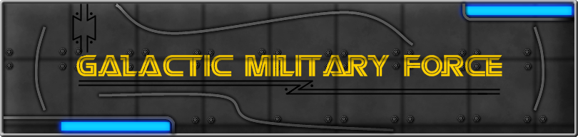
I just recently put a bevelled outline around it, which doesn't quite match the other random grey lines. When I tried bevelling those originally it didn't look quite right, so I'm not sure what I'll do with them.
-
@Jayed - Your sigs are always beautiful. I know I've seen your Samus around several times.
@Stecon96 - I agree the red sig is the more striking one, but if I didn't already see what your name was elsewhere, I wouldn't be able to read it well. 'Course you're also missing all the other information the green one has.
This is a website header I'm working on to help dress up my club's site a bit:
I just recently put a bevelled outline around it, which doesn't quite match the other random grey lines. When I tried bevelling those originally it didn't look quite right, so I'm not sure what I'll do with them.
-
@Yellowman - What impressed me most about your piece was the colored metallic finish to the candle holders. I've been experimenting with colored chrome and couldn't seem to quite get it, but your candle holders are it. The detail on the candles themselves did not go unnoticed, either. I'm sure the candle cylinders did not originally have the tiny notches in the sides or top, where the wax swirls sit on top of one another.
-
@Ash - Thank you
It's always nice to receive validation from one of the greats. (edit: and I don't say that lightly)@Simon Brown - You're right. I think you'd have to use the center drag technique in the separate window to make the line (for the :DiamondGradient: and
 .) As for the anchor points along the line, you could have separate X, Y adjustments (sliders or whatever) to tell the anchors how and where to bend the line. Conceivably, the UI may not be too long.
 -
@Ash - Thank you
It's always nice to receive validation from one of the greats. (edit: and I don't say that lightly)@Simon Brown - You're right. I think you'd have to use the center drag technique in the separate window to make the line (for the :DiamondGradient: and
.) As for the anchor points along the line, you could have separate X, Y adjustments (sliders or whatever) to tell the anchors how and where to bend the line. Conceivably, the UI may not be too long. -
Since I don't know the first thing about writing plugins, I thought I would ask my question here to see if any programmer who would find this sort of plugin useful could design it.
So here's my idea. I may be somewhat lazy in my aim here since I know there are techniques like creating a selection and then filling it with whatever gradient, but I have some ideas on adjusting gradients once you apply one. I'll start with the :LinearGradient: and
 . Once you set one of these, I'd love to have the tool to bend lines as in the :LineCurveTool: tool to bend the core line of the gradient and so create a curved gradient.
 My other idea involves the
and :DiamondGradient: . Once I select the size of my initial gradient, I'd love to click and drag the middle of the gradient once again like the :LineCurveTool: tool and be able to grab and bend points along it to create a curved radial or diamond gradient. I picture the old spraypaint tool from the original mspaint. I know some of these effects can be achieved with :GaussianBlur: or dropshadow on a line, but I feel like this tool could be useful if it's fesible to code. Maybe I'm just trying to oversimplify. Feel free, by the way, to hit me for using the word "gradient" 8 times.
-
Since I don't know the first thing about writing plugins, I thought I would ask my question here to see if any programmer who would find this sort of plugin useful could design it.
So here's my idea. I may be somewhat lazy in my aim here since I know there are techniques like creating a selection and then filling it with whatever gradient, but I have some ideas on adjusting gradients once you apply one. I'll start with the :LinearGradient: and
. Once you set one of these, I'd love to have the tool to bend lines as in the :LineCurveTool: tool to bend the core line of the gradient and so create a curved gradient. My other idea involves the
and :DiamondGradient: . Once I select the size of my initial gradient, I'd love to click and drag the middle of the gradient once again like the :LineCurveTool: tool and be able to grab and bend points along it to create a curved radial or diamond gradient. I picture the old spraypaint tool from the original mspaint. I know some of these effects can be achieved with :GaussianBlur: or dropshadow on a line, but I feel like this tool could be useful if it's fesible to code. Maybe I'm just trying to oversimplify. Feel free, by the way, to hit me for using the word "gradient" 8 times.
-
Ha! Tilo, I love it.
He looks like a Sonic type character but maybe a little more grunge. Excellent and the background is nice and surreal. -
Ha! Tilo, I love it.
He looks like a Sonic type character but maybe a little more grunge. Excellent and the background is nice and surreal. -
@Yellowman - Thank you much. I appreciate it
I'll probably do another lightsaber later on with a unique handle design. As much as I enjoy making something decent like this, it's still not original . . . or at least not as original as I'd like. But thanks again, I consider this is my first "good" submission here. -
@possum - I love the talisman. What impresses me most is probably the celtic knot in the middle, actually, with the way the lines are all interlaced. I know you probably didn't want to think much about the spider more, but I had a question. Is there any way you could metallicize the body? It's an excellent 3d design, but I don't get that hard/shiny metal feel from the skin. As a test, I created an "egg" to match the back end of it (thorax?) and tried to apply barkbark00's chrome text technique with awful results. Hmm, maybe making the chrome first then applying the red tint would work. At any rate, just a thought. Oh, the saber I used was a near direct copy from a toy version I found through yahoo.
That's pretty sweet that you just happened to see the one I made in the Clone Wars. -
@possum - I love the talisman. What impresses me most is probably the celtic knot in the middle, actually, with the way the lines are all interlaced. I know you probably didn't want to think much about the spider more, but I had a question. Is there any way you could metallicize the body? It's an excellent 3d design, but I don't get that hard/shiny metal feel from the skin. As a test, I created an "egg" to match the back end of it (thorax?) and tried to apply barkbark00's chrome text technique with awful results. Hmm, maybe making the chrome first then applying the red tint would work. At any rate, just a thought. Oh, the saber I used was a near direct copy from a toy version I found through yahoo.
That's pretty sweet that you just happened to see the one I made in the Clone Wars.
 .) As for the anchor points along the line, you could have separate X, Y adjustments (sliders or whatever) to tell the anchors how and where to bend the line. Conceivably, the UI may not be too long.
 . Once you set one of these, I'd love to have the tool to bend lines as in the :LineCurveTool: tool to bend the core line of the gradient and so create a curved gradient.
Image Umbrella: Realistic Images
in The Pictorium
Posted
I'm finally back with a new, decent picture, but first, the props . . .
@Welshblue - The image reminds me of something out of FarCry with the guns and crates and beach scene. It's funny how the little details impress the most. I could picture putting together the crates but the little moldy part on the bottom was slick. Definitely a nice, noteworthy touch . . . you know, other than the guns and the dolphins and the water effects.
@EscapistAngel - We seem to have a nice subgroup of artists here who are striving to create better and better blood effects. Yours are excellent along with the blade and the gliph on the blade was a nice touch as well.
@Goonfella - I'm preparing to counter your guitars with my own. I started working on one and soon enough saw you had a pair posted. Grr, still, excellent post.
  My only critique would be on the dimensions of the guitars themselves. The soundholes seem a little large for the size of the guitar and the sides of the body that push inward too much, or if not too much then too high. Otherwise, the other parts look great as well as the music background.
@Possum - Clearly, I'm too slow on the draw here. I start a guitar and Goonfella makes 2. I make a flag and you've got two impressive curtains in your Arabian Nights scene. I was reminded of the story of the woman in the "1001 Arabian Nights" who was forced to continually come up with new stories. I imagined she thought of this when she was nearly out of ideas. "I know! Robot spiders!" I do like the darker version since it fits with the twilight setting. However, I'd love to see a light source, like a torch inside the room throwing some light around. My only other critique is on the spiders themselves. I think you could stand to drop one of the red spiders because it stands out that they're the same. I'd say either drop one, or if you can, adjust even one or two legs of say, the closest spider so it looks different. Oh, the marble effect on the floor and fountain were spectacular. Polished and beautiful.
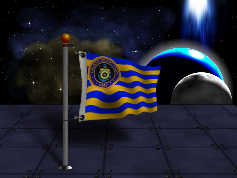
Okay, so here's mine in honor of our club's foray into the online RPG today:
I may have to add another light source so the direction of the shadow behind the flag makes sense.