


atypicalcarl
-
Posts
64 -
Joined
-
Last visited
Posts posted by atypicalcarl
-
-
I love your gallery, Helen! It's inspiring to see what's possible with pdn, and it gives us all such cool ideas for our own work.
Thanks!
-
A template is usually used to make sure your art conforms to a certain printable area at a certain resolution. DPI can be confusing, so templates are very helpful.
Move your template layer to the bottom of the layer stack, then double-click that layer in the layers window to bring up the layer properties. Move the opacity slider until you can see your image through the template.
If the areas you want printed are within the printable guide lines of your template, you're good to go. Delete your template layer and save your image, and you're done. Otherwise keep working.
Make sure to save your image twice. Once as a .pdn with layers (so you can make changes later) and again as a .png file (for printing or posting to the web.)
-
I've been drawing seriously with PDN since March of 2009. In an effort to keep myself accountable and pushing forward, here's an ongoing collection of my progress with paintdotnet.
All comments are welcome - even negative ones. Constructive criticism is even more welcome! I'm posting here to improve.
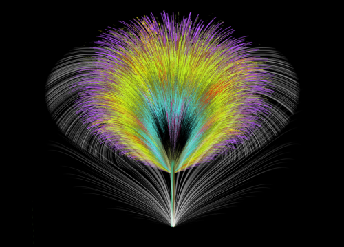
Day 1 - I salute alpha displacement:
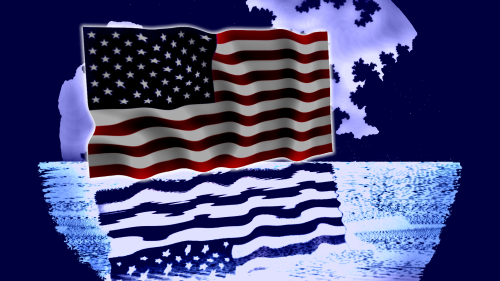
Obviously, I also learned to salute water reflection, mandelbrot fractals, and just about everything else I could toss onto this monstrous thing.
Week 1 - bearing the moon:
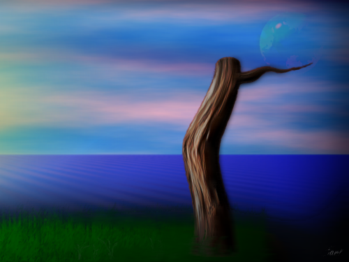
This was created following Ash's wood stems tutorial. Since I had the wood stem, I had to pack all sorts of bloody potato around it...
Week 2 - Fried Eggs:
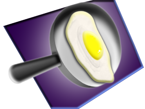
I learned how to use shape3d, Rotate, and Bevel. It's easiest for me if try to create something realistic. It seems to really help me to fully anticipate how an effect will render.
Week 3 - Waterfall:
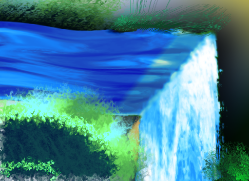
Using Dents and Jitter to simulate acrylic painting. It didn't start that way... so the water doesn't match the style.
Week 3 - Feather:
Making use of gradient bars, jitter, and inside-out.
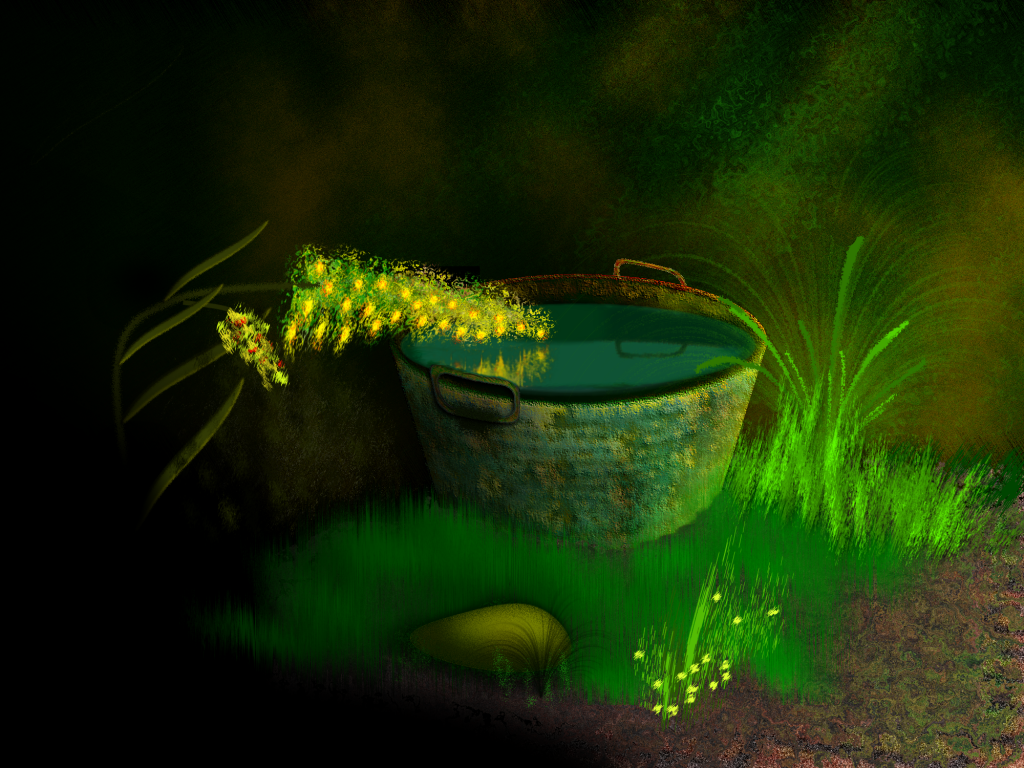
April 12 - Garden Tub:
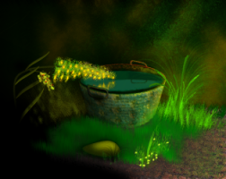
(click for a larger version) - playing with greens and yellows, and becoming impressed with paint dot net. This started as a brick reflection pool, but I wasn't happy with the brick (didn't fit in the woods.) So I mapped it to a cylinder with shape3d and ran it through about a million filters to create a washtub.
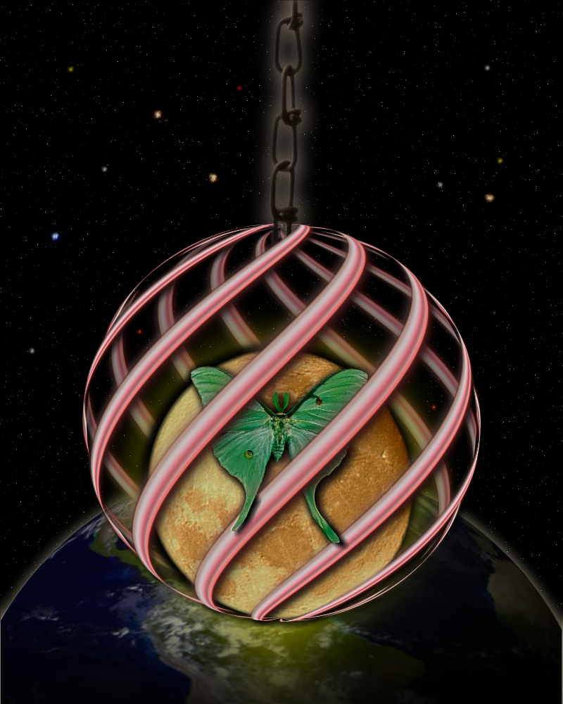
April 15 - Moon Moth
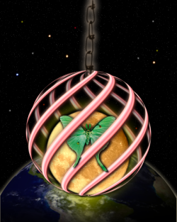
This is a collage of stock images from deviantart (moon, moth, chain) plus original elements created with pdn. Shape3d works great when you create a few diagonal lines, duplicate the layer, then render a half sphere map on each (with the x-axis rotation set to 180 on one layer.) Stick a layer in the middle and you've captured the moon!
Thanks for stopping by!
-
Always save BEFORE applying an effect to a large image.
Keep a black background layer and a white background layer while working on images with transparency. Toggle the visibility on the temporary background layers to check your work against the backdrop with the best contrast. It saves the eyes and makes for easier and cleaner work.
edited to remain on topic.

-
The spacescape rocks, for sure. If you're looking for nitpicks...
There's a star or two in front of the planet at the lower left, screwing with the scale. It messes up an otherwise terrific execution. I like that you've chosen a vertical aspect - suggestive of a panel print. Now make two companion pieces, and you'll have a terrific set for the wall.
-
I like the mountain - particularly the tonal contrast between the summit and the sunset. However, it seems sort of "wasted" when placed in the least interesting part of the canvas (nearly dead center.) Consider placing the summit in the upper-right third, with the landscape flowing downward to the left. It should meld better with the text.
Also, I find the vertical text off-putting. It would flow better with the text positioned horizontally (atop the same gradient you now have) -- leading my eye up and to the right.
-
The dude's probably 7 or 8. Or he's Forrest Gump. It's a very nice brick.
-
I love that, yellowman. Bright and serene at the same time.
Playing with a water theme myself:
Pyrochild's jitter is an awesome effect! Ed Harvey's effects rock, too. Both were used atop hand-work to create the waterfall and foliage.
-
The easiest way (for a noob like me) is to create the "rectangle" on a new transparent layer atop the original image. To resize it, use the "move selected pixels" tool, like LFC suggested. Either click the tool or press "m" on your keyboard. Left-click anywhere in that top layer, then press the "shift" key. Mouse over one of the corner outlining squares (nubs) and move the mouse while holding the left-clicker. The shift key causes the image to resize proportionally along the x and y axes. Release it and you can stretch the image. Play around with the tool. You can move the image around by clicking within the boundaries or resize by clicking a nub.
Another thing you might like to try is MadJik's "buttons" plugin. It seems perfect for what you're trying to do. PS - an arrow may be created with one of the wingdings fonts and it won't look so rough.
-
There's a forum devoted to tutorials for enhancing photographs. Check it out - you'll find it very helpful: http://paintdotnet.forumer.com/viewforum.php?f=36
-
The first is better. Consider adding a gradient to the cloud layer to add a little depth perspective.
-
this post intentionally left blank.
-
Simon's advice is good.
 (of course)
That's pretty much what the website you mentioned is doing. They're running a program called magiczoom which displays the different pics via jscript and css.
-
I can't see them in the normal way, either. However, if I cross my eyes slightly and attempt to weakly focus on a spot in the stereogram, it becomes apparent. Turning my head slightly seems to help.
-
One tip I've stumbled onto that might help: Enlarge the image before you use the wand or feather effect. You'll get far more control over the tool and effect. Zoom in to see small areas and work on them manually, using the eraser. Feather the selection after you've deleted all want removed, then resize back to the small original size. Hope this helps.

-
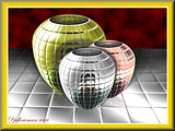
Playing with shape3d, rotate, and bevel, plus a series of circles bulged:
My mouse is acting up, so I'm trying to learn ways to use the effects plugins until I can get back to pixel work. Any tips are greatly appreciated.
-
Sorry, Janetsue. I skimmed right over your tree. Very nice. The only thing I'd suggest would be a little more lighting and shading on the main stalk of the tree - but my home monitor is admittedly a little dark.
stealthed- I like it. The rough lines give it a cartoon-ish but cool feel. I wouldn't change a thing.
-
This is not a photo ,it is 99.99 % PDN
Gold, Silver & Bronze
Wow. I love that still life! Very techno and modern, perfect subject for the medium.
-
An administrator account is necessary because Vista won't allow you to easily get around DEP. You'll need it to move files to program folders, etc. The *very* cool codelab project can only build a dll if you're running paint.net as an administrator on Vista.
Visit the tutorials forum and read, read, read. It's a terrific resource!
-
I appreciate the tips! I did a quick motion blur on the inside of the curve, and edited the post to fix (some of) the roughness.
The tree was made using Ash's wood stems tutorial. I spent so much time wonking that tree with dents and bulges... I had to keep going with it.
-
In Vista, I believe it'll be called "Open File Location." Do as Bolt says and click the effects folder, then paste (or drag and drop) your dll there.
-
The fire effects rock. I've been toying with pdn for a couple of weeks now, and it's all I can do to keep from using fire in every creation.
I'll probably regret sharing before I've mastered this... but here's something I did this morning (100% pdn) based on a compilation of several tutorials:
-
Thanks for a simple and very useful tutorial!
My try:
(yeah... I go overboard with effects)
-
It's very cool, lego. I've been playing around with pdn for about a week and came up with my own first sig... thanks to a few awesome tutorials.


pyrochild plugins (2020-11-21)
in Plugin Packs
Posted
Gotta add my appreciation to the pile, pyrochild. The more I learn about pdn, the more value I find in your plugins.
Thanks for these!