


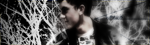
survulus
-
Posts
1,061 -
Joined
-
Last visited
Posts posted by survulus
-
-
Your Altair sigs (all of them) are AWESOME!
 As is your current sig.
 -
Yeah, your good.
You really really need to work on yout text.
Maybe read a few tuts.
Thanks very much.

Though in what pieces does the text seem to be lacking? Or in general. I'll admit, I usually go for a simplistic font, but that's just my style, simple and easy. It's all opinions nowadays, but thanks anyway, I appreciate constructive criticism.
And thanks very much LFC, a slightly opposite comment, complimenting the fonts. It's reassuring to get good coments from acclaimed artist in the forum

-
Your space-scapes..... ahhhh, they are one of my major envies on this forum!!
-
Th text on the burnout sigcould be bette, but other than all of your work is very nice, I especially like the gears sig, and those wallpapers. Nice stuff!
-
Those glossy pinwheels are really brilliantly done! Nice work, on the whole gallery really.
-
Thanks, though I just changed it insetad. the texture would've been cool, but it was teh super simplistic style of thing I was working towards. Ah well, that's gone now, mirror's edge sig now!
Thanks anyway. -
Thanks very much
Yeh, the sloping text was a random attempt to draw the reader's eye down the page, and the bloodsplat is a device for flow too, though it still seems a bit stuck. Though I fit also into a gap in the bloodsplat closer to the text, it looks a little better now.
-
I still think you're one of the best atrtists on the forum and this gallery confirms it. I REALLY love that starfield effect, dont have a clue how I'd create such a realistic star scene.
-
Finito.
Can't wait to see everyone else's entries. -
-
That "Brandon Rush" one came out awesome, as did the Jay-Z ones. Though on some of the pics the renders seem stretched or bad quality. But the effects you apply are always really quite skillful.
-
That dog picture is a brilliant idea, turned out really good, and some of your more recent sigs have been great, like you've really be progressing a lot in your PDN skill. Also the misc picture is brilliant, maybe the best in the gallery, dunno.
-
I like your misc section in particular, some really well done stuff in there. And that new wallpaper, is that 100% pdn, cus if so, wow.
-
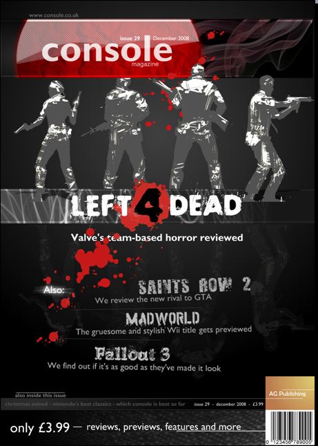
This is really important, it's for school and it's pretty much a games magazine cover, but the flow just isn't right. Any help is SERIOUSLY appreciated!!
-
Amazing new sig by the way, though I'm not a massive fan of the font the image itself is amazing.
-
Really loving that new christmas piece. I also really like how your material seems to have a nicely consistant style to it.
-
Thanks very much everyone for the kind words.
New gallery title banner up. -
In my opinion your skill in PDN is certainly improving, some interesting phsycadelic colour schemes in your images, which is quite good, though maybe in the future try more specific colour schemes and moods. Overall it's a nicely varied gallery. I like the skyscrapers in the water, a simple yet very effective combibation of techniques.
-
Yeh, I just do it the old fashioned way.Duplicate layer, change opacity to half and then put gradient (linear) to transparent. Easy enough.
-
I have finally uploaded all of my images and I'm showing them off here again. I'll update it as often as I can. Criticism and comments are very welcome.
-
It's safe to say there's quite a few people who will always interested in your new material Zwicky.
-
Your current sig is very stylish!
And those new avs? Seriously cool. The best one? Greyscale, though I think the colour of green used is maybe not great. If it was does slightly... more cleanly (for want of a better term) I'd go for the green. -
Wow... how on earth do you do that Ray Lweis one, it's brillaint. But a very polished high quality collection you have there, colouring is good in the last 1 expecially.
-
Is that real? Cus if it is I want!!
Eraser18's Gallery (Updated 12/29)
in The Pictorium
Posted
I love the "bribery" one, gives me all sorts of new ideas actually. Just spraked something, ya know?
And yeh, changing the lighting on photos rocks. Nice photo too.