


survulus
-
Posts
1,061 -
Joined
-
Last visited
Posts posted by survulus
-
-
Defragment it I meant.
 It'll probably be in your accessories or system tools section on your start menu, helps clean the memory by organising it, takes a while though.
 -
Hmm, that is a while for any render despite the size of picture, could defrag your pc, see if that helps speed things up.
-
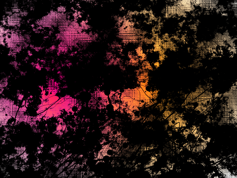
The new flame peice is really cool, but the text colours need to be a lot more subtle, instead of bright yellow and orange maybe tone it down a little... but nice work on the effects on it.
-
I'm having trouble again- my signature and avatar- the background is off, I know it is, I've tried 6 different backgrounds and it's starting to drive me up the wall. Any help?
-
Loving the new signature and avatar, really sleak and profesional looking, as always.
-
Loving the new signature and avatar, really sleak and profesional looking, as always.
-
That one is just awesome, brilliant colours and concept.

-
That one is just awesome, brilliant colours and concept.
-
I love the new wallpapers, really smooth and elegant, and the colours are brilliant, very nice work. And to be honest, you're one of the people who inspired my starscape, no wonder with that pic, I can't get over how detailed the texture is, and the background... anyways, that's old stuff, which is good, but loving the new as well.
-
Awesome texture, I'll be sure to use it something, a really good outcome. Here's what I came up with, I messed about with the colours too.
-
Very nice, yet simple tut, I'm gonna keep it in mind for sure. Here's my outcome:
I made some of my own little tweaks.
-
Very nice, yet simple tut, I'm gonna keep it in mind for sure. Here's my outcome:
I made some of my own little tweaks.
-
Awesome new signature and av combo, and also pleased your gonna be back for another year.
 Glad to see more amazing work, KIU.
 -
Awesome new signature and av combo, and also pleased your gonna be back for another year.
Glad to see more amazing work, KIU. -
That's 5 ago the deadline passed.
-
I think you've really improved since recently, the newest sigs you've done show how much you've progressed, you've not only got a really good grasp of the technical aspects of the program but there's a sense of style there too. Really awesome work on the gallery, so nice work.
-
Some of your planetscapes are amazing, as are your more realistic images of fruit and the wine glass, so I think the whole realistic image thing is your strong suit. Really nice work on this gallery, can't wait for more, because it all has a really nice touch of profesionalism to it. Great work.
-
The hearts are really cool, sort of in the glassy yet crazily colourful style of your previous abstract piece, which is a good thing by the way.
Again, brilliant work. -
That Prince of Persia sig is a really cool idea, nice work.
-
Some really great stuff, from the pics I'm going to assume that your hand-drawing skills are good.
That's assuming you use them here, which it seems is the case, but I may be wrong. -
I don't think smudge would work, gives to soft a look. Have you checked any other font websites?
-
It's all in the font I'm afriad. DAfonts is a good site, check them up, and there's others out there too, there's bound to be one that matches your fancy.
Either that or us the splatter plugin but using a font would probably come out better.
-
I've considered making a tutorial. I've come to the conclusion that i definitely want to do one, I just need to find the time. So, someday soon...
I would REALLY appreciate that dude, I've tried the photoshop tuts, but I'm not good at improv, I'm not good at working my way around the steps I can't do on PDN. But your choice, I know how hard it is to find the time.
Image Hospital: Help With Image Problems Here!
in The Pictorium
Posted
I've had a go at bringing the background's style into the fore as well, but it's kind of tricky, unless it just ends up becoming tomuch of a focal point in itself. Though the background in this case isn't a stock, all PDN, but I understand what you're saying. So maybe if the background were in the same style as the skull, sort of a wierd vector cartoon-y thing?