


Boude
-
Posts
583 -
Joined
-
Last visited
Posts posted by Boude
-
-
how about a "g" and an "f" in lightning?, that way people won't notice you have been on the gold text tut tour
 .
. -
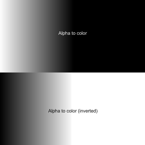
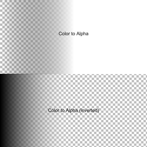
Here is 4 in 1 plugin, all for alpha.
The idea for this plugin came when I was messing around with pdn and I realised that you can't see the alpha channel as well as you can see the red, blue and green channel, so I thought that displaying alpha with a black to white gradient would make alpha much easier to see.
My plugin has 4 options: Alpha to color, Alpha to color (inverted), Color to Alpha, Color to Alpha (inverted) the last 2 bassicly do the same as Alpha mask with no mask, so the plugin uses itself as mask. Alpha to color sets the current Alpha value to be the value of the red, blue and green channel providing you with a "complex" black to white "gradient".
Here are some examples of the Alpha to color mode.
before:
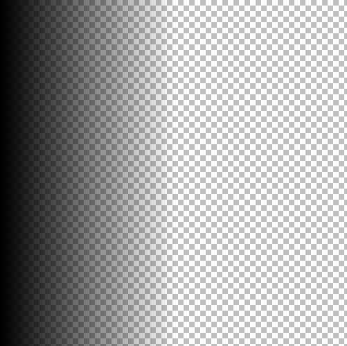
after:
Here are some of the color to Alpha mode.
before:

after:
I tried to enable you to preserve the colors in the Alpha to color mode, I failed
 .
.Hope you enjoy it, by the way my first published plugin
 .
. -
I would want to, but I don't have enough time.
-
clouds, constrast to 100, gaussin blur at 1 or 2, curves to get the good colors.
-
basic antialias works best for me. (use search)
-
Anything glass that isn't plat changed the direction of light, either bundeling it or the oposite, http://en.wikipedia.org/wiki/Lens_(optics), this means that the shadow of the ball should be a focal point, a point where the rays of light meet, so a point that is lighter then the rest. learn your physics
. -
good tut, but glass bundels light (just light a magnifier) ,so you should have a light point and a slightly darker area.
-
@welshblue: for the lines gaussin blur and lower opacity and for the light my advise would be to paintbrush and blur on several layers and different amounts, lots of work, but the best way to get it done properly, don't forget to get an alphamask if you are going to do it that way and you might have to get rid of the bevel.
-
@welshblue: I found out that to give things depth you should adjust the light and/or morph it so that the texture curves around the object, basicly shape 3d+. If you need any more help pm me, I suggest that you pm me anyway.
-
if it's all on one layer try using magic wand with 0% tolerance and additive selection mode and then gradient the selection. btw 0% tolerance only works when the lines aren't :AntiAliasingOn: but :AntiAliasingOff: , with words when the lines are anti-aliased, my advice would be to first color and then draw the lines. And maybe a transparent gradient would help. if you need more advice you can PM me.
-
@oma:oh my god, it's beautiful, looks like a flooded ice cave, I'm currently in need of a lot of inspiration and if I can't find it in the picture I won't find it anywhere.
-
david atwell, I think it's good that you made a sig just to remember us of all the soldiers that died or sacrefied themselves for us, even though I'm Dutch I really appreciate it.
-
try using an extremely large brush size
-
good job, but there are some jagged egdes and the perspective is wrong and the screen is not in the middle of it's pedestal (
-
This is what I got after 10 waves:
My guess is that that is not the desired effect.
Edit:
more experimenting with less radius and more waves came to this:

I forgot to mention the auto level and noise, pixelate, clouds.
-
@topezia: yes, get rid of the frame and I would also try to get rid of the yellowish noise, it make the picture a bit weird, but you did a good job anyway.
-
@LFC4EVER: I think the blue one is better, because the lighter part is just lighter, not red. By the way, it is far too big for a sig.
-
@Olav.k.m: you're right, my goal was to make a slightly dented sphere, however I think it's the only flaw in it. Maybe one day I will change it...
-
@olav.k.m: almost flawless, but the text (50ml) isn't curved and the egdes of the bottle of water are slightly jagged, however I can't find a single other flaw in it, overall great job.
@topezia: It's scaring me to death :shock: , but shape 3d wasn't the plugin for this as it doesn't give depth to the teeth. My advise: only use the smaller one, no flaw in there.
@ash: Your location is an URL.
The product of boreness:
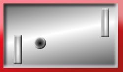
The name of this game was pong right?
-
@kemaru: no offence but you already posted that one, and you -
- made it 3 in a row.- Try not to post your image right after another user's. Allow some time for people to reply (or give an opinion yourself!)anyway, looks good, but could use more color.
@peterpawn: I love it, but I'm not sure if you should keep it like this or that you should get rid of the egdes.
@goonfella: I'm not a really big fan of halloween, in the Netherlands it's no big deal, but I think it looks too bright and the eyes are just gradients try lowering the opacy of the gradient, but overall: good job.
-
@aull Arkenbon: try using tumbnails, in case you don't know how:http://paintdotnet.forumer.com/viewtopic.php?f=34&t=26979
@becauseiwantedto: looks very realistic, just try using alpha masks, and personly I believe it belongs in the realistic part, if not then the compass alone would.
@goonfella: It's not the best abstract of all times, but good effect, try using more colours, I think that would make it look better.
-
@topezia: Well in my country red is the colour of love, we even have a song just about red, but it's Dutch so you probably won't understand a single word of it, and the reason why I let the middle of the line red is because I wanted to leave the lightning effect.
-
@Kemaru: it would look much better if you would have auto levelled it, please don't blame me for taking the privilige.
Note to people not paying attention: I did not make this!
-
@Aull Arkenbon: I like the first one best, it almost looks like a face, I love it, beautiful. Second is good but nothing compared to the first.


Image Umbrella: Realistic Images
in The Pictorium
Posted
@barkbark00:Just to put more presure on you , plz make a tut, I guess even ash could learn a thing or 2 from it.