


ZizOiz
-
Posts
617 -
Joined
-
Last visited
Posts posted by ZizOiz
-
-
I like the second and third one most, the second one because of the well-rendered lightning, though IMO you could do more with the text. I like the third one because of the background-looks like an aurora to me, and because of the text, though, again, you could do more with the text. I like the third one best. Have fun and welcome to the forum!

-
my attempt:
-
Hiii..i m new to this paint.net but wanna learn more things in this..
Hey i m not able to do this..
the trick is really good..
but i didn't get by what u said.. i mean creating that black box from where the picture should pop out cant be done.. how to do that.. only first two steps i was able to do..that is creating duplicate layer till there.. next step i was not able to do..please any one help me..i m new to this paint.net..using it from last 2 days thats it...
and one more thing i dont know how to use layers i mean when i duplicate layers i m not able to go to prev i mean 1st layer..how to do this?? really good thing i found is this one..and i wanna learn plss help...
thanx!!
actually i selected rectangle from tool bar and created a black box where the picture is covered which should be popped.. now next step i.e Select the black box and then select the second picture layer. Invert the selection and hit delete so all that remains is the picture that is in the shape of the box.i didnt get what you said..i selected the black box by using rectangle select.. later i dont know how to select the second picture layer nd also inverting it.. please now help me..after a long try i was able to create a black box..now u have to help me in this step please...
You can select the layers by clicking on the layer you want to select in the layer selection box. If you don't have the layer box, go to Window> Layers. (F7 is the shortcut)
For selecting the black box, once you have selected the layer the black box is on, use the magic wand tool (first column, fourth one down in the toolbar) to select it by clicking on your black box. To select the inverse, press control-I. Then select the layer that you did not cut out, and press delete! Hope this helps!
EDIT: My try:
-
like it!
here's my attempt:
-
Nice! where did you get that font?
my attempt:

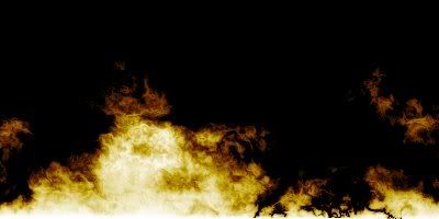
Heh. I just realised how hard it is to see the (I guess you would call it an extrusion) against that background.
-
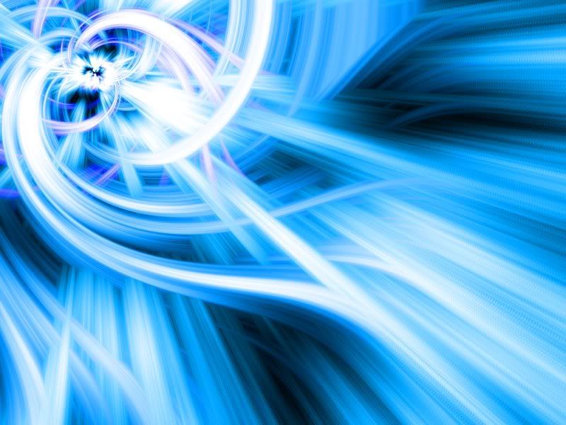
Nice! much better background, IMO!

-
LFC4EVER: that planet is amazing! nice job on the lighting, and the nebulous cloud in the background! The only thing I would do would be to make the comets go in different directions!
-
A really nice tutorial! wonderful introduction to how shape 3D works.
My two attempts:

for the bottom one I tried to imitate the hazardous waste symbol.
-
Yes!
I wanted to see it even bigger than on the gallery page!Edit: looks amazing!
-
:shock:
I said "wow" out loud when I saw it- looks so dramatic, with the intense colors through the bubble. The ripple looks even nicer at this size!
-
I like the backdrop it's on-looks like polished metal, especially like the dots. That would make a neat tabletop!
-
Looks good Ziz. I'm a fan of the last one.
Thanks! that last one appears to be the most well liked of the four!
I also like your signature, has great contrast! -
Nice concept- I especially like the idea of a bootable version of Paint.net! On the topic of looks, I also like the taskbar, and the way you blended the letters, though I would suggest a slightly different background, possibly one that draws the eye more towards the logo. I like it!
-
Thank you! the bottom is my personal favorite, too.I really like your last (current) one, how some lines are thicker than the others, giving a sense of depth.I also like the one Nab likes too, it looks cool.
I really like your sig, the bubble and the ripples work so well with the rest of the picture.
-
Thank you! I really like your current one, particularly the glow across the face of the planet.
-
Nice piece! I think the lighting goes well with the rest of the piece, though I think it is a bit grainy, so you might want to turn the compression down when you save. (if this is the case)
-
All of your work is beautiful. I liked one of your wallpapers (PI+) so much that it's now my desktop, and I had trouble deciding whether or not to keep PI+ as my desktop or use industrialize instead. I particularly like the cleanness of your pieces.
-
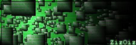
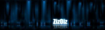
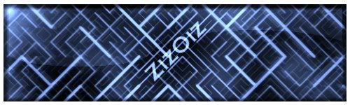
I have accumulated a few signatures that I couldn't share until I registered! I like the ones at the bottom most.


-
Thank you all, and I agree that Pyjo's arm is very good indeed. I particularly like the blending between upper arm and forearm.
-
I really like the background lighting on your ballerina, and your water picture looks so realistic!
-
my first post! I have been playing with Paint.net for a bit now, but just joined the forums last night.

Wow...very nice!
Thank you!
-
Thanks!
-
my first post! I have been playing with Paint.net for a bit now, but just joined the forums last night.
Image Umbrella: Abstract Images
in The Pictorium
Posted
I like it, especially the way it seems to recoil from its most twisted point!
EDIT: @barkbark,I love them, so clean and simple, yet visually interesting! 8)