


ZizOiz
-
Posts
617 -
Joined
-
Last visited
Posts posted by ZizOiz
-
-
The B must have taken a long time to make, with all of those plastic nails to make (that's what they look like to me anyhow
 ) . I like the way it came out, though, looks futuristic to me. 8)
 -
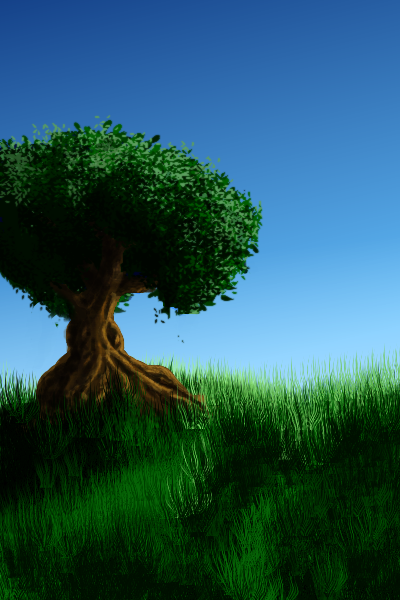
beautiful! looks like watercolor to me! :shock:
-
Updated my sig and avvy, added some glowy line things, richer colors, etc ...
:shock: *mutters a few consonants in shock* so....pretty.... it just keeps getting better and better!
WOW! Expiration :shock: , do you like it to make our sigs seem like something out of a cave?
I love your sig and avatar, I like the new glow lines.
How do you like my new sig?
I like it! it looks sort of like stained glass.
-
You have done great work! I like your pics, I just think you could feather your sig a bit, the text is kinda sharp in relation to the transparency. <-That was a bit too formal. :wink:
Good luck with the rest of your PDN adventure

Thanks! I am thinking about redoing my signature, as I think it got sort of jagged- I didn't resize it enough.
Wow great work love your "danger warning eye" and nice tuts keep up the good work z.Thank you!
My favourite is the twist. It's electric in a way. And the bricks look so real, keep it up.Thanks
Great Gallery - you have a lot of great stuff. Good job overall with everything --One problem -- when I go to view your photobucket album from the link under sigs, it says I need a password... You should figure out a way to make it public.
Awesome job with everything!
I think I did just make it public I'm in the process of checking now, though!
EDIT: heh. Forgot to update this. It's public now!
-
Welcome to the forums! I like your first three a lot! It took me a gew minutes to realize that the squares in the second on were arranged in #1.
-
I like it!
-
Another update! rearranged the gallery a little bit, and posted my new avatar and signature, as well as posting a link to Photobucket's handy slideshow feature for my signatures and avatars, instead of posting them all, as that would increase clutter dramatically, and make scrolling through the gallery a pain in the neck (speaking of which, my neck hurts today. wierd.) Also, I am too lazy.
-
Hi and welcome to the forums!
I really like your top one! and here is the code for thumbnails:
[url=The URL of your bigger picture here][img=the URL of your thumbnail here. You have to create a different graphic as far as I know][/url]
Hope that helps!
-
I too, especially like the first one! Good job and keep having fun! 8)
-
@Ryu: please be nice and don't bite the newcomers!
Masterfrofro: did you get your inspiration from Cars©(I have no idea what other protections there are) for your second one down?
:?: -
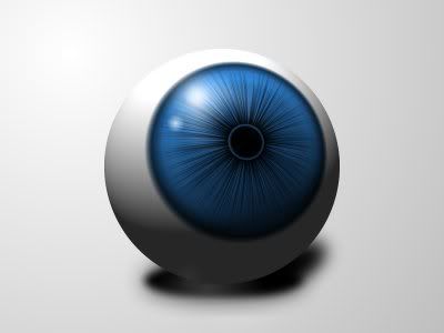
I like your work, especially the 'eyes' at the top! I also like your glass sphere!
-
Love your work. Great job!
Thank you!
New desktop background, see first post. I'm currently using it as my desktop.
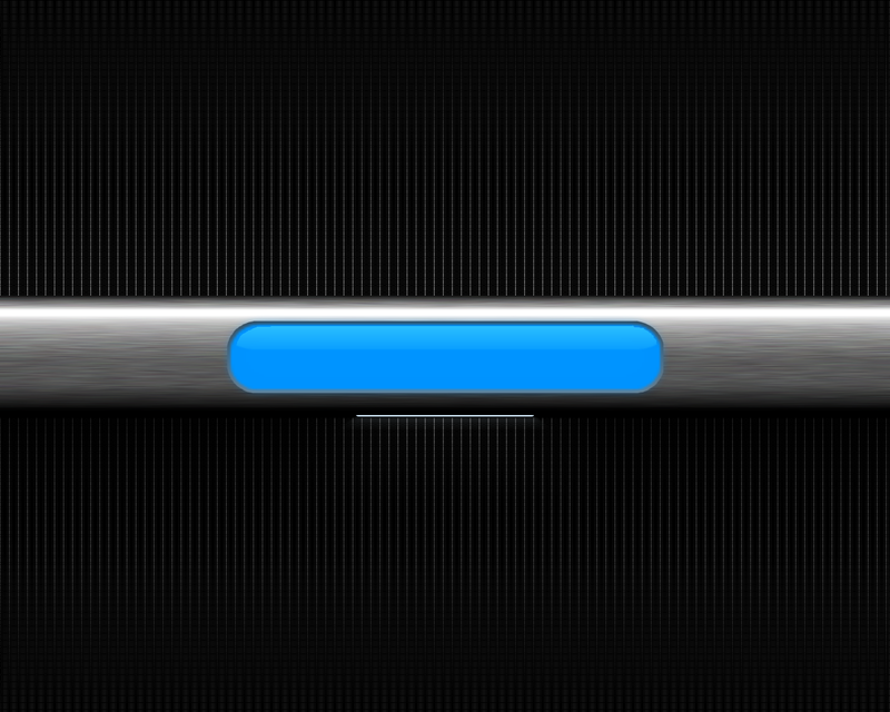
I tried to make a very open mesh texture for the background, and failed miserably. I also think the bar in the center needs to be thinner. I like it otherwise, though.

-
Hi, and welcome to the forums!
Very nice, and Ilike the gradients, though you may want to put some shading on it, to make it look more 3D-ish. Very nice logo with or without shading!
-
Funny! I like the cell-shading type style in the second one, too.
-
:?
 :?
:?  +
+  =
= 
BTW, this piece is called "Fight to the top!"
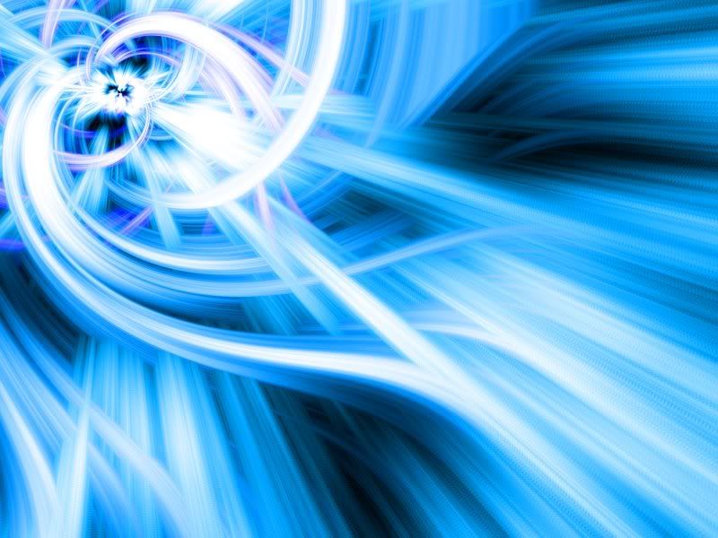
*mutters a sequence of consonants that do not form a word* :shock: That is amazing!!!! The second one looks just like a waterfall, and the third, cascading water. I love all your stuff! 8)
-
Your work is beautiful! I especially like the header and the first one below it! The flowers are beautifully done, and look like they're really hanging down and obeying gravity(That's very hard to do for me) and the second one down, everything looks so delicate! Beautiful work everywhere else, too!
-
Here's another:

Nice! I like it much more than the other one, and it looks so shiny and yet mechanical! The way the rolled over button shines on the mesh is a little detail that makes it that much cooler! 8)
-
I see you like my eye tut
And good job on the rest of your work too.
Yup! I had a lot of fun with your eye tutorial, and it helped me out with shape 3D!
Thanks!I really like all of your work, you have a lot of potential! Keep working at it, you will go very far!You have a nice gallery :wink: Thanks! -
-
Welcome, and feel free to comment! Please?
You know you want to!____________________/_Newest_____________________

____________________/_Tutorials_____________________
 -|-
-|-  -|-
-|- -|-
-|-
 -|-
-|- Made using this tutorial
____________________/_Desktops_____________________
____________________/_Avatars and Signatures_____________________
If they follow their current rate of growth, soon they will be a true pain to scroll through. So here is a link to a slideshow.
____________________/_Contests_____________________

____________________/_Misc._____________________
 -|-
-|- -|-
-|- -|-
-|-

-
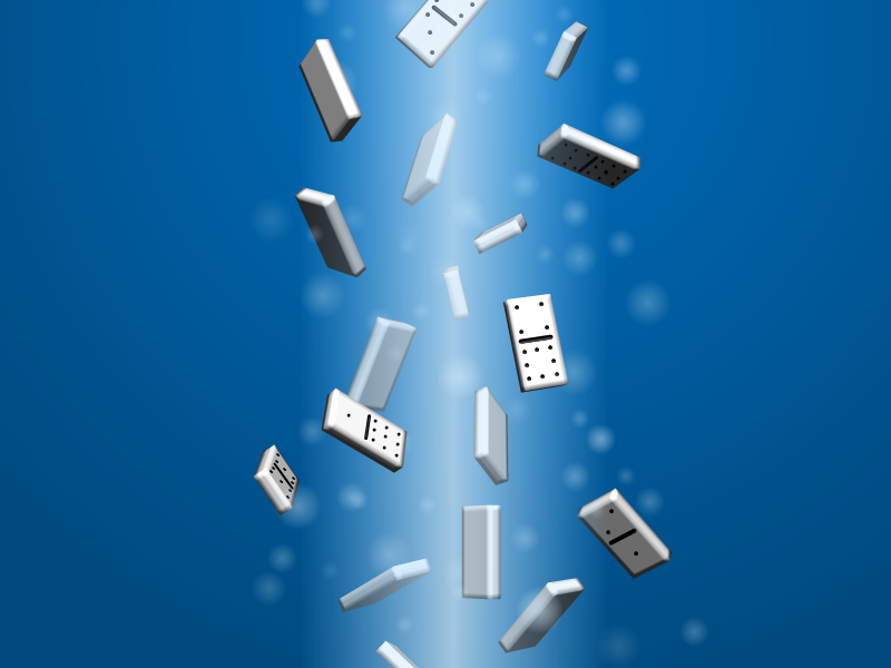
I want some of those dice! they're made of transparent red plastic! The only thing I would add would be a bit more shine on them, and to blur the shadows so they look a bit more like shadows.
-
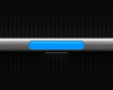
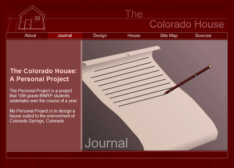
Jake2k:
nice design, very shiny and sleek and easy on the eyes, and I especially like the navigation bar, with the lights at the bottom when you move over them, and the bottom...A webpage I have been working on for an assignment in school. I used paint.net to create most of the graphics.
The homepage when a link on the navigation bar is scrolled over
-
LFC4EVER: :shock: Wow! that's incredibly realistic, right down to the shone on the wood! Nice work!
iRock: That's a great color combination in those clouds-it looks just like sunsets I have seen!
-
The looks excelent to me, no line at the top, and the toy car also looks good, though you could blend the squashed parts together more so there aren't points that you can see where the car was squished meets the unsquished parts. (I'm not sure if that made any sense)
Everything looks good, IMO, though!


 :?
:? 


Salu's gallery!! Updated 5/22: vector lilly
in The Pictorium
Posted
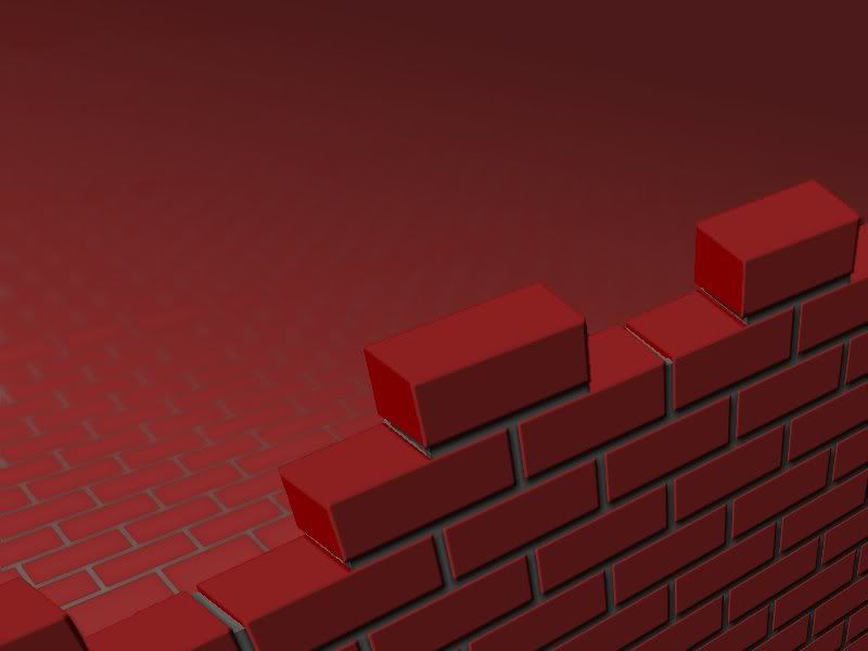
I like your button! and your wall looks just like some of the walls I've seen, though I can't remember where... :? :wink: