


St.Jim
-
Posts
145 -
Joined
-
Last visited
Posts posted by St.Jim
-
-
@LFC4EVER: Your planet looks great! Like a high resolution picture of the moon, good job! I will try and add shineyness to my marbels, they are a bit dull i guess. Keep up the good work people!
-
Here's some marbles I made that I tried to make look like glass (the reflections e.t.c) Just a small attempt and there is probally more I could do if I had time... What do you think?

Click for full size and resolution!
annother one i did (Differnet style)

Click for full size and resolution!
-
Looks a bit flat to me, but otherwise perfect! Just try and use less blur so that it shows the beveled effect I got, for example 5 instead of 7 e.t.c
Like David said, please put some more info as to what went wrong :wink:
-
Nice tutorial! Took me a while to achieve a decent result but it was worth it

My attempt:

Looks a bit like wordart in office 2007.
-
Odly enough there is an opacity setting on the eraser. Just open your colour pallet and change theprimary colour to about 100 alpha to make it only take 1/2 of the picture away when erasing.
Faking soft brushes, just adopt the tutorial for the eraser.
Have fun

-
Amazing plug-in. Has become one of my favourites for making a rainbow/recolouring effect without messing arround with curves/curves+
I think it has plenty of scope for tutorials!
-
A simple take on Vincent van Gogh's Sunflower's:

Stock:

Not the best, the frame could have one with some anti-aliasing, but I think it looks alright

-
very nice tutorial! I'll have to make a new sig with it!awesome tut! Mine didnt turn out as good but still awesome!
Thanks!
@ GHXpert59: Great! I'd love to see the results of your sig

@ BlargElite: What part did it go wrong? I'd be willing to help you sort it out
-
This tutorial is available as a PDF. Click here to view or download it
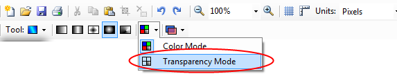
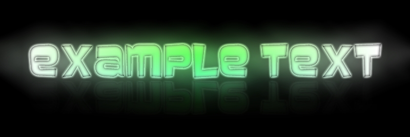
This tutorial will teach you how to create an embossed glowing style text effect:
This is what you will end up with if you follow my tut correctly:

Looks good? Interested? Well lets begin:
--You can use:--
First start off with a simple dark background, and add a new layer - call it text, then add your desired text in black colour.

Duplicate the text layer ( )(naming the duplicate text2) Then select the colour replacer tool (standard settings + large brush, 90 or so) with Primary colour White, Secondary Black. This will look like this:

Gaussian Blur Text2 by 7PX, this will give an embossed feel. Then duplicate Text2 to intensify the white. Name the Duplicate layer Text_colour.

Recolour Text_colour with your colour. Then Gaussian Blur Text_colour by 6PX. Use Circular Gradient with transparency mode ON, and drag from centre of text towards the outside.
--Someone PM'ed me asking where it was so here it is:--
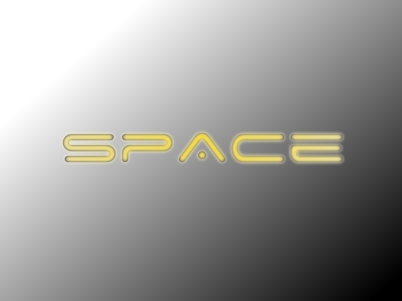
Should now look like this:
Merge Text_colour and Text2, and merge it down again So you have now 1 Text layer. Duplicate layer and merge down (X2) This will make the text glow.
Duplicate Text layer (call it blur) and motion blur at 152.10, centred, 200. And again at 25, centred, 200. Make sure that text is ontop of blur!
 Nearly there! Add new layer (ontop) and call it Line. Then draw a line 2-3PX underneath your text. Gaussian Blur the ends, and black drop shadow on the line layer at 7,7,1,4. Done!
Oh - background, yes, I did change it several times in the tut, this was to show you certain elements of it better, you can just keep it all the way through.
Hope you enjoyed this tut - I will happily answer any Q's!
Answers:
Some people have asked some questions about my tutorial, to clarify them once and for all, I'll post the answers here:
1. PX is the amount you blur the text by (in Gaussian blur) just slide it across (or type in the box) to the amount you want.
2. People who have had problems with the text recolouring I have made a video (I have tried to get across what I meant but it is a bit hard lol)
Video url: http://uk.youtube.com/watch?v=K-j5KwG_SbQ
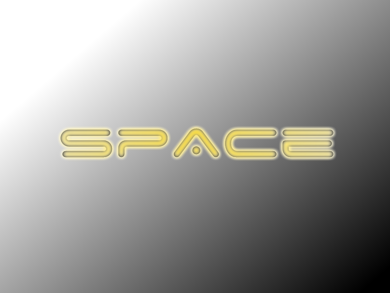
End results from the video:
-
you can just draw it yourself, pretty simple.
It? We're talking hundreds... not one.
:wink:
Well... Easy step to solve this.
Just click on the symbols tab in custom brushes and select some speach bubbles there. Yes they are black, but you can create a black one and recolour e.t.c. Just play arround with it until you find what you want.
-
It's pretty simple to do this. All you need is:
Omit this if you already have it installed.
2. A speach bubble in .png format. An example could be found on google images. A basic one could be:

Just download this and put it in your paint.net user files folder in custom brushes folder.(C:\Users\*Your username*\Documents\Paint.NET User Files\Custom Brushes)
3. Open up your plugin (Custom Brushes) in PDN (A restart of PDN will be required) and click on your speach bubble and away you go!
-
looks pretty real to me
Here's some planet's i've made (I have not used any other tut's for this!)


Click the images to make them bigger!
-
-
yeah, it does look good
Kind-of reminds me of that guy from crysis.And i request a tutorial, and i'm sure others will too.Ditto.
-
Forgot sorry! (Late @ night) I will change it now.
Grumble, grumble.
-
Nice! I like the glass border - perhaps it would look good with a bit of blur arround the edges (On the original image to look like vista's aero interface
)Good job, keep it up!
-
I've also made annother one, using annother image i took (night time one) Can you tell me which one looks the best?

Final image 2

Final image 1
Original files:
-
Yeah, it looks kind of neon-y. I've been working on this vista style (Photographs) wallpaper combiing 2 pictures, 1 of my tree, the other of a night-time cloud streak i took a few nights ago.
The final image
The original images:
I think it look's quite summery, can you tell me what you think of it?
-
I like you idea very much - the clown uses much the same colours as the (Sprinkles? Spray?) in the background. It also blends together quite well.
Not sure about my av though... Do you think I should scrap the only fools and horses tax disk and have a themed one like my sig? Or something else?
-
Here is the one I have spent a whole 5 minutes on
Seriosuly I was pushed for time....

Main page.

Why not?
oops! :oops: I forgot the sources ->

http://www.getright.com/small-pages/ima ... ot-net.gif Paint.net logo
background © me.
-
Yeah I don't see any 'after' image either

Ditto, check your links, I might consider dloading and i'll post what I think
-
So what you're suggesting is tabs for the PDN toolbar (Usually on the left?)
If so, then do you mean something like this?

This could be possible in future versions of PDN, with user-generated brushes e.t.c, but it doesn't look as if it's going to happen soon...
-
Nice! I like the colour of the background chosen, as it matches the colour of the guys shirt. I think that the blur (Or what ever it is behind the guy) needs to be a bit fainter so that it emphasises the guy more. (Sorry for saying guy so much, I do not know a think about football) Other than that, keep up the good work!
-
Im a bit confused... :?
So are we creating just a standard 1 image of what the phone/smartphone would look like when its all booted up e.t.c (Main screen) Because the O/S bit made me think Wha-! A whole O/S! So would I just include what I have said above or something else?


.JPG)
Monthly Skinning Competition XIV - Voting commences!
in Paint.NET Discussion and Questions
Posted
Basically its a reskin of a website that doesnt exist... the Paint.net Gallery!
Some parts of the design are recycled, such as the small borders arround the main page from my other website, but other than that and some stocks used from Vista Buttons.com and the Pi Pie
Hope you enjoy!