


R3VENGE
-
Posts
1,140 -
Joined
-
Last visited
-
Days Won
1
Posts posted by R3VENGE
-
-
make a new layer above your image then do the checkerboard but make sure they are just black and white then use the magic wand tool and set the flood mode to global its the symbol thats a lightning bolt and click it to change it to a globe
 then click the black or white and then hide the layer then do what you want hope this helps
 -
wow i love your current sig
is thier a tutorial on it -
R3VENGE: 2 things, 1 your name breaks the no yelling rule , and of that Metroid Sig, why is there a zoom in of her crotch? I thought that was funny.
well i drew the box first and that was the first part i put the square over so i just copied it
i was going to say some stuff about the joining and the helmet in really small text but i couldnt be bothered to -
very abstract and colourful lego i like it
-
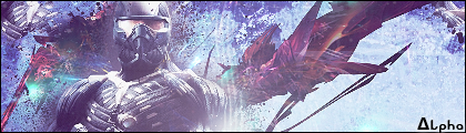
updated with new sig, wallpapers and logo/bar
-
thanks guys
@eraser18:champjev is going to tell me a few tips on backgrounds cos all i come up wiht is a gradient lol
@MiguelPereira:per haps ill use a bit of feather on it
-
that sig avi combo has some really nice colour depth thehamster
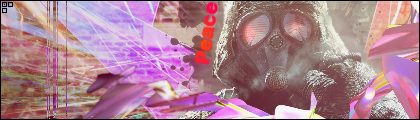
it looks really cool a new style im trying out

normally id go for abstract 100% pdn things but ive decided to go out of the abstract box and started to look at using stocks, renders, fractals and c4d's
so what do you think of this?
-
Actually most people here do not use them and I do… it is just my style a lot of people seem to like it and think I use PS or Gimp…
{Ch@/\/\p}
i use stocks when i make stuff in gimp
and is putting "{Ch@/\/\p} one of your styles too lol :wink:
-
Agent: you’re stuff is to cluttered and plain use some renders and stocks and experiment!
you dont always need a stock or render to make a sig look good though look at ash's he made that no stock ther
anyways
@champjev:i think you need to try and make some stuff without having a stock or render.
-
i really like some of your abstract work especially xplodepy4 you have cleverly disguised a polar inversion
nice work though -
now i understand it
loland the bottom two pictures of "luminosity" look like mercury
-
dude your artwork is amazing :shock:
-
i really like the orb in weave orb it has an amzing effect to it
-
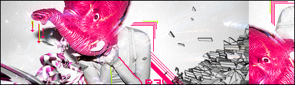
@spirit scout:it seems a bit cluttered but gives good depth i like it but yea its too cluttered for me i like simple open things
heres a new sig im working on its a wip but i dont know what to put on the right...
img removed
anyway what do you think of it so far?
edit: heres the finished one

-
thanks olav i really like the rays in your background and how they all go to the side
it has an amazing effect -
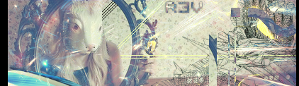
im was working on a new pc background but ive never finished it lol
anyways i made a psp wallpaper and an i pod touch wallpaper a few days ago
im currently working on a sig in a similar style aswell but anyways here thay are what you think? (click to view full)

so what do you think?
-
dude your stuff is awsome
Thank you. Your work is coming along very nicely as well.
thanks
and i like the layout youve made for this -
@j2k: That's hawt.
@jerkfight: Looks nice, but a little to rounded to me. Maybe that's the look you were going for...
---
Two interfaces of my own, one of Google, and the other Paint.NET. (Both for the Monthly Skinning Competition.)
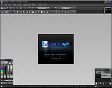
Also can be viewed in my gallery.
o wow i like both of those they look awsome and i love the pdn one i like that it has less clutter of toolbars and that its stored niceley at the top
-
draw it simply with the line tool then use the drop shaow in the same place and wider or maybe i used outline tool and delted the inside(i dont know exactly) then gausian blur it to make it neon like
-
errm im a little confused where do i post icons ive made?
or splash screens
Interfaces Umbrella
k thanks
-
errm im a little confused where do i post icons ive made?
or splash screens
-

Newest stuff is at the top of lists
 Hidden Content: ''
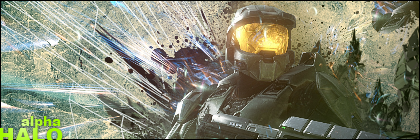
 Hidden Content: ''
-
dude your stuff is awsome
-
heres my first and most probably my only


Image Umbrella: Signatures, Avatars, Logos & Text
in The Pictorium
Posted
yea i need to feather the render a bit but im always stumped with backgrounds lol
  andi only use renders from planeet renders and c4d's of one of my friends and all the fractals i use are actually my own
@expiration: wow nice sig greatly cut aswell
  im going to start on cutting/rendering aswell