


DarkShock
-
Posts
4,312 -
Joined
-
Last visited
-
Days Won
3
Posts posted by DarkShock
-
-
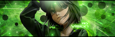
October 25th Update
Got bored. Made a sig.

-
But how many people know who has been past mods? I wouldn't know and I'm sure a lot of the members around now wouldn't either.
Crazy Man Dan (CMD)
Myrddin
And I think oma used to be a mod. I don't remember.
-
@HELEN and dug: Thanks guys. But it's nothing new. Just pieces of my sigs put in one.

-
Is dug crazy!!! O.O
pyrochild hates socks. I won't be surprised if dug goes on a one week vacation (suspension).
-
Thanks for the feedback guys! You're kind words are very appreciated.
@HELEN: What took you so long!!! Kidding. I'm glad you liked them,
@chimay12321: Practice, make something you're comfortable with and have your own style. Identity is important.
-
Ahhh that's what it is.
But then it's flashbacks to the raves of old, munching on too many disco biscuits - then I end up dancing around the room and not creating

Yea looking back, the techno/rave music is pretty annoying. I only used it cause the videos were in time-lapse so I though it mixed well. I'm older now and my taste for music in my videos has changed. If I could go back and change the music, I would.
-
Lol I gotta make a new banner for the new name and what not. I got bad OCD, so I want it to be all centered and look nice.
Download the align plug-in. It will center everything in your selection.
-
@Welsh: It was you who nominated, so a personal thank you, Welsh. I think Dark is a good artist to work with.
Aww thanks.
-
Congrats Daniels.
-
That looks pretty cool to me but I'm no expert. If you get a chance have a look in Darkshock's gallery and check out his amazing videos.
Oh shucks. You're spoiling me.
@phenomenaldeath: It's great how the colors match, but I have to pointers for you. 1. Make the render bigger. It's supposed to be the highlight of the sig and the background is taking up about 80% of it. 2. The text. You should try to cut down on it. If you can't, try to make it smaller and more uniform. The text is on the bottom left, bottom right, and on the left coming down towards the render. If the text is all in a general area it won't look like a mess.
-
No problems for the nomination ... it's been in my bookmarks for ages (along with others for other people I must get around to 'reporting') ... and much deserved
Excellent collab' with Dark' ... a great marriage of styles that look well suited
WHOA! I'm not ready for that yet! O.o
-
Whoa! I think this is the first time I've seen EER post in my gallery.

The song is Evermore by Jesper Kyd.
-
Just curious. Is your name Arika or Akria? Your banner has a different name than your username.
-
Nice work! Is that blood coming out of the sink? If so, I'm not going to ask questions....
-
October 19th Update -- Watch and enjoy in HD

-
Thank you for your kind words. How long have you been making sigs?
-
Awesome sigs! I must know where you got that render of Lightning!
I'd like to see more of your work. It would be great to see you stick around. I also have a thing for render signatures.Welcome to the forums!
-
It was an honor working with you HELEN. You're work is and always has been amazing.
-
Congrats Sasha!
-
Oh shucks. Do you guys really mean that?

-
Thanks guys! Have you see the first collab I did with Kemaru? It was made years ago.
-
Thanks for the feedback guys. It was a pleasure working with the three of you.
-
Dude! We're awesome!
-
 1
1
-
-
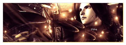
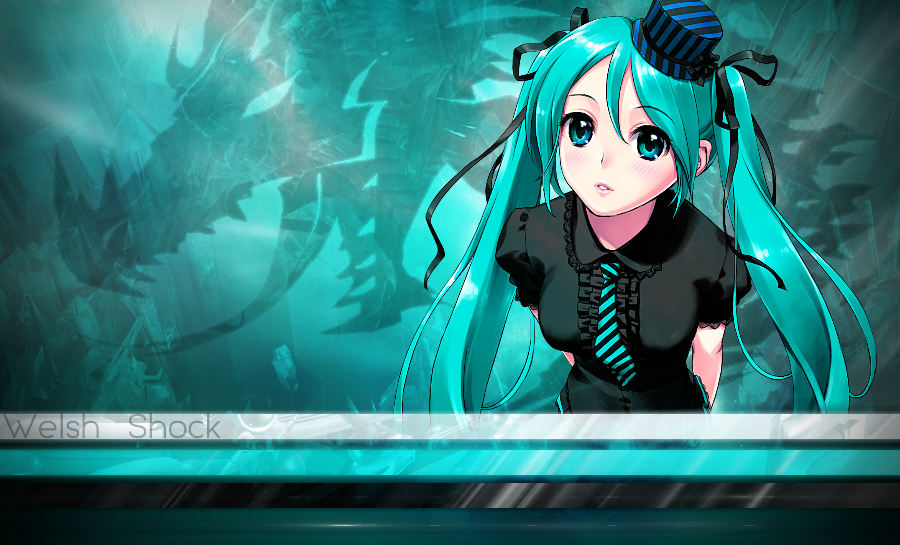
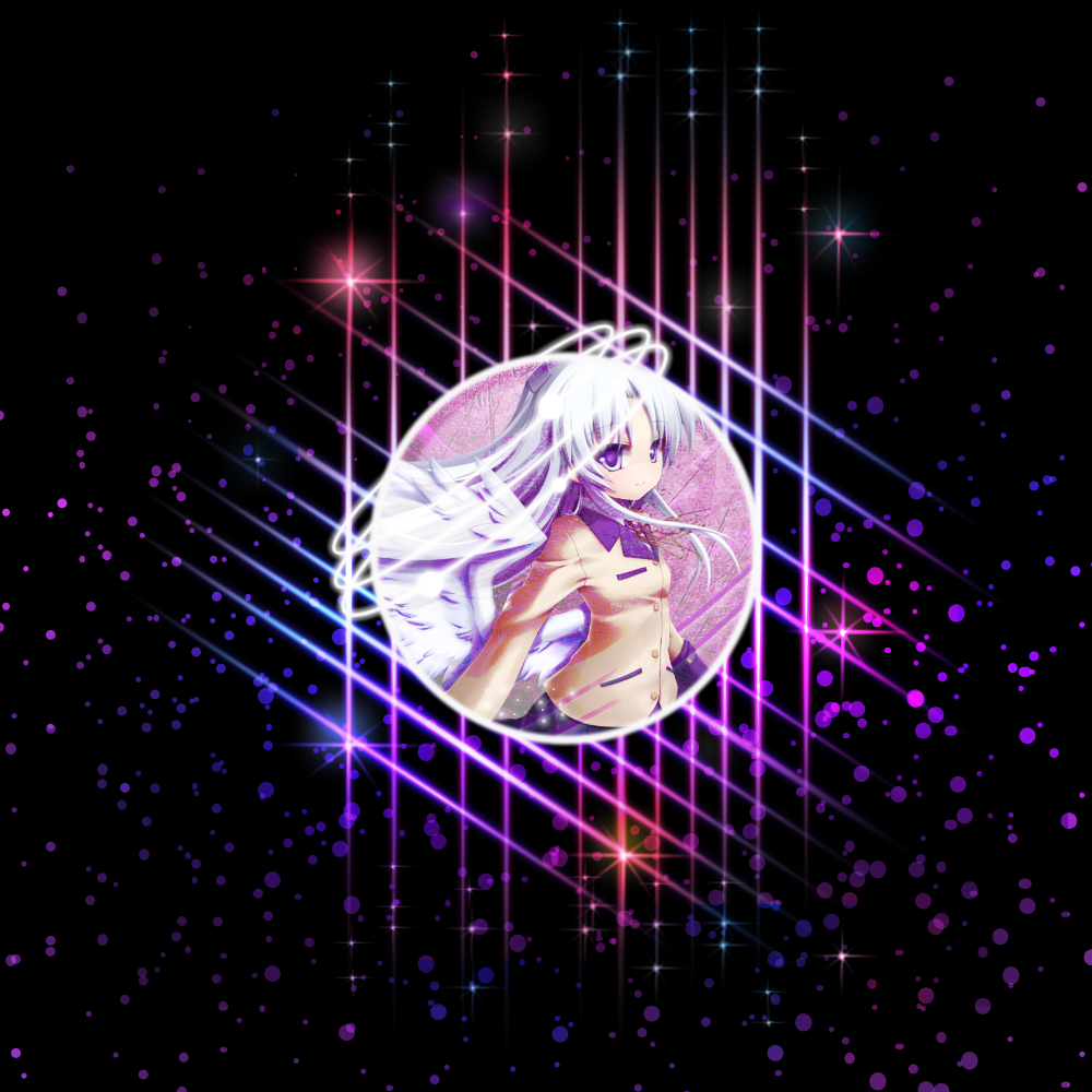
October 4th Update
3 Collabs with our fellow members:
Kemaru/DarkShock
Welshblue/DarkShock (click for larger size)

HELEN/DarkShock (click for larger size)

-
3
-


Sparkle Effect?
in Paint.NET Discussion and Questions
Posted
I have to be honest. I'm not seeing a sparkle effect in that image.
What specifically are you looking to accomplish?