


olav.k.m
-
Posts
265 -
Joined
-
Last visited
Posts posted by olav.k.m
-
-
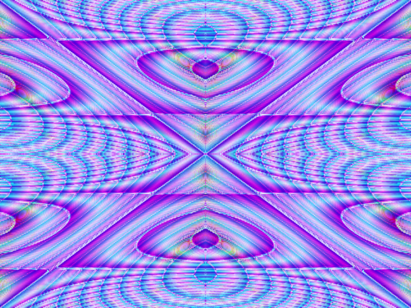
Ryberg360: Interesting picture, I like pictures where concrete things are used to make up an abstract image.
At first I didn't really like the colors, still not completely sure how I feel about them
 , but I guess they kinda add to the image mood/feel somehow
Don't usually make abstracts and this was mostly just the result of playing around with some of madjik's texture plugins:
-
-
I'm not entirely sure i know what kind of brush-effect you want, but if it's like a soft brush you might want to check out this tutorial by wither if you haven't already
It's not for the custom brushes plugin, but still
-
Tried to add some water to my WOTW entry...
-
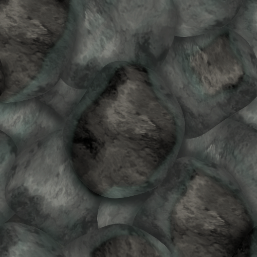
It's tileable, and meant to be tiled at desktop. (original size was 500x500, but made it bigger to ensure it was within the size specifications)
-
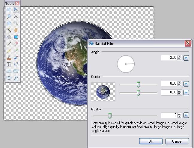
Not sure if this is in here so:
If you have an aliased circle, radial blur at around 2px is an effective way of "feathering"(easiest if circle's center aligned).
If your circle-shaped picture is not one solid color you might mess up the image with this method (obviously) so making a selection using ellipse select, containing all but a few pixels along the edge of your circle. Then invert selection and run radial blur, like so:
^ click it!! ^
-
@ 0(-.-)0: I like the main text, the colors and glow looks good
i do agree with Supermini_man though as far as the reflection goes. @ Supermini_man: I like it. Simple and easy on the eyes. That's often the best thing for a wallpaper
 (not quite sure what i think about the noise though, but hey, that's just me )
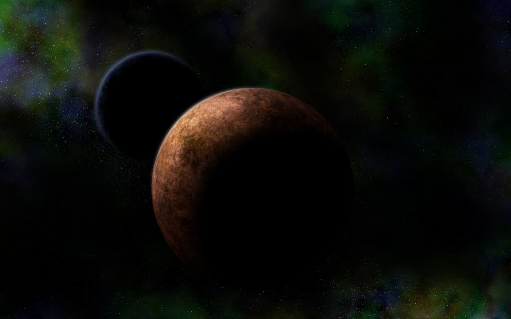
I've seen these space/planet/star-field pictures for quite a while now, but never really took the time to try to make one until a few days ago. They are actually very fun to make
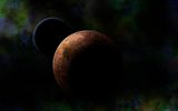
(I realize the lighting might be off in this one...)
This is (loosely) based on flip's planet texture tutorial and some photoshop tutorial on nebulas.
-
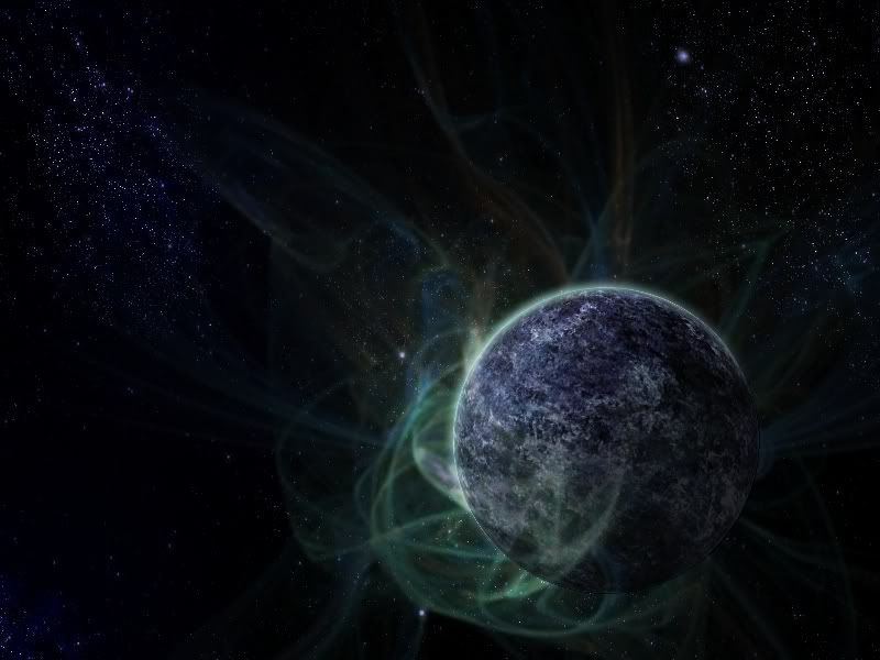
Love it
My try (added a fractal render):
-
-
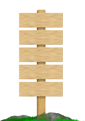
An idea for a navigation bar for a web page I'm working on. (Original is not aliased, but I saved in a lower quality.)
The plan was to have the image placed on the bottom left and scroll with the page; the boards would be the buttons.
Don't think we'll use it though
-
went for the kinda cartoonish style with this one rather than anything realistic
100 % Paint.NET

-
interesting image. I think the smoke and leaf idea looks cool.
Maybe a bit too much noise in the background, perhaps you could try blurring or something so it doesn't stand out as much.
My brother ask me if I could make a silver heart for a necklace.

Not quite satisfied with the bottom, but other than that i think it looks okay
-
am liking those coins oma
I saw this photoshop tutorial a couple of weeks back (link), but then forgot all about it. Then yesterday I remembered having seen a tut for making a woofer and made this:
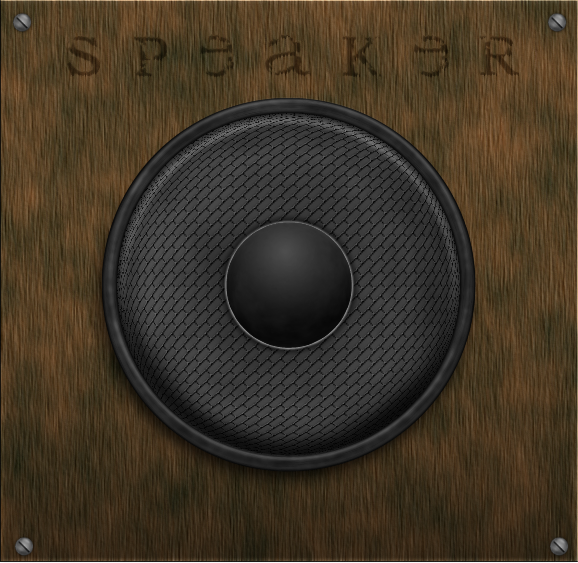
It's not made following the tutorial at all as i wasn't connected to the internet at the time. That's just were i got the idea.
It eventually became my new signature:

The one in the photoshop tutorial is cooler though, so maybe i'll try to make one following the tut...
-
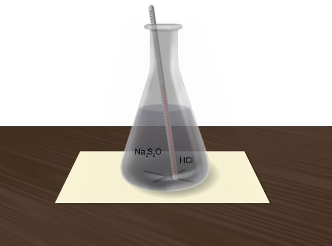
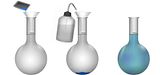
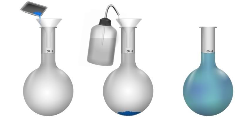
The animation one was made using Shape3D cylinder with a ball bottom. For the other one I made the shape of the beaker in black and then just a lot of messing around...
some reflections were just white lines and then gaussian blur -
Sodium thiosulphate right?
Yes, that's correct
Thanks for the comments.
I actually believe I spent more time making this illustration and animation than I did on writing the actual report, but there u go...
-
I really like that ice cube of yours!
do you use Shape3D or something or completely "by hand"?and nice mouse oma
Once again a picture for a chemistry report:
At first I started making this, but realized that the flask thingy was wrong. So I made it into an animation:
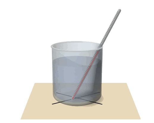
It's not very good, but is supposed to resemble the precipitation(?) of sulfur.
-
thanks for the comments guys
I don't very often get inspiration to make things from scratch (anymore), so when I am in need of a figure for schoolwork or anything I tend to use too much time and energy on them
It's fun though
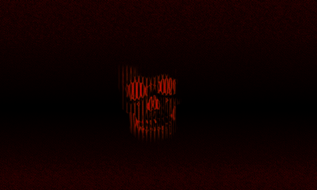
The product of boreness:
Been there, but haven't done that. Looks cool, though if you intend the ball-thingy to look like eh.. a ball, you might want to make the dark radial gradient on it, a light radial gradient instead.
-
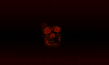
Like the mouth thingy :o .
How did you make it? (stock or from scratch?)
I'll just throw this out here:
^clickable^
Another image I made to another chemistry report...
-
welshblue: very cool !
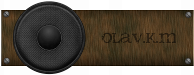
i just figured it was about time to change my signature...
don't know why i ended up with a helmet thingy though
-
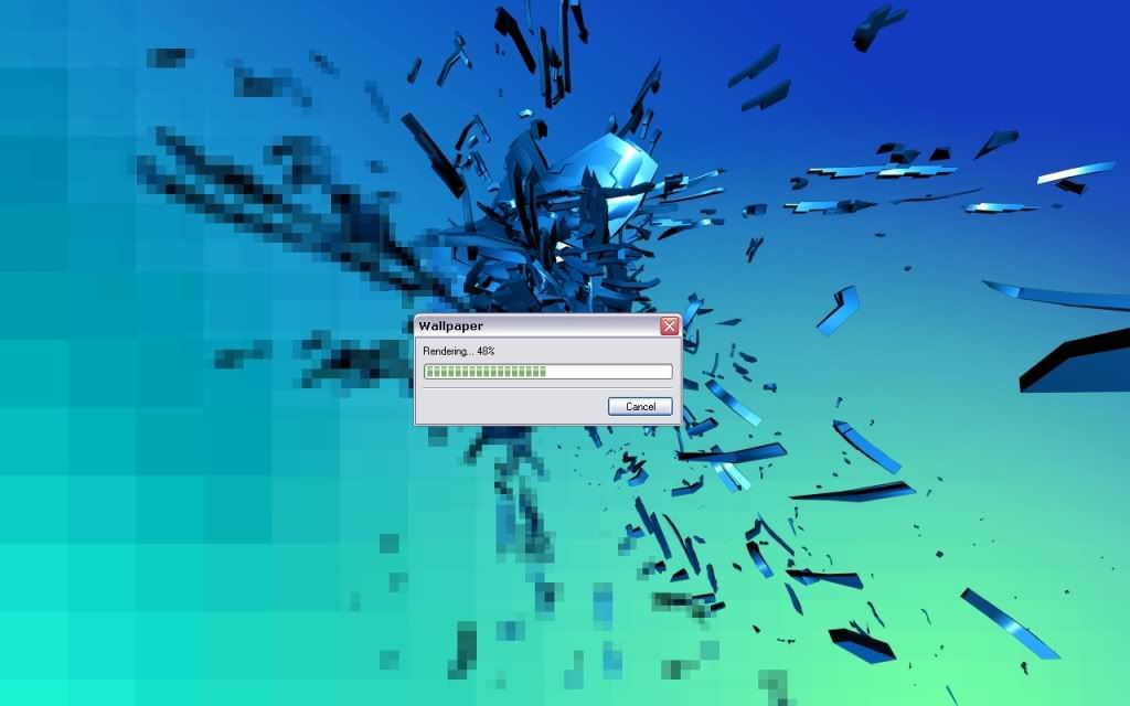
my current desktop
-
thanks guys
will see if i feel like finishing this later, but doubt it
-
I like it a lot. It has got that typical "oma-style" to it, but is still something new.
Was "painting" with the smudge tool. Got lazy though, so it's not finished and will probably never be.
Guess it's not completely abstract, but isn't very realistic either so...
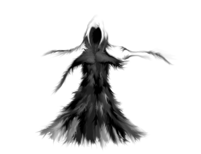
named it "dark angel"
-
Yeah you're totally right

how on earth did you know?
devonance: You can use the drop shadow plug-in LINK on the bullets
-
i like it. the texture fits, and love the coffee cup stain (?) in the upper right corner. Are the bullets a part of the newspaper or laying on top? If the last is the case you might want to add some shadows under them.
Thought I just throw this out here
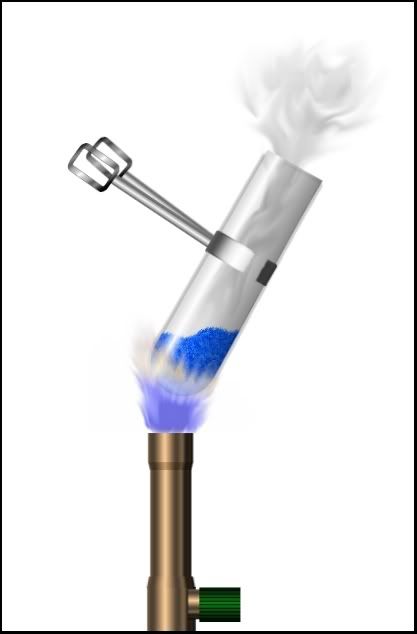
It's a picture for a chemistry report. We had this experiment at school.


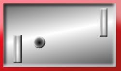
Image Umbrella: Realistic Images
in The Pictorium
Posted
That's very good for a first realistic picture InteractiveBuddy
To make the floor more realistic I would start with going Layers > Rotate/Zoom... and use the Roll/Rotate function to create some perspective.
If you want the bars to cast shadows you can make some black lines on a new layer where the bars are. Then blur them and use rotate/zoom
Keep on working with it
Edit: Oma both those dragonpics are amazing :shock: