


david.atwell
-
Posts
11,615 -
Joined
-
Last visited
-
Days Won
20
Posts posted by david.atwell
-
-
It poses an interesting question, though, doesn't it? Suppose someone comes along in a few years and decides to make an open-source 3D graphics editor. Suppose they see the PdN source and decide to use parts of it as a texture editor. In that way, PdN would become a (part of a) 3D graphics editor.
And I suppose my post doesn't really focus on it enough, but I really meant to focus on the users and pluginsters for PdN, and the fact that we shouldn't shoehorn them in to a specific box that says what the program can and cannot be.
Not that there's any danger of that...
-
^^ Because pdn is not a 3D editing tool
My first reaction was the same as his. I thought to myself, no way that would ever happen. But then I realized something.
Three years ago, PdN wasn't extensible by .DLL plugins. Two years ago, it couldn't perform a 3D rotate/zoom. Last year, it wasn't a Vista program, nor did it have 64-bit support. And last week, it wasn't a 3D editing tool.
Now, it is all of those things. Programs evolve.
And since this new functionality is invisible - even optional - I think we should embrace this new role the program is stepping into.
Now, should we include support for this filetype yet? Probably not. It's not in-demand enough yet to need it. But to say that PdN is not and cannot be a 3D editing tool is sort of closed-minded.
Let's all try to keep an open mind about this. The possibilities are endless. This plugin opens horizons all over the place. Keeping a closed mind is what keeps programs from soaring...if Rick had had a closed mind three years ago, all it would've been was an undergraduate senior design project.
-
 1
1
-
-
Looks like MKT has a hit on his hands

Yeah, I think that's an accurate assessment...Gosh, gone for two days to ride coasters, and PdN changes forever...
...a framework for saving all the settings from an effect/adjustment dialog, and to load them back......would be awesome. I don't know how it would work, but it would be awesome. You're right; it would change tutorials forever...
-
Oooooh very nice MadJik! Yousa gonna be sharin' da source? Mesa curious!
Well, no, NOW he's not...Jar Jar...
In other news, I LOVE this plugin. MadJik is my new favorite person.
EDIT: It's a plugin, not a tut.
-
the question is about plugins, however the link you sent me may be just what i need.....
This forum is reserved for forum publishing only. That, plus the frantic use of question marks, really puts you at risk for being banned from the forum. Ask your questions with a specific subject in the General Discussion forum - or, better yet, use the "search" feature. The moderators here are great, but they're also serious about keeping this forum kept up and looking nice. Please - read the rules for your own good.
Other than that - welcome to the PdN boards! We're glad to have you.
-
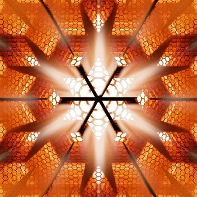
@Madjik: Stop making cool example images and stick with the coding because frankly, it rules! Keep it up!
Yeah, MadJik makes us all feel a little inadequate.
----
I bet you could flip this effect over and use it as lightning. No more scribbling with the pen tool!
We're not too far away from never needing the pen tool ever again...
-
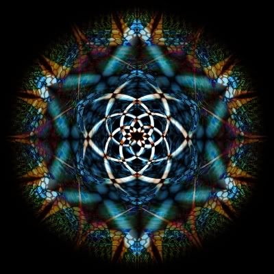
@Madjik: Stop making cool example images and stick with the coding because frankly, it rules! Keep it up!
Yeah, MadJik makes us all feel a little inadequate.
----
I bet you could flip this effect over and use it as lightning. No more scribbling with the pen tool!
We're not too far away from never needing the pen tool ever again...
-
MadJik is one of my new favorite people. I can't wait for this one to go into final release!
-
MadJik is one of my new favorite people. I can't wait for this one to go into final release!
-
Excellent! Just like the "out of bounds" contest on Worth1000.
May I make two suggestions?
1. The shape you describe is a lot easier to make if you create a filled square on a new layer and then use Layers > Rotate/Zoom to move it to the desired angle. That way you can ensure that it will look angled correctly, and not crooked. (Yours looks fine, but I foresee problems with other people...)
2. Feather. A lot. Every layer. It makes things look a lot cleaner and more natural.
My attempt on this is coming soon...
Anyway, I LOVE the tut! Great work.
-
This is awesome, MadJik. I don't think you'd need to ever antialias, if you use a transparent color as secondary and feathered the layer...
Only thing it's missing is the ability to offset the rows...but that's just me being greedy. I can use the Checkerboard for that.
High five, MadJik! This is going to be used a LOT, I'm sure.
-
Ah, but surely if you rewrite it in PDN code, not just copy and convert it, you can say that it's your own work... I don't know...
The problem isn't with copyright, it's with encryption. You just can't get to the code for Adobe Photoshop CS3, because it isn't open source.
And even if you could, it isn't likely that you could do what you're saying (just change a little bit of it and post it as your own work). If you hold a copyright, you hold the right to create (or license others to create) derivative works, which is what this would be.
Yes, U.S. copyright law is archaic.
So we're stuck with coding it from scratch or (unlikely) finding an existing effect's source which has been released under a Creative Commons license, or with all rights waived.
Oh, and I'm in the dark about coding, too. I wouldn't know the first thing about coding this. A little bit of Qbasic about 12 years ago...some HTML and JavaScript, though only enough to be dangerous...I am no programmer. Just a computer geek...
-
I think that DotAtCenter is a genius idea. Maybe you could add an option though to create straight lines that radiate left and right from the dot - so you'd have a line all the way across the selection at the very center of the y-axis, and a line all the way across the selection at the very center of the x-axis. I think that would be incredibly useful.
-
Hey, requests go in General Discussion. We wouldn't want to see you get kicked off the forums!
-
Wow, I love how intricate that is when really it isn't all that complicated. I'll be using this, I'm sure!
Edit: I created the example almost exactly, then flattened it.
Then I duplicated the image, ran the "twist" distortion at 20 and 5 on the top layer and -20 and 5 on the bottom one, then set the blend mode to difference.
I thought that looked awesome.
-
Very sweet, but it would have been good to add an Image Heavy disclaimer.
Done. I didn't even think of it; thanks!
You might want to give your layers logical names.Hmm...good idea. It would definitely make describing it easier...
and ncfan51: Very nice! Careful in the top-right though; you have a transparent part between the medal and the shadow. When you're selecting the white surrounding area, you might want to turn the tolerance on your magic wand down a little bit.
-
This tutorial is available as a PDF. Click here to view or download it
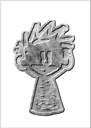
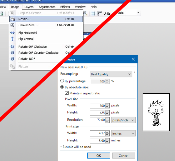
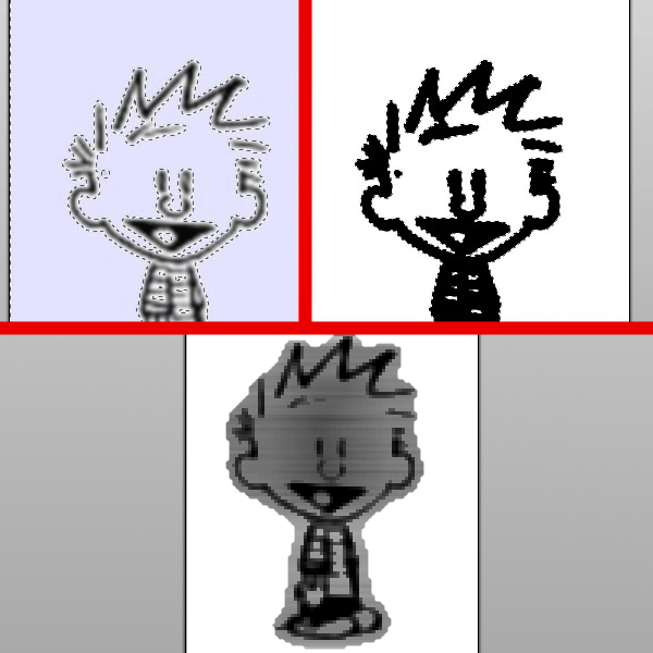
This process works best with a black & white cartoon character or other line art. I chose my hero- Calvin, from Calvin and Hobbes. You won't need anything else that doesn't come with PdN 3.07.
First, get it to a workable size. Mine is 300x425, but obviously yours will be different depending on your image's dimensions.
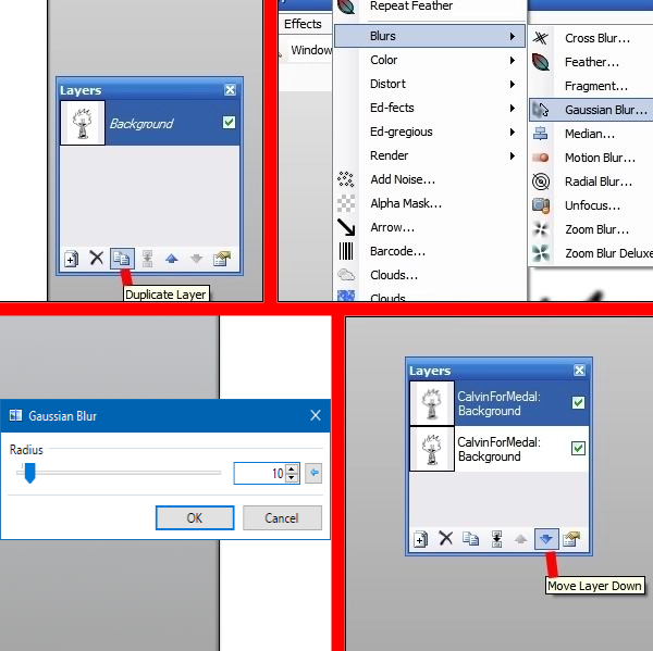
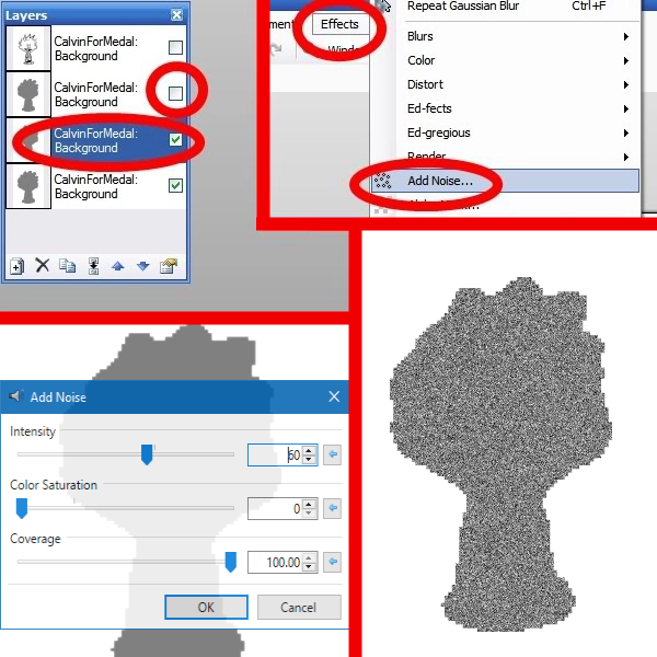
We'll make the metal cutout that forms the medal itself first. Duplicate the layer and gaussian blur it until the "halo" around the image extends out a bit. (Play with the slider until you have a bit of a buffer zone). Once you've done that, move this layer to the bottom.
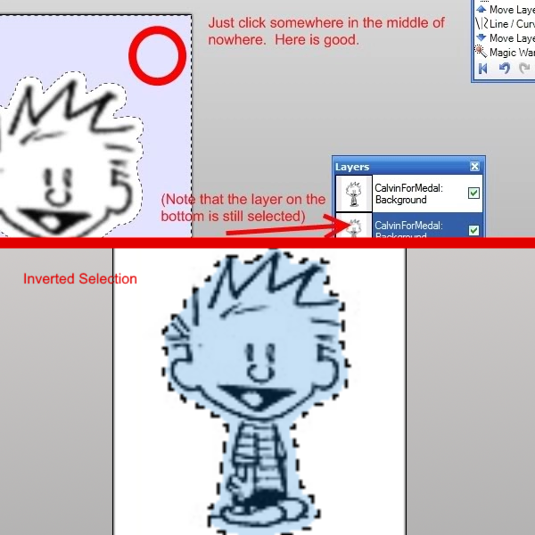
Magic Wand outside the blurriness, with your tolerance between 0-10% (whatever gives you the least blocky cut). Invert your selection (Ctrl+I).
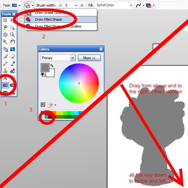
Choose the rectangle tool, change it to Fill Mode, make your color light gray, and then make the box so that gray fills the entire selection, covering up the Gaussian, as so (I made the top layer invisible so you can see what's going on):
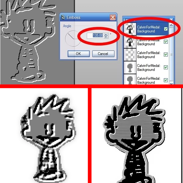
Duplicate the layer twice. You should now have three identical layers of gray, in the general shape of your item. Leave the bottom one alone, and turn the top one transparent; on the middle one, add noise to the selection (Intensity in the 60s, saturation 0).
Motion blur (Angle 0, Distance in the 60s), then deselect it (Ctrl+D). Now go up one layer (to the topmost layer of gray), make it visible, and emboss it at -45 degrees.
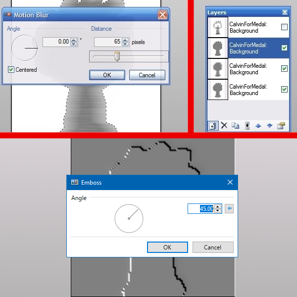
Select your magic wand, turn your tolerance up to about 10, and shift-click on the gray area; hit delete. You should be left with only the black and white (on that layer), which will become the highlights and shadows of our medal.
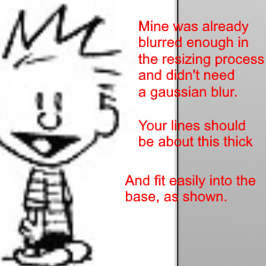
Go back to your top layer (if you made it invisible, go ahead and make it visible again). It should hold your original line image. Gaussian blur it; if you had to scale the image down at the beginning, go around 20 pixels or so. Conversely, if you had to scale it up, it should already be slightly blurry, and you should only need less than a 10 pixel blur (and maybe no blur at all). Play with the slider until it gets to a size that's still recognizable and fits within the metal base you already constructed.
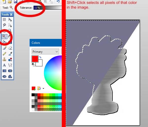
Magic wand again! Change your tolerance to the 15-25 range, and shift-click the white area. Invert the selection (Ctrl+I), then select the color black and your rectangle tool again, and make another rectangle that fills the entire selection. Invert your selection again (Ctrl+I), and hit delete.
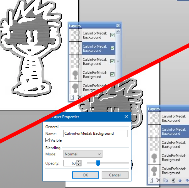
Duplicate your layer. Run another emboss on the topmost one, this one at 135 degrees (the exact opposite of the first emboss - this is what will make it look like it's sunken into the metal, like an actual press or engraving. If you want it to look raised, use the same angle as before). Again, with your magic wand, select the gray area and delete it.
On the second layer down (the thick line drawing), invert the colors (Ctrl+Shift+I). Drop the transparency down to below 70, but above 60. I used 63.
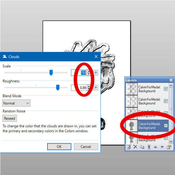
Set this layer blending mode to Overlay, then drop the transparency down to about half (120-150%). Deselect (Ctrl+D), then run a feather of 1-2 pixels on EVERY LAYER except your cloud layer. It's important that you do this before you flatten the image, or you'll end up with very pixelly edges.
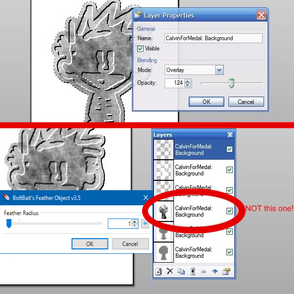
And there's your newly formed medal!
Congratulations. Now find a picture of yourself and put it around your own neck. You can even mess with the curves and make it gold!
Hope you enjoyed my first crack at a tutorial! Criticism/improvements welcome.
-
What...how? That's one of the most amazing things I've seen in a long time. Tutorial would be awesome!
Excellent plugin, by the way. I use it a lot.
-
1
-

Shape3D (2007-08-24) [Bug Fixed September 2023]
in Plugins - Publishing ONLY!
Posted
Sorry, MadJik. MKT is my new favorite person.