


usedHONDA
-
Posts
5,684 -
Joined
-
Last visited
-
Days Won
1
Posts posted by usedHONDA
-
-
I am putting this in a new post because this isn't a contest entry. Just for fun.
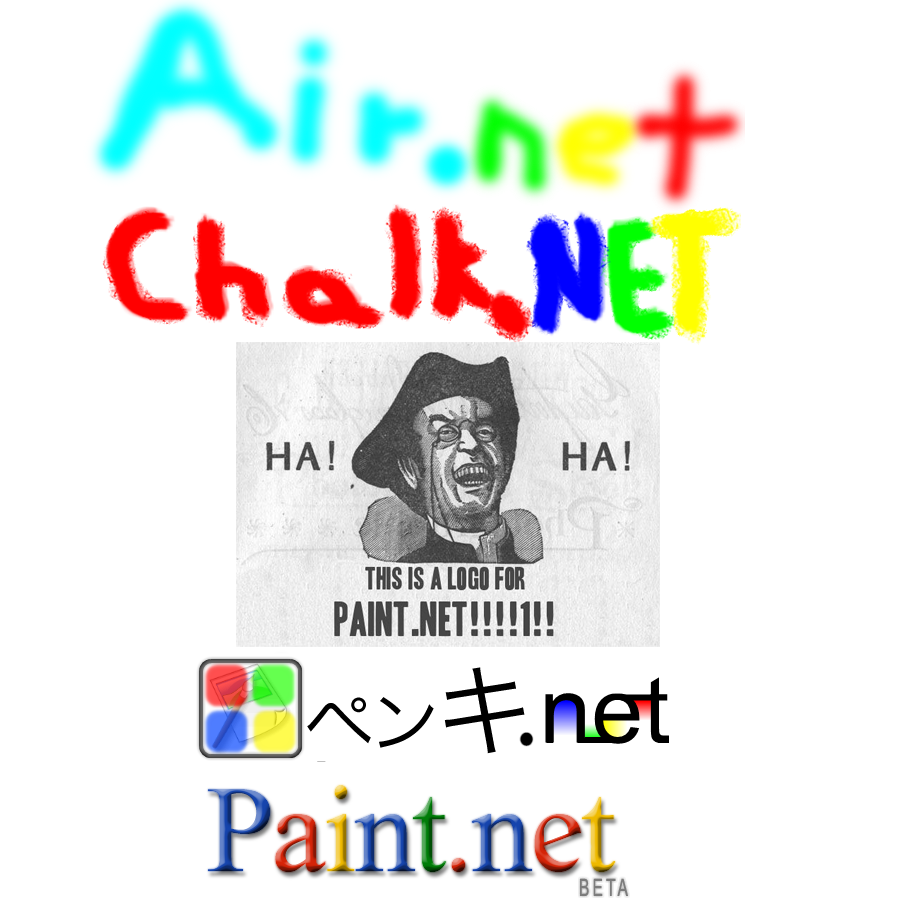
Master Yoda says:
"Make a real logo for God's sake, Man!!!"
-
@Illnab1024:
You could use my origional logo for the lettering if you want. I don't have it copyrighted yet

-
Did you take the "they rock they rule" thing from my avatar?
-
There isn't really a way to bend, but some alternatives are the buldge dissort tool or you can right-click while using the "move selected pixels" tool to change the angle of the object (I use it for angled lettering). I;m not sure if there is a pluggin for that already, but you should search and download some others that you didn't plan on even if you didn't find what you wanted.
-
I didn't plan on making this a contest, but this can be fun. I'll work on it later
EDIT: I decided to have some fun.
Master Yoda says:
"Burns the eyes the eyes the picture does"
ANOTHER EDIT:

Master Yoda says:
"D00D!!! OMG WTF LOL LMAO ROFL BBQ!!!!!!................
looks good."
Master Yoda says:
"A step closer to victory this picture is."
Old school

New school

High school

Master Yoda says:
"The last one looks like the tattoo I got last week."
-
I hate the spray can. It isn't verry usefull.
-
I started the logo making thing!!!
-
I think it make it look cool. Some websites like uber.com (I forgot all the others) look cool because of that. In other words, Comic book writing doesn't look cool.
Another thing I changed is the dot on the "i". [its bigger]
EDIT: I just realized that I forgot to make the image smaller.
I was going to put this in a new thread, but I've had bad experiences with tough moderators at GTPlanet.net. I was banned a week ago.
-
@BoltBait:
Like I said, I saw it in a dream (actually in the dream, I got comments like that
).At least you can use the redone font. That was actually the purpose.
-
*****DRUM ROLL PLEASE*****
I INTRODUCE THE ALL NEW (BIGGER) Paint.NET LOGO!!!
[scroll down]

I can give you the .pdn version with the layers and settings if you want.
No part of this logo has been spared!!! I made it all from scratch! I had to modify the font I used to make it like the original. If your using a skin like the xBox skin, you will see the difference from the logo on the top of the page. Believe it or not, I created the icon from a dream I had one time. It isn't exact, but its close (the one in my dream had more lines and wasn't too pretty).
EDIT: I made the color more saturated on the "icon"

-
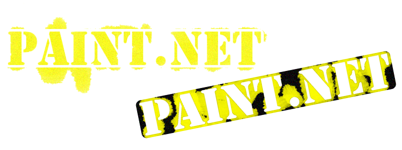
Right now I'm working on a new png logo for the paint.NET logo (so you can apply it to any background color).
What font was used to do the "paint" part? ".NET"? (I know that that's an official logo for Windows and I can find a large image for it, but I would still like to know)
EDIT: I'll just make lines in a new layer instead.
UPDATE: I finally got some time and I'm doing the finishing touches. Well kinda. I'm planning on changing the actual logo a bit. It will be a 430x100 or something like that. Just in case you wanted to do more with it. You can do things like use the logo for Object Dock (look it up).
-
That would be good to include as a primary download (the one that everyone sees first).
-

(I couldn't resist
)Heres one:
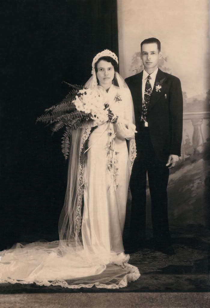
I already did half of the work by taking a couple of big scratches and creases in the scaned photo (and I made it square).
The story behind it (skip over if you want):
The picture is from the wedding of my grandparents. My aunt (very old) found the picture in an old book she had. She gave it to my Dad for Cristmas. He wanted my to scan it and make copies of it. I did that, and now I want (to/you to) do more by retouching it.
-
Right now I'm working on a new png logo for the paint.NET logo (so you can apply it to any background color).
What font was used to do the "paint" part? ".NET"? (I know that that's an official logo for Windows and I can find a large image for it, but I would still like to know)
EDIT: I'll just make lines in a new layer instead.
-
Can you do that to winxp.exe?

-
If you want it to keep your layers, search for a file uploader instead of a image uploader. I've done that once on this forum
-
That reflection effect seems to come in handy for you.
-
I've been looking for a good meme to customize, and I finally found one:
Orig. (Photoshoped, so don't worry):
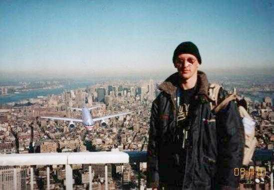
Mod 1 (small in the background)
Where no tourist has gone before

Mod 2
Commercial flights.

You can find the orig. and more if you search Google images for Tourist Guy
-
I know another alternative to CS2.......
CS3!!!!
(in case you didn't get it, CS3 is in beta as of the 15)
-
I've been trying to make the track I posted earlier into a vector, but the program is messed up and crashes when I try to save. Not only that, but I can't find an image hoster that supports the .svg format.
-
-
I was thinking about posting that in the suggestion area.
-
I am now downloading DrawPlus 4 (free) Vector Graphics Editor.
I do have Correl Painter IX and PS CS (both on my Mac PowerBook, and I can prove it with screenshots if you want), but this is paint.net creations, and I want to see what free programs beat others. For example Paint.NET is very good in comparison to PS CS, but the Magic Wand isn't as good (it's misses a lot of pixels)
-
Link to my slightly thicker track (with my original name in the center).
http://www.uploading.com/files/1TK1GDH8/Deland.pdn.html
I also have another one called "Mars Dirt Track". Prety self explanatory. A Mars satallte image with a track (with walls) that tries to dodge a couple of craters and go right through others.
The Pictorium! Post your created or edited images here!
in The Pictorium
Posted
I hope someone would make a magnetic lasso pluggin.
Well to tell you the truth, this is a photoshop job.