


usedHONDA
-
Posts
5,684 -
Joined
-
Last visited
-
Days Won
1
Posts posted by usedHONDA
-
-
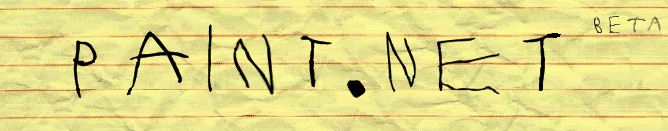
The grey part with the white text reminds me of Windows Vista. I think I'll make a logo that has to do with that...
-
You can see most of that on the dialog bar thing on the bottom and in the image properties in windows explorer
-
I've never used the interlacing feature on ps (and probably never will).
-
I acually got my idea for my sig and pdn logo from your sigs. I guess I just never thought of using the glare until now.
-
Thanks for backing the feed, jake2k!
-
Oops. I meant to move the "NET" part over one. I guess I'll get to that tomorrow (I;m trying to get win2k running on my Mac right now).
-
I downloaded a font called "endless showroom" (accidentally), Made some 8s in red (opacity down to about 40), the most saturated green for the main lettering, and aligned the letters up to the 8s (the creator of the font messed up by not having fixed position).
But I think you just needed to know about the "endless showroom" font to understand

I think I'm going to make a tut out of this.
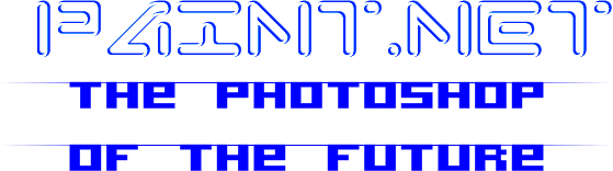
Here is another one. I was going to outfit it with buttons, a stand, and a catchy name for it, but I figured that a slogan and a beta light [and a brushed metal gradient background, a gradient border, a black to dark blue gradient display, and a better centered, less cluttering look] would do enough
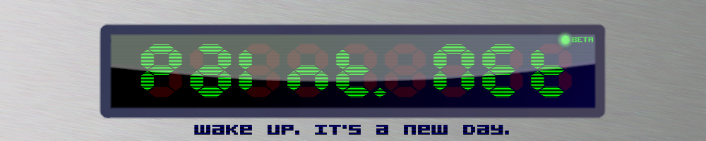
So witch do you like better? The first or second? Criticism welcome!
I will repeat:
@barkbark00:
The logo above and the one here are my only official entries.
-
Well tat also solves tat too!!
-
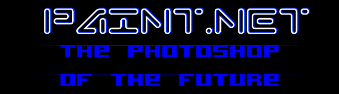
Another one to add to my pathetic stack of logos (but I like this one):
@barkbark00:
Take only the logo above and the one here are my official entries.
-
I'm making a new sig (because everyone else is).
**HINT**
It will be "digital"
EDIT: I'm doing the finishing touches.
I tried it out as an animated gif, but its messed up, so I'm going to make it an animated jpg (yes, you can make them!)
Never mind. It evolves Java.
EDIT 2:
Now it looks too big:
-
Do you mind if I modify your logo CMD?
Actually, I may just do stuff to it and never post it for anything
-
I guess its time to get new fonts (I only have tengwar, witch I used for my avatar).
-
Old school
New school
High school
@BuzzKill:
I figured that
-
Did you use 3d Box maker?
-


OOOOHHHH.
AHHHHH.
SOOOO.
SMOOTH.
:shock:
@ BuzzKill:
Looks good, but Rated E :?:
Now you got my to try one of my own!
EDIT: and were did you get such a big logo?
-
I am too.
Ouch! that was a painful thing to say.
-
Yeah, its funny.
I drove the two cars in the background in my game GTR2. If I where to choose one of them to own, it would be the Porsche. It handles so much better. Less tire wear. More fuel economic. To tell you the truth, Vipers stink.
-
-
I like the second one!
-
I can tell that's a Photoshop.
This effect (the warping of the p, a, and even the puddle) can be recreated quite easily using the Warp.cs which is packaged with the CodeLab plugin. In fact, I wouldn't be so hesitant to bet that's exactly how GreenNova achieved that effect.
Just another one of the many advantages to PDN.
-
(Since it matches with the subject) I think we should buy the domain name from the owners of http://paint.net. at least have a download link there. I was just waiting for a good time to post the suggestion.
-
-
How about "Hell's ice age"?
asdfghjkl;?
Looks like a piece of metal magnified a couple thousand times.
-
The example looks like the lizard woman from hell.
The Pictorium! Post your created or edited images here!
in The Pictorium
Posted
Are you by any chance a dog?