


chimay12321
-
Posts
333 -
Joined
-
Last visited
-
Days Won
4
Content Type
Events
Profiles
Forums
Blogs
Gallery
Downloads
Posts posted by chimay12321
-
-
I like rainbow abstracts - they are a little part of me - that's why I used one as part of the Color Explosion comp.
Seriously, this is meant to be a fun competition. I had fun throwing together an entry this time when I don't usually have enough time. You are free to submit an entry of your liking...
My apologies if you took that as a direct attack against 'rainbow abstracts', that wasn't my intention. I think you should really go on making rainbow abstracts if you like them, I like them too in a way, but to me there's not much variation in them, unless you have a whole other point of view.
And I don't see where I made an attack against the fun of the comp? Of course its first and most important goal is to be fun.
-
chimay12321 said "I think that's what makes everybody's style of art so different, everybody wants to put a little bit of himself, especially his/her mood, in his work"
That is one of my problems,lol,I have way too much in my head and I am a moody old fart so the sigs tend to be off base,lol.

In some way the thing you said is to be seen in your work, your work mostly contains an explosion of colours, as in your head: an explosion of thoughts.
-
A sig should be a picture who identifies you, a small pic that has a little bit of you in it, your thoughts, your character, your life.
I think that's what makes everybody's style of art so different, everybody wants to put a little bit of himself, especially his/her mood, in his work and I think that's what makes art such a beautiful thing. And maybe that's why I haven't entered in a SotW comp yet, because it gives borders to your art, so your feelings and thoughts about it, by a, sometimes very tight, theme.
But the theme of this week is quite spacious, you could do lots of things with it, but I haven't seen anything but rainbow-like abstracts

Maybe I'll enter this week too, if I have any time to make the sig I have in mind.
-
Minners71, I remember seeing that sig a time ago, maybe it was on your gallery or in another sig comp. I still like the idea and the elaboration. The only thing I've to say is that I think it would be nicer for the eye if the text was somewhat sharper
Drew, I like the glassy text, but maybe you could've made it a nice 3D sig?? Make the separated parts of the sig like glass boxes with a glass letter popping out? I think I'd love that, than the sky seems a bit 'emprisoned' in the glass boxen and it would make the whole sig a lot more vivid.
Minnerst71 - 2 (you're lucky
 Mostly I don't like to vote for pics I've seen a long time before)
DrewDale - 0
-
Indeed, welcome back, loved your work, the images and your work on this forum, good to have you back!
Congrats DrewDale and I wish you good luck hosting the comp

-
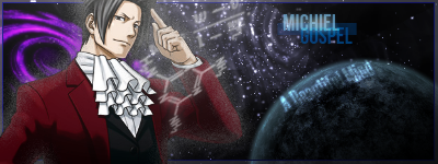
In what way is this a tutorial?
-
Totally what NN says,
Sasha- 3
Red Ochre - 2
-
REALLY cool theme this week
But I don't think I would be able to do something with it :S -
OddLlama: The best thing about your pic is the background in my opinion, the globe and the text are a little too distorted.
Sasha: Great perspective and great detail, very good
OddLlama: 2×

Sasha: 5×
-
Penguin: Another nice try with the same concept, it's a bit boring me, those rings :S
Ekstaze: Nice sig, really like the colours and the random-shape-background
Penguin Dolphin- 0
Ekstaze- 3
-
Fully what Scooter said.
Ekstaze-- 2
Xzerizon- 0
-
Pffff... What I like most about this new system is that you can give both parties an equal amount of stars
Because else it would've been very hard to choose :S welsh- 5×
Really nice embedded diamont, astonishing textures, just beautiful Ella- 5×
Really beautiful flowers, I like the deep red colours used and the sparkles etc. behind the flowers, nice borders too Welsh- 5
Ella- 5
-
Pdnnoob- Really awesome 3D-ness and looks very professional
5 Klyek397- Great image, but, as Minners said, it just misses the 'it' that Pdnnoob's has... 3
Pdnnoob 13
Klyek397 11
-
Welshblue- Great piece of art, it reminds me of my earlier childhood, when I often played Chess or Checkers with my brothers and dad, sometimes I couldn't handle that I was losing and smashed the board all over the ground :$
Drewdale- Gj, nice 3D, only could use a bit more AA and a nice shadow on the PDN logo would be nice to look it more realistic and 3D
Welsh-
:star: :star: DD-
:star: -
Another litlle update for you guys ^^
Siggie
'nother siggie
-
I have no idea what this is supposed to be (my son reckon's its an alien getting sucked into a vortex), but I'll run with it any way:

There is still a battle going on...
-
Hmm.... Very hard choice...
Yellowman's very realistic, but DD's has a nice flow
I think I vote for Yellowman, the orb in the middle of DD's just is... 'nothing', just an orb... Would be nicer if it would be a cool subwoofer or something I think, than you'd get the Ibiza Party idea with the palmtrees!
DD-
:star:Yellowman-
:star: -
That would be a good Idea, I think
-
So then I assume I am not allowed to vote then? Because I did throw the third vote in first. Ok then,I will remove my entry and just sit back and watch from now on.
To hell with these competitions.
It isn't best of three, but untill the three. 3:2 is a legal amount of votes. The one that collect first 3 votes for his image, wins the comp
The same as OddLlama
Welsh- 3
AGJM- 0
-

A background for a poem I made, I have one with a poem on it, but it is written in Dutch, my mother-language, and I'm a terrible poet xD So I'm a bit ashamed to show it :$
Used some random parchment and grass texture (don't know the links), rest is fully PDN
-
welsh- Great flowers, love the texture
Prety realistic Sand33p- One thing: MOST <No cursing.>ING BRILLIANT MASTERPIECE I'VE EVER SEEN
Welsh- 0
Sand33p- 1
-
 1
1
-
-
DD - 2
Chimay - 1
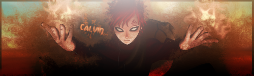
Oh look, it's Gaara! ( who's Gaara?)
I t reminds me of naruto (I only saw one episode) And I enjoy(ed) watching it! =)
P.S. Whats IMO? I cant seem to find the information anywhere...
Gaara actually IS from Naruto
He is a jinchuriki (he has a tailed beast just like Naruto) from the Hidden Sand and later on becomes the kage (mayor?) of the Hidden Sand -
I challenge you with this one:
Gaara of the Desert
-
I fully go with DD
penguin- 0
rafroller- 2


[SOTW Discussion] Talk inside...
in Discussion
Posted
Totally agreed.