


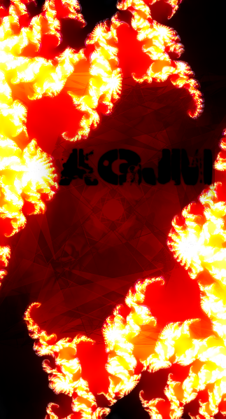
AGJM
-
Posts
480 -
Joined
-
Last visited
-
Days Won
5
Posts posted by AGJM
-
-
UPDATE: New signature made for myself on a promotion forum.

That looks like it's just two fonts. actually, it definitely is - the M's are the same, as are the o's and e's from the other font.
Perhaps use alpha mask to create a brushed metal effect? (Add a new layer behind it, make it white, add noise at intensity:100, color:0, and coverage:100, then motion blur it with the distance at 30, then motion blur it at an angle 90* different from what you started with, at a distance of 10 - 30. Go back to the text layer, ctrl+a, ctrl+c, then ctrl+d, back to the metal texture, and alpha mask. Or use the magic wand tool around the text, ctrl+i, then cut the metal texture - but that's more pixely. You can then use the same method to add a chrome texture, with a linear gradient. All credits going to Adel, and his tutorial)
UPDATE: This is a Facebook timeline cover I made for myself, just because it's true. It's simple, but I love it

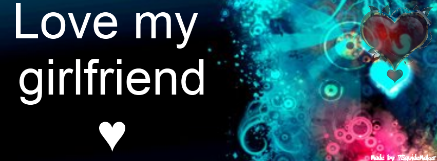
Please give me your feedback

Good idea - but it still looks like a couple of images from the web with text slapped on. It is a nice composition, if not for the blurry background.
Update: New signature!
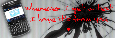
Looks, again, like a composition with text slapped on. Although, the phone looks like a .PNG, and the shadow looks like it might have been your own addition - but I can't tell.
You've got creativity - give some tutorials a shot, it feels better to create all of something on your own.
-
I'm viewing this through my phone as I write this and from why I can tell the logo looks pretty cool. I think it's clean and the colors go well together too.
Thanks.
I like this logo. Please do remember that logos usually need to be consisted of two colors or so with no gradient if it will be printed.
Thanks. Also, that is a good point. I think that making the background a solid, semi-dark gray, while making the text a flat orange color with a thinner or no outline (and no shadows) would work best. I'm not sure - I'll keep that in mind.
-
Remember that thing I posted about somewhere in the Off Topic, about my idea to try making some sort of online thing? However vague that may be?
It took a bit of fiddling and a lot of google searches to see if certain names were taken or not, but I finally came up with a business name. And the idea for it. Now, I just need to look into web coding, perhaps I'll actually get this up and running. Here's the logo, just the initials so that I don't give anything away.

Currently wrapping up the "What Will it Actually Be?" brainstorming process, but I had it narrowed down enough to choose a name - anyways, back to the drawing board for me.
I may eventually go with an engraved look, but this is fine for now.
Edit: going to go ahead and "shop" an image of a theoretical site layout, though I may not share it yet.
-
My original intent with the darkness of it was to make it have darkness, as that was the point of the picture - a glowing sphere in the dark. You could also up the AA on a few steps, with a gaussian blur or feather. Shape 3D also has AA, turn it up to 5 after you've got it how you want it, before you render it. I'll make a video later, so that I'm sure I haven't skipped any steps.
-
Look who saw your tutorial:

Actually, the text looks very nice in that image. It's absolutely everything else that makes me want to flee for my life and innocence.
-
Really great editing.
 Sort of reminds me of a CD cover for a music band. I like how the letters seem to be eaten away in some areas. Well, "eaten away" isn't such a great word choice, but you know what I mean.
Thanks.
Why isn't it good word choice?
I like the font, too. It's called "Weekend Warrior".
Anyways, the CD kind of feel is what it reminded me of, too. Didn't aim for it, but I hit it.
-
It took me between thirty and forty-five minutes to go from this:

To this:
It took me about three seconds to see that the text didn't fit in the thumbnail.
The main reason I was editing it was because I noticed my chair stuck out in a way that made my torso look plump, so I was going to crop it.
Having ADD, I got off track and began editing it.
It's now 11:00 PM, and I have yet to do homework, make a not-so-strange-looking picture for facebook, prepare for bed, or sleep.
I'll do the first and second tomorrow morning (I wake up at 5:30, whenever I can help it. 4:30 when I can't.), the third and forth now.[Edit, for myself, in case I ever come back here - I seem to be up at 11:00 PM in that exact same situation all too often... I'm not a quick learner, haha]
-

Just a shirt *idea*. Not going to update the thread, as there is a football game I need to get to...
-
Thanks. I re-worked an old one - one that preceded this in theme - I think it looks a lot better.
http://customize.org/thumbnails/larger/100554.jpg
To see it full size, download it here:
http://customize.org/wallpapers/90950
Edit: For comparison, view the original:
-
Doing Latin homework, not going to update the whole thread, but here:
-
Man, That's Awesome!! I envy your creativity.
I'm working on a logo for a Design Studio, that I will market my apps or other such gagets, widgets, or other; under.
Want to keep it from being stolen but don't know any way to do that aside from trademarking it, but im lazy so.
Thanks, and that sounds cool.
I de-jaggied the image:
-
Felt like throwing something together while my internet was down. I'll make a less blurry version if I remember to.
I do seem to be liking more of my pictures, again.
http://customize.org/wallpapers/90546
Edit:
If the thumbnail doesn't show, click it or the link:
-
This is cool! Very nice design.
Thanks.
-
Another one. I like having a larger image, even when it has a lot of empty space. It gives it a certain feel.
-
Hey you inserted the video I mentioned into your post YAY!
Love your most recent one, and I admire your skill with abstracts (I suck at it if I don't have a theme/reason for it)
I'm not good when I do have a reason for one. It limits creativity, in my opinion. Anyhow, thanks.
-
Nice fractal colours, I think it works great with the font you have used.Pretty neat!
Thanks.
Another one, inspired by the previous but not as good:
http://customize.org/thumbnails/larger/99695.jpg
Still like it, anyhow.
-
Lookie! Colours! (Thanks for the advice, in all sincerity.)
I like this one.
-
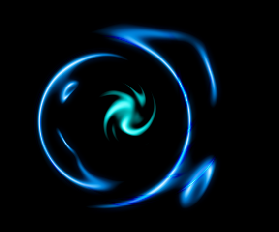
New abstract:
http://i1216.photobucket.com/albums/dd370/Andrew_MacGillivray/DarkAbstract.jpg
Not extremely pleased with it...
-
I like it. It is a happy image to me. Love the colours & the softness of it.
You can add some text to the bottom of the image and leave it as a wallpaper. Great colors, btw.
I ended it early because I couldn't get it to look right to me. I'm still trying to work with a lack of creativity... Maybe I should get some sleep and then caffeine. If that doesn't work, I'll try my medicine...
-
Just a little abstract, trying to work with a little creativity and a tad, not-so-sure-why-it's-there sad feeling. Nothing great to look at, but I'll share it.
-
A new piece, with a new inspiration.
I want to change the circles, though.
It's a bit blurry - the site re-sized it from 3200x2400 to 1000x750
http://customize.org/thumbnails/larger/98094.jpg
Inspiration & Context:
-
Your work has an interesting style and some cool ideas.Good to see something a wee bit different.(BTW on your front page I cant get any of the hides to operate.Maybe due to the new forum or my sluggish old computer.)
I don't know what that would be, as they work for me, but some of my old images don't load for me anymore. I don't know...
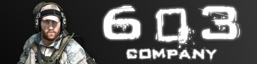
New image, for a BF3 "Platoon". I couldn't think of anything else besides a soldier stock from the game to tie it together... Anyways, any thoughts?
I'm finding myself to be lacking of creativity, compared to my older self.
-
Also, the "Alpha Mask" plugin would help. You could simply make a box behind the letter in a layer below the text, made of the color you would like to use. Use ctrl+a, ctrl+c, and go to the layer with the color box(es). Then run the plugin (on reverse mode). The original layer of text has to be black, but you can change it to whatever color you want through this process.
-
I love the map (reminds me of anicent maps used in movies) and for some reason, I always liked the gradient bars effect. It creates a beautiful scene.
Yeah, me too (on both). I used several layers of gradient bars and several radial gradients with different layer blend modes to get the colors right. Not hard, but I liked it and had nothing else to add.

Diamond gradient star effect
in Distortions and Modifications
Posted
Thanks for sharing.
My result: