


Xhin
-
Posts
131 -
Joined
-
Last visited
-
Days Won
6
Posts posted by Xhin
-
-
I probably need to update my gallery again.

-
Finally figured out the tutorial, although my jewel was lackluster so I made a stone instead:

-
Even if I seem to be unable to follow the tutorial, some of the techniques in it are seriously awesome. Will definitely be using them in future pieces. Also, something I made while playing around:

-
Thank you, welsh, barbie and sharp!
I've (finally) been playing around with some paint.net plugins. Some of them are extremely useful.
Enlightenment
I didn't use any plugins in this one.

Flame Staff
XY Tile reflection + Liquify + Flames

Drop
Render kaleidoscope + polar transformation + stitching + liquify

Meteor
Liquify + Color aberration + color zoom blur

Earth Jewel
XY Tile reflection + color aberration + Shape3D

-
You lost me at some point and missed a couple steps (like not merging the gold ring down when you merge everything else down or the entire tutorial past that point is different) and my computer was trying to die the whole way through, so I just gave up and improvised near the end:

I'll try again some other time.
-
This is awesome. Thanks for linking me to it.
My one gripe with it is that the curvature settings are too precise. With the normal effect, I work in between the -15 and 15 range, but in this one I find myself having to use the arrow keys or the arrow buttons to get that amount, as using the mouse makes the effect too broad.
-
Been messing around with some new techniques over the past couple of days:
Shoreline

Solar Wind

Plethora

Nostalgia

Fractal Jewelry

Pendant

Empyrea

Oracle

Fourth of Julia
(Horrible pun, I know.)

-
Something a little different than what I normally make:

-
Playing around with some new techniques (especially that second one):
Strata

Underground
-
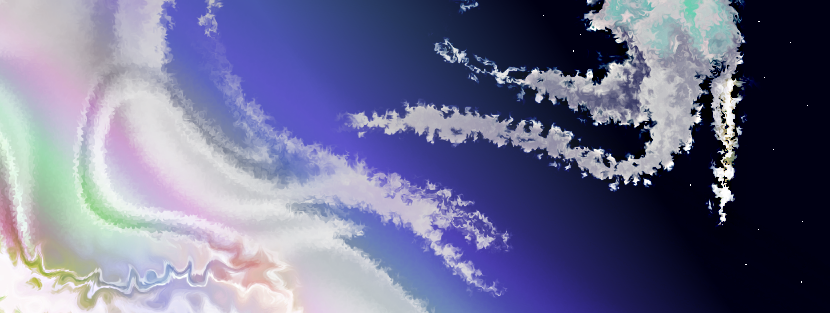
I use dents a loooot in my older pieces and occasionally in my newer ones. In this tutorial I'm going to show you how to abuse the dents feature to get wispy clouds, interesting shapes, and more.
Hidden Content: Wispy Clouds1. Render clouds. Keep all the settings the same, but make sure the colors contrast good. I'm using black and a light cyan here.

2. Crystallize. This will form the basis of the cloud banks. I'm using a larger cell size here (37) to make the cloud banks larger.

3. Use dents to get a good design. Use higher refraction with higher refraction in #2, and lower with lower. Keep the scale about even with the cell size of the crystals. I'm using the settings of 49 for scale and 61 for refraction here.

4. Dent again at lower scales and lower refraction rates to add detail to the clouds. I'm using 15 for scale and 26 for refraction.

5. And again, with even lower scale and refraction to add polish. I'm using 9 for scale and 13 for refraction.

Of course you can vary the settings how you like. Add crystallizations of similar scale right before dents to make clouds smoother, or use less crystallization steps to make clouds more chaotic. The basic technique is using dents of varying sizes to make a more detailed set of dents.
A couple of places I've used this (besides virtually everything before generation 8):

I chose these because they show what kind of detailed shape you can achieve by using two simple in-built effects over and over.
Hidden Content: Wavy DentsIn this technique, I'll show you how to use dents to make wavy abstract shapes.
1. Starting again with the clouds of the previous technique:

2. Crystallize. The cell size should be about a quarter the size you want your wave-shapes. I'm using cell size of 15 here.

3. Use dents. Make the scale greater than the crystals so they dent together, and the refraction enough to make them interesting-shaped without making whorls everywhere. In my case I'm using scale of 123 and refraction of 25.

4. You can of course use the above technique to get better-looking wispy clouds.

5. A couple places I've used this technique (with the rose, I simply turned one part red and cut out anything non-rose-y)
 Hidden Content: Using dents with the 'abusing noise' tutorial
This technique shows you how to abuse dents after abusing noise, in my other tutorial. It was requested

1. Starting with the dented noisescape from the 'abuse noise' tutorial:

2. I've dented it a couple of times to get a smoother look:

3a. Keeping the same refraction level (20) and adjusting the scale creates different cool-looking abstract images (scale is the number after the S):

4. Of course you can use the above two techniques to add even more character to whatever shapes you come up with.

A couple drawings where I use this (repost from the abusing noise tutorial):


 Hidden Content: Making awesome multicolored twists
Here's the technique I use for making a lot of the twists in my multicolored pieces.
1. Starting with the dented noisescape again:

2. Duplicate the layer, and crystallize a part of it (I'm using cell size of 11). PDN dents selections differently than the entire image for some reason, so make sure the crystals are small enough. Also go ahead and get rid of the rest of the layer.

3. Use the "wavy dents" technique to turn the crystals into wavy dents. For an added kick, use a transparent circle gradient and a relief of the layer to make the dents more 3-d (this isn't in the preview image because it's too hard to go back and try to recreate layers)

4. Go ahead and change the hue/saturation/etc so you can actually see what you're doing (or be smarter than me and do the steps on a background that's a black-and-white gradient
)
5. Use a bulge distortion in the middle, with a negative setting. I'm using -138.

6. Twist. Make sure the size encompasses the entire area without going overboard, and the amount keeps some of the original dent shapes visible.

Notes
* Using a relief on ANY technique above helps make whatever you have more 3-dimensional. I use this a lot on my later pieces where I have dents or twists. The exceptions are twists that have too high of an amount or dents that have too high a refraction.
* If you're messing around with noisescapes (especially with some dented shapes gradiented in), you literally can't go wrong with polar inversions (with an edge behavior of reflect that is), unlike when using other bases for them. I used inversions so much on my piece Mayan that it looks almost the same if you try to invert it again.
-
Aaand server's back up.
On topic:
Madjik, I'll definitely check that plugin out. I use all kinds of tile reflections in my new pieces, so the more options, the better.
Also, I'm about to release a second tutorial that expands on this one a bit in one section.
-
Yeah, I'm having server issues. Really annoying since I had another tutorial typed all the way out before my server went down. Should be back later tonight.
-
Whoa, that looks awesome! Please tell me how you got the tile reflection pieces to be multicolored (if it's easier than applying 389482 gradients that is
) since I've been wanting to do that for a while to make some new multicolored pieces.As far as the backgrounds go, I use different dents and gradient them into the landscape. There's a trick to it (see my upcoming Abusing Dents tutorial
).There's a trick to some of the cooler-looking twists too (other than the ones that are just twists of the jewel-looking object). Might make a tut for that.
Sharpen up your twist to the right with gradienting-in a relief of the image. It helps it pop out more, like its (probable) inspiration here:

reliefs work great on twists (well the kinds I'll show in the tutorial), certain types of dents, and certain types of "webbing".
I should make a "Webbing" tutorial soon too. There are so many types I haven't explored, and I'd love to see what you guys could come up with.
As for the coloring/polish, can't help you with that. It usually takes a good hour for me, so good luck
-
In this tutorial (It might be part of a series of "abuse" tutorials
), I'm going to show you how to abuse the "Noise" feature to get vibrant abstract images, interesting starry backgrounds, wispy confetti, and more.1. We start with a plain background. I'm using black for the sake of this tutorial.

2. Add noise, setting the coverage to somewhere between 10-20.

3. Go to the layers menu and hit "rotate/zoom". Zoom in. I use between 2-3, but it can differ depending on your needs and how much coverage you selected above.

4. Add noise again (Ctrl+F) and zoom in again (Ctrl+Shift+Z)

5. Do this a few times. It'll give you a nice nebulous background.
5a. If you want interesting-looking stars, start with lower coverage and zoom in more (I think I went for coverage: 10 and zoom: 4x last time). I've used that technique in the following two pieces:


5b. If you want vibrant abstract backgrounds, Do #5 until you have small amounts of black space, large "clouds" and a new layer of noise on top.

6. Apply dents. Scale should be between 10-20. The effect you're looking for is small enough to not obscure anything and unrefractive enough to keep a couple noise particles, but weave most of them into the dents.

7. Do this however many times you want. (Ctrl+F). Doing it more loses more detail but makes the dents run smoother.

7b. If you want confetti, go for very low coverage, make sure your final product has only zoomed-in-noise, and increase the scale of the dents. Pieces where I've used confetti:


8. Lastly, pieces where I've used the main noise-abusing techniques:
Hope you find this helpful!
-
I went a good month or so without posting here or on my deviantart, so there's a lot of stuff in this update:
Hidden Content: 8th generation (Flint and polar inversions)In this generation, I used polar inversions a lot, plus overused a few objects I'd made before that I call "Flint".
Spacecube

Flint Waves

Clover Jewels

Plasma Kingdom

Blood Arrows

Bat Flight

Gold Worlds

Point The Way

Vortex
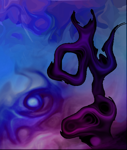
 Hidden Content: 9th generation (Blue/purple webbing)
With the exception of the song image and jellyfish tale, everything in this generation was made by "webbing" one dented gradient. The webbing technique formed the basis of generations 11-13.
Nova

Eye Web

Flame Strike

Many Moons

Yggdrasil

Fetus

Worldbubble

Unnamed (was going to be used for a song which was also unfinished)

Jellyfish Tale
Warning: Massive. (1398x1044, both too wide AND too tall for a desktop image) I don't even want to put a preview here, so direct link:
Hidden Content: 10th generation (Simple inversions / Noise)Aside from simplifying 8th-gen techniques, I also experimented around with the noise effect in "Platypus", "Mayan", "Sky Confetti", and "Seafloor".
Platypus
Mayan
Sky Confetti
Stonebloom

The Core

Seafloor

Gold Warrior
 Hidden Content: 11th generation (Webs and jewels / Noisy Inversions)
This generation is marked by the use of simple webbing and jewel-objects I've made before. I also messed around with the noise techniques in the previous generation to make "Greenhouse", "Mind of the Snail", "Stained Glass", and "A Thousand Rainbows".
Jewelry

Threaded Gears

Flame Webbing

Autumn

Greenhouse
Jewel of a Thousand Rainbows
Eye of the Dragon

A Twisted Sunset

Stained Glass

Mind of the Spider

Mind of the Snail
Hidden Content: 12th generation (Complex webs / More color)Same as the last generation, but I used more complex webs, added more color, added in some new techniques, and came up with a method for each piece in this style.
To Hell and Back

Bridge to Infinity

Summer (will be renamed whenever I finish my current song project)

Privileged Peacock
 Hidden Content: 13th generation (Two-color / More objects) ++CURRENT++
Same as 12th, but pieces now have two contrasting color schemes and I use more objects that I've previously made besides the jewel (I love that jewel though!
)Fire and Ice

Edge of the Universe

Web of Worlds

Mosaic

-
Uhhh delete this reply if possible
-
My most recent:

My gallery is about five generations out of date. I'll remedy that soon.
-
I think the forum's been down lately. Anyway, in chronological order since I was here last:
Hidden Content: ???th GenerationUntitled

Rebirth

Sandsowers

Unicorn

-
Thanks guys

Also, I haven't made any new ones in a while, but I've made some music lately, and decided to name them after/set them to my artwork:
-
Update: I've been experimenting with some new techniques. Using dents sparingly.
Hidden Content:Birth of Time & Space
Duskdream

Maelstrom
(A lot of people like this one for some reason. It's probably the contrast of textures.)

Hearts & Diamonds
(Various techniques involving polar inversions and reliefs)

Dawndream
(Not one of my best, imo, but I put a ridiculous amount of work into it.)
Jupiter

Clockwork

-
So, I actually made my signature out of this technique + concatenating the more interesting parts of Sundream together to make the background.
-
Because trying to move the object after placing it just moves it again without clipping the under-layered object. Ctrl+D works, but then you have to select the whole thing again, or press ctrl+Z. Ctrl+i+i is the simplest route, unless I've missed some shortcut.
Also, that is awesome. Way to take the "skeleton" thing literally
-
Update: Some art I made yesterday, plus descriptions:
Hidden Content:Matryoshka
(I started with a 32x32 icon I made a while ago, and scaled it up 150% for each successive generation. Matryoshka dolls are those russian dolls that fit inside each other.)

Roots & Seeds
(Exploring older techniques; this one is done in the style of second-gen "Jurassic" and "Mandala")

Skygears
(I made a tutorial on how I got these specific shapes; also the zoom-blurred background is the same one I used for Lotus.)

Calligraphy
(Playing around with the same technique)

Highrise
(Made by accident as I was messing around with skygears. The shape in the top-right corner is from the same seed as skygears and calligraphy.)

Jewelers
(Trying to replicate the techniques of Highrise, using first-gen "Otherworld" as a base. The shapes at the bottom are, again, from the same seed as the previous three drawings)

-
Hi all. I discovered this technique recently, and I figured I'd share it. It makes abstract shapes that resemble fossil skeletons, though more cartoonish.
We start with a black-and-white gradient. Having a gradient isn't strictly necessary, but we'll see why it becomes useful later on.

Add a new layer, and make a scribble in any color. Monochrome colors are not recommended. If you're positive you want a monochrome object, however, make a colored gradient (say, blue to pink) and make a scribble in black.

Fragment, setting fragment count to "2" and distance to "2".

Crystalize. you're looking for a setting where a crystal is about 1/6th the size of the canvas, and there are a small amount of actual crystals (4 has worked the best for me). It's also better if they're far apart. Reseed as necessary.

Because you fragmented, these crystals will be slightly transparent. The gradient helps you get rid of ones that are TOO transparent.
Select one of the crystals and overlap it with another crystal, so there's a smooth line in between them.

Hit ctrl+i twice, and then move the object, leaving about a five-pixel gap between the objects.

Do that with all the objects, creating a "seed". Seeds that aren't strictly vertical (ie, L-shaped or V-shaped) seem to perform better.

Use "dents" with maximum scale (200.00) and somewhere between 1/4 (25.00) and 1/2 (50.00) refraction. Adjust settings (slightly lower scales work equally well with good seeds) and reseed as necessary.

Use hue/saturation/invert colors to get the color you want.
Also, I seem to have found the perfect seed by accident. My latest batch of art has used shapes that were made from it:
The actual seed is the white part.
Barbieq25 Gallery - Gallery update 2 new p. 1
in The Pictorium
Posted
. I usually go for 4 x bigger & then reduce it to 25% when I save as a .PNG
It's worth noting that that's only useful for areas that are large; areas that are only a few pixels wide will be blurred and sharp areas can actually look *more* jagged.
Unless there's some method I've missed? I tried resizing a 20"x30" piece and ended up with blurry stars and jagged lines.
Anyway, that aside, your new stuff looks greaet. I love the amount of polish and depth of The Minder. My only complaint with it is that the halo of the red jewel doesn't match the rest of the piece, so it makes it seem as though the jewel doesn't belong on the piece. I'd suggest sharpening it or reducing it, or adding some kind of mild halo effect to the bottom-right and bottom-left corners to make the piece feel more consistent.
Baleen doesn't have this problem because there are transparent gradients on the right and left sides of the piece.
Just a small gripe. I like what you do