


Benji2
-
Posts
657 -
Joined
-
Last visited
Posts posted by Benji2
-
-
Theres plenty of buttons tutorials and even a plug in but nice job, I like the look.
If yours is uniquely different try to post it and make sure to follow the guidelines!
-
Thanks
 , I need to fix that white now somehow
Edit: fixed, thanks for input.
Edit2: Paint.net forum 150pixel hight rule blows haha
New Sig:
-


And critique please!
I shouldn't have chosen that white border huh... I need to change that later lol
-
O I thought the lines were a use of Render> Gradient Bars xD
-
haha, funny skull story

As for the pictures, The first one is nice but If you would have created it bigger and then downsized it or used a couple more layers of blurs and/or lighting to make it a little less pixalated. Try cleaning it up and reposting it
(Hold shift down for perfect circles)
The 2nd picture is better
, I like it more at least -
I think its in the creations portion of Tutorials, try to amke exploding planets
-
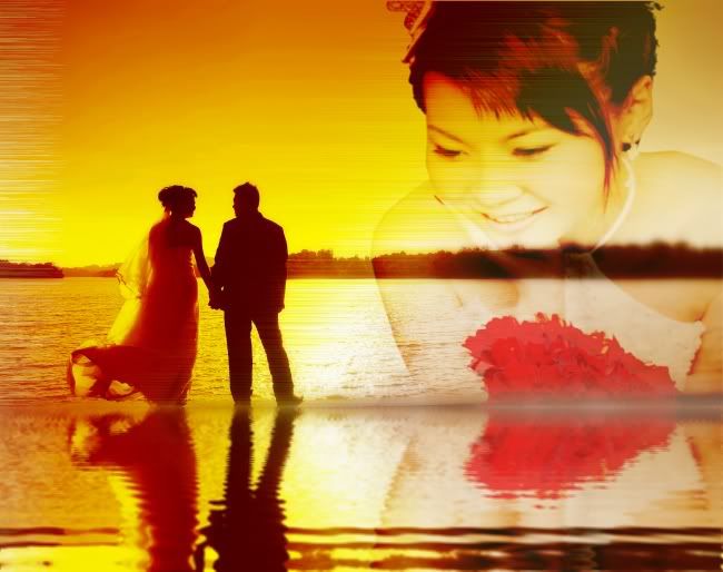
http://i26.photobucket.com/albums/c112/jesmic1829/PDN/reflection-2.jpg
A combination of 2 studio shots from my wedding portfolio..

Very Nice, I like the use of Bars and I really like where the water and the woman meet. The people look splendid as well! :wink:
If that was my wedding picture I would be very happy 4/5, I dont know what else you could do to it but its very good!
-
Umm, images gone.. sorry to bump But I would like to see if its easy to re-set up
-
I like the work ideas a lot actually!
Heres my critique on the 1st picture, Maybe blur the bars so they dont look so rendered? I dunno I'm a newbie xD
-
I Liked this tutorial a lot :wink:
The actual Tut :
http://i208.photobucket.com/albums/bb25 ... dthang.png
Slightly different outcome, on purpose ofc:
-
The sword and gem I used are attached. Nice tutorial.
One thing, the handle.... I need to finish it later
-
All of the alt keys, so you can make sweet buttons...
my Function Button!:

My Easy Button:

-
I would have to say my favorite thing is the plugins... The fact that it is free is a bonus, I would pay for this program a flat fee if it was necesarry!
Its also so very simple in my opinion.
-
It is ok but looks a little bit simple. Its a nice idea, try on making it 3-d and/or making the colors more realistic.

The last man standing.
in The Pictorium
Posted
I like the smudging for the fire and stuff but theres a line about 2/3rds of the way up?