


LumièreDuSoleil
-
Posts
55 -
Joined
-
Last visited
Posts posted by LumièreDuSoleil
-
-
Hey folks, do you want a tutorial for the frost-on-window effect, or is it mostly self-explanatory?
-
Kemaru: Nice, but I think employing a bit of depth of field would make it amazing. Unfocus the front and rear of the effects, and maybe a smidgen on her back arm, to draw focus onto her face instead of the splashes.
Animated signature time.
-
A note; I'm in the middle of a move, and I've had almost nil art time. But I saw [urlhttp]this page[/url], and knew I had to do something.
It's an 8Mb .apng, so you have to use Firefox and give it some time to load all the frames, but it looks pretty slick once it does.
-
Heh heh . . . thanks people. And if you liked Adele, I'm currently working on another piece with her, except as full-color scene wallpaper.
-
-
-
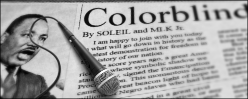
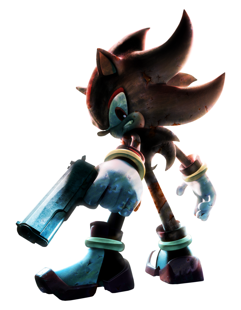
Photoediting; Took a Shadow stock and applied some effects/textures to make this. It's my expression of what has happened to the Sonic series.
Click for a larger size on DA or SUPER SHADOW SIZE THAT for incredible quadrupled detail.

-
So tell me . . . Gundam 00 fan much? :wink:
-
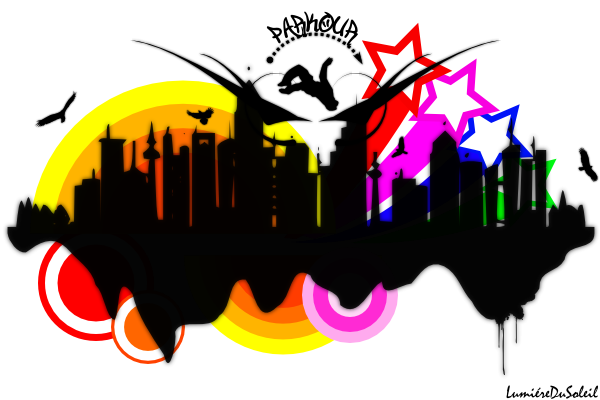
No I don't, but I have friends who do, and one of them came to school on Thursday wearing a shirt from the SF Parkour competition thingie (I live just south of SF), with a freerunner jumping over the Golden Gate Bridge in grungy vector style. So I went home and did my own. Now my sister wants one fro the back sticker of her Blackberry.

-
More toying around. Again . . . heavy use of Smudge. Bullet holes rendered in Inkscape.

And some parkour fun. This a mostly finished piece, with stock bird vectors from BittBox and a vectorized freerunner image from the web mixed in with my own designs, rendered in Inkscape and compiled in PDN. If you like it, please fave it on DA.
-
Wow. Love your photoediting. Especially the FF9 and the cloud+moon ones.
If you want some slick cloud brushes, I've got a pack I ripped from TrackMania.
Cumulus.zip - 2 .png's, 4096 x 256, 16 white cloud brushes with transparency per image. You'll have to cut them into individual brushes yourself, because the program I was using them for imports and chops up image strips automatically.
-
Not bad. However, something about having "Michelle" in neon blue in front of Altair de Assassain and some cityscape seems . . . eclectic, to say the least.
-
Glad you stopped by again. Your work is really nice and polished!
Thanks. I should have more time now . . . and I've kinda gone away from photoediting too, in favor of drawing. I've been cruising DA for anime tuts and stuff.
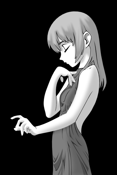
And onto today's efforts. Forgive the imperfect coloring, it's completely hand drawn with my tablet, so the fills have some edge issues. But other than that . . . I've been experimenting with transparency, and this image will give the same effect on almost any color background (even on an image) - even the falling chunks of rock will change accordingly. I think it worked out fairly well.
-
Wow. Gone awhile. Came back, picked up pyrochild's Smudge tool, and started playing around. Here's some tests:
Somewhere between cumulus and cirrus clouds. I had a better cumulus version, but I did something and Smudge crashed PDN. Oh well.
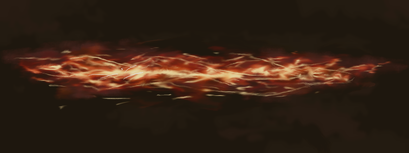
Some . . . sort of . . . fire . . . yeah. I'll work on that.
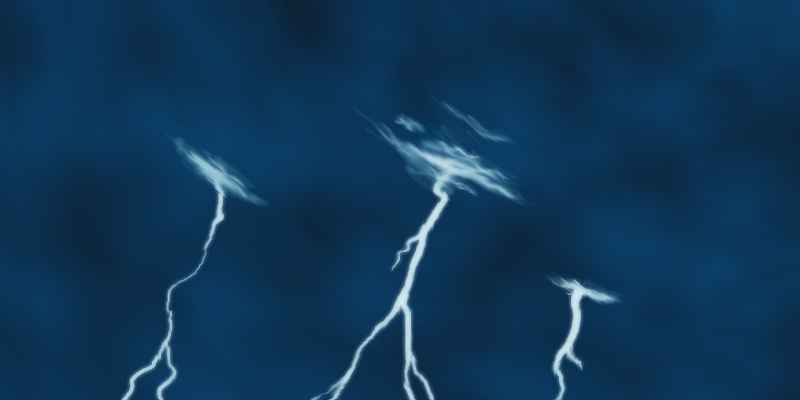
Lightning + clouds. Not horrid.
Some ideas I picked up from some DA tutorials.
-
Bravo Uniform Mike Papa!
Added necklace, name, and tweaked the ear.

Furthermore, http://lumeiredusoleil.deviantart.com/.
-
So . . . yeah. Ton of homework for a few days. Came back, did this yesterday and this afternoon:
It was originally for a signature, but the level of detail at only 150px tall didn't cut it. And no, it wasn't done entirely in PDN (Inkscape mostly), but I feel like showing off.
@Ratchet Ranger: Non, je ne suis pas français, mais je sais la langue. Merci pour la critique, je pense que je vais utiliser la version glace.
-
Guess who has two thumbs and hasn't posted in a while . . . ?
Free time today. Made a Fire/Ice pair of my current sig + avatar. They look best on a dark background.


Which style is best? And moreover, are either of them better than the solid gray version? I'm going to try and add a background with effects and stuff once I decide which to work on, so don't mind the current lack of overwhelming artfulness.
[Edit] Better yet, I solved the issue of needing a black background by giving them a dark colored glow. These are better.


-
-
Thanks guys.
[quote name="pipp92"]love your work especially the glasses ;)[/quote]
That and the rose were probably the most satisfying because I drew them completely by hand.
[quote name="jerkfight"]You have to tell me how to make that planet :)[/quote]
Any votes for a tutorial? -
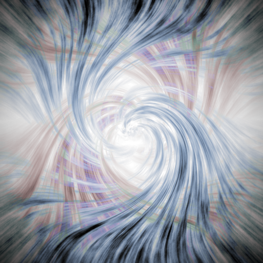
An experiment with using only drawing techniques. No direct drawing with a brush or tool, just multiple applications of different filters and effects. Fun stuff.
Heart of Light
-
Update, new planet drawing, check the top of the first post.
-
You drew out the map of the Earth in your first image? That's pretty amazing. :shock:
Haha no. I'm not that psychotic. I got a satellite image diffuse land map, a cloud map, and a nighttime light map at 1024x512 and pulled them together using Shape3D and some fun with blend modes. The atmosphere and lighting, however, are all me.
-
[12/11/09]
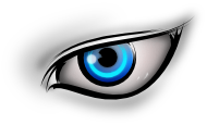
It's . . . watching you.
[12/7/09]

"Sunset," an experimental signature inspired by the ThatGameCompany style.
[12/4/09]
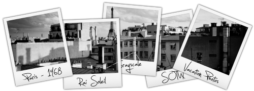
Sigs for the SOTW god, grey for the greyscale throne.
[10/11/09]

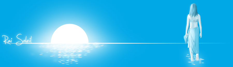
New logo. New name, "Rai Soleil". Image above is a link to my new online gallery.
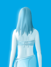
[7/12/09]
WIP of my latest piece, "Precious". Original is 3888x2592, from photo. Only about halfway done - still needs shadows and light effects.
Spring '09:
Hidden Content:[6/12/09]
The five elements of the mind - passion (pyro), logic (glaci), integrity (terra), creativity (aero), and wisdom (aqua). For an RPG, so DNU.
[5/19/09]

Currently . . . give me some advice on pg 3.
[5/9/09]
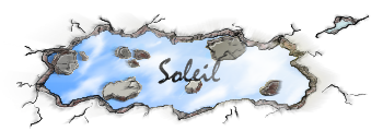
The island tex is from http://www.pixelhuset.se/pixelhuset.html, and everything else but the rust is PDN. It's an .apng, so you have to use Firefox and give it time to load all the frames. My fav so far.
[4/17/09]
Photoediting, on what's happened to the Sonic series. Click for larger pic on DA.
[2/13/09]
A vector piece, parkour themed.
[2/13/09]
Bullet holes + smudged blood.
[2/12/09]
Transparency testing, hand drawn with Bamboo tablet. I rather like it.
Fall '08:
Hidden Content:[10/9/08]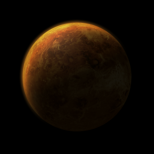
An attempt at a dusty-atmosphered planet. Not as complex as Earth, and not quite as interesting, in my opinion.
[10/8/08]
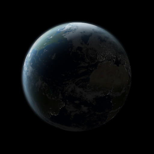
Earth. Yes, that was all done in PDN. I think it looks pretty epic, but I might be psychotic.
[8/30/08]
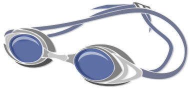
A pair of swim goggles I did for a guy named Swimmer on another forum. Done in Inkscape, enhanced in PDN.
[8/29/08]
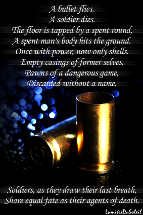
An image accompaniment to a poem I wrote.
[8/22/08]

A rose signature. Done in Inkscape, enhanced in PDN.
[8/20/08]

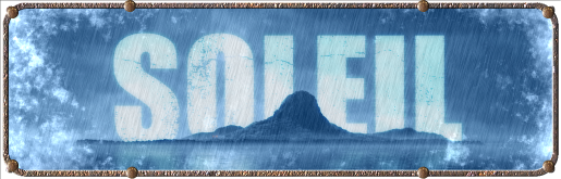
My main Soleil sig. Also comes in light gray for dark-background forums. Done in Inkscape, but I'll post it here anyway.
[7/27/08]
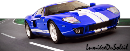
A blue Ford GT. (do they even make blue GTs?)
I also bid my salutations to the forum, and inaugurate my first post.
~Soleil
Welcome to Vectorvilla **(ymd 09.06.14)**
in The Pictorium
Posted
I usually create my vectors in Inkscape and export to PDN for FX, so I can reuse most of them for themed things like my sig + avatar.
Speaking of FX, your text style for "JEREMY", "JESSICA", and the first sig really has flair.