


Sfifer
-
Posts
602 -
Joined
-
Last visited
-
Days Won
5
Posts posted by Sfifer
-
-
It's more than likely an actual in-game modification. Does Forza have support of Mods?
-
How about this?
-
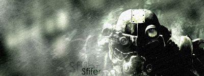
Wow okay TRIPLE POST! But my gallery, my rules.... right?

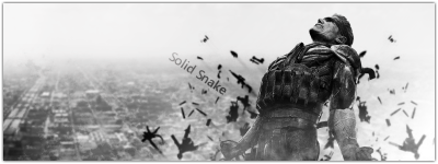
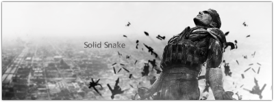
Anyway, here's a Metal Gear Solid sig a friend asked me to make.
-
Here's ones with borders

Which is better?
-
I'll get working on a border for it soon.
-
Update Time!
I'm not sure which one I prefer, I ran 'Film' on the last one at the end and I'm not sure if they need a border or not...
-
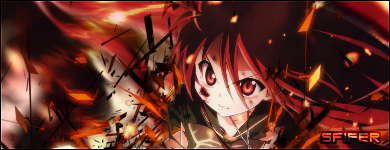
I challenge thee with this
-
Ouch, that seems harsh yy10
-
^ Pointless post dude, seriously.
--
Schnicka: 1
N00Bz: 2
I love both of them, however I voted for N00BZ simply based on personal preference.
-
This one is hard; I request stocks for reference.
-
yeah this isnt really a PDN question at all.
-
Wow..... That's awfully selfish.
--
Since Keith technically voted I guess the standings from the last comp are:
N00bz: 3
TheHowler: 0
N00bz wins.
--
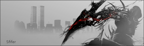
I challenge Keith with this old one
(btw keith only 3 of those characters are actually from Code Geass)
-
 1
1
-
-
It was a tense one indeed N00Bz haha
--
N00bz: 1
TheHowler: 0
Noobz's is just far more polished that yours Howler. His is cleaner and has more attention to detail right down the placement of the text behind the render. TheHowler yours is a bit blurry and the text doesn't really stand out. The border could do with some AA as well, but a good effort nonetheless.
-
My daughter is a huge fan of his.
Hopefully she'll outgrow it soon

Hahahahaha,the opinion of all fathers worldwide.
-
And while you're at it Pyro delete pontingroy.
-
Damn so close.
--
Rookking: 1
Balnce: 0
Sorry Balance; the render's contrast is a little to high and besides that the background is a bit bland. Rookking's just flows better; it's busy yet subtle.
Edit: Also Balnce you need to make the text far more noticeable. I didnt even see it until i physical stared at the sig.
-
Just erase the price with the erase/rubber tool and replace it using the Text tool.
-
Just to clarify...
The scores are
Sfifer: 1
N00bz: 1
TFPrime you need to score properly
-
Haha alrighty Chrisco, no more 4 way competitions.
I'll enter with this:
(Edited because I called Chrisco CSM, I always do that damn it.)
-
Awesome guys thanks heaps! It's the first thing I've tried to make in a long while and thought I'd try go for something simplistic.
-
Yes Kemaru vs. Schnicka.
N00BZ one the last round.
Everyone please stop conversing here now and start voting on the new competition.
--
I'll start off:
Kemaru: 1
Schnicka: 0
I love the colours and the blending in Kemaru's the only fault I can find in it is the large block of bright purple/pink on the left stands out too much and seems awkwardly placed. Schnicka yours is still really cool but the text stands out too much and distracts from the centre of the piece, also it seems too jagged from it being downsized at a different ratio.
-
I think we should just move on with the next competition. N00BZ easily wins haha
-
Also hit up http://www.planetrenders.com for some proper character renders. it will make things a lot easier for you so you dont have to keep using screenshots from the movies.
-
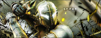
Whoa, i think I better update this thing hey?
Here's something I whipped up before.

Sig Battles (ENTRIES/VOTING ONLY)
in The Archives
Posted
you're*
--
NinjaManDan21: 1
TFPrime: 0
NinjaManDan's seems more like an actual 'sig', where as yours Prime is just more of a square picture. The effects on both are quite basic, and although NinjaManDan's is based of a tutorial he has taken it in his own direction. Also it reminds me of the Matrix slightly.
Prime your's just doesn't work as well; green and orange are two contrasting colours that don't mix well, especially in the way you have tried to. Also your subject matter is getting repetitive