


Zwicky
-
Posts
615 -
Joined
-
Last visited
-
Days Won
2
Posts posted by Zwicky
-
-

It's been less than a month after my last update, but some of you may have noticed the flurry of activity of me spontaneously changing my sig and avatar a lot :wink:
I was randomly reading a thread in the Alfredo when someone mentioned a technique that I'd never used before. These following sigs are the results of my frenzied experiments, and I'm very pleased with the outcome. The first one, and the others to a lesser extent, are Kemaru-inspired, mainly in the flow and colours.


That's all from me, enjoy! Comments are appreciated

-
Thanks Wilson
Yes it's called LeviBrush. I chanced upon it while making my Coldplay signature set trying to replicate the Viva la Vida font they used. -
I can't tell if you're being sarcastic or not, but my inner optimist will take that as a compliment!
-
Well done and congratulations! I'm pleased that I got a few votes
-
Ooooh can't wait for the results!
-
I cheated a little bit actually :wink:
I used a render of some light-rays, and turned it greyscale/black and white. Then on a separate layer above, I painted big blobs of the various colours I wanted to blend together with a very large paintbrush size. Then I Gaussian Blur-ed it a lot to mix it all. (see Crimson's tutorial for that part, he explains it better) Then simply set that layer's blending mode to Overlay to achieve the coloured ray effect. Play around with transparency gradients from there to adjust it to your liking, ie I had a separate black background that it all faded into.
But yes, if you were going 100% PDN, which I highly recommend, instead of using a light-rays render you can try and make your own. Render normal black and white "clouds", fiddle a bit (ie pencil sketch or an effect of your choice) and then use a large Zoom Blur. The light rays need to be greyscale for the overlay to work properly. Make sure the overall contrast is quite high or you wont be able to make out the "rays"
Phew lot of writing, too much probably. :oops: Hope that helps!
-
Curiosity killed the cat :wink:
-
Really nice. I like the second one better as well. The only tiny gripe I have is to do with the blurring of the white text. I know its intentional and what your trying to do but it doesn't quite strike right with me.. Really great job overall though

-

100% Paint.NET
-
Try this direct link then, http://www.dotpdn.com/files/Paint.NET.3.5.1.Install.zip
-
Thank you both
Sokagirl, 666 posts! Is it a sign? :wink:
-
Cool stuff. Orange is my favorite color! Also, what font do you use for the "welcome to my gallery" on the first post?
Thank you, the font's called called Rezland, click for the dafont page, you can download it from there. Handy hint, it looks smoothest if you duplicate the text layer and then merge it back down for some reason. I think it appears as just "rez" inside Paint.NET. Hope that helps!
-
I really shouldn't be making a gallery update right in the middle of exams, but here it is folks! I've changed the layout of my gallery, and posted a nice and large welcome picture, it's hard to miss (the one below is a clickable thumbnail because of its size). I think I subconsciously took a few hints from the new Office 2012 logo.

As well as adding in my latest signature set, the purple space one. I've been wearing it for a while, but have been waiting 'til the next update to slot it in.


I also have a new wallpaper, which I actually made nearly 6 months ago but thought I had lost!

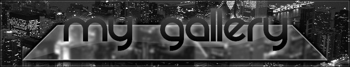
And last but not least I made a gallery banner that I only ended up using for a day, it got replaced by my orange friend above. It's in the Other section of my gallery on the front page. I tried to make my own version of the Mac OS X 10.6 RocketDock skin for use as a gallery banner. I used this photograph from InterfaceLift as the background.
That's from me, hope you enjoy! Now I need to get back to my Accounting study!

-
Ok, then take a look at this page http://boltbait.googlepages.com/install. You can't open the plugins inside Paint.NET, you have to move them to the Effects folder to use them. Normally here C:\Program Files\Paint.NET\Effects
-
^ I wish I had your computer then
Thanks a lot Rick, 3.5 is awesome.
-
Try out the plugin, and with any luck there won't be any hand work involved.
Hope it helps you. -
Like the Newgrounds people.
A nice change from the norm. -
Hmm...
Is there a way to automate something like this:
- Pixels with white color get full transparency
- Pixels with white/green mix get the corresponding mix of transparent/green
- Pixels with green color get no transparency
The Color to Alpha plugin may be helpful.
-
Liking your gallery, and wow, your latest starscape is really cool (all your space stuff is!!). Nice work!
Are you planning to release a tutorial when you have the process down pat? I also like many of the signatures on the first page. -
Well done winner and runner-uppers!
-
-
It's that time again, I present a couple new things, as well as my first wallpaper!
Hopefully you've already seen this, but it's my latest signature set.


I also made an alternate version of the signature, experimenting with a few things

Here's my entry for the 25th SOTW Competition, we had to work with a set colour scheme, and the competition was titled Dark Emotion.

And last but not least my first wallpaper in this gallery! It's not particularly original or brilliant, but its a start right?
Click for full size, its only at 1024*768 size because my screen is not big nor my computer very powerful 
Comments appreciated as always!
Thanks for visiting!
-
Hey you've probably seen this sig (I've been wearing it for a while):
But i've made a different version of it, and I'm not sure which one I like best.
This one has got 3d bits and pieces added and a brushed metal texture on one part of it. My only fear is that I've overcomplicated it. What do you guys think is the better of the two?
-
Probably a silly question but are competitors allowed to vote?


Zwicky's Gallery - UPDATED 11 June 2010 [New Wallpaper Set]
in The Pictorium
Posted
Thank you all
@barbieq25: I did try and fiddle around with the text in the last set, mixing colours to make it more interesting, but I left it the way it was so that it didn't distract from the background too much