


UFWHOA
-
Posts
59 -
Joined
-
Last visited
Posts posted by UFWHOA
-
-
a happy accident :-)
-
wow after reading this topic I just realized something that I have been complaining about to myself for a while....woooowwwww haha
Don't worry this is relevant to the topic.
My complaint was that I hated how when I used the circular or diamond gradient in particular with transparency, that there was a really high transparency right in the center that would erase that area when really what I wanted was just to "fade" away a certain area. After getting curious and doing a simple little experiment, I found that the gradient is adjusted by the alpha values of both the primary and secondary colors. Oh man, I am excited now for the fun I am going to have with this new realization.
Edit: p.s. (In case some of you needed to know.) What I did to test how it works was have one layer be solid white and then make a new layer above it filled with solid black, then I experimented with the gradients on the black layer by expanding it and leaving it there and then adjusted the alpha settings of the primary and secondary colors to see how it affected the layer's transparency.
-
-
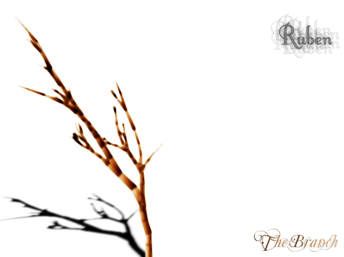
this is my latest one as of this post.
I felt inspired to do something minimalistic and nature-themed.
-
oh that's what you wanted? yeah i didn't clearly understand what you meant, yeah that's simple haha but you got it and the sig looks nice.
-
hmm I'm not too sure what you're trying to do but if you're trying to make a gradient follow the path of a curve, I think the best way to do that would be to make a solid color background, then draw a thick curved line across the middle or wherever. Then use the gaussian blur effect to heavily blur it so the two colors blend into each other. Also keep in mind that is just a quick generic way, there are many other ways to go about it, from using the very powerful Curves adjustment tool, adjusting the contrast, using the different layer blends, and the list goes on.
I hope this at least points you in the right direction. If not, I'm sorry.
-
I do a lot of photo edits, particular portrait shots. For cleaning up blemishes, what I do is use the select tool to select the blemish area and use the median blur to reduce the appearances of the blemish because it helps draw more of the skin tone towards the blemish, reducing the redness of it. Reducing blemishes while maintain the natural appearance of skin tones is very tricky. You have to get used to using median blur to spread out the skin tones, gaussian blur to feather out any edges, and even use layers and blends such as lighten and darker, etc. There are various methods to reduce blemishes, some are better than other depending on the situation too. It takes practice but after a little while of doing it, you'll begin to understand how to approach cleaning up a blemish in any picture and make it look clean and natural.
Hope this helped.
-
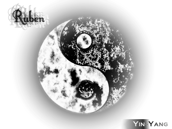
I got into the yin-yang tutorial and after writing about a better (simpler) way to make a good yin-yang, I felt motivated to do another one. I made two versions of the same thing.
You can look at the tutorial here.
http://paintdotnet.forumer.com/viewtopic.php?p=134906#p134906
first one
now in 3D with tweaks
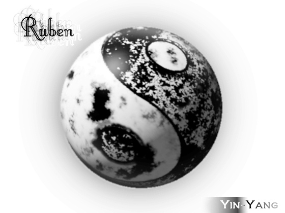
how do you like them?
-
Here's my input:
I really like the idea of the "one thread per user" to display all their submitted pictures. Especially since it'll be easy for people to lookup a user's work if they are interested in seeing more. The sigs and avatars are a great way to attract people into seeing more their stuff and what they are capable of doing with Paint.Net. I also like how you would be able to see which thread is updated most recently and you can scroll through the page in the thread to see the progression of their talents and work over time.
I also think that we should encourage...not enforce though...people to post side-by-side pictures of a "before" picture and "after" if it was an editing job done from using another picture or sketch as a base to start from. This wouldn't be necessary, however, if people just started from the blank white canvas the program initially creates during startup.
I think the new pictorium shouldn't be much of anything that's more complicated than the format of the forum already is (like adding too many sub-categories to place works in and such), I think it's important we keep it as simple as it is now. It'd be a good idea to start with the User Threads first as a dedicated gallery for each of us and see how it evolves from there.
Also I like how someone (not gonna go back and search for who exactly) mentioned that this forum is first and foremost a paint.net forum. Just a reminder to everyone that paint.net is not Adobe Photoshop and the forum is not DeviantArt, nor will it ever become a perfect replacement for either of them. What I really liked most about paint.net is how original, powerful, and simple it is compared to all the other software out there, and I hope it'll always stay that way.
-
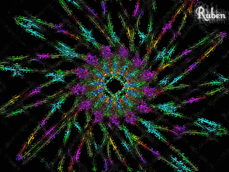
I notice people here do a lot of abstract stuff, how come I don't see much photography going on?
also, here's an abstract thing I just messed around with since plenty of people are into those
-
New signature:
excellent, I really like that a lot, if I could add it as a favorite like on deviantart, I would haha
edit: here's my post
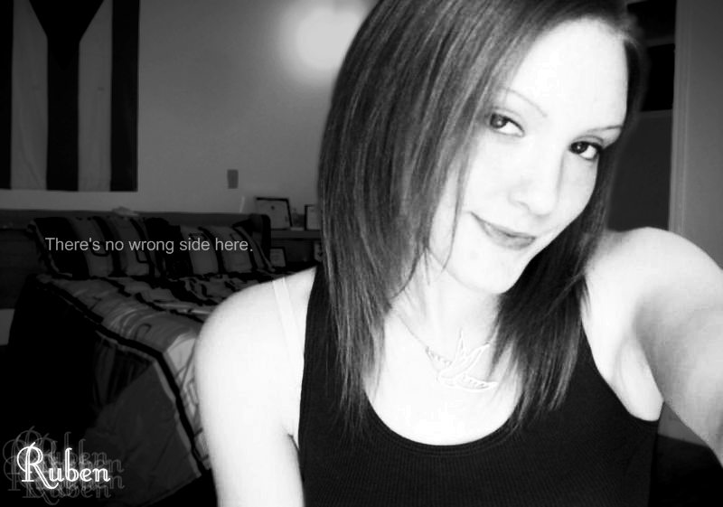
I made B&W picture of a friend on mine, I cut her out and made it look like she was in another bedroom instead. There's a colored version still in the works as I'm trying to make it look as close to natural as possible (lighting and hue differences between the portrait and background).
-
Also, I'm a guy.
In what way does this matter?
However, as there are no other replies (ooops, David was again faster
 ) I would suggest the following things for Paint.NET 5.0:
-Paint.NET should be the entire OS. For example, Word docs would open in Paint.NEt, ready for editing.
- Close to the last point: Paint.NET should have the text processing abilities of Microsoft Word 2007. Same for Excel, Power Point and Access. This goal is achieved by buying Microsoft - Please donate: http://www.getpaint.net/donate.html
- Paint.NET should cook your food.
- Paint.NET should clean your clothes.
- Paint.NET should ensure that you go to heaven when dead and not to hell.
What I want to say: In the last time there are quite a lot of requests and suggestions, and most of them are either doubled or make almost no sense. Paint.NET is goooood the way it is and suggestions should only be made when they would significantly improve the program. Last point: Suggestions should be no copies of the abilities of Photoshop - if Rick wants to rebuild Photoshop, he can review the changelog of it himself.
haha that was funny
-
I Tried to remake the avatar of the Da on usedHONDA
i got Three results :
And whit border *special for Ncfan51* :wink:
I'd reccomend using sharpen on the white diamond gradients to make it look more like a reflective glare...just an idea
-
here's my latest so far
people are doing some really good stuff
-
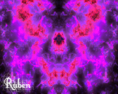
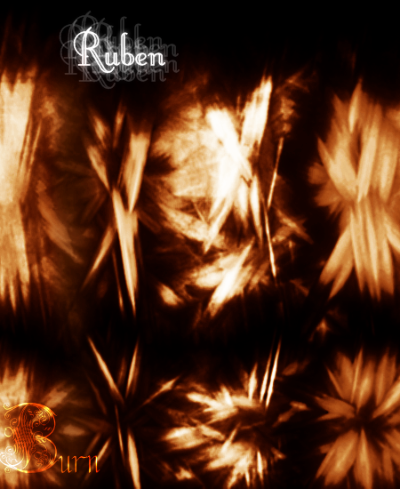
I made this after reading about the crystalline effect tutorial and then messed around with it giving it major and minor tweaks
-
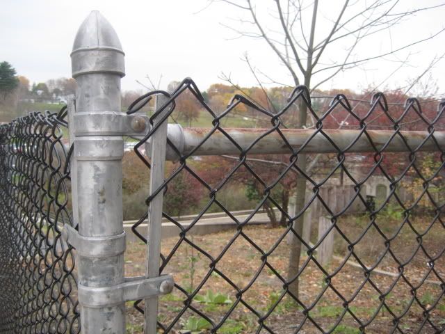
before:
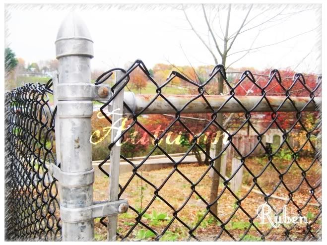
after:
-
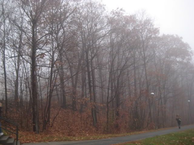
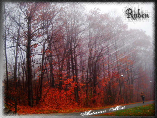
I'm new to the pictorium, this is my first submitted picture so far.
Before:
and after:
this was about after 3 weeks of learning to use the program
I've been using and learning for about 2 months now.
I have a lot of stuff I messed around with, maybe I'll post more up, but we'll see how this does for now :-)
very pretty
thank you :-)
-
I just want to add that the Conditional Hue/Saturation plugin works very well for this too
here is the topic where you can download the .dll from.
http://paintdotnet.forumer.com/viewtopic.php?f=16&t=1102&hilit=conditional+hue
when using it, you can choose the range of colors you want desaturated (grayscaled) and/or increase the saturation of a specific color/hue you want. This is actually the method I use for the color accent effect.
I know I'm posting this response 5 days after the topic was posted, but I felt this information is useful too.
-
I'm new to the pictorium, this is my first submitted picture so far.
Before:
and after:
this was about after 3 weeks of learning to use the program
I've been using and learning for about 2 months now.
I have a lot of stuff I messed around with, maybe I'll post more up, but we'll see how this does for now :-)
-
hmm interesting, I think I might actually try this out myself later because from what I see, it looks like I could replicate it using gradients, text, zoom blur, layer blending and...a few minor things that I can't think of but this looks like it's feasible to do on pdn.
-
I just want to add and mention that the alpha mask plugin would be very helpful for this..it's what I use very often ever since I downloaded it.
-
this following information was mentioned in another topic I found when I did a search to understand more of what the clone stamp tool was capable of:
If you change the transparency of the primary color, by clicking on the "more" option in the color wheel window and adjusting the alpha value anywhere from 0-255, you affect the alpha value (transparency/opacity) of the cloning.
here's the topic I found it in.
http://paintdotnet.forumer.com/viewtopic.php?f=12&t=21190
one of of the many joys of using the search function hehe
Edit: I just realized that the transparency only works with anti-aliasing enabled, if you disable that, then the fill of the clone stamp brush will be opaque (solid).
-
ahh the alpha mask plugin will do the job nicely, a little time-consuming to get to what I want but works very nicely regardless. Thank you. Maybe in the future there'll be some kind of "gradient design" tool or something. Thanks.
-
I've been using this program for a few weeks now and I'm wondering if there is a way how I can make a custom gradient of my design and use it to "fade" or adjust the transparency of a photo. I know how to make a gradient design to darken or lighten an image, and I know that the gradient tool can be used to "fade" a picture. I feel the gradient tool is limited in terms of designs and shapes, I'm looking for a method that'll provide the flexibility of a feature I'd love to use often. Am I clear enough? Can anybody help me?
Feel free to criticize me harshly anytime you want, I think it's funny when you guys do. haha
Thanks.
The Pictorium! Post your created or edited images here!
in The Pictorium
Posted
I'm currently just experimenting with the Polaroid frames concept for my photographs. Here's the second outcome of it.