


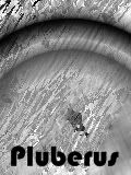
Pluberus
-
Posts
139 -
Joined
-
Last visited
Posts posted by Pluberus
-
-
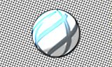
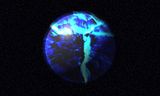
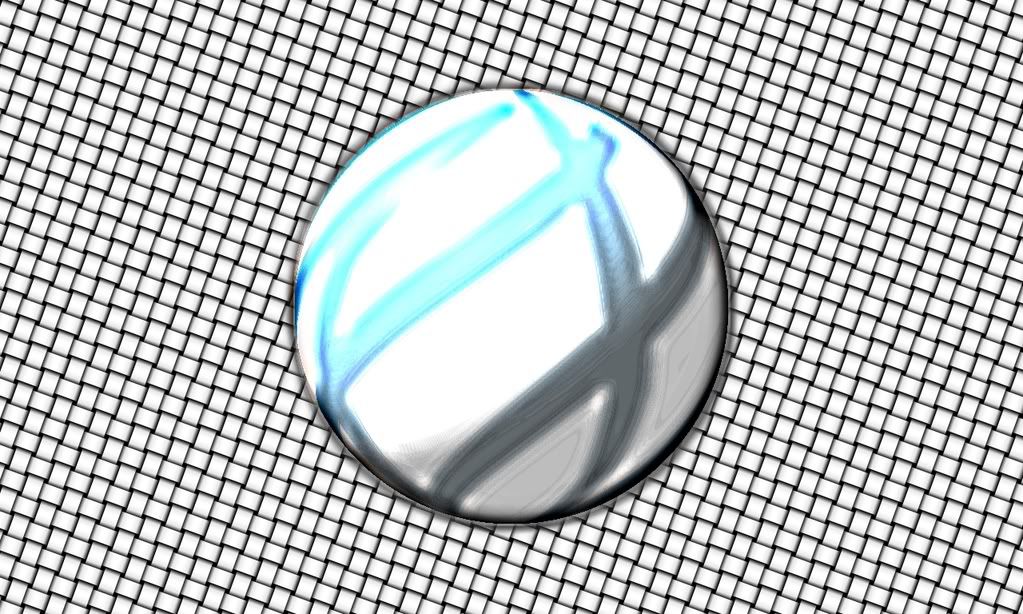
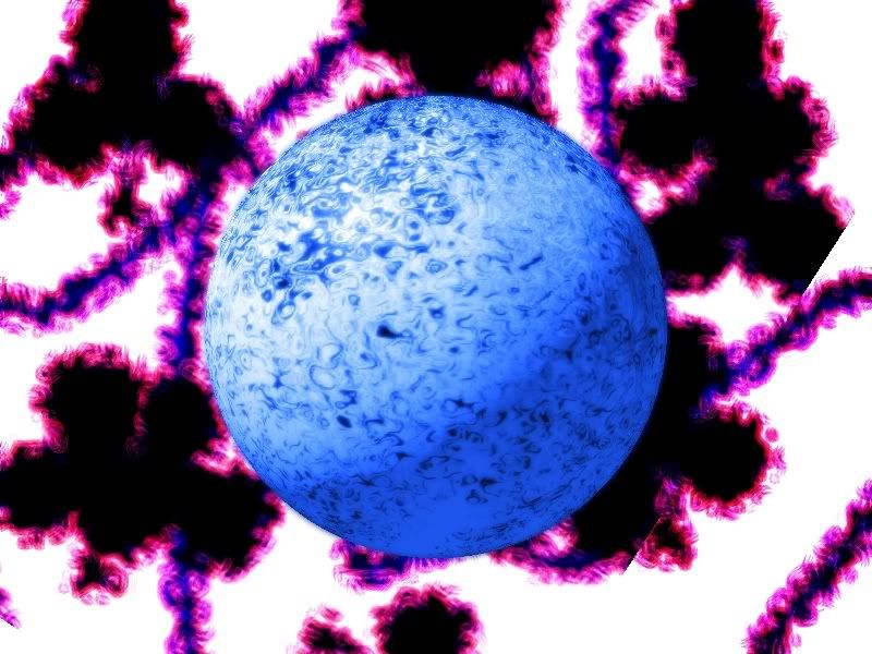
Very cool! I like the orb and the korean/chinese writing rasters. I'd use the orb one as a desktop background if it was larger. Keep the good work up!
-
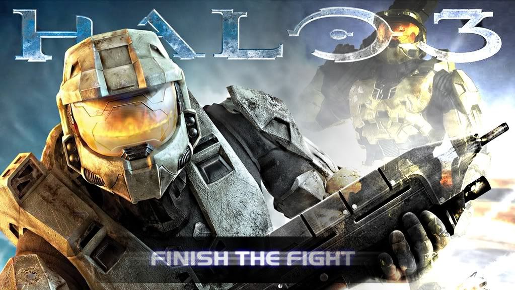
Very nice Valiken! I really like the halo sig with the spartan looking into space. Keep it up!
-
Wow, I LOVE the space scapes and those spheres. They are totally awesome! Keep up the awesome work. Congrats on making it to the galleria (not surpristing at all
 )
) -
UPDATE - Due to school work, etc, I have decided to only update my deviant art () for times sake.
Here is my gallery. I will add photos/pictures as a create and upload them. Criticism is enjoyed, I love being corrected, as I can only get better
 ! All my work is 100% PDN except for stock images, unless otherwise noted. All names are from left to right. (Click images for fullsize)
Backgrounds/Wallpapers/Photo edits and manipulation
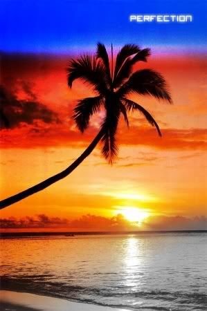
Perfection

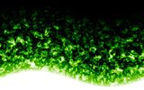
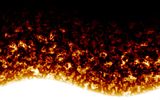
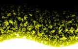
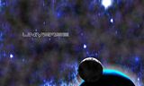
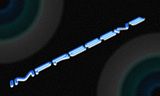
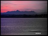
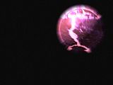
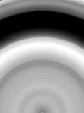
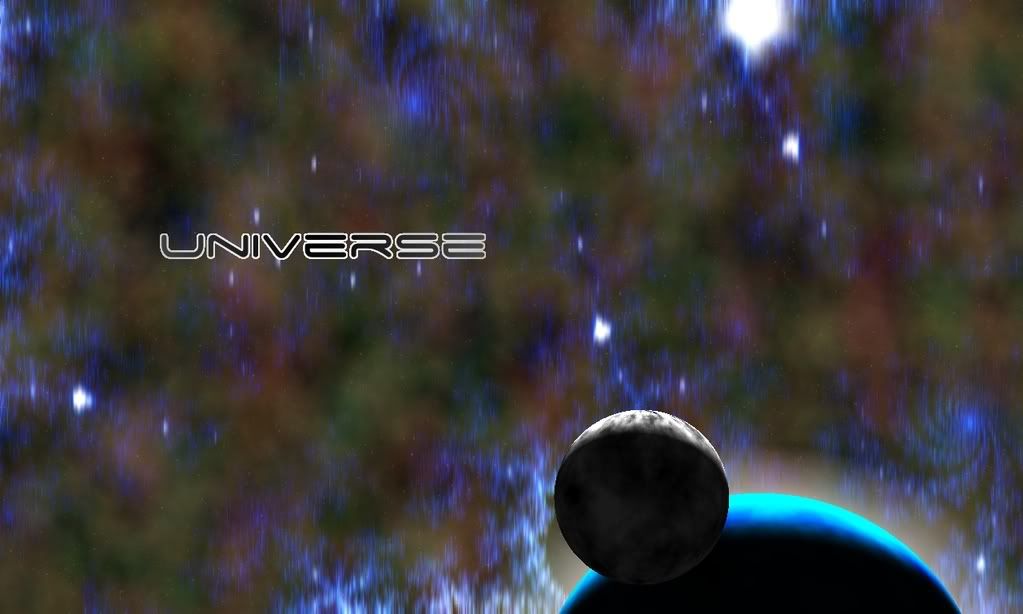
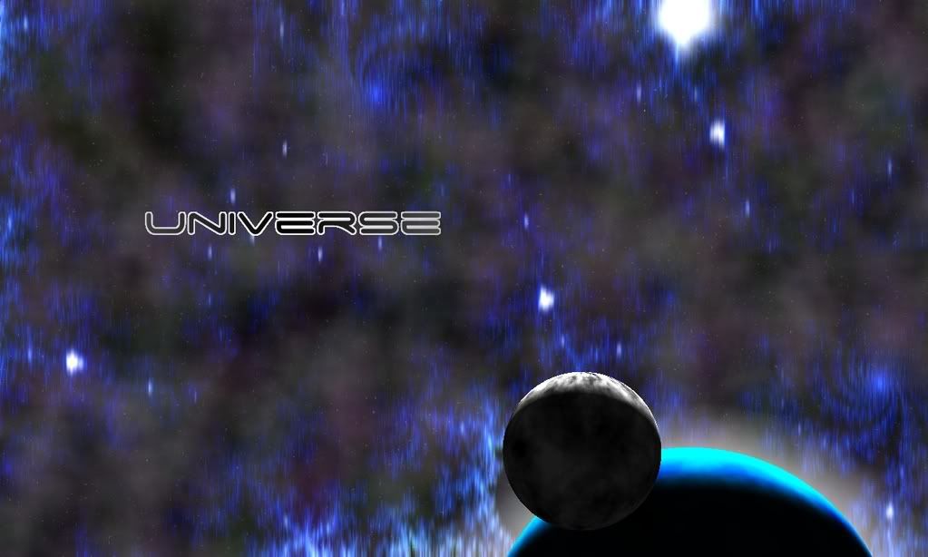
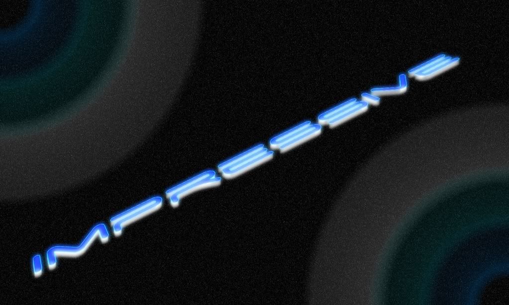
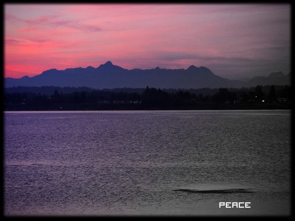
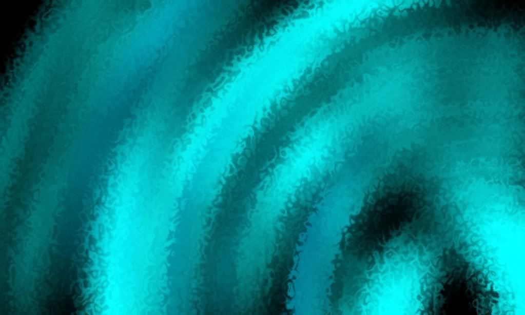
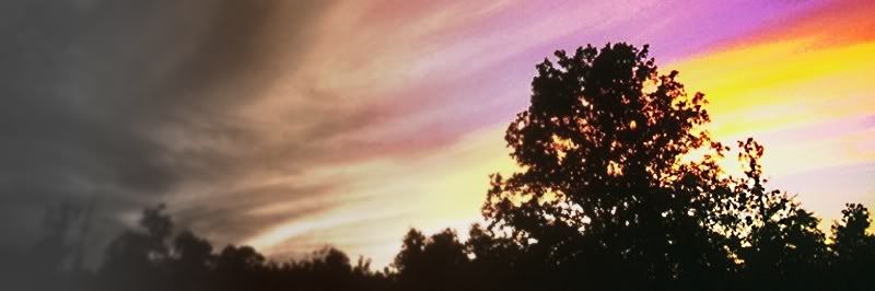
Universe, Universe 2, Impressive, and Peaceful Sunset

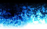
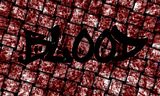
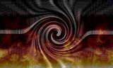
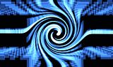
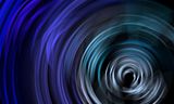
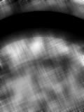
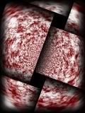
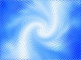
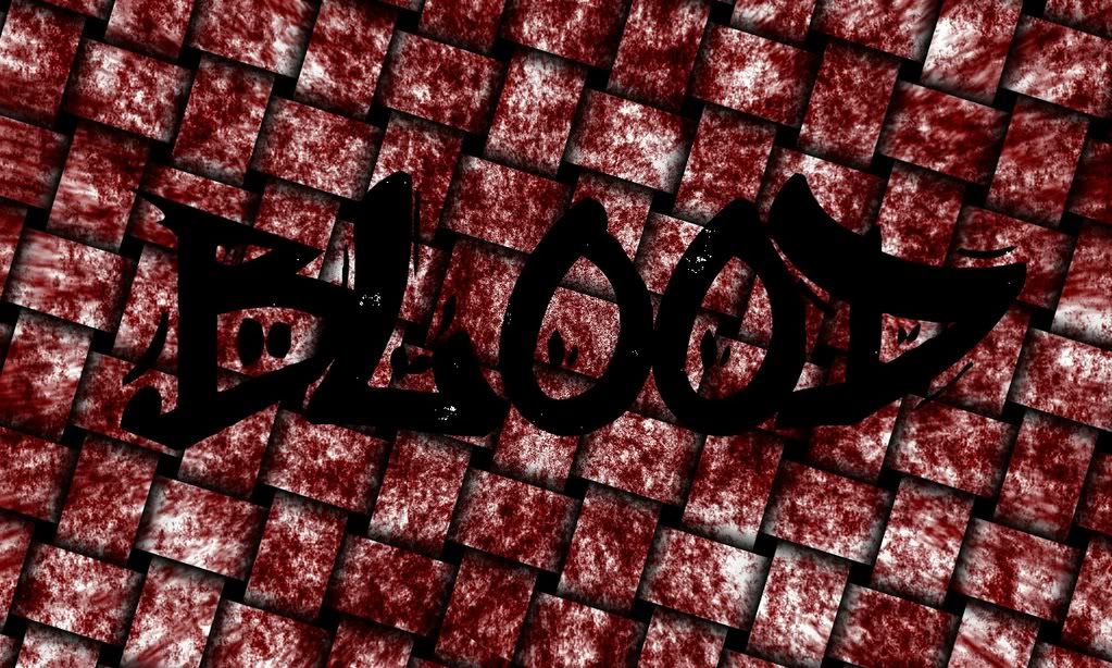
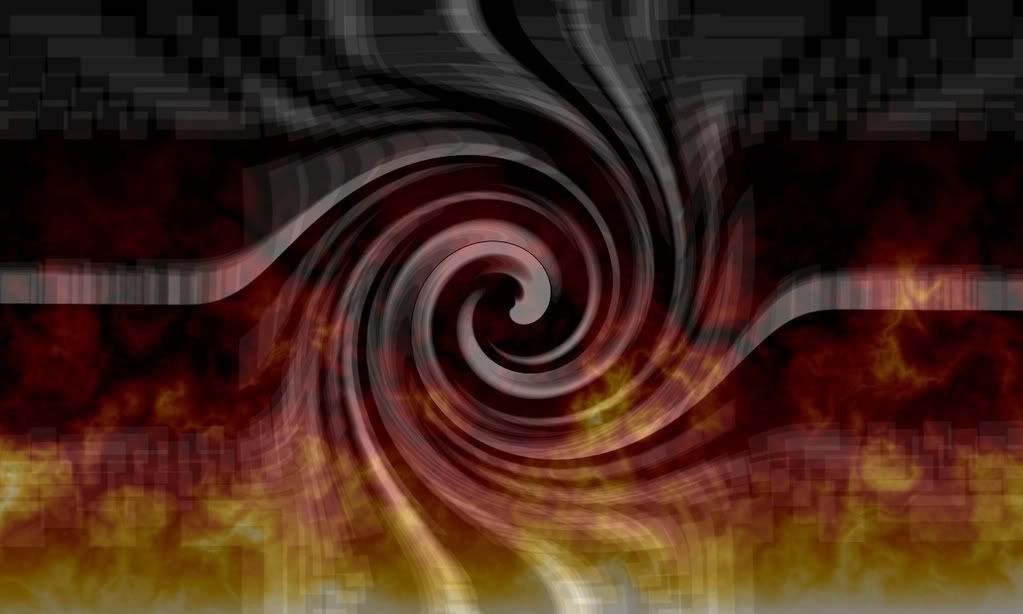
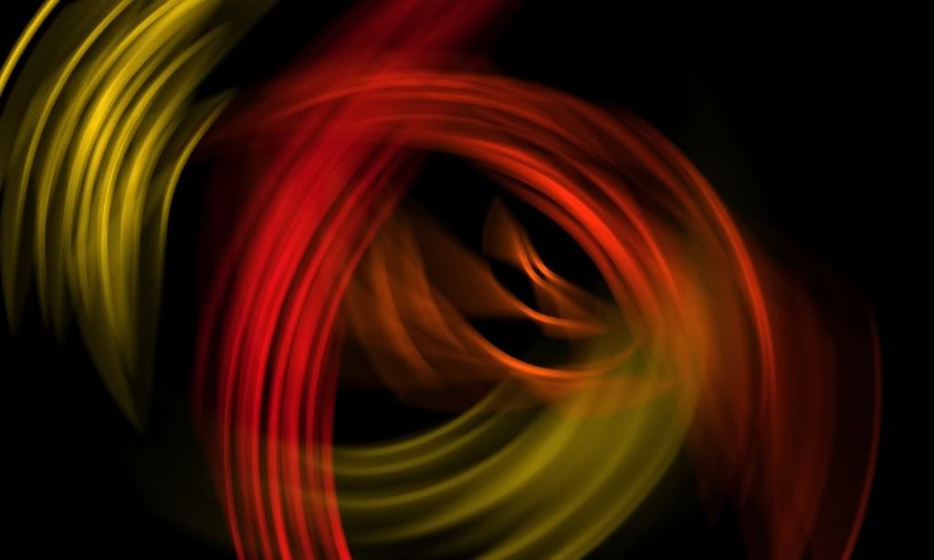
Blood, Halo Abstract, Fire Spiral, and Blue Matrix.
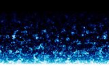
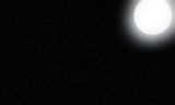
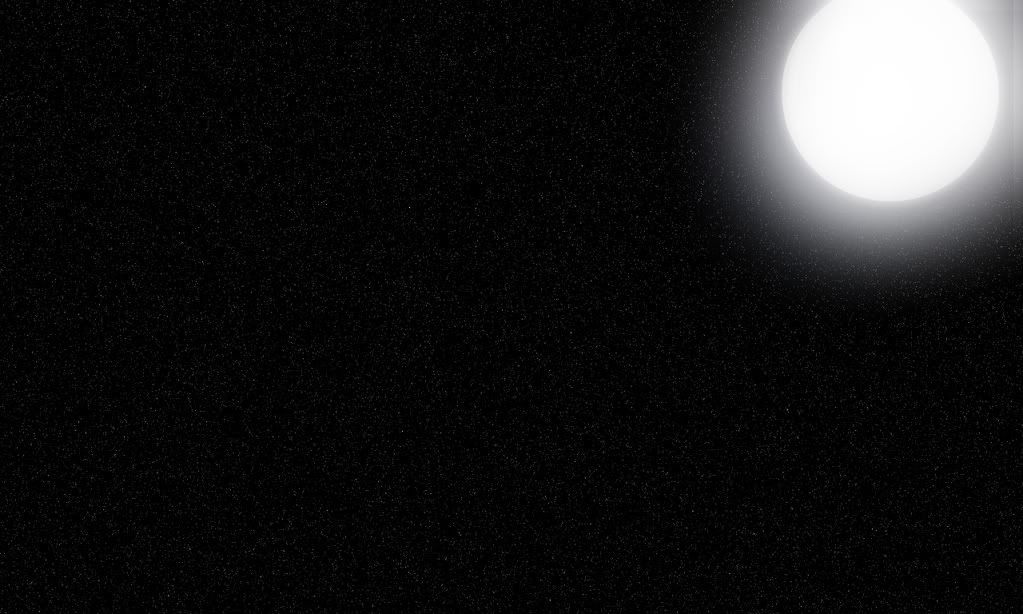
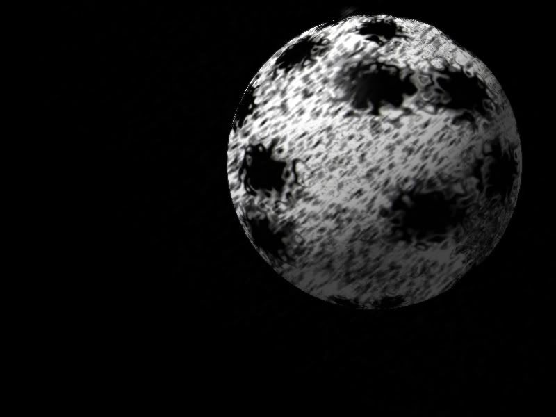
Bright Moon, Weaved Orb, Dented Ripples, and Animated Rain.

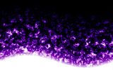
Animated Rain, Silver Spartan, Borealis, and Blue Ripples.


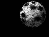
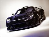
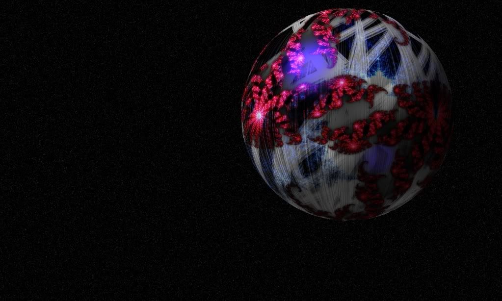
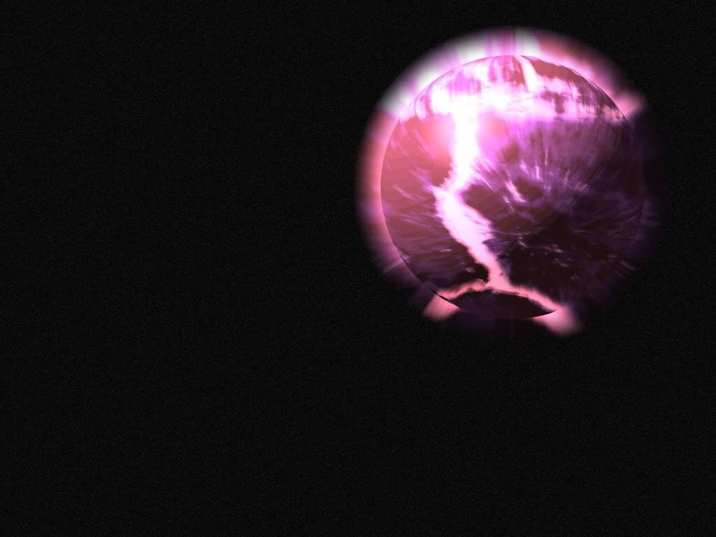
Distorted Orb, Lone planet, Suspended orb, and Aged Gemballa.

Signatures
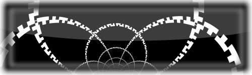
Gears

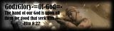
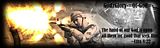
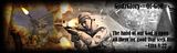
4Rappelz.com Logo, GodzGlory clanmate sig idea, GodzGlory2, and GodzGlory3

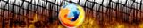
Faded Sunset, Thatched Fox, Firefox Abstract, and Flaming Name.


Avatars
Gray stars, Faded Gray, Scratched Metal, and Bloody Weave
By the way, I LOVE the new Pictorium forum. Thanks!
If you wanna check my deviant art, (I probably will update this more than my deviant art
) its http://pluberus.deviantart.comNotes:
*The silver spartan stock image comes from ICGAMERS. I simply made it black and white and sharpened for a cool desktop background.
*Faded Sunset is a photo manipulation. I faded it from Black and White, to Sepia, and back to an over-saturated original color image.
-
Very nice job Janetsue!
-
This is a GREAT idea! This will especially help those just getting started in PDN. (Not that they need many plugins... I just really helps to get to what you are looking for faster. Also, some tutorials don't specifically show you where in the Effects menu to go. Search would make it much easier.
-
@jake2k: Beautiful button! I really like it. Now if vista developers only had people like you to help design their GUI....

@worldnewser: Those are beautiful designs. How do you go about making them?
-
My newest PDN creation - Its really big because its supposed to be a high resolution desktop wallpaper or canvas print on deviant art:
-
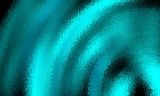
Oh lol. Here is a Blue ripple abstract desktop background I made:
-
@Madjik
:shock: Wow!! That's awesome. What's your DA so I can watch you? Great job!
My first graphic that I placed on deviant art to be sold. It probably won't sell any copies but at least I know how the system works when I get really good at graphics designing (give me a couple more years
):
-
wow what a night for the pictorium.
Pluberus I added you to my watch list over on DA and added a comment to one of your works in your gallery. excellent job.
I appreciate it oma. Thanks for the compliment!
-
@trek
I like your abstract wallpaper - its pretty interesting.
@myself
Here is a reflective tile gradient thing (haven't named it yet :wink: ) that I whipped up: (click for fullsize)
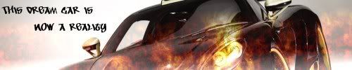
Also, here's a car photo I edited using Rick's tutorial:
-
Here is a desktop wallpaper/logon screen background (Logon studio by stardock - its free) that I made with paint.NET. How do you like/dislike it? click on the thumbnails for the full size versions.

Here is my "borealis" image:
-
@barkbark
Both of those designs are pretty cool. I like them a lot, especially your barkbark text - it looks kind of like the star wars text that moves towards the horizon.
-
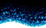
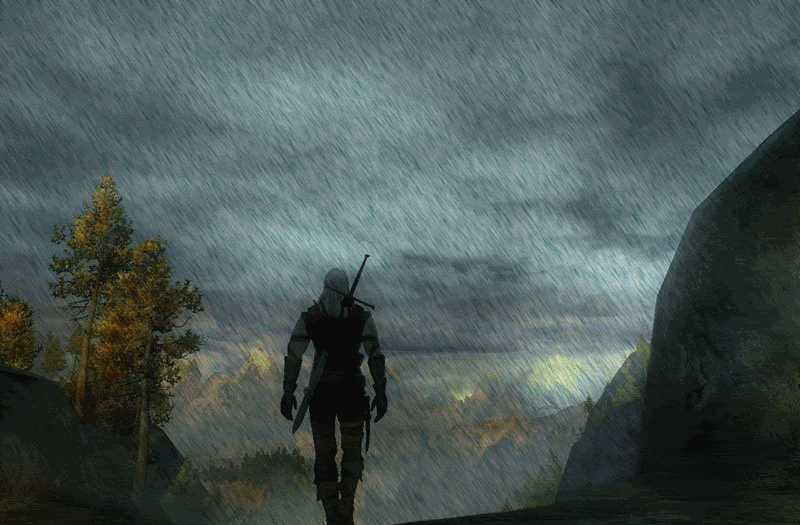
Here is a picture I modified to add rain using someone's animated rain tutorial:
That would be even better if you could show the movement of the guy walking.
That would be cool but very hard since I started with a single image. It wasn't a video or anything - I just added water
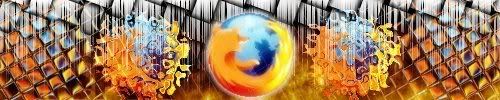
Here's my newest firefox sig:

I like that one better than this (which was in my sig) - so I am going to change my sig right now
: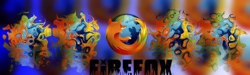
**Edit - here is a an offshoot of my newest firefox sig. How do you all like it? or dislike it?
-
Its hard to explain, anyways, if I need help I'll just ask in the Pyro Sig tutorial thread. I don't want to hijack this thread. It IS supposed to be to show off your work. Thanks anyways. Here is a picture I modified to add rain using someone's animated rain tutorial:
-
I tried to follow the Pyro Sig tutorial but I couldn't figure it out so I made my own version.
A sig background I created. I couldn't figure out what kind of text to put so its blank right now.
This is what i got when i did pyro's sig

But that's my point, I guess. I didn't follow Pyro sig's tutorial. I got confused so I made up my own steps.
-
I tried to follow the Pyro Sig tutorial but I couldn't figure it out so I made my own version.
A sig background I created. I couldn't figure out what kind of text to put so its blank right now.
-
Wow expiration! Your entry is.... AMAZING! No offense, but I think it blows all other current entries out of the water. Great job!
-
Here is my newest sig creation:
-
Same for me. All the pros are going to submit their entries at the last moment. This means - guaranteed LOSE for me.
-
Any criticism on my entry? Too late to change it I know, but its my first contest entry (I've only recently started graphics designing/editing - see my sig
). Anyways, I would like to know what I make better next time.Thanks!
-
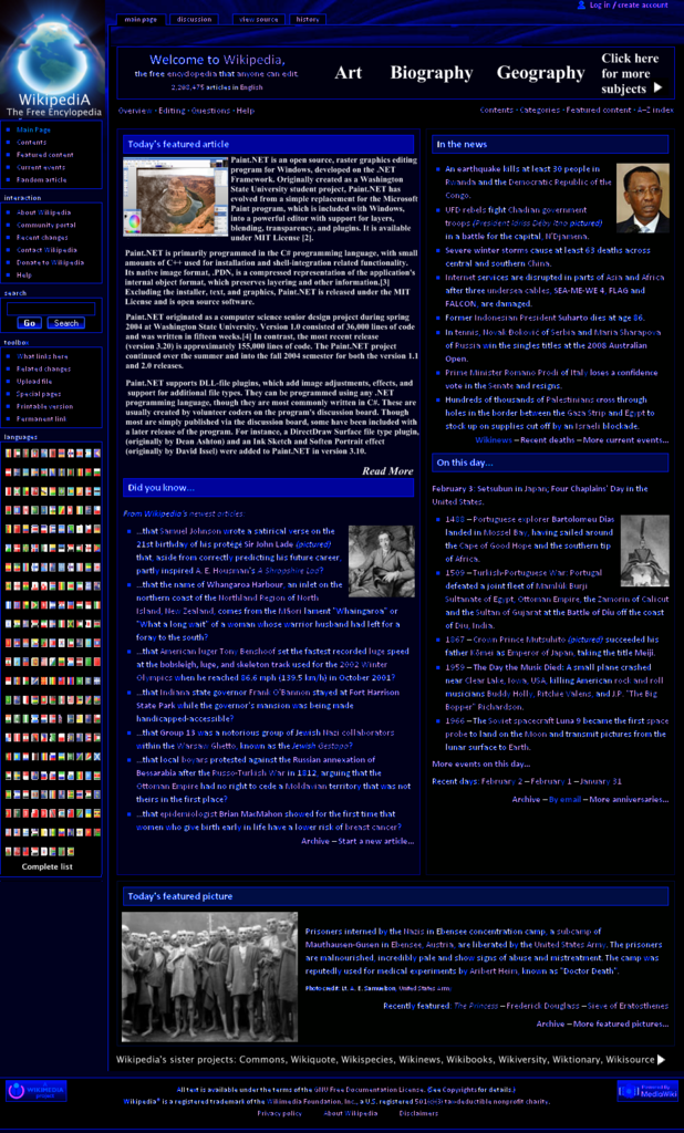
Here is my humble entry: (Click it for Full-Size version)

- I used no plugins except the basic ones that come with Paint.Net. No other photo editing program was used.
I used the provided Wikipedia home page screenshot.
Glowing globe is from icon in upper left is from 3ddude.
Flags display list in languages section is from famfamfam.Edited to add the bibliography. (Image link list)
- I used no plugins except the basic ones that come with Paint.Net. No other photo editing program was used.
-
I'd say a Whoa! That's totally awesome! Kind of whoa
 )
)


My banner making History : In Images (newcas12's gallery)
in The Pictorium
Posted
Wow, I like how I can see your definite improvement. Your later styles are WAYYYY better than your early ones. Keep up the good work!
I like styles 25 and 40 the best.