


aile
-
Posts
207 -
Joined
-
Last visited
Posts posted by aile
-
-
A new Sig:
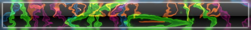
Still searching a Name for it^^
that's pretty cool. its looks like people morphing in a disco bar or something. im not good with titles though lol..
-------------
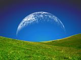
here are my latest abstracts:


-------------
and also my photomanip(make-over) entry:

^ click for full size please
 ^
^ahhh, too many images for one day, im gonna take a rest now.

-
here is mine:

no stock used, enjoy!

-
some text effect i worked on when i was bored:

i really wanted it to have the effect of a photoshopped text i saw a while back, but i guess i was too ambitious...or im just not trying hard enough.
-
New Avatar and sig combo!New avatar and sig combo!
whaaa? me too
-
It would require many structural changes, cause many bugs and the team have many more important things to work on. Just open up two instances of paint.net side by side - that should do the trick.
hmmm, no, you cannot open two instances of pdn. if you open it again, it will just revert back to the original one. :wink:
-
a glass butterfly, achieved by playing with glass blocks:

here's another one with some green nest at the background:

amazing, can you pm me how you did it?
thanks for the compliment.
however i cant quite remember the exact steps i did for that. i started that a loong time ago, then i stopped and it was only now that i was able to finish it.what i can remember though is that i drew something, then glass blocks effect, changed the color (color balance/curves), shape 3d to form a cube, then polar inversion...hmmm, thats all i can remember :?
-
a glass butterfly, achieved by playing with glass blocks:

here's another one with some green nest at the background:

-

Looks great! However, I think the pale halo around the eyes might be something you want to address.
thanks for that d.a... sometimes its hard to see the flaws of your own work, unless someone actually comments on them
I redid the picture and made her skin darker. Is this better?*attachment here*
yes, the second version looks better.
----------
Edit:
Thanks Darkshock!Minor revision: I changes the sky a bit, now it's deeper blue and has more contrast.
ooo i like the darker sky
it enhances the picture even more. -
oops.. it was only a while back when i realized that her eyes looked a bit off :oops: :?
here's an updated version:

-
I colored an old sketch of mine today and was hoping for some constructive criticism. I think I may have made her skin too pale it's hard for me to tell.
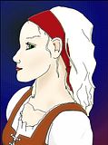
yes, the coloring and shading is quite nice
.. but she does look a little pale. the color of her skin almost matches her hair color, so maybe you could add some contrast with those two. but other than that, i think you're in good shape. --------------------
ok, here's my latest photo manip which was inspired by those worth1000.com contests:

face: Alexis Bledel
eyes: Emma Watson
equals: Alemma Bledson :shock: :shock:
there's another version where i added angelina jolie's lips, but im not going to post it since it looked soooo wrong.. :?

-
found it using search, use it next time k?
-
P.S. That image was made entirely in Paint.NET...no photo
:shock: i actually thought it was a real picture :shock: ... ive been punk'd.
-
LOL, is that a quote from demetri martin?
----
Karma Blue: the second one is really good
007 Nab: nice editing! i like it.
-
another photo manip:

clicky here to view full size on my d.a.
...i could use a little page view from you guys XD
just so you know, its more than just color balance and/or hue/saturation
------
images used:
model:[link]
bg: [link]
-
that is really nice!
-
My favorite right now is aile's:

hey thanks!
glad you liked it. :wink: -
my newest photo manipulation:

------------------
stock images from:
http://tragicstock.deviantart.com/
http://twofold-division.deviantart.com/art/Scene-Stock-II-69923013
-
Well im off for today but before i leave here is 2 banners ive recently made. Should i use any in my sig. If so, which ones.


hmm.. for a while there i thought you were ncfan. :shock: lol anyways, both of them look ok, the text on the first one might need a little :AntiAliasingOn: or feather... but i like the bottom one because it looks less busy than the other. but its your sig, use whatever floats your boat
-
No offense but its not really a good photo for manipulating.
i kinda agree with that. well, not that its really bad, but it was difficult to "beautify" the image since...you know, it was just.. a tree...
 i did some editing on it and it got to a point where i don't really know what else to do, add or adjust.
but i tried and posted my entry anyways.
i totally support this contest, but maybe we could use a more interesting picture next time? like people, faces, black and white images for example? :wink:
-
here's mine:

hmmm...done with some chips and soda

-

Nice!

QFT!
Thanks guys!
and janettsue, i like your drawings, especially the last one!
-
experimenting with retouching.
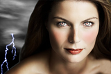
the retouched does look better than the original.
and i love the added lightning bolt background.here is one i did months ago on hayden panettiere. i was just trying my hand and experimenting on make-up editing, she ended up pretty silly

also, i've decided to give up on my frosted text. (this is the 2nd and final version.)
 it does look better than the last one, but im still not satisfied with the outcome.
-
its shift + magic wand
-
i am working on a frozen effect on a text right now...

....but i feel that there is something wrong..
:?: hmmm... any suggestions guys?


grid fill - but not exactly
in Paint.NET Discussion and Questions
Posted
hi, you could achieve that effect by using textile (effects>render>textile). i forgot if it was a plugin or if it already comes with pdn. if you dont have it, then it probably is...
here is the sample result: