


iiMsoGFX
-
Posts
10 -
Joined
-
Last visited
Posts posted by iiMsoGFX
-
-
Most recent one:

-
Really awesome Pics! Nice gallery.
-
Made that a week ago:

-
Was it really done in Paint.NET? Cause it looks kinda amazing lol.
-
Chrisco97 - 3
himself22 - 0
#winner Chrisco97
-
I ask because I was terrible when I was under a month old user.

Great job on them!
LOL. I watched some tutorials and I watched some other people when they were making sigs so I kinda learned from them

-
I like them overall, they're really good for someone who has been using Paint.Net for under a month. But here's some suggestions:
The first one I like overall, but the colors don't really match (the soldier is too bright, and the background is too dark), and I can't really tell what the background is, and in my opinion (as always), I the white outline on him looks kind of weird
For the second one I like all the blurs, but the colors, It think it should be the other way around, the background black and white, and the person and your name colored.
I like the third one, no criticism there.
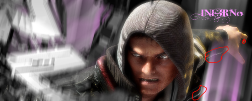
The fourth one, I don't really think the font of the text matches the picture, and it's hard to read. The guy (I don't know who that is), looks angry and almost sinister, when the font is very fancy. I like the color though. And one more comment on the last one, I would use some anti-aliasing. (example)
Here's some links to anti-aliasing plugins:
There might be more...
Thanks for your postive feedback. That guy is the guy (lol) you play in Prototype
-
Thanks Chrisco!
I don't know, like less than a month? But why do you ask?
The first one is my recent one, i used some plugins I just downloaded from here

-
Hey Guys & Girls!
My first post, yaay!
Well, here are some of my sigs:


Here's my gallery on Photobucket: http://s320.photobucket.com/albums/nn352/Team_GFX/InfernoKiLLa/
inF3Rn0's Sig-Gallery
in The Pictorium
Posted
No, that's what his hair looks like in real-life
Thanks for your feedback