


Romanticidal
-
Posts
15 -
Joined
-
Last visited
Content Type
Events
Profiles
Forums
Blogs
Gallery
Downloads
Posts posted by Romanticidal
-
-

Second attempt.

Love this tutorial. Thanks!
-
Ahh, Twilight. The love of my loins and the bearer of my heart.
Honestly, I don't think I want to see the Twilight move in sheer fear that it'll totally ruin the book.
I like the signature, overall. The only problem I see with the Twilight one is that the layers of Edward and Bella is easily distinguishable. Not totally sure how to fix that, to be honest. I've only had PDN a few days myself, and it happens to be my first picture manipulation/editting application other than Paint.
Great work.
-
Personally, I love it the way it is. I wouldn't know where to start if I tried with that. Looks amazing. :]
Kudos to you. Keep it up.
-
Everything you mentioned I got except one main thing. adding the new color. I was able to make the old color remain while the back ground went to the black and white. Even with the hue and saturation it didn't change anything. Did I not do something correctly. I followed your instruction to the T or so I thought. I even tried to use the recolor but I don't know how to enjoy that to the fullest either. Would you like to enlighten me on that?
Your a jewel...
Thanks
NG
I don't think I completely comprehend what you're trying to say. Could you please post a screenshot of what you're currently up to?
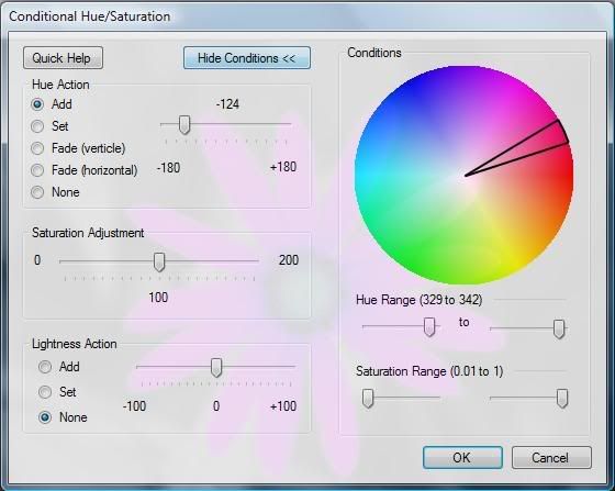
The way I did it was simple: I finished with the flattened image and I used Conditional Hue/Saturation to change the colour of the flower (it is, afterall, the only coloured object in the image). I then duplicated the layer and Gaussian Blurred the top layer, and then halved the opacity of that layer to create a softer effect.
Could you elaborate a bit more, so we can get an idea? Or, what would you like me to elaborate more? Which step, exactly?
-
Thank you for the reply. I am playing with the adjustments, it's goes right into Auto level, black and white, brightness and contrast, curves hues and saturation. ( needless to say mine little charge doesn't look like your chart here) invert colors, level and sefia.
is there another spot where I should be looking for your chart?
Thanks a bunch!
NG
Sure, sure.
I added a link in the same post as I presented the other chart, that takes you to the Plugin that gives you Conditional Hue/Saturation.
Link: http://paintdotnet.forumer.com/viewtopic.php?f=16&t=1102
Download the .dll file to your Effects folder in your Paint.NET program files.
(Should be like this:
C: Program Files/Paint.NET/Effects)
Close Paint.NET. Reopen it, and try again from the first step I gave you.
-
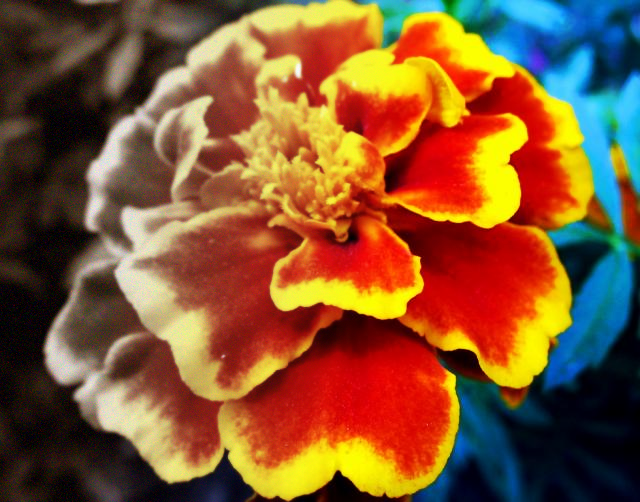
I have a question! Will paint allow to to have a black and white photo then enter a new color in a spot? for instance the photo above is of a yellow flower and a beautiful black and white background. Can I change that flower to pink? I have my fingers crossed!!!
Fiddling with Conditional Hue and Saturation (http://paintdotnet.forumer.com/viewtopic.php?f=16&t=1102) (and a little Gaussian Blur with reduced opacity on a duplicated layer to remove some of the grittiness), I got:
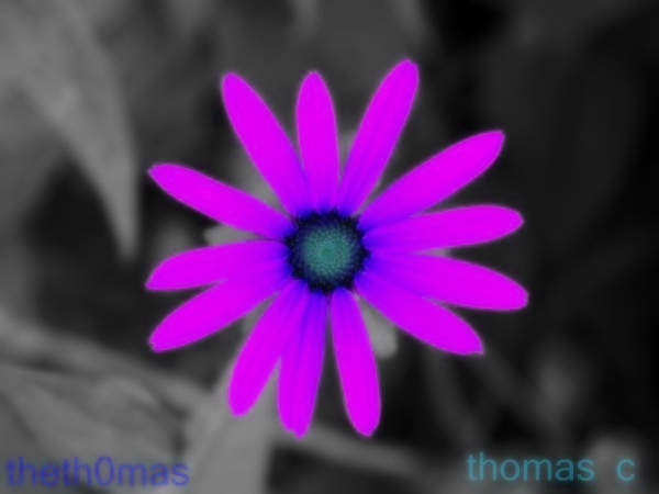
Sorry, Thomas. I used your image. Too lazy to recreate it.

Steps:
Opened up Thomas's Flower.
1. Adjustments -> Conditional Hue/Saturation and enter around these values (fiddle with it):
2. Duplicate the layer.
3. To the top layer: Effects -> Blurs -> Gaussian Blur with a radius of 6.
4. Open up the layer properties for the top layer (the one you just modified) and change the opacity to around 110-130.
This gets rid of some of the distortion after you use Conditional Hue/Saturation.
There are probably more ways to do it, and considering I'm only new to the programme myself, I found that the easiest way to do it.
-

♥
Inverted colours, added a textile effect, increased canvas size, deleted parts of it and voila.
-
First attempt:

I might go through and edit the colours at a later stage. I'm pretty happy with it overall. It is, afterall, my first manipulated image from scratch. :] Tut or not, I'm proud of myself. Hehe.
@Tylertut: great work, mate. Done this before? Great outcome.
-
Bit controversial on my behalf:
Added Sepia to the bottom layer. :]
Thanks for the tut.
-
My first attempt at both PDN and this tutorial (
):
Added some noise at the end. :]

Problem when taking Screenshot via Remote Desktop Connection
in Troubleshooting & Bug Reports
Posted
Save the screenshot in MSpaint and then open in PDN?
I've never used RD before, so I wouldn't know unfortunately.