


Magistrate
-
Posts
17 -
Joined
-
Last visited
Content Type
Events
Profiles
Forums
Blogs
Gallery
Downloads
Posts posted by Magistrate
-
-
Thanks so much Ash


-
Um... This doesn't really pertain to the sea shells, but how did you affect that water in the beach background? I've been trying like crazy to make a water-like affect (stormy seas, ponds, spouts, typhoons), but I could never get that glazed look- they all just looked like glorified, twisted paint

-
Is there any way to somehow set this up so that it stays in the same window as the actual image? That would really help- for me, at least.
-
Oh, I have to say I really like that one a lot- great job

-
I haven't been on here for a while, but thanks for the smudge tool! This helps immensely!
-
How many frames was that?
-
This is a rather nifty tutorial

-
I have to say I like that orb effect- it kind of looks like a palantir.
-
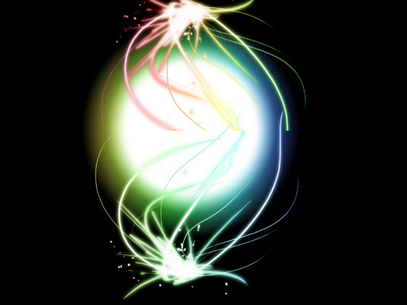
Rainbow ORB!
Now that's neat looking
-
That's cool, but you could use some of the other brushes in that brush set to enhance the picture a little more- you know, add a little difference... Ah... Get me? :?
-
Eh heh...
 My bad. Thanks.
 -
Holy bloody potato Topezia, those are all really great- just goes to show that just because something's free doesn't mean it can't complete with the programs you buy
 Wonderful job.
 -
Hey, this is a really handy plug-in, I use it a lot, and thanks a ton
I just have one problem: it started running very slowly when I started compiling a lot more brushes. Why isn't there a delete option (or am I just missing it?) and is there a way to add multiple brushes at once? Currently I can only do it one at a time.
-
Heh, not bad:

-
Thanks a ton, I never new how to add brushes like that, and the principles here will be useful in the future, I'm sure
-
Um, I don't know if posting in here for your first post is frowned upon or something, but I made this using the 3D render plugin and some other bloody potato. The only thing not original are the words (not the paper), which came from The Silmarillion by J.R.R. Tolkien.

I think the lighting is a tad off, though.


 My bad. Thanks.
Detailed Aged Parchment
in Tutorial Graveyard
Posted
Parchment Tutorial by Magistrate
Purpose: To make an aged piece of parchment paper.
Finished Product:

1. Go to your Colors Window, hit "More >>" next to the drop-down list and above the color selector, and then go to the right. About 5 lines down is the word "Hex"- to the right is a field with "000000". Enter the hexadecimal color code "e9dbba" and then hit "<<< Less" to shrink the Colors Window again so that it's out of your way. Your Primary color should now be set to a tan-type color. This will be your base color.
2. Select the Fill tool from your Tools Window and fill the Background Layer with the tan color you just added. Then create a new layer on top of the Background Layer- the name doesn't matter.
3. Now go down to your Colors Window again and right below the tan color square is a black box overlaying a white box- click on it to reset your Primary and Secondary colors to prepare for the next step.
4. Now, with your colors reset, on the new layer, go to Effects in the File bar at the top and then go to Render -> Clouds. Keep it at default settings and hit OK.
5. Now, on the layer with the black and white clouds that you made in Step 4, go to Effects -> Stylize -> Emboss. You can just leave it at default settings once again. Now hit OK.
(Image_5)
6. Now, you should see a border from the Emboss effect around your picture- a white line on the right and a dark on the left:
To fix this, we are going to crop out the edges by going to the Tools Window and selecting the Rectangle Select tool. Select everything in the picture but those edges. Now go to Edit in the File bar on the top, and then at the very top click on "Crop to Selection". If done correctly, the very small outside edges that weren't selected should be gone, and you should only be left with the Embossed Clouds.
(Note: Golden text added for comedic relief from this tedious tutorial with a result that's probably not quite worth the effort- your result so far should not include this text! If it does, please consult your local .NET framwork programmer for assistance.)
7. Now set the Embossed Clouds layer to "Overlay". To do this, go to Layers in the File bar at the top of the screen and go down to Layer Properties. Underneath Blending in the resulting window, click on the drop-down arrow and scroll a little until you find Overlay. Select it and then hit OK. So far, your texture should look like this:
That concludes the very simple version- flatten and your done. The following options are just embellishment.
8. Now, we're going to turn up the wrinkle quotient of the paper. To do this, select your Embossed Clouds layer and go to the File bar at the top of the screen. Then go over and click on Adjustments. Click on Brightness/Contrast, and then change the Contrast indicator to your liking- I set mine at 60. If you did this step at the same exact number I did, your texture should look like this:
9. Next, we're going to add an old script watermark to give it some extra retro flair. To do this, flatten the image (if you haven't already) by going to Image -> Flatten in the File bar at the top of the screen. Then add a new layer (once again, the name does not matter) and select the Text tool from the Tools window and click in the upper left-hand corner of the image. Select some kind of old, elegant, and/or cryptic font, make sure the font size is descent, and then copy & paste the following text a couple million times until the whole paper is covered with symmetrical and evenly spaced lines of text:
(Yes, web developers- or people who know latin- should be familiar with Lorem Ipsum- I got this off the Lorem Ipsum generator at http://www.lipsum.com.)
If you're curious, the font I used is called "Abaddon". It should now look similar to this from edge to edge:
10. Now, we're going to make it more mysterious looking- by erasing some of your hard-pasted text. Select the Erase tool from the Tools Window and set it to about 50 pixels in diameter (this is the Brush Width two bars below the File bar at the top of the screen). Erase random chunks here and there and try to avoid accidentally making straight lines of erasing. Don't be too picky, though, we want it to look natural. It should look similar to this:
11. Next, we must blend it in with your parchment background. So, blur your text layer by going to Effects in the File bar, and then to Blurs -> Gaussian Blur. Set it to about 4- it will vary depending on your font. Then set the Blurred text layer to Overlay (if you don't know how to do that, check step #7).
12. You've probably noticed something- it might be a tad too light for you liking (the text). The solution: darken it! (Who'dve thought?) Anyway, to do this, select the text layer, and go to Adjustments -> Brightness/Contrast and then set all your bars to their default values (do this by clicking the arrows next to the white boxes on the right of the bars). Set Brightness to -100 and Contrast to 100. Repeat. Then go to Effects -> Photo -> Sharpen and set it to max- hit OK. It should look similar to this:
13. Now flatten it again (if you don't know how to do this, see step #9).
And your done.
I added a little more with just some more layers, blurring, shapes, overlaying, etc. and got this:
(Yes, it looks cheesy, but I tried to do something special for the end.)