


mustang maverick
-
Posts
141 -
Joined
-
Last visited
Posts posted by mustang maverick
-
-
Thanks stefTACULAR, this one is for you I suppose.

Edit:
@stefTACULAR I like both of your sigs. Old, and new.
:wink:
-
Thanks Moc...
Ash that is great!
The reflections could use just a tad bit of work, but that is really good.
Sorry about taking your lightbulb idea. haha:P
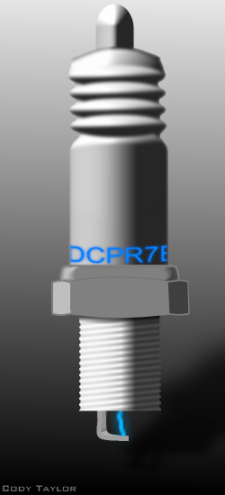
I'm, going to start working on a spark plug today. I'm not stepping on any toes there am I?
:wink:
-
I feel that I hang out in this thread too much.
But I like looking at everyone else's work.
Nice job Trooper.
:wink:
-
I agree!
:wink:
-
Thanks Ash, coming from you that means quite a bit to me.
:wink:
-
@moc
Nice, effective use of plugins.
Inspiration struck me when I hit the switch this morning. :idea:
Sort of ironic...

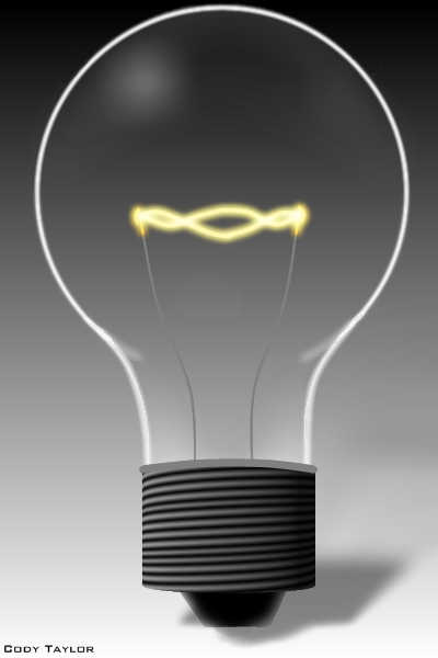
:wink:
-
@stefTACULAR
@OMA
@And anyone else that commented the last picture I posted.
Thanks so much!
:wink:
-
@Barkbark
That would be nice.
:wink:
-
Hope this helps.
At the least it should help you get started.
http://paintdotnet.12.forumer.com/viewtopic.php?t=3363&highlight=signature
:wink:
-
@picc84
@Trooper
Thanks a lot!
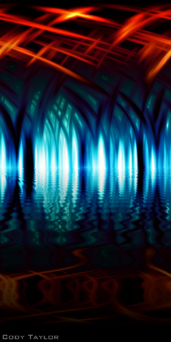
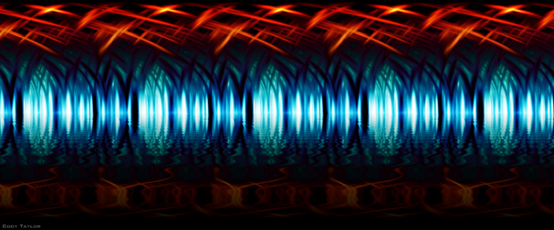
Here is a link to the panorama version of the "fantastical, vaulted, water-filled catacomb".
http://i35.photobucket.com/albums/d151/jesuskittycjhs/catacombpanosig.png
I hope Trooper doesn't mind me using his line.
-
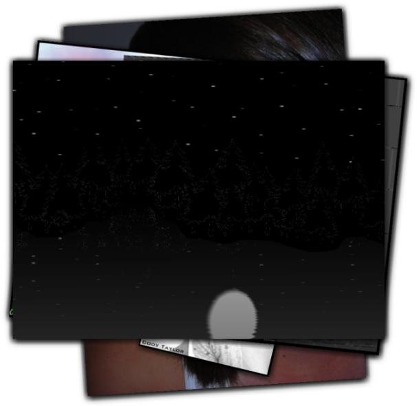
My one a day...
This has to be the best image I have put out in quite sometime now.
Quite possibly "ever".
:wink:
Edit: "Nice cursors usedhonda."
-
Great tutorial!
The possibilities are absolutely endless!
:wink:
-
Welcome paran.
Nice work by the way.
:wink:
-
Thanks Ash, i'll work on that.
You always seem to have positive criticism.(which I need without a doubt.)
Thanks for that.
Nice work Trooper.
-
Has anyone ever taken pictures of the stars with a really long shutter speed so that the stars are elongated?
Suggestions?
:wink:
-
Nice work Oma.
I would like to second what you said about improving if you maintain an open mind and try new things often.
And once again, nice work!
:wink:
-
CMD:
Paint.NET is an photo manipulation program as much as it is an graphic creation program, probably more so.I like the contrast range photos (or in this case, rendered photo-realistic images) give, and it's nearly impossible to re-create that dynamic digitally. I feel justified in using it because photo manipulation is one of Paint.NET's "selling-points", if you will. Up 'til now, The Sketchpad has rather ignored that aspect of it.
What do you guys think?
I agree...
:wink:
-
Ash!
Once agian, you have blown me way.
Great job!
-
Like oma said, this is my 'one a day'...
She looks sort of animated. I don't really mind it though.

Suggestions?
-
do you know I was out to my favourite chinese restaurant for lunch yesterday with some gals I used to work with and found my mind wandering. I was thinking I bet I could replicate that bamboo wall over there in paint net ever so easily with the 3d tube .....but how do I do the cross rings...... had to snap myself back to the group real quick before I missed out on the juicy gossip.
haha I can relate.
Wow, can I ever. haha :wink:
-
Wow!
Oma beautiful work!
I know what you mean about being addicted. :wink:
It's to the point now, that I am looking for things to do other than mess with PDN all day. I feel i'm rotting away...
-
@hope
Welcome.
Nice images...
-
@Marko
You may have a point there. But as long as you can achieve the desired effect by complying to this "rule of thirds" I doubt it matters how you go about doing it. When I learned this rule in the compositon portion of an art class I took, I was taught to draw those lines and later eliminate them.
"Between you and I... I never did draw the lines." :wink: But I did adhere to the principle.

-
@Ben
That is a good question...
I wonder that myself...
Along with other things that we do without noticing. :wink:

Newbie here looking for some help
in Paint.NET Discussion and Questions
Posted
@Mrt3991
Just a suggestion. But I feel it gives text a bit more pizazz, if you will.
If you put your text in a layer of its own, then duplicate the layer containing the text. Then add a bit of glow to the bottom text layer, it gives the text a bit more imphasis.
You may already know how to do this, I apoligize. I just thought I would make the suggestion.
Edit: Doing this will give you somthing along the lines of the text in this sig.
The layers window should look somthing like this.
Layer 2: colored text (any color you like)
Layer 2: colored text (any color you like) with a bit of glow.
Background: Image you wish to lay under your text.
Once again, that is just a suggestion. Heed it, or not, just a suggestion.
:wink: