


six
-
Posts
33 -
Joined
-
Last visited
Content Type
Events
Profiles
Forums
Blogs
Gallery
Downloads
Posts posted by six
-
-
Insane.
My laptop has... twice the PDN Functionality of this computer. Time to get up to date!
Also, yeah I'm back from being banned. From my PC.
-
Why be a genius cj? Why do it?
Back from being mass banned from computer. Got me a new laptop too

-
You like flower!?
-
-
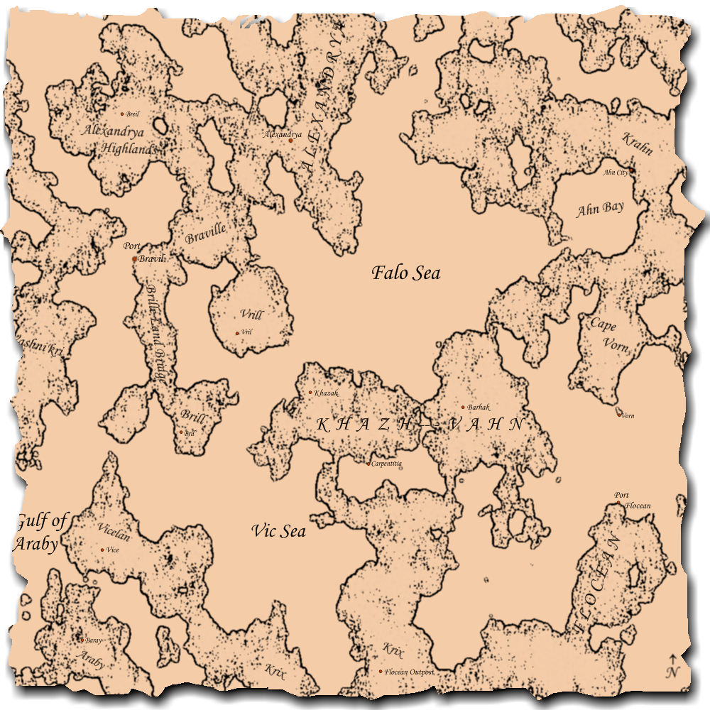
While fiddling with this tutorial, I accidentally found a way to generate generic world maps. Unfortunately, I spent too much time fiddling with it so I have to go now.
Clouds
Clouds (Difference)
Pencil Sketch at 3 size and 0 range.
Then refine in whatever way you see fit.
-
Tile Reflection?
Looks pretty epic because there's not much detail loss.
-
Thanks. Someone should download every single plugin worth having and place them in one file for easy download. And keep said file bumped so it doesn't go under.
-
My internet died yesterday.
 Winner!
My result:

And while I'm here:
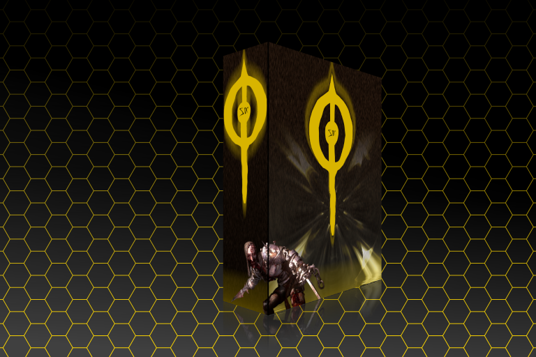
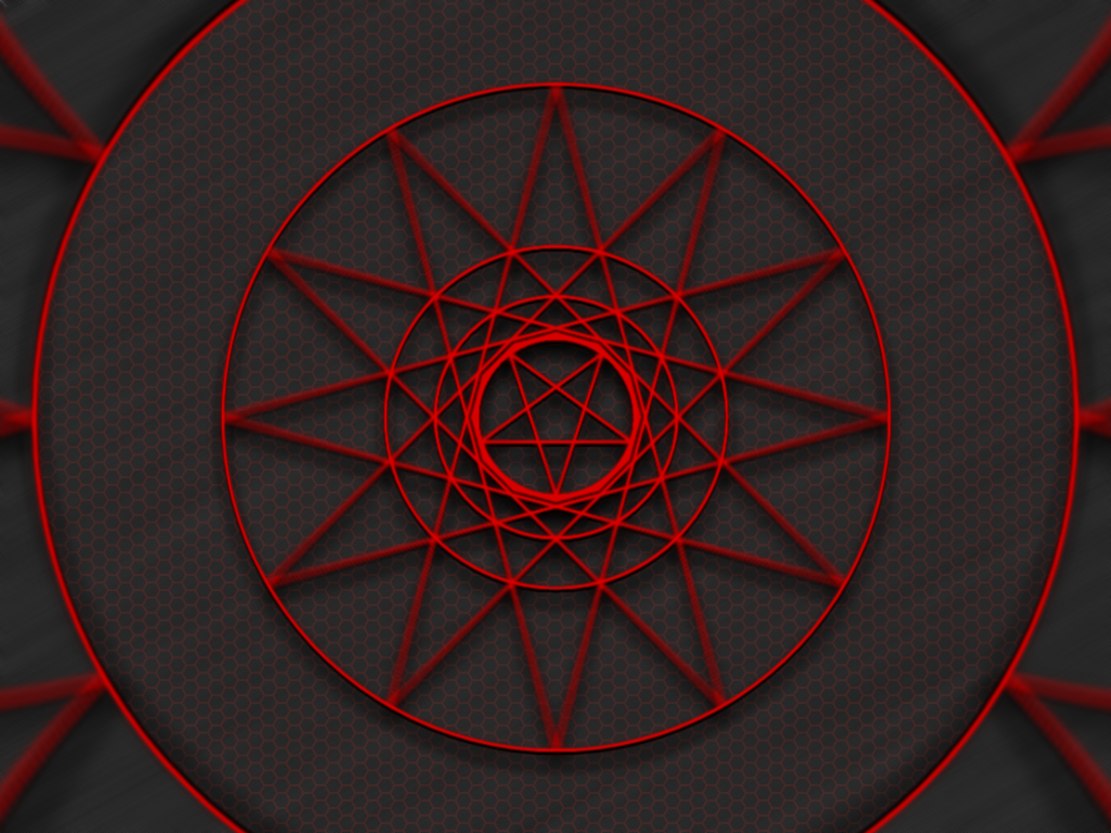
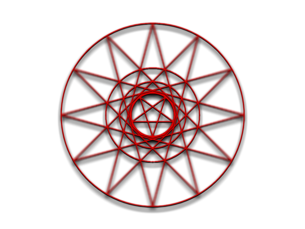
Background [1024x768]
Symbol [1024x768]
-
Yet another great tutorial from cjmcguinness.
If there was a rating system, you would have a Winner.
-
Paint.NET is awesome. This is the internet. Everyone here is testifying the fact.
Whoa, you can predict the future!
-
Box box, I come in a box!
Buy me!
It's me in a box, buy me now! All details on the wrong side where you cannot, and never will be able to see them. Only while stocks last.
-
I wish.
It's machine code. :o
And some original work.
With my friend's joke.
-
Hm. What font is that? Or did you actually brush it?
See signature. Render.
-
Shoom!!1

Yours is mucho better.
 lulz
lulz -
Down, has anyone told you your sig is sexy?


I did a lot of extra effects. It's a link to the full thing btw (@500x500) and I messed with layer blending modes on it to get the right effect. There was one with screen, one with darken, one with reflect then one with glow. It accented the blue nicely.
-
Mine, reduced to avatarish size and background transparent!

And a different one on a background. It's wallpaper size.
They're black and white because both came out in horrible shades whenever I changed hue/sat or curves so... meh. I call it Necromunda.
-
Not a picture, although I would like you to consider my Avatar/Sig as well. It's a fractal frame generator for Windows, which is very useful if you're looking for a background to use on your signature. Or if you're just looking for inspiration.
Apophysis - Fractal Frame Generator
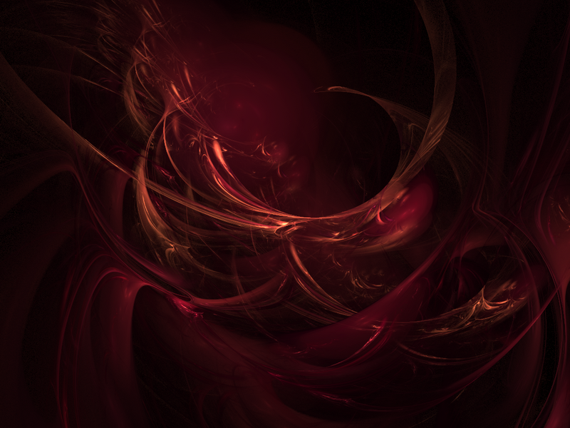
Here is a sample image:
Blood Rose - 800x600 (Originally 1024x768)
EDIT: Sig is on the line at 498x100. Originally 600x125.
-
Not really. Took me about ten minutes, all I had to do was save one then zoom blur and repeat.

-
Your site's down. :o
-
Funky tutorial. Used UnFREEz to make a gif.

-
How the hell did I get first post on a tutorial this handy?
Or did I..?
Heh. Anyway, this could be applied to all kinds of patterns. Let's do a Safari!
Double Firstpost.

Text Tool - Wrap to selection
in Paint.NET Discussion and Questions
Posted
In lieu of a licensed copy of Photoshop, I use Paint.NET for my general design brainfarts. I've used it for a few years now and only now have found something I dislike - a lack of word/text wrapping functionality.
So I decided I'd pop in and even remembered my account details on the first go (woohoo! This never happens) and drop a request for this functionality, as much as I hate requesting things in general due to a patholo--moving on. My vision is thus:
Step 1. Enable Word Wrapping (a button up here, assumedly). This would ideally have a dropdown also allowing you to change whether it wraps on whitespace only or mid-word with a hyphen.
Step 2. Make a selection. If there is no selection, it wraps to the image border.
Step 3. Type. When the text hits the right (or left, for right-aligned text, or exceeds the width of the selection/image for center-aligned) it will wrap at the appropriate point. When out of vertical space the text would merely be cut off as it is now.
Bonus points: Make center-aligned text centered relative to the selection. Justified text would also be possible when there are given bounds, but who even uses that? Sheesh.
As it is now, text is based only on an anchor point (and is rasterized only - no editable text is a bearable downside for the gigabyte of memory I save from what I last saw of Photoshop, but that's not saying I don't often want for it), having text based on selection bounds if a selection exists would be a very user-friendly way of making it all much more powerful. I know Paint.NET isn't a word processor but nicer text handling would be a big plus for those of us who use it for more design-oriented purposes. As noted, text being editable objects (I don't much like the 'text layer' thing, but I can't honestly think of a better way) would be cool too.