


Musiphonix
-
Posts
42 -
Joined
-
Last visited
Posts posted by Musiphonix
-
-
It's a nice picture, but the background kinda seems distorted. Good effects.
___
http://musiphonix.deviantart.com/#/d4sdu0x
It's my current desktop background. I'm not reposting the description, really cannot be bothered at the moment (how lazy of me).
-
Long time coming, wow. I thought I'd give your tutorial a go, and tada!
Before:
http://newevolutiond...allpaper-37.jpg
(Can't be bothered to make it smaller)
After:

-
To add something to a selection, press CTRL and drag. To remove, press ALT and drag.
There are many more wonderful things you can do...

-
Original post is 2 years old and the poster hasn't been online since then either. I don't understand why anyone would bother digging in back up just to ask someone that likely doesn't use the forum anymore to fix the broken images especially when the image hosting website used no longer exists. I suggest you try figuring it out yourself. If you can't, I'll see what I can do to make some example images for you. (just say please
 )
)Didn't realise it was that old, it was at the top of the pile! So someone else bumped it. But oh well, nvm.
-
Every picture is completely broken. It's probably not your fault, but please fix them. By the looks of other's results, this would be worthwhile knowing!
-
I should explain that this was (originally) a Photoshop tutorial. http://psd.tutsplus.com/tutorials/icon-design/create-a-photo-realistic-iphone-in-photoshop/
I've just decided to split it up into 3 parts.
-
Man I love quick replies! I won't update all the screenshots (no need to) but I'll update the template for it. Thanks!
-
Hello, this is my second crack at a tutorial, or rather a set of tutorials. This is the first instalment in the "Photo-realistic iPhone" series, which covers the front of the device. The second covers the rear of the device, whilst the third covers the side. I'll update with the links when I write them.
The following tutorial assumes that you have a decent understanding on how (from a user perspective) Paint.NET works. If you're new, read up on the help files before you attempt this tutorial.
_ _ _ _ _ _ _ _ _ _ _ _ _ _ _ _ _ _ _ _ _ _ _ _ _ _ _ _ _ _ _ _ _ _ _ _
Resources:
_ _ _ _ _ _ _ _ _ _ _ _ _ _ _ _ _ _ _ _ _ _ _ _ _ _ _ _ _ _ _ _ _ _ _ _
You will need the following plugins:
_ _ _ _ _ _ _ _ _ _ _ _ _ _ _ _ _ _ _ _ _ _ _ _ _ _ _ _ _ _ _ _ _ _ _ _
Tutorial:
You will be making this:

1. Open "iPhone template" (found in the resources section).

2. Fill the template with solid black.

3. Create a new layer.

4. Select the Paintbrush tool and set anti-aliasing to off. Set the colour to white and the size to 26. Create a white circle as shown in the image below (we'll center in in the next step).

5. Align object, center horizontally.

6. Create a new layer.

7. Draw a opaque, curved rectangle as shown in the image below (we'll center in in the next step).

8. Align object, center horizontally.

9. Create a new layer.

10. Draw a circle as shown in the image below. Be sure to make it the same hight as the object you drew in step 7.

11. Create a new layer.

12. Draw a solid rectangle like the one shown in the image below.

13. Align object, center horizontally.

14. Create a new layer.

15. Paste an image that you like the screen to display (I'm using a screenshot from the Curves+ plugin (because I'm lazy)). Make sure that it covers the white square.
16. Go back to layer 6, select the white square and invert the selection. Go back to layer 7 and press delete. You can now delete layer 6 (if you want to).

17. After this point, we'll be bouncing around layers. I suggest you name your layers (if you haven't already, like me).

18. Create a new layer above "Button". Name it "Button Icon".

19. Draw a small square over the button, the colour should be a light grey (#808080). Be sure it's in the center of the button.This should be a hollow square with anti-aliasing and a 1px border.

20. On the "Base" layer, select the black. Set the primary colour to solid black (#000000) and your secondary colour to "#0A0A0A". Draw a linear gradient from top to bottom as show in the image below.

21. Set the secondary colour to a light grey (#999999). Goto the the "Button" layer and select the white area. Draw a gradient like the one shown in the image below. OPTIONAL: Use one of the many anti-aliasing plugins on the button (if you think it's too rough).

22. Set the primary colour to "#0A0A0A". On the layer "Front-Facing Camara", select the white area. Fill it.

23. Select a square within the circle. Set the secondary colour to "#0C0099". Reverse the colours and draw a gradient like the one shown (I did have to use the paintbrush with anti-aliasing to do that (awkward sizes)).

24; Select the graident, invert selection. Soften edges with the settings shown.

25. Change the primary colour to "#4C4C4C". On the layer "Speaker", select the white area and draw a linear gradient like in the image below.

26. Without deselecting, create a new layer above speakers. Name this layer "Speaker Holes". Select the rectangle drawing tool and change fill to "Percent 25". Make the primary colour completely tansparent, reverse the colours and draw a 'solid' rectangle over the selected area.

27. Deselect. Go back to the layer "Speaker". Use gaussion blur plus with the settings shown.

28. Create a new layer above "Screen Image". Call it "Lighting".

29. Go to the "Base" layer, select the tranparency and invert the selection. Go to the "Lighting" layer and draw a solid white line cut-off by the selection edge (follow the image).

30. Select the white area you've just drawn. Draw a white to transparent gradient like in the image below. Change the opacity to something between 170 and 210.

31. Deselect, flatten and you're done!
_ _ _ _ _ _ _ _ _ _ _ _ _ _ _ _ _ _ _ _ _ _ _ _ _ _ _ _ _ _ _ _ _ _ _ _
Thank you for reading my tutorial. I hope you had fun executing it. If you have any suggestions, I will most likely head them (unless they suck).
-
My attempt is as follows:

Yes, clearly I did fiddle with some things. Click the thumb nail for a larger image (1000x1000).
___________________________________________________________________________
The tutorial? Brilliant, not the easiest to play around with but still great. You get an:

-

Is my attempt (click to enlarge). I call it "Holy Reactor". What a brilliant tutorial, because you can apply other creative steps to make it more awesome.
I give you 10/10 .
-
I'm thinking about doing a flash or silverlight app to show the gallery 'cause it's going to get big. Probably the silverlight option is better. But is either allowed on this forum? Hmm......
-
Although I'd love to, I can't thank everyone a million times. But still; Thanks!
P.S. I'm still updating it. Soooooooo many images.
-
Thanks! I'm currently updating the list. There are about 70 images to put on the list....
-
This is my personal gallery on every single image I've ever made (not in chronological order).
Some - in my opinion - are beautiful, some are.... poo poo.
I'm also using this thread to showcase my "Betas", the unfinished works.
_ _ _ _ _ _ _ _ _ _ _ _ _ _ _ _ _ _ _ _ _ _ _ _ _ _ _ _ _ _ _ _ _ _ _ _ _ _ _ _ _ _ _ _ _ _ _ _ _ _
LEGEND:
The following are postfixes for image titles (Image_Title[n]):
* (asterisk) This is used to show that it is the direct result of a tutorial, I will try to include a link to the tutorial.
n (rating) This is used to show how good I think the image in question is. n is replaced by number (1 to 10, 1 is shockingly bad). This rating is relative to all my other works, so 10 is my best image, not the best image of all time. This goes after all other postfixes and will be n if part of the name consists of ^ characters.
0 (rating) This is another version of n, it is used to show that this image is humiliatingly bad. Please do not review it, I don't need to be told that it's bad, I know.
% (Percentage) This is used to indicate that you have permission to do anything you wish to this image. You must still give credit to me and you may not use it commercially.
^ (Power Of) This indicates that there are multiple version of this image.
The following are prefixes for image titles ([n]Image_Title):
* (asterisk) This is used to show that it is the indirect result of a tutorial. These are usually part of much bigger works. I will try to include a link to the tutorial.
& (ampersand) This means the image is part of a large project.
& (ampersand) This is an indication that the image is in alpha stage. Please do not review it, it won't be anywhere near finished.
& (ampersand) This is an indication that the image is in beta stage. Please review it. It's easier to change in that state.
s (stock) This is used to show that the following image contains stock images.
The following are suffixes for image titles ([n]Image_Title[n]):
* (asterisk) This shows that the image is a project containing multiple 'tutorial results'. I will try to link to all of the tutorials.
& (ampersand) This shows that the image is used a a custom stock, so that it's used in loads of projects.
_ _ _ _ _ _ _ _ _ _ _ _ _ _ _ _ _ _ _ _ _ _ _ _ _ _ _ _ _ _ _ _ _ _ _ _ _ _ _ _ _ _ _ _ _ _ _ _ _ _
In the event that you were wondering why I haven't updated it for a while. It's because I've been busy creating a silverlight gallery for a website dedicated to (guess?) being my personal gallery. I'm also working on a comments section. I'll update this gallery with the link when I've finished. Just thought I'd give you the heads up
 .
._ _ _ _ _ _ _ _ _ _ _ _ _ _ _ _ _ _ _ _ _ _ _ _ _ _ _ _ _ _ _ _ _ _ _ _ _ _ _ _ _ _ _ _ _ _ _ _ _ _
Name: *&Tablet7
Format: .jpg
T.N. Resolution: 128 x 80
Full Resolution: 1440 x 900
Category: Miscellaneous Desktop Backgrounds
Description:
This is one of my newest images, it was created to replace the standard desktop background that comes with the theme "TerraNova" (which is awesome and I fully recommend it to all Windows 7 users). There's a massive black border around the entire image which is why I consider it a beta.
Tutorials Used:
http://forums.getpai...ree-dimensions/
Image:

Name: Maze Texture*6
Format: .jpg
T.N. Resolution: 128 x 80
Full Resolution: 1440 x 900
Category: Miscellaneous Desktop Backgrounds
Description:
I had fun making this one, simple, yet effective. I adapted to tutorial for desktop background use. The thumbnail doesn't do this one justice, to intricate.
Tutorials Used:
http://forums.getpai...ground-texture/
Image:

Name: Image Gallery^4
Format: .jpg
T.N. Resolution: 128 x 80
Full Resolution: 1440 x 900
Full Resolution 2: 1440 x 860
Category: Cheap Desktop Backgrounds
Description:
It sounded like a neat idea at first, but it turned out to be awful. I'm gonna try to redo it, do the idea justice.
Image:

Image 2:
http://lh5.ggpht.com...8mo_uz0Y/dk.jpg
Name: SOnverse Template5
Format: .jpg
T.N. Resolution: 128 x 107
Full Resolution: 1200 x 1000
Category: Concepts
Description:
I was publishing a feature request for Onverse and made this to show it.
Image:

-
PCWorld, http://www.pcworld.c...nloads/file/fid,64533/description.html
Forgive me if this has already been posted but I love the "editorial review".
When I need drawing tools and other advanced capabilities, nothing beats Paint.NET.Don't let the Web-oriented name fool you: this is a powerful image-editing program, one stuffed with Photoshop-quality features like layers, special effects, and plug-ins. The just-released 3.5 version of Paint.NET adds an updated user interface, new effects, improved startup performance, and a long list of tweaks and fixes. Best of all, it's absolutely free.I'm perpetually amazed that you can get software this powerful that doesn't cost a dime. Consequently, I think using Paint.NET is a no-brainer for any user looking to edit, enhance, and otherwise modify images without spending crazy bucks on Photoshop. Bottom line: If you want to edit images, get Paint.NET.
EDIT: Oh kittens, I suspect usedHONDA has already posted this. I saw his name in the reviews list.
-
[quote name='Stone85' date='15 October 2010 - 04:13 AM' timestamp='1287116033' post='338025'
/thread
What? Do you mean </thread> or [/Thread]?
And what is your aim with that statement?
-
CSM, that sig made me crack up. Thanks.
I'm gonna go with Chrisco, I love the Halo-3-style font, what is it?
Chrisco: 3
csm725: 1
#winner Chrisco
_______________________________________________________
Now.... Anyone fancy a bout with my new one? I need the feedback.

-
Stone 3
Psycho 0
I like the effect psycho. but it's to simple (and random).
#winner Stone95
Anyone wanna fight my new sig (I need the feedback
)?
-
I'll enter my current.... Simple

-
My try (with my own twist):

-
I read somewhere, probably in another tut, that there are 700 plug ins for PDN. Can you imagine loading them all. We wouldn't have to do anything. The program would do itself...ROFL.
I have nearly 700 plugins for PDN, and yes, it was a real crab (uh-huh) to download them all. It takes quite a while to open PDN buuuut..... What ever you want to do (with a picture), there's a (plugin) for it.
-
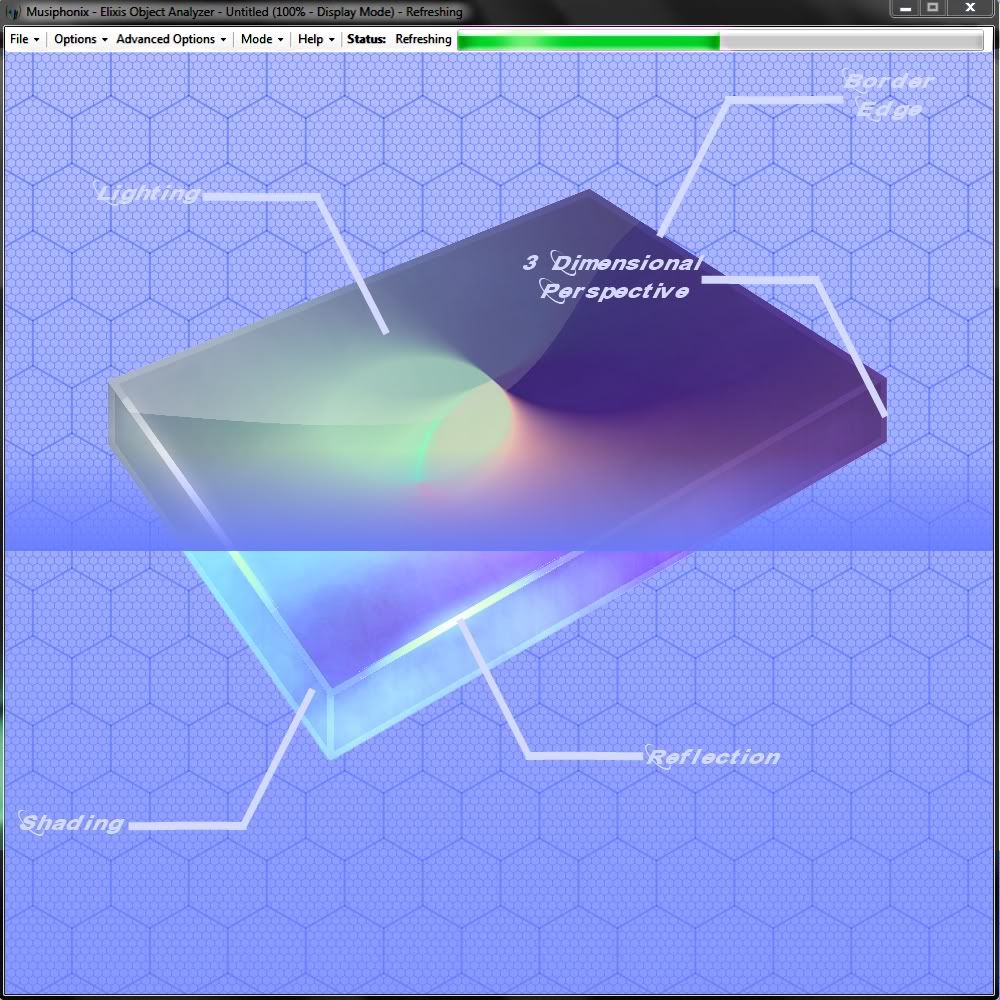
google chrome interface:
Hidden Content: Google Chrome Interface
SWEET! I use Google Chrome as well! Two things that (I think) could improve it:
1. The tabs at the left hand side (I assume they're tabs); The gap between them is too large, maybe close the gap up.
2. On some of the boxes, maybe round off the corners.
_______________________________________________________________________________________________________________________

Image Linked to a 1000 x 1000 pixel image.
I see this kind of thing in sci-fi movies and cartoons.
The main image (the blue bit) was made in Paint.net and the application window came from Microsoft Visual Studio 2010.
Now no, this is not a real application (2029 it should be though (I plan, allot)), there's not a single line of code behind it.
I'm going to make a tutorial on how to do this, when I find there isn't already one ^_^.
EDIT: Corrected Paint.NET to Paint.net. Screw.
-
Here's another one. I seem to be having a lot of these lately. Step six calls for running feather with true feather checked on a moderate feather radius plus at a high effective strength. The only feature on my feather is a radius. There is no true feather, no effective strength, just the radius. Am I missing another plug in?
I had the same problem, the way I got around it was:
1. Use the magic wand tool to select the black area.
2. Use the "Outline Selection" plugin and fiddle about with the width.
3. Use alpha mask to remove the remaining black.
-
I'm at the step just before using the alpha masks. I have them created and ready to go. What I need is more info on creating an origin. This is the first time I've heard of it and am not sure what you mean. It says create an origin on the black layer. How do you do that? I'm having a ball doing this and am loathe to put it down, even to wait on an answer. HELP!
I have no idea what this is or how to do it. I'd say skip it, it makes no visible difference (look at my results, I skipped that whole black layer step).


Image Umbrella: Desktop Art
in The Pictorium
Posted
Neither of those words fit. And typing that sentence was actually faster .
.