


Jayed
-
Posts
153 -
Joined
-
Last visited
Posts posted by Jayed
-
-
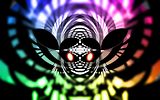
Here is my mail for the compition, it is my own branded webmail app, this was made using Paint.NET and no other applications.
PAWNAGE!!!!
Unfortunately you can only use Paint.NET so you're disqualified
 [jk]
[jk]I'd skin these if I had half an inkling on how to do it. I lost my paint.NET with it's 90 plugins and such... o.o' haven't had time to put it back together :?

-
Hi all forum members..
Regards,
Ireena
The spam thread is the off topic section. Post there if you want to spam. If you have a tip for pdn by all means share here

"I am a spammer!" does not qualify for a tip according to Rick... :?
-
As far as custom brushes on a separate layer, that`s something I always do. If you find you don`t want the effect anymore you can just delete the layer.
no i was meaning on a new canvas so that you can use the brush at it' s full size.
Hmm. I always did it slightly differently... O___o'
1) flatten image.
2) use the brush thing on the flattened image. Get it to what you like. click Ok.
3) undo until you have all your layers again.
4) make a new layer
5) ctl+f
-
I like it. Great job with Chad.Here's some loose rules for you, k?
1. Do not use them same text every time.
2. Do not rotate your text.
3. Avoid having only one word for text.
4. Use simple fonts.
I always use the same text...
Here's some loose rules for you, k? <-- sounds kinda put-offish.1. Do not use them same text every time. <-- clarification? Same text style? (I agree to that save for certain occasions) same text itself. (that can be repeated if it's the IGN [gaming] or ID for forums...)
2. Do not rotate your text. <-- text can be rotated well in certain ways. [ number #1. it MUST go with the flow of the sig. number #2. it should be near the center and origin point of the flow]
3. Avoid having only one word for text. <-- and what's wrong with that? If I make a sig my text is 'Jayed' most of the time. That's fine right? Using a random word for CC is also fine
 Just make sure you tell them it's a sample word[
4. Use simple fonts. <-- amen sista! the only time I'd break that rule is when it calls for it. LIke an amazing grace signature I made with Jesus' cross on a hill? That needed some cursive fonts so I put that on there.
Also, making a simplistic sig that is with a well known figure. (like mario--use the Mario font from DaFont) (or Pokemon--use the pokemon font) However... if you have a complex sig like what the person had. Then you use simplistic fonts.
ALL FONTS ARE IS COMMUNICATION IN AN ART FORM. Make the art form conform to what you're doing. If you have a simple signature, appropriate font. Complex signature, anything that goes with the flow (most likely will be a simple font legible at very small sizes)
If it's a dot matrix sorta thing. Maybe get a dot matrix test? The font is your communication help to the person viewing your graphic art. It is communication but it is also part of the art. Don't ruin the art by ruining the text. They go hand in hand man

Oh yeah, and chat. I love it
but the gradient in the background is somehow too complex and interfering with the scene? The foreground is simple while the bg is complex but it's flashy enough to draw our eyes away from what we need to see. Try bluring the background or making it a linear  gradient stretching from the figure to the beyond
 -
Just kill the text on all of them, it does them no justice.
True, but you gotta get the right text for it man. He's using all that bubly textie junk it looks horrible with the sigs (no offense, the sigs are nice the text isn't fitting though)
If he changes them to a techno-macro font I can guarantee improvement in the sig's look. Or he could just make the font really tenie and modify it pixel by pixel in a separate document :shock: that'd take too much work though hehe.
-
Middle one is great, but remove the text. You're a fast learner.
Nah, the text is fine
Diff font would help [my personal preference is for the style you're doing you should use a text legible at very small sizes like a technoey font O.o' Whatcha' think? All text is really is communication in an art form. (Pictures are communication in graphics form.)] -
Hey, this is my first sig, tell me what you think...

PM for the PDN if you wanna!
Comment, comment!!!

Hmm, from my knowledge of photoshop I'd say that that image has been altered in photoshop and then he got it off the internet and pasted the text on there xD
(You would need to use levels and a cooling filter to get that look from a sea pic like that. Or have a million dollar camera with a gel on the lens)
-
@Possum Roadkill I love those fractals, and I've seen many other awesome fractals they have created with that program, I haven't reached that level yet I just find a random fractal automatically generated by Apophysis each time I start the program, manipulate it, and send it out *phail*
@Jayed You want to see who's PDN art O_O
EDIT: Just got a brainstorm. I was wondering about how to get more realistic solar flare and I hit it: Jitter. Make some Jitter, cut out some of it and smudge what's left! *facepalm* Why didn't I see it before?!?
You were too busy facepalming yourself O__o"
And I wanna see hellboynecro's pdn artwork. He did his work in photoshop I think O.o" But I wanna see him try it in paint.NET
-
It's kind of difficult to do a spacescape in general. The atmospheric dust can be generated easily with the clouds effect, and the stars can be done easily as well, but the texture for the planets aren't so easy.
By the way, I've just made another wallpaper. No PDN involved, it's a fractal flame done with Apophysis. It took almost a half hour to find all the right transforms, so I'm pretty proud with the result.
Once again, it links to my dA.
Whoa ! Nice ! Now do it in PdN ! I know you can.
No he can't
(jk) I wanna see what you accomplish in PDN Will be interesting O__o -
Oh I can see it coming.... the new raptor sig will have a possum in it's mouth as it shakes it from side to side.... Oh no ! Not brother Opie! ( get it, Opie, OP, Opossum...)
Ok seriously, it's been a long day, sorry. Yes, I would really like to see it with something more than the blackness. I can see where you are coming from on it, but it is just too bleak.
I, just to give my humble suggestion, think that maybe Oma's palm leaf tut to create some plant life so it looks like it's jumping out of the deep dark underbrush. You could make the foliage really dark and it would have the effect I think you are looking for. Maybe? Sorry, if you only know how bad this day has been....not in the tragic sense, but in the frustration level. I hope that helps ! My 1.5 cents worth anyway.
I lol'd at that
*claps* And yes, possum has a good suggestion (my .5 cents to makes his worth 2 ) -
Maybe I'll have better luck with comments on this in here:

I've had some comments on the dark corner, but it's pretty much supposed to be dark.
I think its pretty good.....the dark bit adds meaning to it in a way somehow......... what do u guys think of my new one:)
@Raptor
Okay dude, I know you're already going to be ticked off at me for saying this but the dark has to go
Make it a really nice dark tan or something that the raptor comes from. Not just a fat brush with Gaussian blur smeared all over it (that's what it looks like to me personally)
Stop bashing yourself [Possum Roadkill], you said that just fine.I disagree though. Everyone uses polar inversion for their backgrounds when they start out. So everyone's work looks the same when they start out. If you want to my advice, don't use polar inversion, ever, unless it's to actually distort something into a certain shape like oma does.
I also suggest looking at some color theory, so you can decide what color's you're going to use.

B--B--But teh KOLORZ :shock: :shock: :shock: they so pwetty T.T
@BEyza Jokes aside, yeah. As much as I like polar inversion You gotta do without 8) There are some instances where you can use it correctly. Oma is one, and... (by yours truly, using for example)
If you look at it You can see that the polar inversion I used creates something abstract (props to MadJik for the abstract tutorial) And it is something, maybe something else. (the eyes do make it kinda slanted for "abstract" but meh
I like it that way <.<" )The effect of polar inversion is not to get something colorful, it's to get something unexpected. Which, combined with something called knowledge and experience (you'll get that later hopefully XD) You can make some really awesome stuff. Just check Oma out :shock: I have no clue how she even got the COLORS on half of her stuff much less the blinkie stuff.
(did I mention how much I like blinkie stuff? xD)
Overall I like the sig, you just need some experience, something other than polar inversion, and a paintbrush and you're good to go
I'd like to see what other awesomeness everyone gets around to doing O____o"
-
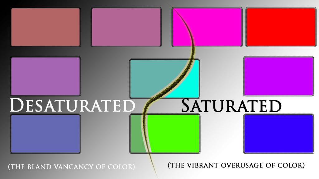
Any color looks good with gray, or any highly desaturated color (or absence thereof, for black).

Sharp, what sets your signature apart from the many others the users here make? That's something you should ask yourself, always.
Aaaaggghhhh! Big words ! I'm just a small woodland creature with an internet connection. Ok, I know what you are talking about now, sort of. After reading a big long scientific explanation about wavelengths and nano whozies, then part of Abney's Law (optics) "The shift in apparent hue of spectral color that is desaturated by addition of white light is toward the red end of the spectrum if the wavelength is below 570 nanometers and toward the blue if it is above." (Yeah as if I understand that)
I finally ran across an article by a photographer who explained it in normal people terms and actually had pictures. Then I found this site that had color palettes. And voila,

Thanks ! I learned something else tonight. Ok brain is full, must go to bed now.
Here's another lesson for you
If you ever manage to get out of bed o.O"
[off topic: happy birthday to me
] -
Who's piloting the UFO?

* G A S P * it's Kermit! And cousins of Kermit o.o" They don't seem to like eachother :O (I like the picture though, 20/2)
-
@ Xander_Lyon, Much improved. I like the wires sparking in the lower right corner. The laser blasts look good as well except the one suspended above the main image. It looks a little out of place. I also like the idea of the panel smashed in. If you want, try this tut and it might be useful in giving the smashed panel a more realistic look by adding some wrinkles to the metal. viewtopic.php?f=35&t=27775&hilit=waving+flag Try looking through the text tuts, I know there is one in there that will help with the painted on look you are trying to get.
You're right about that other laser blast. I was trying to suggest different weapon types were hitting the hull. Instead, that blast just looks like a shadow, so I thought I could turn it into the shadow of whatever's attacking . . . but a better burn would likely make more sense.
It's funny you showed me that flag tutorial. That's exactly what I used to give the panel a smashed in look. I'm not sure how to tweak it further to give a better busted in look. The key to the displacement map seems to be how much you blur the black and white parts on top of the greyscale map. Is that what you used on your curtains? I didn't think you could be that detailed and get such a subtle effect.I gave it a try in photoshop
I used two effects lol...1) Liquify...
2) Photo filter + brightness/contrast filter
What do you think?
[img=http://i235.photobucket.com/albums/ee307/DragonKrystal/Header.jpg]
-
@Jayed - Your sigs are always beautiful. I know I've seen your Samus around several times.
@Stecon96 - I agree the red sig is the more striking one, but if I didn't already see what your name was elsewhere, I wouldn't be able to read it well. 'Course you're also missing all the other information the green one has.
This is a website header I'm working on to help dress up my club's site a bit:
http://i126.photobucket.com/albums/p109/didgeboy/header1.png[//img]
I just recently put a bevelled outline around it, which doesn't quite match the other random grey lines. When I tried bevelling those originally it didn't look quite right, so I'm not sure what I'll do with them.
<3 thanks, I didn't realize someone actually appreciated my work
-
I was kinda bored so one morning, I took a cool stock... added some gentle effects with Photoshop....
Gasp ! :shock: Uh, never heard of it. Is it a camera store? :wink:
no O_o it is not a camera store... It's a farm... in LA, California I think... *mutters a little* yeah, I think so O_o
-
I was kinda bored so one morning, I took a cool stock... added some gentle effects with Photoshop....
Gasp ! :shock: Uh, never heard of it. Is it a camera store? :wink:
no O_o it is not a camera store... It's a farm... in LA, California I think... *mutters a little* yeah, I think so O_o
-
I was kinda bored so one morning, I took a cool stock... added some gentle effects with Photoshop....
Gasp ! :shock: Uh, never heard of it. Is it a camera store? :wink:
no O_o it is not a camera store... It's a farm... in LA, California I think... *mutters a little* yeah, I think so O_o
-
I was kinda bored
so one morning, I took a cool stock... added some gentle effects with Photoshop (it's the best for gentle effects like this one ^^") And voila I guess... I made an avvy, sig, desktop and kinda outfitted everything with this theme BG:
[56k warning... sorry, but it's really freaking big
][EDIT]http://i235.photobucket.com/albums/ee30 ... d2Avvy.jpg | http://i235.photobucket.com/albums/ee30 ... Jayed2.jpg
 [jk]
[jk]

 gradient stretching from the figure to the beyond


PDN Tips and Tricks
in Paint.NET Discussion and Questions
Posted
I don't think he is
:evil: :evil: that should be in the "very important read first dummies" file Next to the "read me"