


silverhammer
-
Posts
34 -
Joined
-
Last visited
Posts posted by silverhammer
-
-
I really dig a lot of the new features and the new design.
My one caveat (though maybe this is just me): the new version seems to be slower than the previous version when working with very large images (in particular, 5100x3300). In the older version there was always a long delay between performing an action and actually seeing the results when dealing with really huge images, but this delay seems to have extended significantly with the new version.
-
Perhaps that other plugin could achieve the same affect, though you'd have to tinker with a bunch of options first. I guess if you want something simple then mine is more streamlined to use.
I put it in adjustments because my plugin is essentially a "Black and Transparent" plugin so I think it makes sense to put it in the same menu as the "Black and White" adjustment.
-
This plugin is like a more useful version of the color replacement tool. Whereas the standard tool merely paints over pixels if they're close enough to the secondary color, this plugin recolors every pixel a different amount based on how similar it is to the secondary color.
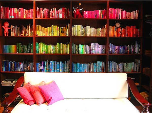
For example I'll use this colorful image:
Here's the built in tool replacing pink with cyan at about 30%:
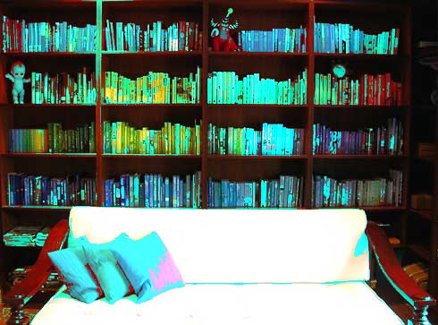
Notice the ugly, harsh edges and how some pinkish parts of the image are entirely untouched.
Now my plugin replacing pink with cyan:
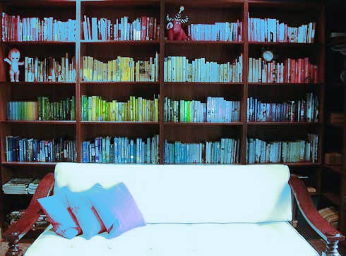
No more ugly edges! My plugin changes all pixels of the image based on how similar each is to the secondary color.
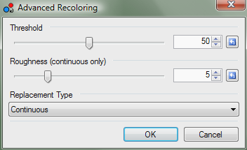
*Threshold changes how strongly pixels are recolored based on how similar they are to the secondary color
*Roughness changes how quickly the recolor effect falls off after the threshold is passed when continuous replacement is selected. Lower values look 'nicer' but tend to give the image an overall tint
*Continuous replacement recolors all pixels different amounts and looks really nice. Cutoff works similar to the normal tool as pixels over the threshold are not recolored at all - recolored pixels however are colored more 'accurately' than with the built-in tool.
Note that this plugin works like the built-in tool inasmuch as the color used and the color replaced are the primary and secondary colors in the palette, respectively.
-
This is my first plugin and though it's pretty basic (and might have been done before), I think it's useful. Essentially it takes a black and white image and converts it to a "black and transparent" image. The whole point is that if you have a sketch, applying this plugin will make all of the white parts transparent so that you can color it, add a background, whatever.
Download the zipped DLL >> Isolate Lineart
-
Only the PDN format stores the color of completely transparent pixels. All other formats set transparent pixels to black, not just TGA and regardless of RLE compression.
Perhaps you could try giving stuff an alpha value of 1 instead 0 so that the color is preserved. Though I can't imagine what your work could be to require this.
-
I'm not entirely sure what you mean. Keep in mind that RGB and HSV are two different ways of representing color. So whenever you change an RGB value, the HSV values will change and vice versa.
If that's not the issue and you actually can't change colors at all, when do the numbers switch back? Is it as soon as you click on something or immediately after you type something in? Does your color palette still work for selecting colors?
-
I can tell you that an effect like that would be very difficult to pull of in PdN.
-
Weird, I just confirmed this. It seems to happen with many RGB values not just 255, though certain values do not change when you use the eyedropper. I can only assume that PdN stores colors in a different format than ARGB so some rounding occurs when you actually draw on the image. So I don't think that the eyedropper is picking up the "wrong" color, rather the color you're actually drawing is slightly different from the one you selected. So this bug shouldn't actually affect your drawings in any way as the visual difference between 254 and 255, for example, is essentially nothing.
-
Here's my idea for a plugin. Basically it would let the user input equations that would take RGBA/HSV values as input and would output other RGBA/HSV values. When you hit "ok" the plugin would apply your equation to each pixel of the image individually. I know it doesn't sound that amazing but I think you could do some really cool stuff with it. For example:
The equations
R = B
B = R
would simply switch the red and blue values of every pixel.
If you had a black and white image,
A = 255 - V * 2.55
would make each pixel more transparent the lighter it is. It would be really handy for isolating line art.
Or you could do stuff like
R = R + (S / 100) * (255 - R)
which would increase the redness of each pixel based on how saturated it is.
I have no idea how plugins are coded, so would something like this even be possible?
-
I added three more pictures to the original post.
-
If you're dealing with a really large image like that, I highly recommend using Image>Resize rather than shift and drag. The result will be much higher quality.
-
This was my first image in Paint.NET and it's still one of my favorite

-
Eh, I liked making the signature but I'm not that into picture signatures I guess. I just try to get as much practice as possible.
-
The gradients in the Paint.NET logo don't look very good when they're not on a white background as you might have noticed. You're going to want to make the gradients on a separate layer and change the secondary color to complete transparency. That way the gradient will look good no matter what background it is on.
-
This is my gallery. Images appear in no particular order. Be sure to click on the thumbnailed images!


-
Click for large size!
I made it for a concert at my school.
-
Honestly, just follow the tutorial. It may be hard work but it's worth it to learn a bit. Personally, I avoid plugins almost entirely because I find too many of them restrictive - they give you too specific of a result with little creativity on the artist's part. By following tutorials you can learn not only how to achieve a certain effect but how to use Paint.NET in general to create whatever you want.
-
Personally, I place batch processing at the bottom of the list of features I would like to see implemented. I have multiple image editing programs and it can sometimes be a good thing to have functionality split between them. I'm not going to use Paint.NET to view slideshows, rotate by 90 degrees, or batch process images. I use Irfanview for that kind of stuff because it's made for that purpose. Paint.NET I feel is more for image creation or image editing rather than batch work or little tweaks.
-
I honestly don't see why this is necessary. If you're working on an image with multiple layers then most of your incremental changes should simply be saved to the pdn file. When you're done and want to share the picture then you go through the whole save as thing to get the bmp. Sure it might be a little annoying but we're talking one extra mouse click and one keyboard command :?
Actually, here's a slightly easier way. Before you save as bmp, do a normal save for the pdn file. Then after you do the save as go to File>Open Recent and the pdn version will be the second on there. On second thought this probably isn't any faster. But how else would you shave time off of a process that already only takes a few seconds?
-
I hope that you can follow a tutorial without pictures!
1. Write your text
 on its own layer colored black.
2. Use
 at 0% tolerance with the flood mode set to "global" and select the empty space
3. Ctrl-I to invert your selection and make a new layer :AddNewLayer:. You should now have a text-shaped selection.
4. Make your gradient
 with whatever colors you like and then deselect
5. Change the blending mode of the gradient layer to "Screen" to soften up the edges
6. Ctrl-Shift-F to flatten and you're done!
If you also want that faint border around the letters read on:
7. Don't flatten the image yet. Duplicate the original text layer :DuplicateLayer:
8. On the bottom text layer apply a Gaussian blur at 1px
9. Use
to select the empty space again. This time tinker with the tolerance until the selection is almost right up against the letters (I used around 15%)10. Ctrl-I to invert selection again. Fill :PaintBucketTool: the selection with black (make sure the tolerance is at 100%)
11. :Properties: Lower the opacity of that layer until you have a nice, soft outline.
Here's my result:

As with any tutorial, be sure to tinker with each step to get the effect that is right for you.
-
This was one of the most confusing things for me when I first got Paint.NET
The trick is that when you have an area selected use the
 tool and click and drag anywhere on the canvas in order to move the selection. You don't actually have to click and drag inside the selection like in MS Paint.
 -
I believe that you are thinking of rasterization. The most popular program for that is The Rasterbator though I'm not sure if it has any other output other than PDF. I don't know of any Paint.NET plugins that accomplish the effect.
-
Eh... good tutorial, but I feel like the tutorial section is more for tutorials on how to use Paint.NET - not just how to make art in general. I'd say go ahead and post it there. The worst that'll happen is it'll get moved to a different section.
As for art. Here's a sort of minimalist background I made.

-
It's not that, it's the fact that even afterYeah' date=' don't ever say that. Being easy to use has no relationship on difficulty to implement.[/quote']he still seems to think that everything he says should immediately be added to Paint.NET.There's nothing wrong with making the gradients look more smooth. The problem is the way you seem to think every idea you think up is golden, and should be immediately be incorporated into Paint.NET. The problem is how you believe that it's incredibly easy to make whatever changes to the program.
How about you go ahead and download the source code for Paint.NET, look through all ~150,000 lines of code, and then tell us again how easy you think this all would be.
So then, the problem is, you think you know more about programming than programmers do.
Yeah...if by "everything I say" and "every idea I think up", you mean the one single idea I have suggested. Secondly, I'm not a newbie, I've been using Paint.NET for a while and this is my new account on the forums. Also, I happen to know how to program in several languages. I never once meant that it would be easy to implement this idea, what I meant was that it seems to me like it would be a lot easier to implement (and more useful) than a lot of the other features I've seen requested.
Furthermore, I suggested this idea and Rick Brewster said that it wasn't feasible to implement due to needing 16-bits per pixel and whatnot. However, I pointed out that a simple frosted glass filter accomplished the effect. And woah! All of a sudden I'm a know-it-all who think he's better than Paint.NET's lead programmer? Did I miss the part in the forum rules that we're not allowed to disagree with the developers?
No, I'm sorry. I take it all back. I am a mere newbie and you, pyrochild - 2007 Plugin Author Award Winner, are right. While this neat little dithered gradient effect is useful and a visual improvement over Paint.NET's current gradients it is technically infeasible - nay - impossible to implement and no attempt should ever be made to add it into the program. As for me, I shall forever walk the Earth as punishment for pointing out an area in which Paint.NET could be improved and for having the unspeakable indeceny to suggest a method by which it might be implemented.
You're a jerk.


 on its own layer colored black.
 at 0% tolerance with the flood mode set to "global" and select the empty space
 with whatever colors you like and then deselect
 tool and click and drag
Isolate Lineart
in Plugins - Publishing ONLY!
Posted
I'm actually trying to make a new version of this plugin currently. The problem is that I currently only know how to use Code Lab and I need to use HSL values, which Code Lab can't access directly to my knowledge.
Can anyone help me out here?