


Tom Jackson
-
Posts
37 -
Joined
-
Last visited
Content Type
Events
Profiles
Forums
Blogs
Gallery
Downloads
Posts posted by Tom Jackson
-
-
Nice work pyrochild, great minds think alike! I coded up almost exactly this about a week ago, and we're thinking about including it in a future version.
-
I find something more about this problem.
I used this picture in different layers:
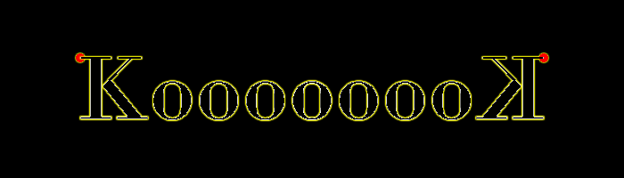
And I rotate each layer with different angle to see the red dot.
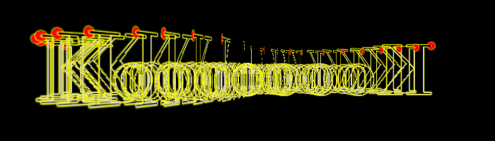
Conclusion : the Red dot doesn't describe an ellipse as we could expect. It describe like a flat 8. That's the point.
I see the issue you're talking about now... you're right, the red dots should form an ellipse. I'll investigate this.
-
korteck, I believe you are trying to create a spinning effect with the text by repeatedly rotating it. This isn't quite the right approach for doing this effect in Paint.NET.
When Rotate/Zoom is performed on an image, it make the image look like it's been tilted/sized/rotated. The problem is that if you repeat Rotate/Zoom, it's not the case that you're rotating the flat text "KortecK". You're rotating a picture of the word, which is already rotated.
If you want show text rotating as it does in your sig, you need to do this:
-
[*:9bf73]Draw the text
[*:9bf73]Tilt the text by 10 degrees
[*:9bf73]Save the image, then UNDO the Rotate/Zoom.
[*:9bf73]Tilt the text by 20 degrees
[*:9bf73]Save the image, then UNDO the Rotate/Zoom.
[*:9bf73]Tilt the text by 30 degrees
[*:9bf73]...
Repeatedly rotating the text with Rotate/Zoom is like taking a picture of a picture from an angle, printing that picture, then taking a picture of THAT picture from an angle. A bit of an odd concept, but that's what you're doing with Rotate/Zoom by repeating it. Try the above steps to accomplish what you're going for.
-
-
I when i do the cloud effect ALL IT DOES is change the backround from white to black, when i do effect again it will turn opposite color.
Example: I do cloud, backround is white. I do cloud again (ctrl f) and it turns black again..
It sounds like your foreground and background colors are the same. Make them black/white.
-
I've changed the instructions a bit, I've found these steps lead to hotter results. Let me know what you think. The main difference is that I adjust the text layer's and clouds layer's levels before flattening, resulting in a better 'negation' image. Try it out.
-
This tutorial is available as a PDF. Click here to view or download it
Here's how you can create neat firey text like this:
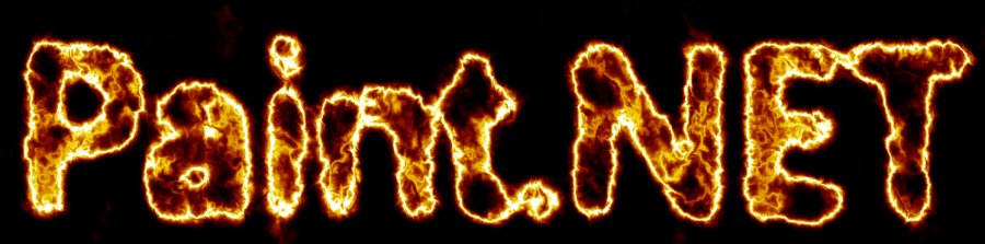
(More images will be added later, it's kind of late at the moment)
-
[*:1d2fa]Create the text layer, white on black:
-
[*:1d2fa]Use a large, blocky font
[*:1d2fa]Blur this layer with a gaussian blur so that the details of the text are still recognizable (holes in letters like 'A' shouldn't end up closed). One eighth the point size works well. The stronger the blur, the less readable the final output will be.
-
[*:1d2fa]Use a large, blocky font
[*:1d2fa]Create the difference clouds layer
-
[*:1d2fa]Set the blending mode for the clouds layer to 'Negation'
[*:1d2fa]Render clouds with the scale for the clouds at roughly twice the font size.
[*:1d2fa]Repeat it a bunch to get a whispy look
[*:1d2fa]Use Levels to adjust the clouds layer. Open the levels adjustment, hit Reset, then under the output area, the replace the default values of 255, 1.00, 0 with 128, 2.0, 0. These are the output White point, output gamma, and output black point, respectively.
[*:1d2fa]Use Levels to adjust the text layer. Open the levels adjustment, hit Reset, then change the input white point (the top-left textbox) to 210.
[*:1d2fa]Flatten the image.
[*:1d2fa]Use Levels to adjust the flattened image. Open the levels adjustment, hit Reset, then change the input range (the textboxes on the left) to 255, 96 (it defaults to 255, 0).
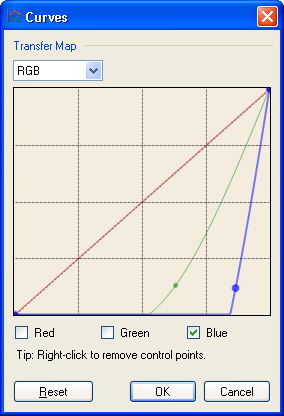
[*:1d2fa]Open up the Curves adjustment. Choose 'RGB' under 'Transfer map', then uncheck the 'Red' and 'Green' checkboxes so you're only modifying the blue channel, add a control point as shown below. Do the same for the green channel so you have the curves shown below.
-
 1
1
-
[*:1d2fa]Create the text layer, white on black:
-
Some people can find bliss in in three colors and transparent.

(Almost no work whatsoever FTW)
Kaiser Yoshi Wins.
-
could you please post an image for step 5 and 6

Done
-
I also made this using similar techniques:
-
 1
1
-
-
This tutorial is available as a PDF. Click here to open or download the PDF
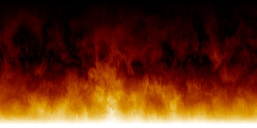
Paint.NET has a new effect called "Clouds", which makes very nice looking fractal perlin noise. I've found that it's quite neat to use this to create fiery effects like this:
It's pretty simple:
Make a new image with dimensions 1000x500
Draw a gradient like so (with white at the bottom and black at the top):
Make a new layer.
Double-click Layer 2 to edit its properties
Set the Blending Mode to 'Overlay', then hit OK.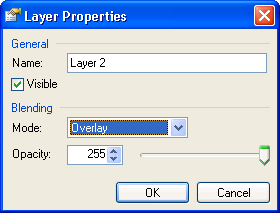
Go to the 'Effects --> Render' menu and choose 'Clouds'. Change the blending mode to 'Difference', then hit OK.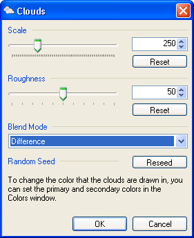
Push CTRL+F to repeat the effect. Do this about a dozen times.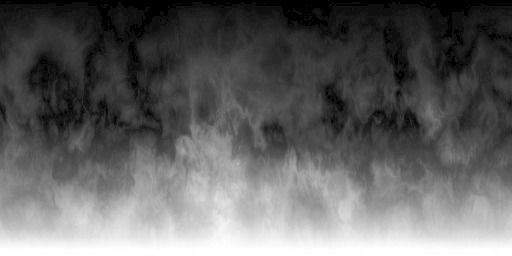
On the 'Image' menu, choose 'Flatten'. This will give you a single layer with some nice black-and-white clouds.
On the 'Adjustments' menu, choose 'Curves...'.
Choose 'RGB' under 'Transfer map', then uncheck the 'Red' and 'Green' checkboxes so you're only modifying the blue channel, add a control point as shown below. Do the same for the green channel so you have the curves shown below.
Q.E.D.!Other things to try:
- Use different shapes for the Layer 1 Gradient. Round gradients make neat looking explosions
- Tweak with the Curves, the general shape of them should be preserved to keep good saturation, but the channels don't need to go in the above order. Try Green, Red, Blue (instead of Red, Green, Blue) for a copper flame (copper burns green).
- Play with the 'scale' setting of Clouds for finer or Coarser clouds
- Play with the Roughness setting for clouds for softer or sharper fire
-
Just try things out, you never know what you'll get.

-
I was debating the option to allow saving with different resolutions and color modes. Actually, I guess I still am debating. I may decide to do it later since it would be nice to have both low and high resolution icons in the same .ico file, in fact this is sort of the convention for icon files.
I really need to be able to make icons in arbitrary sizes. I really do need to be able to save icons that are 190x35 or any other arbitrary dimension.
-
Thanks for the bugs, I'll look into those. I'm not sure about the wrapping thing, but I'll look at it. Don't count on a wrapping indicator, though.
Ideally, we would write a full-fledged code editor, but that would be a little overkill for these purposes.
-tjackson
-
The X/Y pan boxes refer to where the center of the image ends up as a fraction of the width/height of the image. Leaving it at 0, 0 causes the center of the image to stay in the center (no matter how the image is tilted). Setting it to 1, 1 causes the center of the image to be placed in the bottom-right corner of the output image, setting it to -1, -1 causes the output image to be centered on the top-left corner.
-
To where should bug reports and the like for the CodeLab utility itself be directed?
This topic will do fine, what's the bug?
-
This can be done quite painlessly!
1. Create a new image at the resolution you'd like
2. Layers->Import from file
3. Select the move tool
4. Grab any of the corners and drag it to resize the image. Hold down SHIFT to keep the original proportions.
5. Recenter the image as you like.
-
This is quite feasible, we'll consider it for a future version or plugin.
-
Yes, Paint.NET's levels will work wonderfully for this. Go to Image->Adjustments->Levels, and just adjust the input range to select a narrower ban of the color range. This can be done by either:
1. Moving the triangular markers on the left gradiant bar,
2. Adjusting the values in the text boxes on the left side (the "Input" side),
3. Double-clicking the color boxes along of "Input", by default the top one is white and the bottom one is black.
-
Yup, it's in the pipeline.
-
There is no dedicated tool for this, true.
What you can do, however, is perform a Sepia effect, then use Hue/saturation to achieve the desired results.
-
Done and done.
Try out the recolor tool a little more. Note that CTRL+click selects a new fore/back color, while SHIFT+click simply shifts the foreground and backgroun color to match the newly selected color.
1. CTRL+right click on source color
2. CTRL+left click on replacement color
3. Do some replacing.
4. SHIFT+right click on a different shade of the source color. Both colors will 'shift' their intensity to do an equivalent replacement.
-
The following features will not make it into v2.5, but we are still considering them for future releases:
* Gradients
* Multiple documents open in one instance of Paint.NET (MDI or tabs)
-
1. The gamma belongs on the input side rather than the output side. It is something that I frequently adjust at the same time as the input; the output is something I rarely ever adjust.
Interesting idea, I'll consider that.
2. Channel selection should be radio buttons, a combo box, or a multiselect list. I have never had the occasion to want to adjust only two channels at once, but I frequently adjust a single channel; this should take only one click, not two.I've found the ability to adjust two layers at once to be very useful. It's quite handy to be able to increase the 'blue-ness' of an image by both increasing blue and decreasing yellow (R+G). I do not intend to remove this feature.
3. Gamma fine adjustment is not fine enough; the up/down buttons and arrow keys should adjust by .01, not .1 units.Agreed.
4. I find it very unintuitive to have two vertical, opposing histograms. I think they should be facing the same direction, with one underneath the other.It is a little unconventional, granted, but I think it shows the result of the actual transformation that levels is doing much better. It makes it easier to see that a given input color is being mapped to a given output color, and they vertical symmetry of it makes the relative intensities of the colors much more clear. Vertically stacking the histograms, or making them face the same direction makes it very difficult to preceive relative heights. Many optical illusions illustrate this.
5. The tab order makes no sense and there are no keyboard shortcuts for the inputs.Yup. I'll fix that.
6. Double clicking on a color for black/white/other points brings up the system color picker (not even Pdn's picker!), but this feature is really only useful if it allowed use of the eyedropper.
That's a side effect of the effect architecture. At some point in the future, you'll be able to click those then directly select a color out of the original image.
-
We have this, except we call it "Import from File". It can be found on the 'Layers' menu.
-
On a side note, how useful do you think tilt-able ellipses would be? As it is, the ellipses are effectively constrained at 90-degree intervals. UI implementation aside, how useful do you think this would be?


Fire Effect (finally)
in Plugins - Publishing ONLY!
Posted
I've finally got around to implementing a single-effect implemenation of the fire effect. Due to the nature of this effect, it does best when you give it a blurry black and white image to start with:
And it remakes the same shape as a firey outline:
Try it out!
http://ddrcoder.com/Fire/TJacksonEffects.zip