


davidf
-
Posts
63 -
Joined
-
Last visited
-
Days Won
2
Posts posted by davidf
-
-
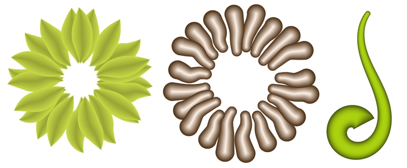
This plugin has just been updated to version 1.1 ... it now allows transparent backgrounds, non-circular dots, overlapping dots and variable sized dots.
See what you think!
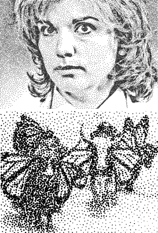
Edit: Here are a couple of examples ...
The top image is the same as in the first post, using dot size 2.33, size variation 0.27, spread 0.54, squash 0.45, bias 0.0 and lightness threshold 0.97. The darker areas are due to the "squash" value.
The bottom image uses variable sized, non-circular dots.
-
In terms of shapes I really like the 'Yak/butterfly' example you posted. When you stipple with a (real) brush or felt-tip pen the marks produced will vary in a slightly randomized way (both shape and position). Now whether it is possible or practical to incorporate varying shape is different matter. Generally I think adjustable random is more pleasing than strictly geometrical.
Good point about stippling in real life -- I'll think about what would make the dots look more "natural" .
Here are some hand made stipples:

I would like to see an option for 'transparent' for the background color, as this would save time converting the image into an 'object' layer, where further manipulation is easier.
OK, I'll see if I can add transparency in a future version.
-
I'm always in favour of many options, so if the variable size/shape choices are still practical I can see no harm in adding them. (only if this does not involve too much extra work though!).
I was thinking a little about shapes yesterday ... what did you have in mind? A set of fixed shapes (squares, triangles ...) or a shape provided by the user (trickier to do)?
Edit: For an interesting "crescent moon" effect, try using large dots (size 10+), Effects > Stylize > Edge Detect, then Adjustments > Invert Colors.
Dot size is a slightly different issue; at the moment the code assumes equal sized dots. Maybe the existing "halftone" plugin covers this already?
Re: plug-in pack - definitely - I've found it best to leave new plug-ins published for a few weeks before adding them to a pack, just incase there are any minor changes required. Saves people re-downloading the whole pack each time.
OK, I'm persuaded! I'll put together a plugin pack soon ...
Nice pics from you & Nitenurse, by the way. Thanks for posting!
-
Added another idea to the first post in this thread - 7) Search and replace.
-
OK, here's me:
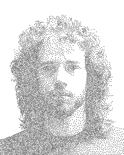
Nice picture! According to your avatar, you've had a haircut since then ...

Here's another:
When are you going to compile a plugin pack so users can download all your awesome plugins in one go?
Um, eventually! I kind of assume people look up your excellent "plugin index" if they want to find more by the same author:
http://forums.getpaint.net/index.php?/topic/15260-plugin-index
-
People who use this plugin might also be interested in another related one called Stipple, which draws circles instead of pixel sized dots:
-
OK, I've implemented Stipple now (using fixed sized dots, to make boltbait happy!) ...
http://forums.getpai...n-21st-nov-2012
It doesn't use quite the same algorithm as in the document mentioned in this thread, though (Weighted Voronoi Stippling) -- instead, it uses something like the COFI (Circle of Influence) algorithm, starting with the darkest areas & excluding an increasingly large circle around it as it continues to the lighter pixels.
-
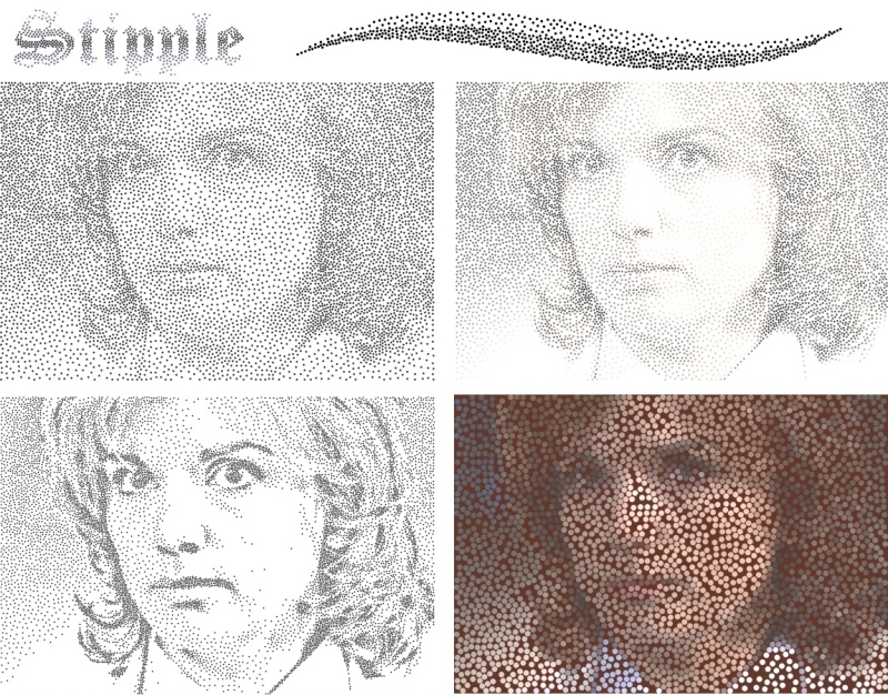
Effects > Artistic > Stipple
Changes in version 1:1:
-
Added "Size variation" to vary dot size as well as spacing.
-
Added "Squash" to allow dots in dark areas to overlap.
-
Added "Distorted dots" for non-circular dots.
-
Added "Transparent background".
Replaces an image with a "dotted" version (circles with density depending on the image brightness).
The parameters are as follows:
Dot color - the color of the dots (unless Colored dots is selected).
Background color - the color around the dots.
Dot size - the diameter of the dots.
Size variation - how small the dots get in the lightest parts of the image (0.0 means all dots have equal size).
Spread - controls how far apart the dots get. Affects lighter colors the most; black pixels always causes dots to touch (or overlap if Squash is nonzero).
Squash - controls how much dots overlap in the darkest areas.
Bias - behave as though the image is darker (negative) or lighter (positive). Does not affect extreme colors (black and white).
(This parameter is exactly the same as for the Dot plugin: http://forums.getpaint.net/index.php?/topic/25461-dot-plugin-17th-oct-2012).
Lightness threshold - if this value is less than one, the brightest pixels are ignored (so white pixels become empty areas). See the bottom left image in the example above.
Colored dots - if selected, the color is taken from the pixel in the middle of the dot.
Distorted dots - makes dots non-circular.
Transparent background - makes the background completely transparent (Background color is ignored).
Reseed - reset the random number generator. Depending on the image, this may sometimes have no effect.
Tips
- Be patient with large images! On my computer it takes 12 seconds to process a 3000x3000 image (but just a few seconds for 2000x2000). Consider reducing the image size first, since the results will probably be similar. The progress bar may not advance, but the effect is still working.
- This plugin works best with images that either have smooth gradients or high contrast. The bottom left image in the example above was sharpened a lot first (using Effects > Photo > Sharpen with the maximum sharpness three times in a row).
- The algorithm draws the dots from darkest to lightest, so thin black lines against a white background look much more distinct than white lines against a black background.
Download: Stipple1.1.zip
As usual, love to see any pics using this plugin!
-
 1
1
-
Added "Size variation" to vary dot size as well as spacing.
-
I have noticed a slightly unexpected behaviour. Not a bug!
The 'identical lines' checkbox can be selected in radial or parallel mode. It then remains selected but greyed out when returning to point to point mode, (producing many lines on top of each other appearing as one line). This is logical and I don't know if any other behaviour would be better. It just puzzled me for while that I had selected a number of lines but could only see one. Perhaps it shouldn't be greyed out if it is active? - anyway not a problem.
I would actually call that a bug (as in unintended bahavior), even if it's relatively harmless ...
Love the picture! Thanks for posting it. Those branches/tentacles/whatever look a little scary, though.

-
Port it to Visual Studio? There is a checkbox in CodeLab to 'view source' when you build the effect. Using this you can cut & paste your code into a new Visual Studio project.
(You'd also get the option to use a WinForm with .... Tabs!)
It's in Visual Studio at the moment (since it needs to do some things in OnSetRenderInfo(), which you can't do using CodeLab), it just uses IndirectUI because Rick Brewster strongly suggests doing that ...
-
Any progress on the load/save XML idea? It would be a cool way for users to swap settings...
I do love the idea, but there is no way to implement it using IndirectUI.
Rick Brewster said that something like this may (or may not) be included in a future version of Paint.net:
-
Strange. I was 100% sure I also had 1.1 with the larger file size. I even checked, deleted the old one and downloaded it again. Odd.
No problem!
(I'd still love to see any new pics from people! I'm interested in uses other people have for this plugin).
-
Davidf, I have some suggestions:
-The plugin starts with just a small point in the center, it would be good if you replace it with a shape like a leaf or any colored curly line, to be visible on all background colors
Done -- two people's votes is enough to convince me! It now draws an initial line from the center to a point half way down the image.
The new version of the plugin is 1.1a.
- I believe it is possible to combine the Start Point, End Point, Recenter, X -adjustment, Y-adjustment and rotate with with one or 2 functions only, I really don't know how, but I feel it is doable, to reduce the UI size
It started off with just the Start Point and End Point, but I found it very useful to have the other controls as well -- just a matter of personal preference. They're deliberately at the bottom so they don't get in the way of the other controls (and you need to scroll to the end to get to "Reseed", "OK" and "Cancel" anyway).
-The window is stretchable to the sides, I am not sure if it is possible to make the lower slides and functions to jump on top to be side by side when you stretch the window to a certain width.
I am using "IndirectUI", which is provided as a way of making consistent GUIs for Paint.net plugins -- it limits what the GUI can look like, though, so the controls must be vertical like that.
BTY, the additions to the new version are awesome.
Thanks!

-
You might want to check the version you uploaded. I'm not seeing the changes?
Hmm ... not sure what's happening. It seems fine when I download it ("CurlyLines1.1.zip").
The .zip file should be 19206 bytes (the old one was 17596 bytes), and the .dll 44544 bytes (vs 40448 bytes) ...
Anyone else having a problem? The easiest way to check if you have the new version is the existence of a "Swap colors" checkbox just after "Second color".
-
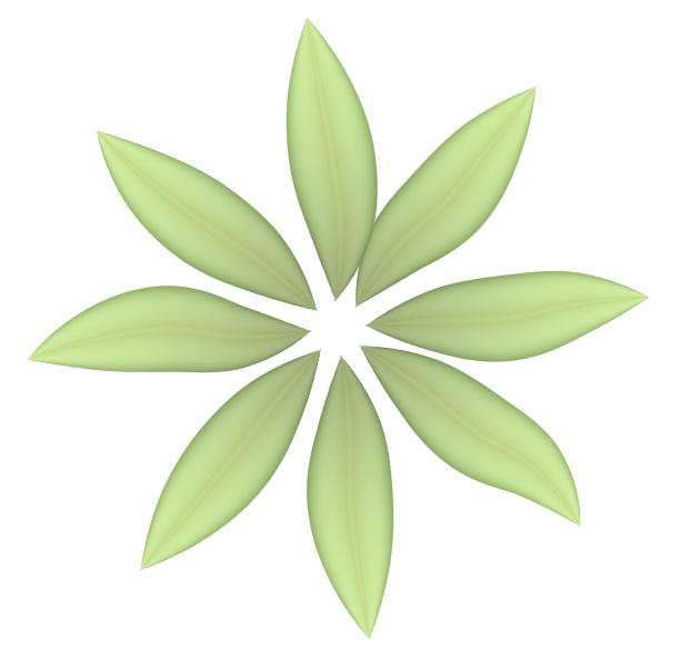
Curly Lines has just been updated to version 1.1 ... here are the new features:
1) The dialog is now resizeable (using midora's code snippet).
2) There is a new color mode called "First to second color -- across width". I posted a preview of this; here it is again:
3) There is a new "transparency" slider.
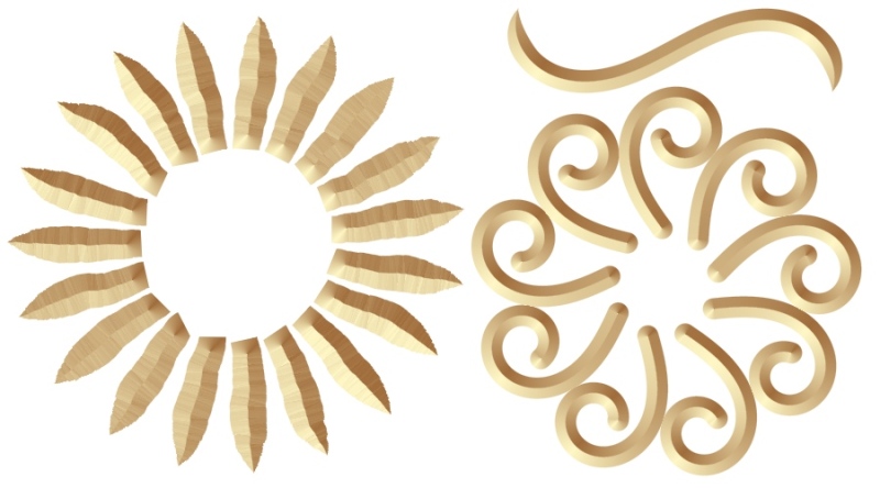
One possible use for this is to combine several modified versions of the same set of lines (using the same "randomization code" each time). The example below does this three times, once with color mode "first to second color", once with mode "first to second color -- across width", and once with a much smaller width to create the middle part of the leaves.
4) There is another new color mode called "emboss", as well as an "emboss angle" control near the bottom of the dialog (just above "Recenter"). I think it looks best with a very light and a very dark color with similar hues.
With a low "smoothness" you get a crumply effect (which surprised me!), as in the left image below.
(At the moment, "Flat" endpoints aren't handled perfectly -- they should really be triangular wedges, not round looking. See the inside endpoints of the left image to see what I mean).
5) For convience, there is a "Swap colors" checkbox to swap the first and second color.
6) There is a checkbox labelled "Start radial direction is random" (below the "identical lines" checkbox). Normally when radial lines are being drawn, the first line is from the start to the end point. If this box is checked, the first line is in a random direction instead (the end point just controls the radius).
An example of where this might be useful is when you are drawing one line at a time using "Ctrl-F" (repeat the last effect).
If this checkbox doesn't make sense, just ignore it.

I'd love to see any new pics!
-
I believe stippling uses fixed sized dots.
Good point (and the original image I showed had fixed size dots) -- though I like the look of the variable sized dots too.
-
I think we have something very similar... http://forums.getpai...-17th-oct-2012/
Well, that's a plugin I made too, but I like the idea of variable size circles instead of just pixel sized dots.
Here's another example (before & after stipplig):


-
If you can read a bitmap off the clipboard with transparent pixels, I'd be impressed.
I can't seem to figure out how to do it.
Eek. Thanks for the warning!
The following page looks potentially useful, but I haven't tried anything out from it yet:
http://stackoverflow...lpha-channel-in
It does get me wondering how Paint.net itself handles the alpha channel when you copy and paste a selection ...
-
How can I add 'snow' to a still picture?
If you mean noise (rather than literal snow), you can use Effects > Noise > Add Noise (with zero color saturation).
If not, could you explain a little more?
-
The Object Fill reminds of this:
http://forums.getpai...e-paint-plugin/
But to me is not user friendly, I like something simpler
Yeah, that's a slightly different idea.
This is the kind of interface I was thinking of:
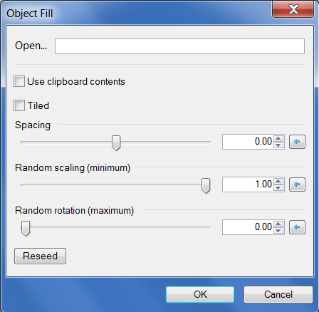
The input file (or clipboard contents) is assumed to contain one or more objects surrounded by fully transparent pixels.
"Tiled" means that objects can be partially drawn on one edge and continued on the opposite edge.
(Maybe there should also be a checkbox called "avoid edges" to forbid partially drawn objects when it isn't tiled).
A spacing of zero means "touching", negative means overlapping, positive means far apart (1.0 = the width of the object).
The Crystal growth and the skeleton are great ideas, especially the Skeleton for text effect, I don't remember we have something similar to both.
Looking through the list of existing plugins, the only one I can see that does text effects (other than drawing along a spiral etc.) is this one:
Text Pro - http://forums.getpai...showtopic=17056
Have I missed any other plugins that change the appearance of text?
By the way, these are all just ideas -- I'm not "reserving" any of them, so feel free to implement if they inspire anyone.
-
Just wondering if anything like the following plugins already exist (or are in development) ...
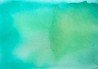
1) Watercolor fill
Shading that is kind of "splodgy", like watercolor painting.
2) Object fill
Given a set of objects (surrounded by transparency) -- either from a file or the clipboard -- fill the current selection with non-overlapping (or overlapping if a box is checked) copies of randomly selected objects, possibly with random scaling or rotation.
Not the same thing as "pattern fill"!

(Couldn't find a perfect image to fit this -- close enough!)
3) Crystal growth
(Diffusion limited aggregation).
Grow a fractal-looking structure outwards from a point (or adjacent to a particular color).

4) Skeleton
Find the skeleton (medial axes) of a shape:
http://www.voronoi.c...st_and_Skeleton
(Which could lead to other interesting effects, like shading the different regions in particular ways, or even warping based on adjustments to the skeleton -- just dreaming! I have no idea how to do that).

5) Texture synthesis
Photoshop CS6 has a "content aware fill" ... the following does something like it, but might take too long to run:
http://graphics.cs.c...EfrosLeung.html
6) Stippling
Edit: Done now ... http://forums.getpaint.net/index.php?/topic/25637-stipple-plugin-21st-nov-2012
Weighted Voronoi stippling, described here:
http://mrl.nyu.edu/~...ples-node1.html

7) Search and replace
I know it might sound weird, but it could be handy to be able to erase or modify repeating patterns in an image -- for example, artifacts in a scanned image, or an unwanted background pattern.
Coming up with an interface could be tricky. I am imagining a small grid (16x16?) where each pixel in the target pattern can either be "this color" (with a tolerance?), "anything but this color" or "ignore". It would also be handy to be able to fill the pattern from the clipboard or a file. There would also be an operation for each pixel: "change to this other color", "leave unchanged" and maybe some other unary operation (invert, brighten / darken ...)
Not sure what to do about overlapping matches in the image. Maybe the top / left has priority, and pixels involved in a previous match cannot be involved in second one.
Edit: Maybe not such a weird idea after all - Andrew Glassner designed a (very!) advanced "image search and replace" in 2003 that could change the first image below into the second one:


-
I love this plugin, it's so much fun to fiddle with! The documentation is thorough and an excellent addition. With it I'd quickly be lost in the UI
I think this is worthy of being stickied. Well done davidf. (all these forum icons & I can't find a sticky one - have a trophy instead)

Thanks! (And to everyone else for their feedback, too).
Hope the "known bug" with wide lines isn't too annoying & doesn't come up too often ...
ps I made a tadpole!
Pic? (I'm fond of tadpoles! But not if you don't want to ...)
-
Those are impressive initial results for the shading across the line width!

Particularly the first example, which hopefully indicates that when lines cross over each other, the lines should appear to be one on top the other - (something which is currently difficult to do if shading the 'object' created by the effect).
Yes, the lines are drawn in (random) "depth" order. When the order wasn't random, overlapping radial lines looked wrong (each line was above the next one, if you can picture that ...)
It would be ideal if you can keep the existing length-wise shading and have a slider to blend these colors with the new cross-wise shading.
So, 'start' and 'end' colors from the UI colorwheels and 'edge' and 'middle' colors from the Primary and Secondary colors - with a slider to blend the two different patterns. The advantage of the Primary & Secondary colors is that the transparency can be selected before running the plug-in. This (hopefully), would allow blending of edge color or middle color or both edge & middle colors with the existing length-wise color shading. I hope that made sense.
That's kind of awkward with the way things are designed at the moment, but you can get a similar effect by drawing the same set of curves (using the same "Randomization code") on two different layers and then either using layer opacity or an interesting blend mode ... here is the kind of thing I get (layer 1 and layer 2 are the original two images, with layer 1 on the bottom):
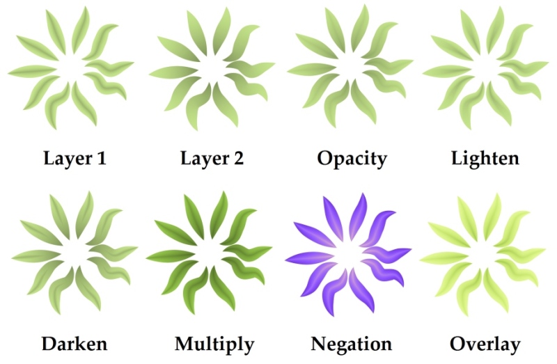
I think I like "darken" the best. "Lighten" does something interesting with the center lines -- they spread out a bit ...
-
OK, figured out how to do coloring by width instead of length -- this is a preview of what it will look like. (The new version of the plugin isn't ready to upload yet, though).


Stipple plugin - updated to v1.1 (27th Nov 2012)
in Plugins - Publishing ONLY!
Posted
Cool! What other effects did you use for the hand?