


Xzerizon
-
Posts
185 -
Joined
-
Last visited
-
Days Won
2
Posts posted by Xzerizon
-
-
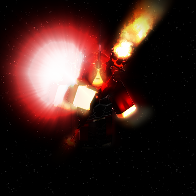
I haven't been able to find a picture yet, let's see...
Ah, here we go. It's the sun effect in the center, basically.

-
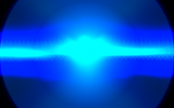
There's this bloom effect in many sci-fi franchises. Basically, a bloom effect is applied to lighting it make it look like it's glowing. However, the particular bloom effect I'm trying to figure out how to do is... stretched horizontally, for lack of a better term. Does anyone know how to do this?
-
Have you tried this plugin: http://forums.getpaint.net/index.php?/topic/24587-normal-map-renderer/
Or this: http://forums.getpaint.net/index.php?/topic/23936-the-normal-tools-v-011/
Or this: http://forums.getpaint.net/index.php?/topic/21224-heightmap-v13/ with http://forums.getpaint.net/index.php?/topic/2534-normal-map/
Ah. Thank you, BoltBait. As it turns out, the Normal Tools and Heightmap work spectacularly together. Thanks for the links.
http://searchpaint.net/ 'tis thy friend

Yeah, I would have searched if I had any idea that normal mapping plugins existed. Unfortunately, I didn't. Oh well.
-
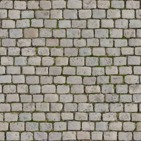
I've been using Blender a lot recently, and, not wanting to front the money to buy a Normal Map generation program or (oh dear) use GIMP of all things, I decided to try creating a Normal Map in Paint.NET.
What is a Normal Map, you ask? Normal Maps are images that are used in conjunction with a texture to give the texture false 'depth', allowing, say, light to shine onto the bricks in a texture while not getting into the cracks between, or making light come from a specific side.
The original texture:
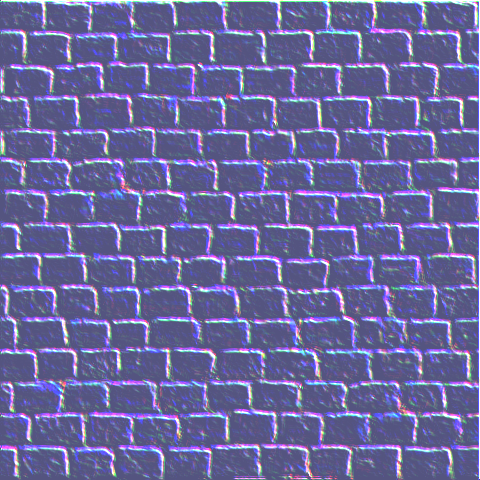
The normal map:
The result:
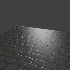
Not the best, as you can clearly see.
How could I make improvements? Is this even practical? Any suggestions?
-
Another long delay, but I think the pictures are worth it.

I haven't had as much time to design, and I haven't been cranking out as many pictures. I think I'm growing up.
Llysin Rift [spacescape] -

I think this is my first truly 'good' spacescape. You be the judge.
This is still kinda a work in progress. I want to add asteroid belts, but I can't figure out how to make realistic asteroids.
Also, if you think it would look better without the text, let me know.
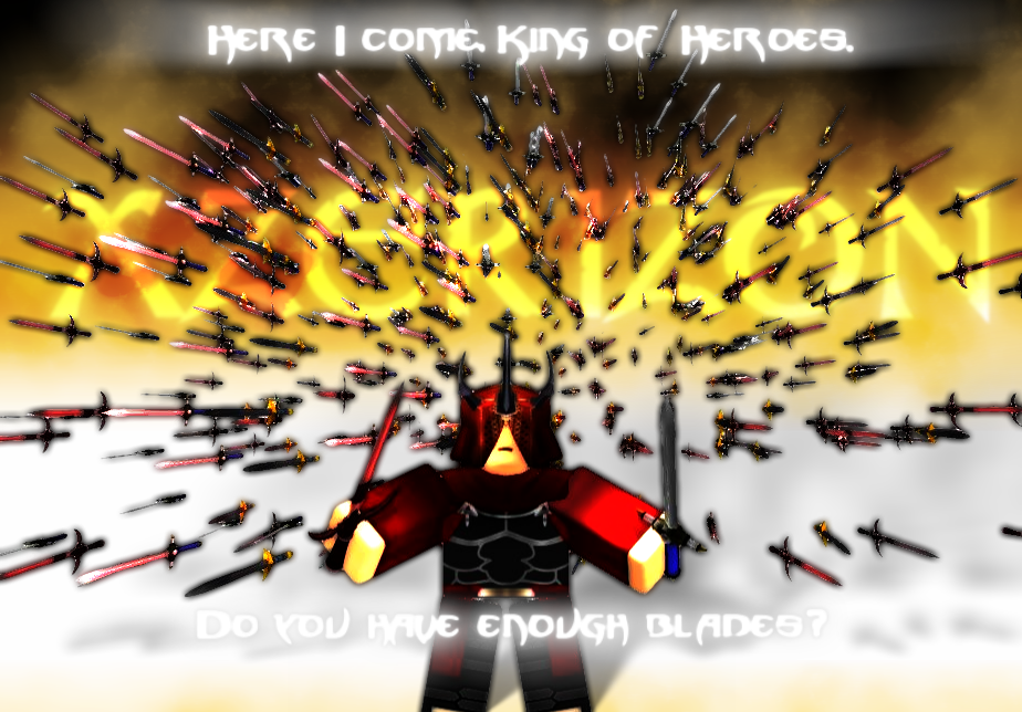
Project Aegis [Thumbnails] -


 These are all 'teaser' thumbnails of a project codenamed Project Aegis a friend and I are working on in ROBLOX.
 -
@HELEN
Thank you.
Not really much to show this time. I haven't been making as much art as of late, and what I have made, I've spent a long time on. Maybe not as much time as you masters, but still pretty long.
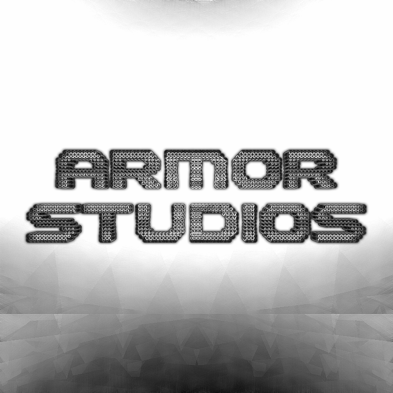
Armor Studios Logo-
Completely drew the armadillo. No stock or reference image used.
Bastion [Thumbnail]-
http://i1256.photobucket.com/albums/ii500/XzerizonAlderii/BastionThumb_zps6cc7b9c7.png
I think this is one of my best works yet. You be the judge.
-
SkullBonz: A nice piece, with some nice texture, but the border is really cutting it for me.

pdnnoob: Very, very cool! Very well done. For critique, the planet's brightness seems a bit off, and it would be nicer to have some more obvious/numerous space clouds.
Skullbonz:
x 15PDNnoob:
x 19It's a tie.
Going to put in this work I made quite a while ago.
-
@HELEN
Thanks.

Cast Metal [siggy]-
My latest siggy. I'm pretty proud of it.
Cast X [Avatar]-

Birth of a New World [Wallpaper]-
More of an experiment, than anything, but still pretty cool!
When Worlds Collide [Wallpaper] -
As a continuation of the Birth of a New World wallpaper, I created this. Smudge = awesome.
-
No one has entered for a long time. I think it's frowned upon to enter twice in a row, but this would be dead otherwise.
-
I've been trying to create realistic clouds from scratch. This is what I have so far. Make sure you click on it to view it in full size.

What can I do to make it look more realistic? Anything about the texture or whatever?
-
Seriously, how do you do all of this? Your artwork is exactly/nearly the style I adore.
It's freaking amazing.
Congratulations on the Galleria nomination.
-
 1
1
-
-
@barbieq25,
Thanks for the compliments and congratulations!
@HELEN,
Yes, coding is fun. That is, if you aren't using some insanely impractical language like jQuery. It may do some cool stuff, but jQuery drives me nuts, .-.
Thanks for the compliments. I'm glad to be back.
Logo of the Week Contest Entry: "Sweet Talk":
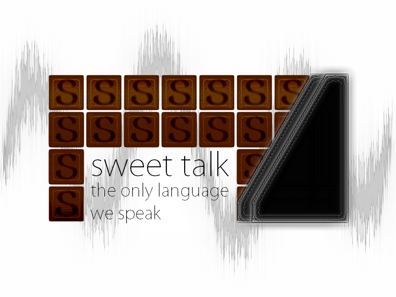
LOTW entry. I decided on the title 'Sweet Talk- The only language we speak.'

A Terrible Mistake [Photo Manipulation Test]:
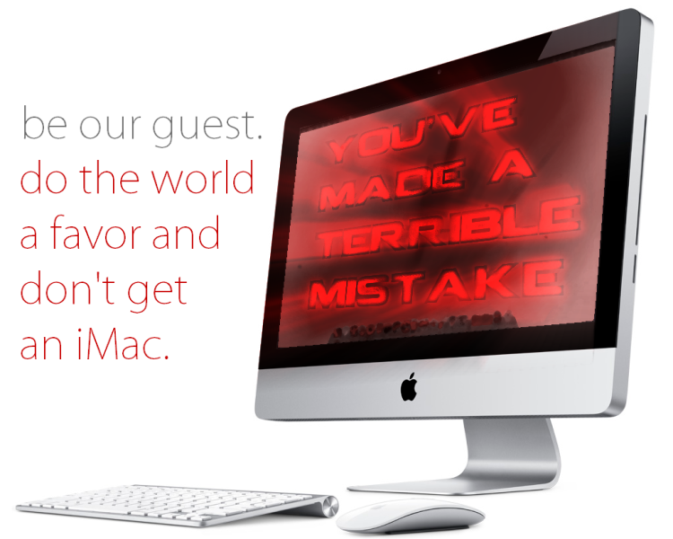
Stock Image: http://www.gsccompass.org/wp-content/uploads/2011/04/Mac.jpg
I, at first, wanted to put a PDN screen on an iMac, but I found positioning it was too difficult. So, I went with this instead. Please be assured, iMac users, that I don't have a problem with those machines. I just was playing on a joke and the terrible fact that iMacs do not run PDN!
-
Your latest pieces are absolutely beautiful. Death Came In Stages... just... felt right, if you know what I mean. My condolences on the death of your father. :c
The dog paws are quite cute. Four dogs scamper around the house, leaving paw prints all over!
-
Very nice work here. I laughed quite a bit at the error messages. The drawings are very good.
The only complaint I might have is that the shadows, where you apply them, are a little too thick, at least for my liking.
Keep up the good work!
-
Absolutely beautiful. Sparkly, with well-blended colors. It feels perfect.
-
I know I'm a little late, but congratulations on making it to the Galleria!
Your latest piece is nice, realistic. I like it very much. Almost photorealistic, in fact.
[thumbs-up]
-
No thanks/apologies necessary, ShinichiOkazaki. We're all here to help each other out. A little rearranging of your siggy will allow you to cut it down to size while still retaining the important features.
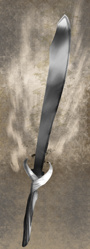
If no one else wants to challenge chimay12321 right now, I'll enter with my current siggy. If ShinichiOkazaki wants to try again with an appropriate siggy, I'll step out.
-
ShinichiOkazaki, that's a nice image. However, there is already a battle ongoing. Just giving you a friendly reminder!
Minners79- A very nice concept and well executed. The shadows could be somewhat thinner, though, in my opinion.
DrewDale- Also a cool image. Again, the shadows could be a lot thinner, though.
As I like the concept of Minners79's better, the score is now:
Minner79- 3
DrewDale- 0
Minners79 wins.
I will allow the above entries to compete rather than enter my own, if that's allowed. (Not sure if that's covered in the rules.)
-
I've been gone for a long time. Sorry,
I feel like I have grown a lot since I last posted.
For one thing, I've learned a lot of new things about coding. I already know some HTML, CSS, jQuery, Lua, Python, and Ruby. I picked these up rather fast- I kind of surprised myself- and I'm actually going to make a full-blown game with my newfound knowledge.
I hope I have grown in my artistic talent as well- you be the judge.
Glowtrack Label-

This is the label for the game I'll be making. It's called 'Glowtrack'. It's a reflex racing, sci-fi game. The concept is that you have a total of five colors- red, yellow, green, blue, and purple- that represent different colors of tracks. By pressing a key, you change the color of your car. However, you can only collide with the track that is the same color as your vehicle; otherwise, you'll fly right through them. The game itself will be very well made, as well as I'm planning.
Backslash\ Logo-
http://i1256.photobucket.com/albums/ii500/XzerizonAlderii/Backslash_zpscb55a895.png [Too large]
This is more something I was playing around with. If I ever make a game called Backslash, I'll use this.
Estrela RTS Game Engine Logo-
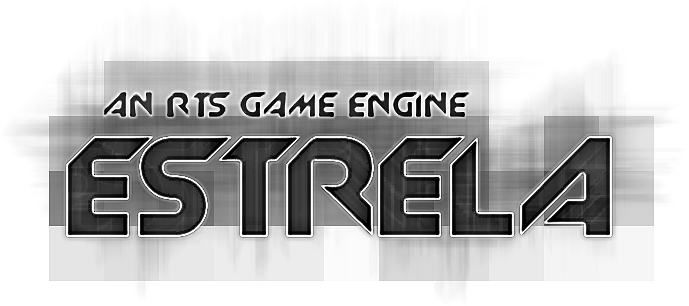
On ROBLOX, I'm the head of a project to make an RTS game engine. It aims to revolutionize the way games are made on ROBLOX.
Initial Armor Studios Logo Draft-
http://i1256.photobucket.com/albums/ii500/XzerizonAlderii/ArmorStudios_zps8546d768.png [Too large]
The Estrela project is being tackled by Armor Studios. This was the first draft of their logo.
Xzerizon [space]-
I became a Writer on the ROBLOX Wiki. For my profile, I made this picture.
Avalon Thumbnail-
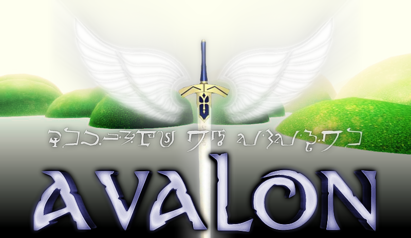
StuntMike and I are creating a military group on ROBLOX. This is the thumbnail for the base.
StuntMike Thumbnail-
I created a profile thumbnail for my friend, StuntMike.
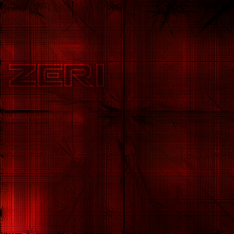
Xzerizon [Archlord]-
A profile thumbnail I created for myself.
Xzerizon [Faker]-
http://i1256.photobucket.com/albums/ii500/XzerizonAlderii/XzerizonThumbnail_zpsb41deef7.png [Might be too large]
The profile thumbnail preceding the previous.
-
I'm trying to create a skybox (basically, a giant hollow cube that goes around a map to give the impression of a sky) for a game.
However, I don't know how to create a good sky and such that fits within the template and looks smooth all around.
Basically, the template is as follows: (note: this isn't actually the template. Each side is uploaded individually. The template is to show the wrapping.)
So how would I create a good, realistic sky that wouldn't look messed up at the corners or not matching up at the top or such?
-
I would love to see more space art
They're really good. The only thing I can pick at is possibly the planets, maybe more practice on the lighting could do the trick!Thanks. I'll try to get some more space art up soon.
Blue Sphere (made with the fabulous Clipwarp plug-in by Red Ochre Dark White Xz Sig
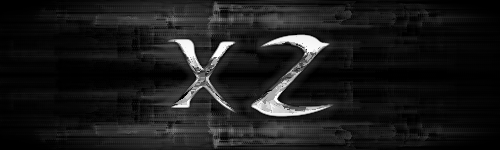 ROBLOX Studio Splash [Attempt 7]
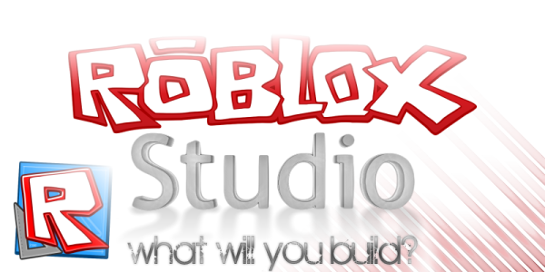 Control Sign (also made with Clipwarp)
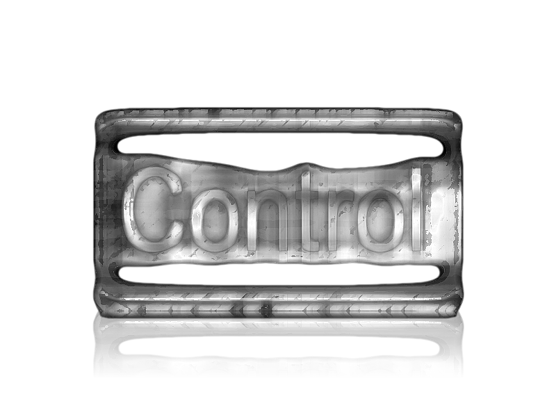 Killstreak Symbol (Clipwarp)
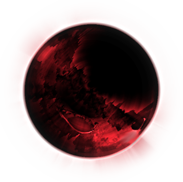 ROBLOX Studio Splash [Attempt 5]
 ROBLOX Studio Splash [Attempt 3]
-
Sorry I missed your earlier works, but by golly, they're phenomenal! I can see your work used as wallpapers and in ads. The Nemesis ad is perfect. Nice typography and choice of text and colors.
The Globe, Xor Design, Mech images are very well-done. Mech has an icey texture and great form to it like an ice sculpture.Thanks! I didn't really think Mech as an ice sculpture: interesting perspective.
Love the globe! Mech is pretty cool too.
Thanks.
Happy or unhappy ?
Leaning towards happy. It's just one of those moments like 12/12/12 at 12:12 PM.
Your work is so lovely to look at
 and this is unbelievable: just fabulous
I'm also loving Caster's Globe and Mech. Great works - well done!
Thanks. I also really like that fabulous, torn up wall.
-
111 replies.
Belated happy new year.I honestly have no idea how I made these images. I was actually trying to make other stuff, but these almost magically appeared on the canvas.Caster's Globe Xor Design
 Mech
Mech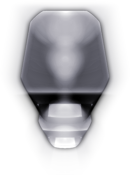
-
This sig challenges you with me.


 and this is unbelievable:
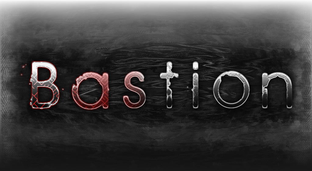
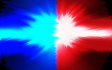
How to: Achieve a bloom effect?
in Paint.NET Discussion and Questions
Posted
...
Now I feel stupid. I had no idea it was that simple. I managed it a little while ago using a long, complicated series of stuff including bidirectional blur and fragmentation. And then I learn this.
Thanks, EER!