


Ilke
-
Posts
46 -
Joined
-
Last visited
Posts posted by Ilke
-
-
Thanks everyone for being there on "inauguration day"! The gallery seems to be indeed off to a great start.

@Jaxon: Yeah, I did use True Blur to de-serrate the reflection, I guess I'll have to use more next time
 Can't wait to see your gallery too!
 -
Fascinating creations. Your work is diverse and full of clever ideas. Made me love surrealism again XD
-
That spacescape is just of professional-quality. Your drawing skills must be pretty good too, love the guitar.
-
M-m-m-mindblowing. I just love how in The Golden Touch the mouse is seamlessly integrated to the rest of the picture. Your glossy/3D shapes are just fascinating otherwise.
-
Gotta love your work on the shapes. Paradise Dawn just became my new favourite
-
Nice stuff you have in here. Gotta love how you have plenty of ideas
You don't seem to be in friendly terms with anti-aliasing though, but I can see you're improving faster and faster when it comes to that.About the latest pic, I just gotta suggest something: Can you make the car's shadow not pitch black but a bit transparent?
And no matter what you think, your photo restorations are great.
-

Ladies and gentlemen, behold and welcome to the Trefoil Gallery!
In this gallery one can basically find almost all my Paint.NET creations. I could still be considered a beginner when it comes to Paint.NET, so one can say I crave for constructive and helpful criticism which I hope will help me improve my work and become part of the community. I use no other software than Paint.NET though I do make usage of stock files for renders or textures sometimes.
The gallery is free to visit (until I can apply some pay-per-click scheme to this thr-oops, nevermind!) though constructive criticism is encouraged vividly.
.
27/11/11 - Gallery launched! I inaugurated the gallery by uploading all the jewels I made thanks to Barbieq's tutorial, all the contributions to the Pepper Spraying Cop meme I've ever done and two sigs. The gallery does need to be restructured and organized badly, please don't mind that. Anyway
free cake for everyone!.
PASTICHES/PARODIES - In which I contribute to memes or imitate notorious imagery.
.

Battlefield: Occupy Davis

Davis: Love, Undying.

John Pike, KPA policeman in 2027
JEWELS - My creations with BarbieQ's Jewel tutorial and other experiments.
.


SIGS - Self-explanatory.
.


-
(Sorry for the delay, I was held up quite a bit)
First of all, thanks to everyone for your suggestions! Mountman's mini-tutorial seems to have done the trick quite nicely: the burn effect is much closer now, and the colours are much more faithful to the original work. While Barbieq25's example is quite stylish, it diverges too much from what I want to obtain. I will still keep this (definitely more advanced) mini-tut in mind though, in case it would be more useful later on. Yellowman's method also sounds quite interesting, though I'll need to familiarize myself with the Clone Stamp tool a lot more before attempting anything. I'll keep experimenting, I already have something decent, but why not develop something further to get a tutorial perhaps?

-
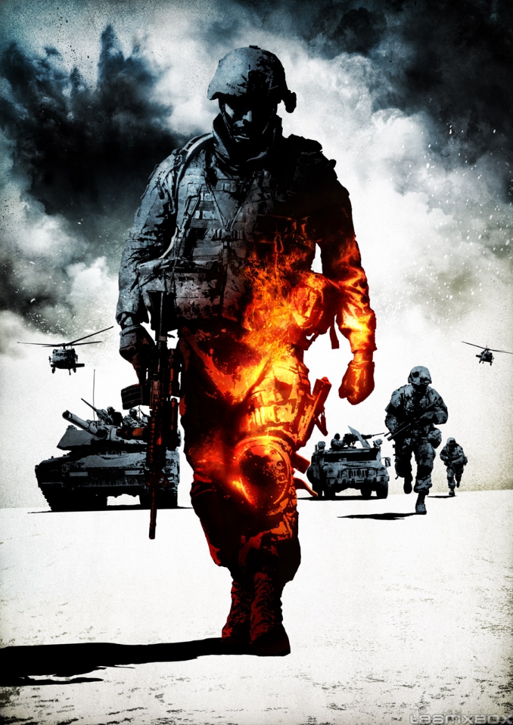
Well hello people,
I wanted to imitate the style used in the recent Battlefield posters, especially the slight flame reflection effect covering part of the soldiers. So I looked for tutorials, only to find out that there is practically none for Paint.NET, let alone for anything. Oh, there
one video, but it makes use of Photoshop's custom brushes, the result is not really the same both in the vid AND when I tried to do it. There are other works done already, who managed to imitate the original posters pretty well.And now I am here, asking the far more experienced editors than me out there what to do with Paint.NET in order to get that burning effect. There is an approach I've tried, if it helps.
1. Draw an oval above the places to have the flame effect.
2. Put a gradient (yellow to red) on it.
3. Gauss-blur the oval (30 was fine).
4. Put the layer with the oval as overlay.
5. Copy the layer a couple of times.
It looked close... kinda. Except that when in contact of the blue colour of the object I wanted to apply the effect on, the flame blended in and took a greenish colour. The red colour was also much more extreme in the picture, lowering its quality.
If you have any tips, suggestions and other things, you're definitely welcome.
Thanks already.
-
Nice gallery, at least you don't suffer from a lack of ideas. Though as welshblue said, a bit too much blur in some of your work. Your skull kid sig, for example, is perfectly adjusted.
-
Really love Dark Fleur, the texture's uhmaaazing, though I think too much of the shape is shadowed.
Don't get me wrong, Future View of the Past is quite good too, though well, not as much as the former
-
Very, very, very, very *20 minutes later* very, very, very amazing. Real good job.
To make all this gold, you use the same formula you've added to your tutorial, do you? As in bevel --> curves --> fastFX etc...
-
TheHowler: 1
minners71: 3
TheHowler: A vertical signature? Huh, don't see how that would work. Also the image quality seems to have suffered a bit, quite many artifacts there. Point goes to minners, with a colourful (and more traditional!
) design, and generally nice renders (if they are, that is, otherwise just kudos). -

The first creation I did with the tutorial. After that I tweaked with the blueprint in other creations a bit, using gemstones, opals, different shapes and colours...
Couldn't do the Galaxy tute's effect, so I skipped it for a simpler highlight.
Bonus points for guessing which flag this is, hum hum hum!
-
Here be mine, used in conjunction with BarbieQ's Jewel tutorial. Tweaked with the opal's contrast to get "deeper" colours. Lighting's simple, inspired by minners71's creation.


Jaxon's Gallery of Finger Paintings
in The Pictorium
Posted · Edited by Ilke
Now that your gallery is posted, gotta say it's a pretty good start right there! All the works are generally pretty good and stand out very well, especially the wrenches. Not so heart-wrenching
Though I'm kinda split about December Moon. One man's "artsy" could very well be another's "clumsy", and I tend to take the other side when it comes to the simple snow and the jags. Making the original image bigger and then resizing it could significantly help next time though, good work. I also do find Alien Orb and Purple Box are quite the rough gems, but at least you have some pretty good ideas, and that's the basis to all. I'm not necessarily focusing on the negative, it's just that the other images are perfect enough as they are
Otherwise, no issues at all. Keep going!