


minners71
-
Posts
731 -
Joined
-
Last visited
-
Days Won
9
Posts posted by minners71
-
-
-
I'm liking all the new works NMD and as B mentioned great text placement on the solid ninja sig

-
If you scroll down the tutorial until you reach the first hidden section and open it you will get an easy to follow fix.
-
NMD - Very hard to pull off a vertical sig ( I know I have tried ) and this one just doesn't do it,sorry

Edit - Didn't mean to sound too harsh and it has actually grown on me but point still goes to Xzeri
Xzerizon - Just seen this sig in image battles and thought WOW! I love it +1
NMD21 - 0
Xzerizon - 1
-
Just did a tutorial for this then checked your example and realised that you didn't actually want a rainbow
Still made it so will post it.
First you need these 3 plug ins
Conditional hue/saturation
http://forums.getpaint.net/index.php?showtopic=885
Object align
http://forums.getpaint.net/index.php?showtopic=8375
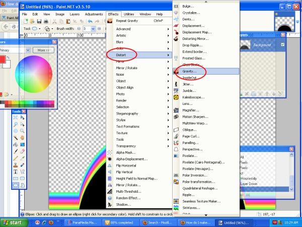
And Gravity
http://forums.getpaint.net/index.php?showtopic=7968
Second open up PDN and just use the default options for new project
Use the paint bucket tool and fill it with a colour I chose blue but anything will work ( except black or white )
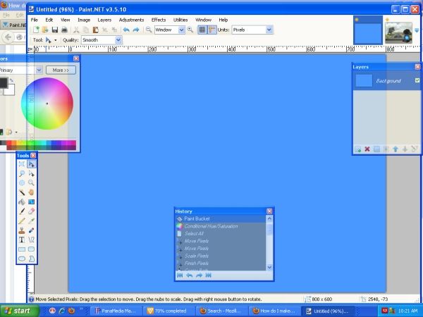
Then go to adjustments/conditional hue/saturation and change the highlighted parts
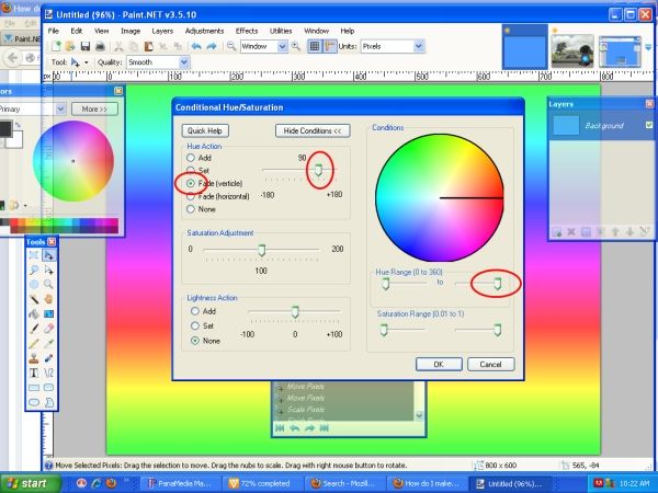
Then use the blue arrow tool and click on the image to reveal the movement points and drag the top middle one down
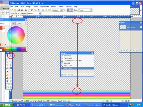
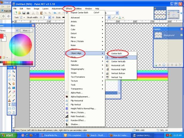
Now use object align to center it
Now add a new layer and choose draw eclipse and change it to filled, hold down the shift key while drawing to keep it round and then use the blue arrow to move it down
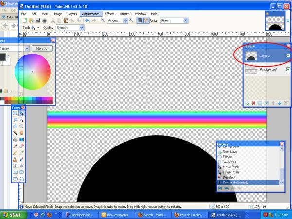
Merge both layers together anr run gravity plug in at default selections
Use magic wand set to 71 to remove black ( click on it then press ctrl+x )
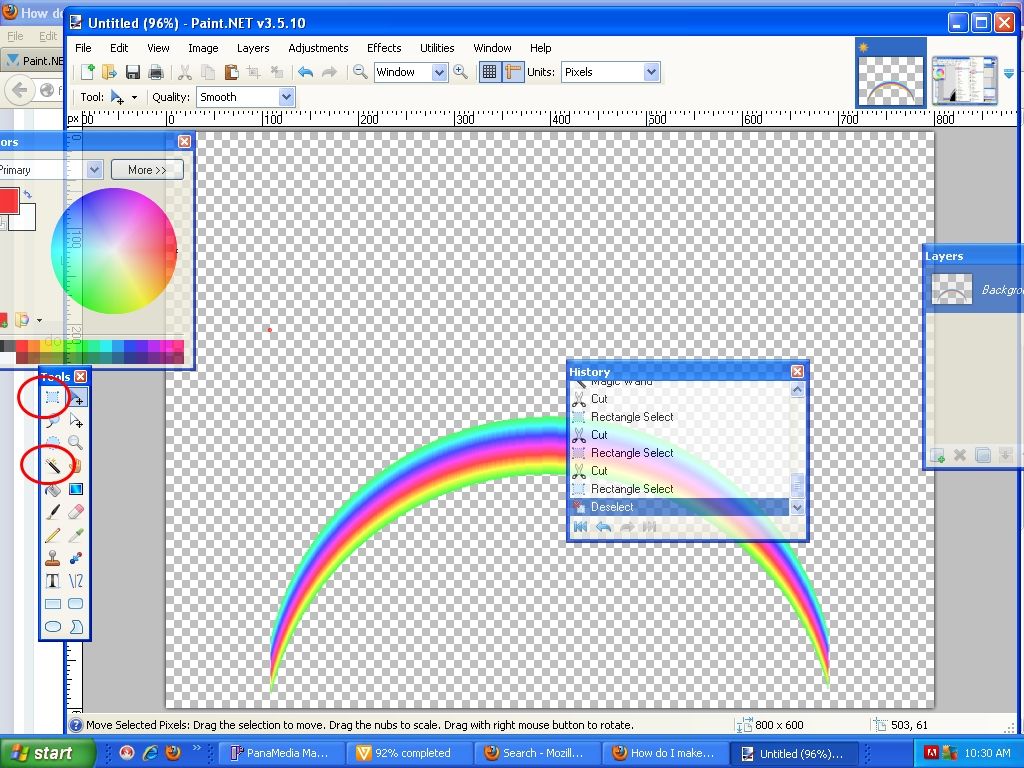
Open up your image and add your rainbow ( delete any parts you dont want with eraser and set layer mode to overlay plus use gaussian blur to help blend it )
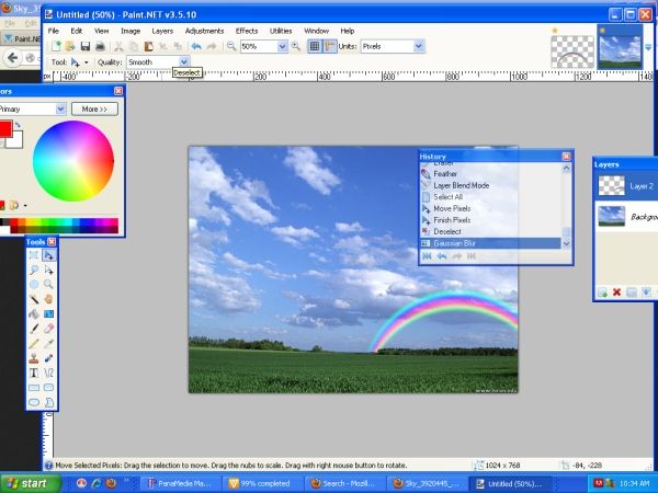
voila.
There may be a few mistakes as I was very tired when putting this together
-
 3
3
-
-
-
-
Well done everyone,have to admit was expecting a low turnout when I chose the subject glad I was wrong.
-
The colour picker tool should work,place your mouse pointer on the colour and press the "K" key this should select the tool,looks like an eye dropper and press the left or right mouse key.
-
Here's what I would do.
1.Open a new file by pressing CTRL + N
2.Input the size as 960 x 150
3.Goto LAYERS>IMPORT FROM FILE and select your 160 x 152 image
4.Move this to the right with the MOVE TOOL ( the blue arrow )
5.Now use the RECTANGLE SELECT TOOL and select the left hand portion of your image as shown in the below pic.
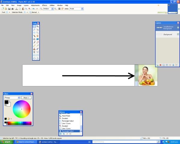
6.Now use the MOVE TOOL (blue arrow ) again and drag it to the left using the middle left nub.
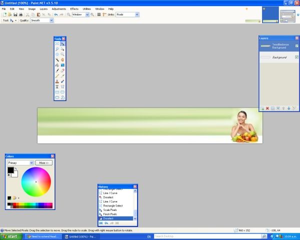
you could also after step 5 copy this to another layer and do step 6 on both and then run an effect on the top layer such as EFFECTS>DISTORT>CRYSTALISE and use a transparent linear gradient to blend them together.

-
Great works and also love that second image http://i.imgur.com/4ksJ0Tf.png look forward to you getting stuck in your computer chair more often
-
Thanks RFX and Helen ( not sure what sig you are talking about ? )
-
-
Congrats everyone.
(Have PM'd Drew with some ideas for the next one )
-
Love the new comp banner
-
I made this quickly using tube oblique.
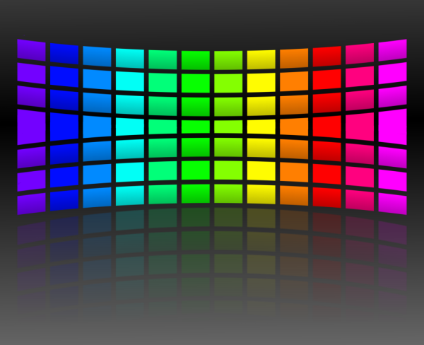
Basically made a wall of coloured squares then centered them using object align
Duplicated the image and turned off the bottom layer, then used tube oblique with a y ( bottom slider of the top 2 ) value of about -60,then turned off this layer and turned on the other and used tube oblique with a value of +60 on the y axis.
Turned on both layers and then erased the parts I didn't want ( so the bottom half of the upward curve image and the top part of the downward curved image )taking care where they meet.
Not perfect and probably a bit hard to do on a complicated image.
-
1
-
-
Welcome back NN79
The place wouldn't be the same with out you. -
I will enter this,hope it meets the deadline ( Oh look here is a handy world clock I can check
 )
)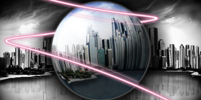
stock image http://www.one2one-removals.com.au/wp-content/uploads/2010/08/Cityscape5.jpg
-
Well if that "argument" is all it took for her to leave then so be it but at 33 years old I would of expected her to be more mature about it especially as she is a fully qualified paramedic and emergency care assistant. Wonder what her bedside manner is like ?
If this is really all down to a real ****** day at work and she apologises then so be it,we all have bad days and sometimes post when we really shouldn't,but in my book it needs to be sooner rather than later.
-
Well this is all a bit childish,saw nothing wrong with Blackpenny's question, NN79's response was a bit standoffish though and then to cancel the comp after all the hardwork everyone put in is just lame.
I too vote for Drew to take over
-
Sorry I missed this battle,I would of voted for skullz.
@Drew the I is still in the box if you look at the perspective.
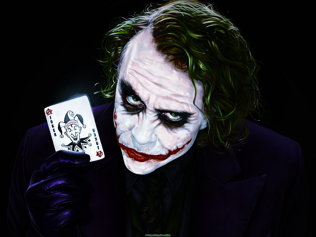
Done for a fellow gamer.
Source image http://images2.fanpop.com/image/photos/9000000/Joker-the-joker-9028188-1024-768.jpg
-
Sasha - Nice attempt but a bit too many jaggies for me
Red Ochre - Fantastic, very smooth and very shiny. Feel like getting a cloth out and polishing it
Sasha - 1
Red Ochre - 2
-
I like it Prosper,personally I would of gone with a single pixel border but apart from that great.
-


SOTW#83 - Mathematical / Numerical - Results are in.
in The Archives
Posted
Used stock images and can link to them if required but I think it's pretty obvious what I used.