


Rookking
-
Posts
31 -
Joined
-
Last visited
Posts posted by Rookking
-
-
Aw N00Bz took my spot again T-T
N00Bz: 1
TheHowler: 0
N00Bz c4d is effectively used
-
Schnicka: 1
N00Bz: 1
I like both signatures but I love N00Bz use of the stock. The grainy effect when used effectively looks great, I believe N00bz utilizes it in a great way.
-
Sfifer: 2
Keither Cancel: 0
I think Sifer's has really nice flow, the c4d is effective. Keither, yours is good but the flow is a bit odd
-
Okay, I'll enter with this

-
Kemaru: 3
Schinika:0
@ Kemaru: I like the brightness of the signature however the left side is very bleh.
@ Schinika: Could be more visually eye appealing nevertheless the stripes look cool
So I enter with this:
(its from an online game I play) (back ground was created by me)

-
Sweet idea
-
DANGIT! I just came back from vaca today and I missed this one
-
Entering:

20 layers of goodness

-
K_I_N_G- 2
PTG- 0
King's signature was much brighter the flow is great and the render is clearly shown, and the text is easy to read
PTG- No clear render, the text is hard to read, as axle said, lots of head turning. I like the vivid colors and how it seems the text is bouncing out at you
-
Updated on a new style I'm trying out

-
Updated with signatures made FOR friends
! -
Any more SOTW's? I missed my chance with this one, but I'll be happy to participate in the next
-
Updated with a new style I'm trying
Oh and need help on how to make my texts look lest bleh
-
, I've tried before and it didn't look pretty.. I can try another one and post it on here for you guys to see, but don't expect much

-
Cool work. I challenge you to make a poster/wallpaper using your sig techniques.
I really don't know how to make a poster or wallpaper LOL, I can only do small space art
-
Updated
*Three new signatures added* / quick typography tag added-(from friend)
-
Axle's colors are go a bit more with the render, the flow is nice, and the focal point is shown properly however, there should be more lightning.
Mayor's text is a bit off and the head is half cut off
2-2
-
If your running windows, make sure you have all the service packs..
-
Aiight next round.. Heres my entry:

-
Updated with made by friends >
-
W@@DY- your signatures is a little bit too plain, render is a bit blurry, and text is hard to read. But I definitely like the idea of the render over sizing the back
Chrisco- The render is good, but your text is very hard to read, the c4d in the chest is a bit too much. The backgrounds good and so is the lighting
I'm going to have to give this one to Chrisco.
-
Ooo and updated

-
1 gallery per person, please. I've locked your older one.
Oh my other one was just a CnC thread, sorry for the misunderstanding
-
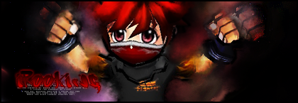
Rookking's gallery
OKAY, I started a new signature shop on one of my favorite online game sites. I got a huge response when I offered free signatures to the first five participants. Here's my completed work so far on them:


Signatures: (Newest to Oldest)


 (not advertising, it was just a signature for one of the admin's who work there)

Made by friends
!:

Updated and cleaned
Sig Battles (ENTRIES/VOTING ONLY)
in The Archives
Posted
Okay, I'll verse someone with this signature!