


Bob11
-
Posts
49 -
Joined
-
Last visited
Posts posted by Bob11
-
-
I made a video clip which has hundreds of png images with little white dots (a lighting issue). Can paint.net apply an effect or filter to a multiple files to get rid of the dots in my video?
-
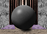
I liked doing this tutorial. I couldn't get the stem to look like I wanted. Also, I had trouble getting the shadow on the perpindicular wall right. Still, it was a learning experience, which is what I like about doing tutorials like this. Thanks for making it.
-
Do you apply Dents to just the tail or the whole comet? I don't have some of the options in my Dents. Probably an older version. I couldn't get the crecent either. I'm a beginner so it's all a learning process. Here's my attempt.

-
Wow. You've done a spectacular job on all the tuts. I didn't think my rose tutorial was hard, but maybe it was. Keep up the stupendous work, bud!
I did your tut a few months ago and I can't recall why I thought at the time it was hard to follow. But as I said, others had no problem with it. So maybe it was a day I wasn't wearing my thinking cap.
-
Nice job on all the tuts.
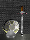
... one small thing, on the combo of the tuts with the sword, discs and helmet - the helmet seems a bit bright against the other objects.
I recall getting some very appreciated help making that helmet. As a PDN novice, I recommend it highly to others who might read this. I rearranged those three objects so many times I was going nuts. In this configuration, I wasn't happy with the helmet's right horn being obscured by the lighting from the shield behind it. I don't know if that's what you are referring to. But I have only limited PDN skills in any case.
-
Day Two of linking my PDN images from Photobucket:
This is from a video tut fhttp://www.youtube.com/watch?v=iRlVMoB7gpo It uses a couple of plugins I'd never used before. It uses the Seamless/Texture plugin (among others) to create the effect. A lot of different techniques in this tut.
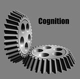
The shape of the gear is from a very good tut by Madjik called A Way to Design a Gear at getpaint.net. I learned a lot from this tut. The metal finish is from a tut Make Some Gears/Cogs by WelshBlue at getpaint.net. I made four different gears based on Madjik's tut. After I finish the other 3 images, I'll decide if this one stays or is deleted. Here, the gears seem a little distorted.

ncfan51 sig tut Glowing Grafitti? at pdnfanatics.com. I got to use a few new effects, etc for this quick and easy tut.
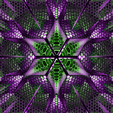
MadJik's tut Power Reactor? (Stuff with Hexagrid) at getpaint.net was a very easy tut to follow. Some modifications create some interesting results.
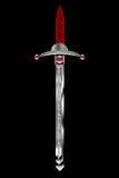
For this image I combined at least four tuts, all of which can be found in the paint.net tutorial forum. Make a Viking Helmet and Simple Shiney Discs by Welshblue and Sword beyond beginners level (image heavy) by Oma.
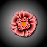
Shape3D#4:Easy realistic Flower by Ash at pdnfanatics.com. Although this tut was labeled easy by the author, I didn't find it to be so easy. Not great results either, but I did finally finish it. The Panneling plugin didn't work at all so I did that part manually.
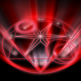
Magic/Alchemy/Ritual Circle by Blah at pdnfanatics.com. It was a fun tut to do. Somewhere in the middle a big star appeared in the middle without an explanation how to put it there. Luckily I found a star generating plugin that worked okay. I also have a little more white glow coming up than the tut showed, but I knnd of like the effect.
This was a very hard tut to follow. Wine Glass Tutorial by Goodfella at www.pdnfanatics.com. I'm not too happy with the results.

This was a tut I tried when I first started doing Paint.net tutorials. I quit in frustration. Although not perfect, I'm happy that I could get through the tut. I may change the handle if I can find something that'll work. The one in the tut looks too 2D. The tut by Oma is at: http://forums.getpai...el-image-heavy/
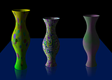
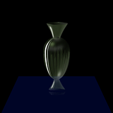
Make a Vase with Point Warp a tut by SargonIII at www.pdnfanatics.com Very easy to follow with great results. Compared to the last tut with vases I did, this was one was much easier with better results.
This is another attempt at Helen's Ice Cube tut at www.pdnfanatics.com. I added the rings I had made from another tut to create more depth in the cube. I also adjusted the dimensions and angle of the cube a little.
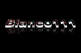
This is from doing Helen's tut "How to Make a Glass Cube" at www.pdnfanatics.com. I put Blanco's head shot in it with some trail for some depth. The image of Blanco is one of the first images I made with Paint.net. I like the way the rays of the cube blend with Blanco's image.
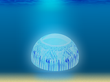
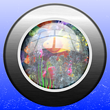
This was a easy-to-follow tut Making Underwater Scene by Briamoth at www.pdnfanatics.com. The tut calls for the blue in the center of the sand to be removed, which I did. But when I added the floating crystal from another tut, I added a blue reflection/shadow on the sand.
Well, it's later in second day, and I realized I could edit this post so I don't have reply to myself. I don't know how this is supposed to be done, so I'll just go ahead and add to this post. Or is that double posting?
This was a relatively simple tut by WelshBlue called Improved Spanner/ Wrench at www.pdnfanatics.com. The gear part was already made. Still, I learned a couple of new plugins with this tut.
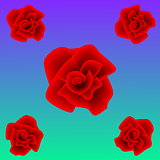
This is from Rose Tut Using Shaped Gradient by Helen at www.pdnfanatics.com. It was very hard to follow. Yet others seemed to have no problem with it. In the end I added crucial steps to create a result that's similar to the model rose in the tut. I might try this tut again with my added steps to make the tut work.
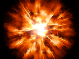
Realistic Explosion tut by Ben_R_R at www.pdnfanatics.co. This was an easy tut to follow.
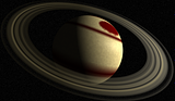
This is my second attempt at this Ringed Planet tut by Sidneys1 at www.pdnfanatics.com. This came out much better.
This was a pretty hard tut by SargonIII How to make a Gassy Vase at www.pdnfanatics.com. One of ohe plugins required for the tut was no longer available. WelshBlue told me in the PDN forum about a substitute plugin that would do the same thing.
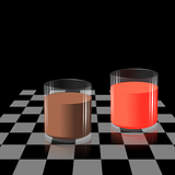
This ia a tut by SargonIII called How To Make A (Drinking) Glass at www.pdnfanatics.com. These are the same glasses as in the other two drinking glass images in this album. But this time I included a translucent liquid effect as well as rhe reflection below the glasses.
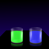
This ia a tut by SargonIII called How To Make A (Drinking) Glass at www.pdnfanatics.com. In this image I learned how to use the Wet Floor Reflection Plugin. Unfortunately, I lost the transparency of the drinks somewhere along the way.
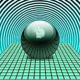
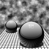
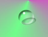
Make a Glass/Glossy Orb tut by SargonIII at www.pdnfanatics.com. Another great tut by SargonIII.
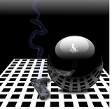
This is my third try with th Make a Glass/Glossy Orb tut by SargonIII at www.pdnfanatics.com. I was trying to get the right distortion of the gun's reflection on the orb. I used Perspective and TubeOblique to distort the reflection image. I also added some smoke from the gun. I don't know what kind of gun it is nor how much smoke it emits when fired. But one can take realism only so far.
Make a Glass/Glossy Orb tut by SargonIII at www.pdnfanatics.com. I don't like the way the white circular light reflections came out. Maybe I need to make them more transparent. Still, the use of Perspective, TubeOblique, and Shape 3D Plugins is truly amazing. That's what creates the reflection of the floor on the orbs.
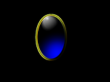
This is from a tut by PeterPawn which I got from www.pdnfanatics.com. In this PeterPawn's Jewel Technique tut I learned some new ways to make a jewel. The use of the Magic Wand with a pattern layer was especially interesting since I had encountered something like that in another tut which I couldn't understand. I may go back and give it another go.
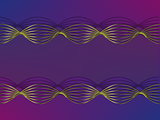
This Wire Effect tut is part of a series of tuts called Twisted Effects all by SargonIII at www.pdnfanatics.com. I used a standard 800 by 600 pixel size canvas. When I used a canvas twice as large, I was not happy with the results.
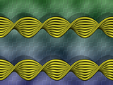
This image is based on the Twisted Effect tut by SargonIII at www.pdnfanatics.com. This is one of at least three companion tuts that all follow basically the same steps and use transparent gradient with Polar Transformation to create the twist. I also decided that the shorter strips would look like blades if I cut them at each end. They're not perfect points, ergo the gray background.
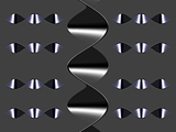
This was an addendum of sorts to the Twisted Effect tut series by SargonIII at www.pdnfanatics.com. These links show no tension, so I have them floating. I don't know how to make the links flush to show tension. This tut like the others uses trail, transparent gradient, and Polar Transformation.
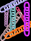
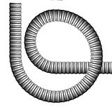
I don't have a Photobucket description for this one. I know it's a combination of a couple of tuts. The tubes are the main focus here. I'd like to acknowledge the tut's author if anyone knows who it is.
This was a fun, easy to do tut by SargonIII called Making A Ribbon at www.pdnfanatics.com. It uses the multi-color gradient plugin. I added the multi colored gradient text and duplicated the original ribbon with different colors..I have to be more careful with the initial line creation next time to avoid imperfections.

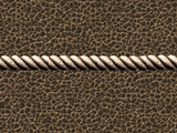
The tut Make a Rope by SargonIII. It was a relatively easy tut to follow. The leather background is from another tut. Lots of texture in this image with white, black, and shades of brown. Makes you want to mount a horse...
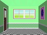
After Goonfella at pdnfans.proboards.com told me how to delete the shadow on the floor, I'm now happy and can move on to another tutorial. This was a tut called Building a 3D Room by SargonIII which I found at www.pdnfanatics.com. This was a very absorbing tut.
This is from a Rainbow signature tut by LFC4EVER at forums.getpaint.net. This tut gave me more practice with the brush import steps. I like that the letters are hidden, but I suppose for a sig, they should be clearer.

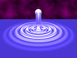
This was an attempt to follow the 3D Water Drop tut by Sargon111 on the pdnfanatics.com web site. It didn't come out right. I had a hard time attaching the connection with the drop.
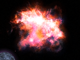
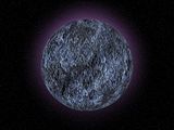
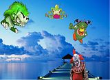
I made this by doing a tut by Heat Stroke at pdnfans.proboards.com. It starts with literally my scribbling on a blank layer. I added the planet which I had made using another tut. This Nebula tut had the option of importing an actual photo of a nebula(from a Google search)as one of the layers. I took that option but wish now that I had not. I plan on doing this tut again using only Paint.net (sans nebula import)
This was a very easy tut to follow (with great results). I don't know why it's listed as an advanced tut on the pdnfans.proboards.com web site. For some reason the tut directs that the wood be put on a slant. For use in an image, though, I suspect I'll be rotating it to a vertical or horizontal position.
This is from doing an easy-to-follow tut by WelshBlue at the pdnfans.proboards.com web site. For some reason this tut was listed as advanced. For some other reason, the directions called for orienting the wood on a slant. But to be of use in another image, I'll most likely reorient it vertically or horizontally. In any case, I am pleased with the results.

This tutorial by Lance was fun because I could keep changing the top layer's color and the rest of each letter was not affected. The texture was from SargonIII's Cracked Floor Tute. I don't know about the reflection. The angle of the letters bring out their 3d quality, but when I added the reflection (not part of this tute) I wondered about the result. There's also a tinge of green I don't like. But I can only play around with the colors for so long before it's time to move on. Both tutes at pdnfans.proboards.com.
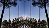
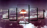
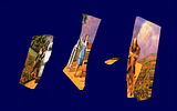
Much like the theme in Kubrick's 2001..., this image has evolved. Originally it was based on the Images in Panels tutorial. But after many revisions it now has a popout effect included in the left panel. I may do something more to the ground.
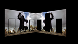
Someone on the pdnfans.proboards.com web site did the Images in Panels, and used a graytone for the background. That one is better than this, but I like this well enough.
This image uses a photo from Google Search and a paint.net tutorial by BarbieQ (Images in Panels)at the pdnfans.proboards.com web site.
This is from a panel image technique by BarbieQ at pdnfans.proboards.com. Using the same background as the panels is one of the options. I want to try changing the configuration of the panels and do something different with the background next time.
This result comes closest to the models shown in the tute by Ella at pdnfans.proboards.com. In the end, I was't using the Trail plugin correctly.
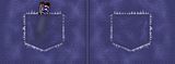
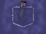
Someone else posted their result from Ella's Tute at pdnfans.proboards.com. It had two pockets as you would normally see them on jeans. Although the tute was for only one pocket, I thought I'd try the same.
After many hours of redoing this tute over and over again, I'm happy enough with this result that I will move on to another tute and give this one a rest. (Tute by Ella at pdnfans.proboards.com)
I used Barbieq25's tut to make this jewel for someone I know. The letters are her initials. A great way to personalize an ecard, etc.

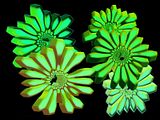
There're definitely more wrinles in this image than in Flower Power Two, but they seem a little stretched.
This was from a tute by Ella on the pdnfans.proboards.com forum. Very simple. I did learn about fabric wrinkles with a tute by her at the same site.
This is from a tut by SargonIII. The tutorial teaches about the uses of the mask in Paint.net. I'm still not too sure of the concept. But hey, rock on!
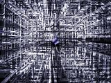
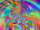
This abstract picture was done following a Paint.net tutorial by heat stroke at pdnfans.proboards.com The blue thingy in the middle is from a tute by Sargon III at the same web site.
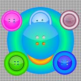
This was a result of spending too much time with a tute (this one from Ella at pdnfans.proboards.com). You start going a little crazy. The buttons started to look like human faces. And after attempting to arrange the buttons I had made...behold! The Button Man!!
Well, I'm starting to get some depth here (Fourth attempt). Still needs improvement. This tut, Polar Inversion Flowers (by WelshBlue on PDNfans.proboard.com) gave me trouble. But it's time to move on.
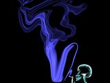
This smoke effect was from a tutorial by Sargon III on the pdnfans.com forum. It was fun and easy to follow. And I did learn about a couple of Paint.net plugins.
This was from a tutorial by Sharp in the Paint.net forum. I finally settled on the conical gradient for the background.
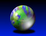
I followed a tutorial by Drakaan to make this marble. I modified some of the settings to get the best marble look I could. The original canvas was Terry Toon cartoon characters.
This was a difficult tutorial to get through. The stone lacks luster because I couldn't get that part of the tutorial. Still, I like the way it came out well enough. Tutorial by by BarbieQ25, who does beautiful Paint.net art.
This picture was done following the same tutorial as the one I used to create Kaleidoscope in this album. I did more brightness blending on the text in this image to make sure it doesn't blend in with the background (like the Ksleidoscope image).
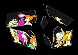
I like the thinner glass. Unfortunately I didn't know how to deal with Fred and Betty's black hair (or Dino's paws). And what happened to Barney's face? The little chip of glass at center top was not intentonal, but I like it.
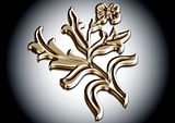
It wasn't easy, but I was able to complete this tutorial. I love the realistic gold effect. I may add to this image later, but it looks great as is. I definitely will do another image using this tutorial (effect).
I made this image following a tutorial on the Trail plug-in. I borrowed the abstract image I made from another tutorial.
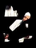
There's nothing new and different here. I didn't even black out the background of the original picture, which is something I wanted to practice with this technique. But the original picture was so great, I wanted to do something with it. I'm going for a thinner glass next time. I did change the background of this image to a dark blue and some noise (stars).
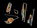
Finally! I got the clear glass pane effect I saw in the tutorial. The key turned out to be deselecting the shards before I manipulated them. If I had only known. I love this effect. I will try it out a few more times before I move on.
This was done following a tutorial in the Paint.net forum. It basically uses the emboss and curves plug-ins at specific calibrations.
Unfortunately, it's only simulated crystal (mixtture of white and black) and is in fact opaque.
This was done with the Trail plugin, which someone on the Paint.net forum was kind enough to suggest. Not only was this a lot easier to do, but it looks more like glass (porcelain, anyway).
This was done following a great Paint.net tutorial by MadJikf59. Although not of that artist's caliber, I feel this came out good enough to display.
This was done following a metal effect Paint.net tutorial.

I combined two Paint.net tutorials to get this result.

My first celestial orb (more or less) following a tutorial in the Paint.net forum.
From following Kaunas163 Paint.net Tutorial. It's not perfect, but I still like the way it came out.

Playing around with Paint.net
I was so proud of myself for being able to follow this text cool tutorial: http://forums.getpai...ss-text-effect/

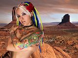
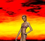
One of my first times making use of a tutorial created image (the firey background). The girl is from a Google search.

One of my first layered images. The girl, the rose, and the desert.
Using Paintnet and Tutorial http://graphicssoft....l/ss/peteye.htm
3-17-11 2nd Layered photo. Thanks to Paint.net and youtube tutorials
3-16-11 1st Layered photo. Thanks to Paint.net and youtube tutorials.
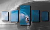
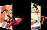
This is more practice with the popout effect using Paint.net and two great tutorials, which I still have to refer to to complete these renderings. http://cybernetnews....es-in-paintnet/ and http://forums.getpai...d-after-images/
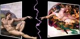
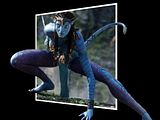
I couldn't get God's finger any closer to Adam's due to the latter's stretched out leg. But I discovered the lightning plugin and thought it would add to this side by side pop-out image.
I tried using an elipse tool instead of the rectangle. I read with Paint.net you should think out of the box. I thought the cut off foot in the original photo was going to be a problem, but it actually makes the illusion work.
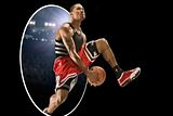
More practice with the pop-out effect. Nothing special here. I'm always amazed at the illusion this effect makes. It really gives the original picture a 3d look.
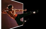
This is a redo of a pop-out picture of Bruce Lee. The previous version had a distorted frame. This one is improved, but it is not yet ready for prime time.
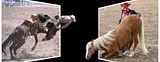
Size matters. Which is why these two pop-up photos don't work seamlessly together. Still, it's my first side by side pop-up picture creation. I'll try it again, of course.
I like the way this one came out. The woman has limbs all over the place, which makes for a great popout image.
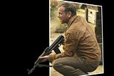
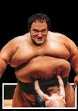
I have no idea why Tarentino had this photo taken, but I think it came out pretty good as a pop-out picture.
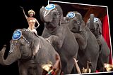
This pop-out picture seems more like a entrance door for the elephant procession, which is not what I was going for. I do like the effect of the two people at the bottome of the picture (One inside the border and one outside the border.) This was serendipitous.
This is my first pop-out picture when I didn't have to refer back to the tutorial. I still need more practice, though.
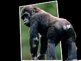
I googled pictures to find one that would be relatively easy to use for practicing the pop-out effect.
This is my first popout. I finally found a tut that I can follow.
This was a YouTube Paint.net tutorial "3D Metal Shape." I used WhichSymbol+ for the first time. I had to refresh my memory about how Paint.net works. This tut was good for that. A couple of new techniques were employed. I like the results.
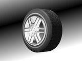
This was from following a long, difficult YouTube PDN tutorial. It is a well-done tut, but has many steps. I'm not sure if my rim fits the tire perfectly. I changed some of the settings in the Shape3d step to make it fit better than it would have if I hadn't. Really impressive that someone knows how to create a tut like this.
"Helio Ignite Sig©®" by Expiration. This tut had a sig that looked very cool, but I couldn't follow the directions well enough to make it look as good as the one in the tut.
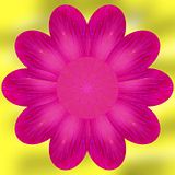
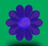
This is a second version of a flower from Yellowman's tut "Making a Flower." After he informed me that I could use a circle to make the flower, I gave it a go. I had to adjust some of the settings, but I think it came out pretty good-and it's round! I still need to get better at using the Liquify effect.
This is from following another great tut by Sargon III (Yellowman) called "3D Paper." It was a YouTube video.
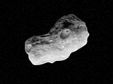
This is from following a YouTube tut "Paint.net Asteroid Tutorial". This is another Yellowman tut, I think.
This follows a Yellowman YouTube tut "Make a Notebook." It was a very difficult tut to get right. It takes several complicated steps to get the coil. I also had trouble with TubeOblique (which curls the paper) because it kept messing up the alignment of the two coil layers. Problem solved when I noticed in the tut that a selection on one of the layers is moved. The drop shadow helps with the realism, esp with the coil. I enjoyed this challenging tut.

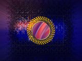
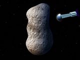
This was from following a two-part YouTube tut by SargonIII called "Asteroid Part-1 The Texture" and "Asteroid Part-2 Shaping the Asteroid."
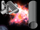
I added the spaceship playing around with shape3d. I plan to add some shapes on the asteroid to help with size.
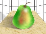
This was from Oma's tut "Pear showing simplified blur painting." It was a well-done tut and I learned from it. I had trouble getting the stem the way I wanted it to look. Also, I think the shadow on the wall is off. Still, I'm happy enough with the image.
Here's another image following a SargonIII tut. I had some problems figuring out how to make the circular holes because this was not explicitly
explained in the tut. I had to go back to another SargonIII tut and modify a couple of the steps. Also, my result ended up being darker than the
final image in the tutorial. And I had some remnant ghosting (which I erased pretty well). It was interesting and fun to practice using Paint.net
effects in new ways. I had done Madjik and Welshblue tutorials making gears a while back (see above). I think those tuts used different techniques (but I forget).
This is from following another SargonIII tut. They're always worth doing. I had trouble lining up the pipes, but I don't think it's that noticable in the image.
-
Gradient shine is when you use a white/transparent gradient on a corner of and object to make it shiny.
You can use motion blur by setting the blur to opposite the direction you want your glass to "fall"
(I haven had much experience with motion blur so i wouldn't know)
I just noticed today your reply. Thanks for the explanation. When I try another one, I'll have to try using a transparent gradient, although I'm not sure exactly where it should be applied.
-
Abstract Art? Sorry, I just discovered that it was Abstract Art you locked. I'm still trying to make sense of how all this works.
-
Thanks Helen. The tut's author, Sargon (aka Yellowman?), had some very interesting steps to produce the flower. And that's what I particularly liked about the tut. I'm trying to learn PDN by doing tuts, but it's been slow-going.
-
Anyway, I'm pretty confused as to how this image posting works here. But what the heck...I think I'll include the original descriptions of PDN images that I wrote and saved on Photobucket.com. I'll leave out images that I already posted in the tutorial section if I can recall. I'm always looking for new, good tutorials to do and learn from. Any recommendations would be welcome. They were getting scarce, so I started doing Photoshop Elements tutorials. I won't post those images here, though.
Ella's tut Glass Text With Filling at forums.getpaint.net. Once I read in one of the posts you could use different backgrounds other than gray, I went a little nuts trying to pick out a background that would bring out the transparency of the text. Unfortunately, the color of the liquid in the text got a little distorted.
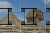
This tut Woven Photo is by Iwonder_who at forums.getpaint.net. I had a hard time weaving this photo, which I found via Google Search. The directions for this tut were very good and the few posts with woven images helped me get this image. The hieroglyphic stone square was also found via Google.
Mr. Bobert's tut Advancedish Planet at forums.getpaint.net. This was a great tut, but it wasn't easy to do. I should've had more land to start.
The Un-Photoshop style sig tut - LJXD Style at getpaint.net. This tut gave me a lot of practice using the line tool in bezier curve mode. I may go back to this tut again and avoid the several mistakes I made with this image.
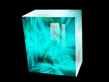
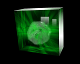
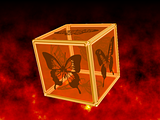
Although the frame of this box is better than the one wth the butterflies, the image is not as good, overall. I think the images on the box need to have more blackness/ opaqueness to them.
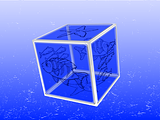
S3D#1:Different image on each sides of a cube.(EASY) #1 by Ash at forums.getpaint.net. I spent many hours on this tut. I couldn't get the transparency to work the way I wanted, I like this result though.
Interface Orbs by Expiration at forums.getpaint.net. This was a very challenging tut. It was very well done so I could get through it after many hours. The background is from another tut which I don't have a record of.
Pyrochild sig tut at getpaint.net. This was a well written tut that was easy to follow. I like the results except for the text reflection in the water. I couldn't get the reflection to look as good as the reflection in the tut.
-
I didn't see the squareness of the flower until you pointed it out. The one in the tut is squarish too. I still like it, though.
-
It's been a few months since I've done any PDN tuts. But I just did a great YouTube PDN tut "
." (The author wasn't listed.) I plan to post to this thread the images I make following other PDN tuts I do. I may go through my older Photobucket PDN images and post them here too if I can figure out how to do it. Although not perfect, I'm glad I was able to follow this tut.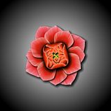
-
I followed your directions about the hue change, but although the results were an improvement, it still was not that good.
Then I followed your directions again, but applied the black Drop Shadow before the white Drop Shadow. I like this result much better. Maybe I just prefer a black shadow over a white one.
I wondered what would happen if I skipped your directions about the hue change but just applied the black Drop Shadow before the white one. Not good. Gray circles around the stones.
Anyway, thanks for the tip about the hue change.
-
I thought my result here might go well with LJXD tut result, since both have a plasticy look to me. I'm not sure they work together, but here it is.

-
Don't slide x/y in the Drop shadow to much, apply it in a small amount and repeat it.
Try it, and if it doesn't work with you, then there is some other solutions to work around,
I changed the x/y values in the Drop Shadow Menu to one, and I still see the white border around the stones. They remain after I apply the Drop Shadow again in Black. I also tried increasing the Magic Wand Tolerence before deleting in the previous steps. That didn't work either
-
Once I read in one of the posts that the gray background could be changed, I went a little overboard to bring out the transparency of the text. The liquid in the text got a little distorted. I enjoyed doing yhis tut, though, and I plan to make the transparent box using your method soon.
-
I really liked this tut. I had some trouble at the outset using the Magic Wand until I made an extra white land layer to go back to. I should have had more land to start with. I'll try the outline plugin again and see if I can get it to work with the Magic Wand. I still like the results and enjoyed the mental exercise.
Thanks for this tut. -
This tut gave me a lot of practice using the line tool in bezier curve mode. I was happy to get through the tut even though I made a few mistakes.
Thanks for the tut. -
I enjoyed doing this tutorial. The directions were clear so even a beginner like me could follow along (albeit not easily). I also like the results.
Thanks for posting this tut. -
You can use the "gradient shine" technique to add some reflection to it
Just make sure you have a direction for the source of light.
EDIT:
You can also add a bit of motion blur to make it look like it's falling
And i have another tutorial comming up too

By "gradient shine" do you mean Gradient Mapping or something else? In either case, can you give me further explanation on how to use the technique? Same with Motion Blur. Thanks.
-
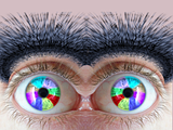
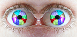
I just did JaffaCoder's tut Colored Eye. I thought the eyes needed brows. Your tut supplied the hair I needed.
 Thanks for the tut.
 -
I thought I followed your tut carefully, but I keep getting a white ring around each stone. I tried to adjust the settings for drop shadow, but it didn't work. Any ideas?

I changed the x/y values in the Drop Menu to one, and I still see the white border around the stones. They remain after I apply the Drop Shadow again in Black. I also tried increasing the Magic Wand Tolerence before deleting in the previous steps. That didn't work either.
-
This was a great way for me to practice using the Magic Wand. You should change the spelling of "insert" to "invert" in step two. Newbies like me might waste time looking for the "insert" tool.

 Thanks for the tut!
 -
I played around with your background and got this. A little different but I kinda like it. I have to figure out how I can use it, though.


Applying Effects to Multiple Files
in Paint.NET Discussion and Questions
Posted · Edited by Bob11
I'm making the video in Blender. I'm a beginner, but following the tutorial, my output is: xvid, format AVI, Codec Mpeg-4 (divx) and MP3 for something or other. Those are the settings I wrote down, which worked the last time I animated the pngs (and are a little different than shown in the tutorial). As explained in the tutorial, sometimes the settings will work and later the same settings will not work.
A couple of noise reducer filters in Photoshop Elements worked on one image, but PSE can't apply filters to multiple images. I'll download InfanView since I read on the home page it supports PS filters. That would be great! Thanks for the information. I really appreciate it.
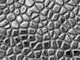
This is before PSE noise filter:
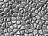
This after PSE median noise filter: