


PaintNetRus
-
Posts
27 -
Joined
-
Last visited
PaintNetRus's Achievements
")


-
It looks like you drew a stroke on your image. In general, this visually distorts the image. And it is not necessary to remove the stroke completely, just make it less visible, as is done in the Light modes.
-
Yes, it is too bright, especially in dark images. In other modes, it almost does not distract.
-
This "white outline" makes it very difficult to work with the image. The canvas should be without an outline.

-
Problem. Shape type: Rounded rectangle
PaintNetRus replied to PaintNetRus's topic in Troubleshooting & Bug Reports
I just wanted to create a button like that and I chose a simple way to do it, as it seemed to me - Shape type: Rounded rectangle but the final result was not as I expected, and I decided to report it. Similar problem with - Shape type: Ellipse but most likely it should be so

-
I wanted to create Rounded rectangle. But the result surprised me. It looks very bad. Angles are curves. tested on Paint.Net 4.1.2, 4.1.6, and alpha 4.1.7 Select Shapes tool and set: - Shape type: Rounded rectangle - Brush width: 1 - Corner size: 1 - Antialiasing Disabled and create a shape on canvas Problem - only two corners will be rounded then increase Corner Size - 2 Problem - corners look very bad, they are all different and increase Corner size a little more - 6 look at this However, the corners are displayed correctly if Antialiasing is Enabled. look at gif but even when using Antialiasing, the corners are not 100% identical, you can make sure to compare the color at the smoothing points compare points at top and bottom


-
I did not find a discussion about Dark Theme, so i create this topic. Dark Theme has a problem. Elements - icons, text, windows forms - too light, too contrasting - first example if make a dark theme a little lighter, then the elements will be less distracting compare these images pdn_dark_theme_original.png and pdn_dark_theme_lighter.png on the ..lighter.png screenshot, the interface is perceived a little better - second example it would be better if all the window elements were dark loot these image dark_theme_pdn.png even in this example it is necessary that the text and icons are less light. I understand that pdn uses windows forms. I hope in the future there will be a solution for this. and I know about the contrast theme in windows, but this does not solve the problem with light elements.


-
1. File - New 2. use Ctrl+B to turn on overscroll 3. Select 'Text Tool' and click on working area 4. then just hold down the any key - type text - the working area will move to the left (problem one) - then repeat step 3 and 4 - the work area starts jumping at the time of typing (problem two) Video for example, in Photoshop the working area in this case does not shift.
-
Trouble. Dithering\Antialiasing in Gradient tool.
PaintNetRus replied to PaintNetRus's topic in Troubleshooting & Bug Reports
Yes. I previously reported this issue. Thanks. Problem if antialiasing is enabled... -
Trouble. Dithering\Antialiasing in Gradient tool.
PaintNetRus replied to PaintNetRus's topic in Troubleshooting & Bug Reports
Video Dithering Problem.zip -
Trouble. Dithering\Antialiasing in Gradient tool.
PaintNetRus replied to PaintNetRus's topic in Troubleshooting & Bug Reports
yes, it problem.. for Photoshop in this case, little bit pixelated is missing screenshot
-
Trouble. Dithering\Antialiasing in Gradient tool.
PaintNetRus replied to PaintNetRus's topic in Troubleshooting & Bug Reports
no.. screenshot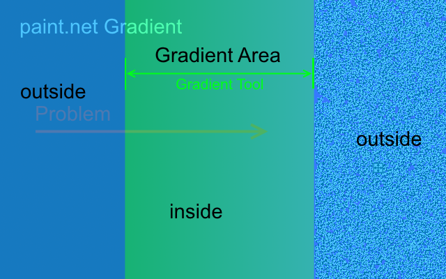
-
Trouble. Dithering\Antialiasing in Gradient tool.
PaintNetRus replied to PaintNetRus's topic in Troubleshooting & Bug Reports
A real use case - Make Rectangle - Use Gradient Tool - Enable Transparency Mode for Gradient Tool (set Black and White colors) - Make the rectangle part transparent then - Use Magic Wand tool - Set Tolerance 0% for Magic Wand tool - And select an area outside the Rectangle so You see that the part of the rectangle is not completely transparent Expected Result, that the transparent part will be completely transparent, and with Magic Wand Tool you can select the actual visible part of the rectangle.
-
Trouble. Dithering\Antialiasing in Gradient tool.
PaintNetRus replied to PaintNetRus's topic in Troubleshooting & Bug Reports
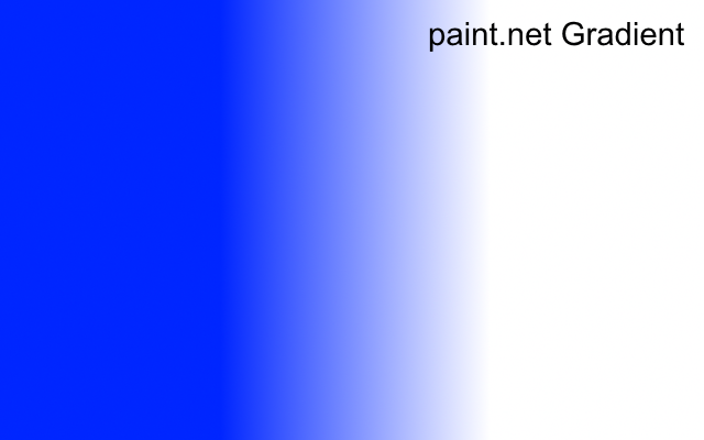
Gradients created in other Graphic editors, for comparison with paint.net You see, GIMP and Photoshop use anti-aliasing, they do not have this problem


-
- Create new layer - Use Gradient tool - Enable Antialiasing for Gradient tool - Make a Gradient in center of layer then - Use Magic Wand tool - Set Tolerance 0% for Magic Wand tool - And select an area outside the gradient so You see that Dithering for Gradient tool in Paint.net is broken Anti-aliasing is applied to the entire layer, this is incorrect Anti-aliasing should only be applied in the gradient area, and should not extend beyond its area Look attached files

-
paint.net 4.0.3 is now available
PaintNetRus replied to Rick Brewster's topic in Paint.NET Discussion and Questions
Hello. I found a small problem when working with canvas. So: 1. Select tool "Rectangle Select" 2. Select an area. 3. Remove the selected area (use "Del" or "Ctrl+X") 4. Select tool "Rectangle Select" 5. Select another area. 6. Select tool "Move Selected Pixels" and move the selection. 6.1 Obtain an image of: Image >><< 7. Select tool "Color Picker" 8. View color in transparent areas. 9. In the first area of the color will be - 000000 ("Opacity - Alpha" = 0) In the second area of the color will be - FFFFFF ("Opacity - Alpha" = 0) ___ And yet, for example, I want to create a gradient "from transparent to white": It turns out that "Opacity - Alpha" in the red zone is not "0". There is noise with "Opacity - Alpha" = 1. And in the blue zone "Opacity - Alpha" in the red zone is not "255". There is noise with "Opacity - Alpha" = 254. The resulting image: Image >>>>><<<<< How do I make the gradient (with the option "Antialiasing Enable") to red and blue zone was not noise (with different "Opacity - Alpha")?


