


gekkoutora23
-
Posts
18 -
Joined
-
Last visited
Posts posted by gekkoutora23
-
-
I was kinda going for the dark approach, but i see what you mean. I noticed that with it at 500 x 160 its hard to see. Is this any better?

-
Here's my take on it.

-
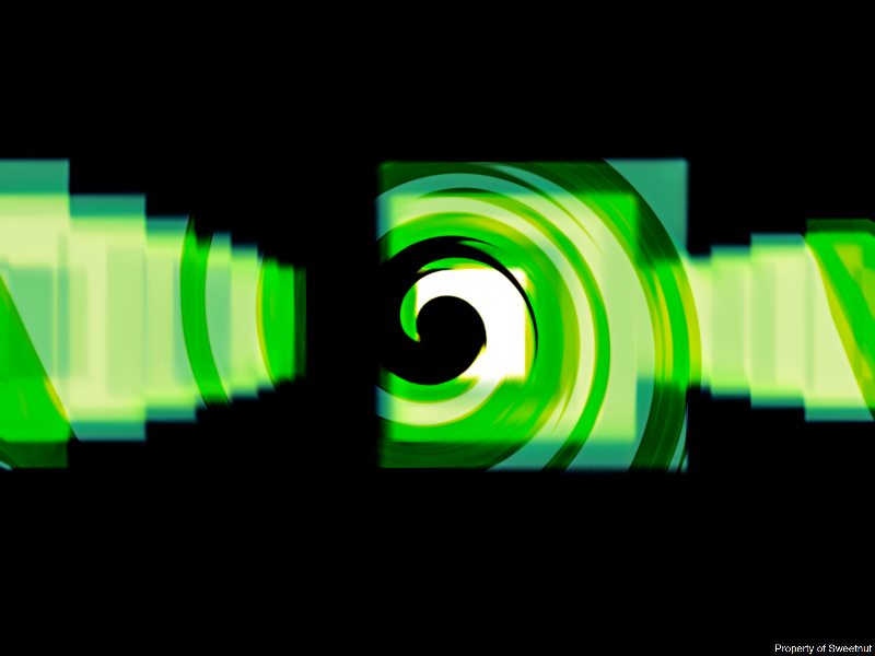
twisted green blocks

Could you please make a tutorial for you picture because it is really nice looking.
-
nice. thanks for the tutorial. I really appreciate it.
-
Could you make a tutorial for the 4th signature? because that is really cool looking and i would like to learn to make it.
-
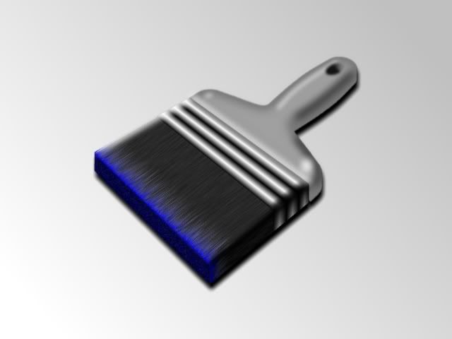
Here is my first brush. Hope you like it.
-
All your images aren't showing up. please go in and fix that.
-
I think the outcome works very well. I have always loved the tile effect. Yours is great!
The idea of course is to remove the rest of image that you started with but your idea works very well too. Goonfella did a different take on it too.
I know but the idea just popped into my head when i was going thru the tutorial. i have took several of my wallpapers and put the effect to it. if you want i can post them.
-
you need to put the image back up there.
-
Very nice... the tile effect on the columns works a treat!
Thank you. Just experimenting with the different effects with paint.net.
-
Good tutorial. Here is my take. I would love your comments and constructive criticism. I am somewhat new to paint.net.

-
Pictures would be very helpful.
-
Um this forum is for Tutorials only. I am just letting you know before the administrator does. There is a forum for questions. Next time post there instead of here.
-
Hello. I saw some of you guys' brushes and wanted to make one. I don't know what I want to do with it though.
Hey your links don't work.
-
This is what I got. Great tutorial. Thanks.

-
-
I have plug ins that i used with a previous version of paint.net. How do i use them with a newer version of paint.net?


Schnicka's Signature Tutorial (Image Heavy)
in Tutorial Graveyard
Posted
And i think i know what you did different with you tut and your sig. maybe instead of using a black background use a light gray and dark gray splatter.