


Aislin
-
Posts
616 -
Joined
-
Last visited
-
Days Won
7
Posts posted by Aislin
-
-
a good start on the tower I must say, but, it does look a bit flat...
have you ever seen the rules or some theory about 3d drawing? the ball on top is good of course, but the underneath must look a bit more round as well...maybe use the 3d object plugin for it? try to make it a bit more round on the sides, it will be okey then

-
BBQ as long as you can see what kind of vehicle it is, it is okey
Now I see there are a couple people who want to join, I'll set the dat to: 1 Sept 2012
-
Example for the Digital Art Vehicle competition.
It really isn't my best, since I have alway's done portraits + I usually take like 24 hours time for one image, this one took me "just" 6 hours.

-
Avi, I would say it actually is possible, IF you know what you're doing and HOW you are doing it... so, in order to prove it, it will be one of my future PDN projects
-
Hi everyone,
I would like to try an other realistic art competition, if there are enough participants.
For this one I thought about painting vehicles, since there are more guys here and it is more populair than portraits. The rules are very easy, you can use the following effects/tools:
All of the blurs
selection tools
erase tools
line tools
gradient tool
custom mini brushes
smudge
all of the colors
2 other effects of your choice ( you will have to tell which ones been used and how)
You may use a reference photo, just add it here together with your finished picture.
It doesn't matter what vehicle, a train, airplane, bike, car... or maybe a new invented vehicle? Use your imagination, but remember, it must be a realistic digital painting and not a photo editing!
Some useable links:
http://forums.getpai...ainting-a-hand/ Painting tut
http://forums.getpai...gital-painting/ Painting tut
http://forums.getpai...toshop-brushes/ Adding photoshop brushes
http://forums.getpai...rushesmini-v19/ how to use custom brushes
EDIT: Date is set to 1 Sept 2012
EDIT: example (made in 6 hours, really not my best, the extra effect that I used was of course the stars) The reference Photo:

-
or, what I have done, but it on an extended hard drive, you can take to school... lol (I'm not sure that will work)
-
also, I use the line tool very much in my digital paintings, it really depends on how you use it, in some way's they really don't look jaggy, I think that is also a matter of the size of the image... if you create a line on the basic canvas it would look more jaggy than if you creat the same size line on a bigger canvas. It is one of the reasons I only paint on canvas bigger than 800x800 lol
If you make white buildings it might be good to make 2 lines on the outside, one a lil darker that the air behind it as the most outer line, and the other line white or a diff light color. I do that in all of my paintings, it creates a better look in my opinion...
You can see a bit of that in my tut: http://forums.getpaint.net/index.php?/topic/22939-painting-a-hand/
-
thanks for all of those nice comments
I actually started with 2 other pictures, one of Tomy and one of Zhang Ziyi, but they will have to wait since I have won 2 tourtickets of Poets of the Fall their German tour and huge fan as I am, I will go to all 6 concerts, of course + I will make one special artwork for them
-
Love the dog
especially his hair and his eyes -
Thank you, Aislin. However, I didn't use the ink sketch effect. I drew the picture by hand, then scanned it into my computer and colored it in Paint.NET. The inking was painstaking, especially because I drew it on newsprint, which is not ideal for ink drawings. Anyhow, I'm glad you liked it. Thanks for stopping by.
oops, it honestly does look like you used the inksketch effect, than it's even better than I thought!
-
Hi Dug
well of your 3 new ones, I really like 2 of them
the one with the woman and your self-sculpture, they are rich of colors and very well done. I just would like to say 2 things about them...the one with the woman, the part where they are attached to each other... if you add a lil texture as is, very light very tiny white dots or skincolor dots or even a bit of grain or noise, the skin would look a bit more realistic as if it's their own and not painted/smudged. Maybe it's what you did on purpose, then, I haven't said anything
Your self-suclpure, it looks INCREDIBLE, but, when I look on top of the hair, It looks kind of 'cut out from a picture', maybe you could solve this with a tiny soft smudge? or if you've one, some kind of ' adobe dots pensil' in the smudge effect. somehwere on this site (forgot where) you can find how to add them...
As I said, those two are almost masterpieces to me
and I am glad to see how you have improved since I was gone -
your last one is amazing! I love the shapes and the colors
I know what you mean with a bad computer... I have a 4 year old ACER ASPIRE ONE (notebook) with a bad Hanns.G monitor attached... and I must say, these notbooks are not created to photoshop... But still, with a lot of patience I manage to do larger images...
-
Auditor is a great image
the smokesare good and the background is wonderful -
amzingly done
-
your robocop is amazing! love the way you used the inksketch effect
-
thanks
I actually painted those twoo very smooth, you know, as in my other works... But I wanted to make them a bit more realistic, so I did a bit of smudging, I did a bit of custom mini brushes (I have like, 50 skin pensils from Adobe Photoshop) at last I added grain and added noise... voila!Me myself and I, are most proud of Taylor Lautner, because of the intense and realistic look
I will make some time today to go look through your galleria's
EDIT, but I see I missed some cleaning up next to the face and shoulder, I have a bad computerscreen... have to look from each side of it to see if I missed something... lol
-
An other new work... This time I made a lot of use of custom mini brushes and smudge, creating a 'painted' look, it was a lot of fun
Reference photo: http://images4.fanpo...722-499-649.jpg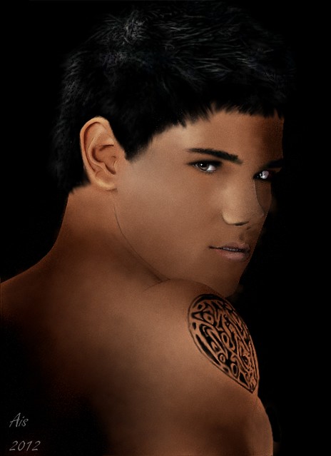
also Updated Tomy his picture, better than the B&W version?
-
thanks helen and bbq, I'm fine... I have such little time these day's, so I rather spend the time I have on creating than on watching the forum a lot... sorry, but I guess you'll understand?
how are you?
-
So here it is, the finished digital painted portait of Tomy!!

-
I actually never used it... only use layers, and sometimes I set my layers to reflect or overlay.... lol
-
incredible written tut, I finally learned something about the alpha mask! lol, maybe it would make my portraits a lil more easy to do ;-)
-
maybe a tutorial about realistic smudged hair? I'm not pretty good at that yet, lol, and also not very good with smudge, so I would love to see a tut of that ;-)
-
Welsh, above your reach? I don't think so... your work is so impressive, I couldn't do that! and thanks everyone ;-)
-
I can only agree with those who responded before me, impressive, would you like to create a tutorial of one of these things? I think I may speak for the others, that we would love to see how you created them
Aislin's Gallery (Update 30-12-12)
in The Pictorium
Posted
thanks but I just don't like the front... lol
Anyway, I am starting with a huge project, a band poster (intirely painted). I have made a collage from roughly cut out pictures first, to see what composition I would like and came up with this:
just remember, this is not painted yet, but I am going to, and since it has got 6 faces, it would take me a while to finish... giggles
What I would like to know is what YOU think about this composition (since I am actually making it for the band)