


Xander_Lyon
-
Posts
76 -
Joined
-
Last visited
Posts posted by Xander_Lyon
-
-
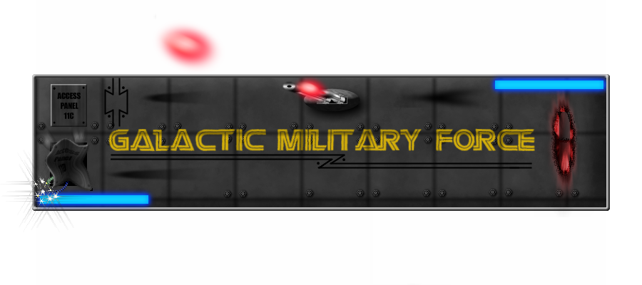
@ Xander_Lyon, Much improved. I like the wires sparking in the lower right corner. The laser blasts look good as well except the one suspended above the main image. It looks a little out of place. I also like the idea of the panel smashed in. If you want, try this tut and it might be useful in giving the smashed panel a more realistic look by adding some wrinkles to the metal. viewtopic.php?f=35&t=27775&hilit=waving+flag Try looking through the text tuts, I know there is one in there that will help with the painted on look you are trying to get.
You're right about that other laser blast. I was trying to suggest different weapon types were hitting the hull. Instead, that blast just looks like a shadow, so I thought I could turn it into the shadow of whatever's attacking . . . but a better burn would likely make more sense.
 It's funny you showed me that flag tutorial. That's exactly what I used to give the panel a smashed in look. I'm not sure how to tweak it further to give a better busted in look. The key to the displacement map seems to be how much you blur the black and white parts on top of the greyscale map. Is that what you used on your curtains? I didn't think you could be that detailed and get such a subtle effect.
 -
@ Xander_Lyon, Much improved. I like the wires sparking in the lower right corner. The laser blasts look good as well except the one suspended above the main image. It looks a little out of place. I also like the idea of the panel smashed in. If you want, try this tut and it might be useful in giving the smashed panel a more realistic look by adding some wrinkles to the metal. viewtopic.php?f=35&t=27775&hilit=waving+flag Try looking through the text tuts, I know there is one in there that will help with the painted on look you are trying to get.
You're right about that other laser blast. I was trying to suggest different weapon types were hitting the hull. Instead, that blast just looks like a shadow, so I thought I could turn it into the shadow of whatever's attacking . . . but a better burn would likely make more sense.
It's funny you showed me that flag tutorial. That's exactly what I used to give the panel a smashed in look. I'm not sure how to tweak it further to give a better busted in look. The key to the displacement map seems to be how much you blur the black and white parts on top of the greyscale map. Is that what you used on your curtains? I didn't think you could be that detailed and get such a subtle effect. -
@Possum - Wooow, man, excellent work. Even the darkening of the sky and highlighting of the moon helped a lot. Your vases in the back look like Oblivion or Dark Messiah items. Your left red spider is actually touching the crystal ball now with all the juicy reflections therein. I think my only critique is a little nitpicky. The lines on your backwall that now give it perspective don't seem to match the angle of the floor or anything else. Of course your curtain wrinkles still blow me away.
-
Sharpen the text and do something else with the black lines under it so they look like a part of the design. Try to make its corners pointy (just below the T in MILITARY), right now they're kind of round.
[Edit] What letters does this logo represent? Are they obvious enough?
I may take that text back to its original look and maybe just up the transparency a touch. I could never get it to look very "painted on" to such a uniform background without losing some integrity. I may recolor those lines, too. It seems like every time I'd add something new to the picture, original design elements became nearly unnoticeable or pointless.
Oh, and I think your logo's letters are obvious enough but I'll follow LFC's example and not declare what I think they are.
-
@Starsai - for some reason I can't see your sig anymore, otherwise I'd comment on it. :? I remember it being a Bleach (I think) sig with the main chick on the left in color and the group in b&w on the right with some fancy coloring in the background filling the space. I can appreciate Blooper's suggestion about maintaining a central focus, but I liked how the 2 groups kinda bookended your sig. If I could see the thing I could be a little more accurate, sorry :?
@Possum - Well, you can see below I added some things to the header I first posted here. I did mess with the yellow name a bit but with everything else there I think the effect is hard to notice.
-
@ Xander_Lyon Very nice job on the flag. It is improved. I know what you mean about planning. You'll get there. Sometimes I make parts of the image outside of the main image so if I need to I can go back to that individual piece and make changes and then put it back into the main image. Also,on larger works, I will save a backup of the image at certain phases so I can go back in time to an earlier phase of the image. Use as many layers as it takes, especially in the more complicated pieces, just remember to name the layers.
 One final thing that I have learned to do is to flatten the image, copy and past to a new image and then undo the flatten and save the original image in it's final stage. I save the .pdn files in a separate folder from the final .png.
I've been following at least one of your steps, as far as saving a .pdn file alongside the final .png. Part of the purpose of this forum (most of it for me) seems to be displaying, getting the critique, then fixing it again. I think I will soon have to start saving layers in different pictures in both forms so I can go back to earlier work out of order. I'm sure everyone wishes each layer had its own history so you wouldn't have to erase recent work to find older bits.
But, that's why you save individual layers separately, right? Oh, YOU, sir, are the reason I planted my flag on the hull of a ship out in space, by the way. I was all proud of my little flag with the shapely knob on top and all and was about to post when I saw your recent grand piece. That's good, though, feeling that pressure to step it up. This is my first piece with an actual background other than just some gradients. (And I had an idea if you still haven't found a fix for your spider shadow-on-the-wall from the first spider-bot picture you submitted. Set the spider's shadow so that it moves past the wall, so to speak. Then, select the part of the shadow that crosses on to the wall and oblique it the opposite direction of the initial shadow until it's parallel to the wall . . . but looking back at your original picture, the problem was that the shadow didn't connect to the spider. So I came up with a solution to a problem that didn't exist. Oh well. )Finally, since I didn't say it before, thanks to Wither for the "polished spacescape" tutorial (which introduced me to his feathered brushes technique) and to BleekII and Drew for the flowing flag technique.
-
@ Xander_Lyon Very nice job on the flag. It is improved. I know what you mean about planning. You'll get there. Sometimes I make parts of the image outside of the main image so if I need to I can go back to that individual piece and make changes and then put it back into the main image. Also,on larger works, I will save a backup of the image at certain phases so I can go back in time to an earlier phase of the image. Use as many layers as it takes, especially in the more complicated pieces, just remember to name the layers. One final thing that I have learned to do is to flatten the image, copy and past to a new image and then undo the flatten and save the original image in it's final stage. I save the .pdn files in a separate folder from the final .png.
I've been following at least one of your steps, as far as saving a .pdn file alongside the final .png. Part of the purpose of this forum (most of it for me) seems to be displaying, getting the critique, then fixing it again. I think I will soon have to start saving layers in different pictures in both forms so I can go back to earlier work out of order. I'm sure everyone wishes each layer had its own history so you wouldn't have to erase recent work to find older bits.
But, that's why you save individual layers separately, right? Oh, YOU, sir, are the reason I planted my flag on the hull of a ship out in space, by the way. I was all proud of my little flag with the shapely knob on top and all and was about to post when I saw your recent grand piece. That's good, though, feeling that pressure to step it up. This is my first piece with an actual background other than just some gradients. (And I had an idea if you still haven't found a fix for your spider shadow-on-the-wall from the first spider-bot picture you submitted. Set the spider's shadow so that it moves past the wall, so to speak. Then, select the part of the shadow that crosses on to the wall and oblique it the opposite direction of the initial shadow until it's parallel to the wall . . . but looking back at your original picture, the problem was that the shadow didn't connect to the spider. So I came up with a solution to a problem that didn't exist. Oh well. )Finally, since I didn't say it before, thanks to Wither for the "polished spacescape" tutorial (which introduced me to his feathered brushes technique) and to BleekII and Drew for the flowing flag technique.
-
Right side of the flag looks a little stiff, don't you think? A little distort would fix it right up.
Also the clouds behind the flag, can clearly see a black border between the yellow and blue clouds.
Do be afraid to blend them together, many things don't line up in nature.
You're right about the flag, Ash. I wasn't happy with that right side but I had saved it in such a way that I'd have to recreate the flag before applying a changed displacement map to fix up that edge. But, a little twist and a little power stretch helped a bit. (I feel like I'm playing chess in thinking several moves ahead of how to save a project so that it can be altered again.) I also added some more blue cloud to take care of that rather obvious dividing line between blue and yellow.
http://i126.photobucket.com/albums/p109 ... roject.png
@Possum - I'm looking forward to seeing what you can do with Ash's comments/suggestions. With some of the veteran artists here, I feel like we're in a master's class.
-
I'm finally back with a new, decent picture, but first, the props . . .
@Welshblue - The image reminds me of something out of FarCry with the guns and crates and beach scene.
It's funny how the little details impress the most. I could picture putting together the crates but the little moldy part on the bottom was slick. Definitely a nice, noteworthy touch . . . you know, other than the guns and the dolphins and the water effects.@EscapistAngel - We seem to have a nice subgroup of artists here who are striving to create better and better blood effects.
Yours are excellent along with the blade and the gliph on the blade was a nice touch as well. @Goonfella - I'm preparing to counter your guitars with my own.
 I started working on one and soon enough saw you had a pair posted. Grr, still, excellent post. My only critique would be on the dimensions of the guitars themselves. The soundholes seem a little large for the size of the guitar and the sides of the body that push inward too much, or if not too much then too high. Otherwise, the other parts look great as well as the music background.
@Possum - Clearly, I'm too slow on the draw here. I start a guitar and Goonfella makes 2. I make a flag and you've got two impressive curtains in your Arabian Nights scene. I was reminded of the story of the woman in the "1001 Arabian Nights" who was forced to continually come up with new stories. I imagined she thought of this when she was nearly out of ideas. "I know! Robot spiders!"
I do like the darker version since it fits with the twilight setting. However, I'd love to see a light source, like a torch inside the room throwing some light around. My only other critique is on the spiders themselves. I think you could stand to drop one of the red spiders because it stands out that they're the same. I'd say either drop one, or if you can, adjust even one or two legs of say, the closest spider so it looks different. Oh, the marble effect on the floor and fountain were spectacular. Polished and beautiful.Okay, so here's mine in honor of our club's foray into the online RPG today:
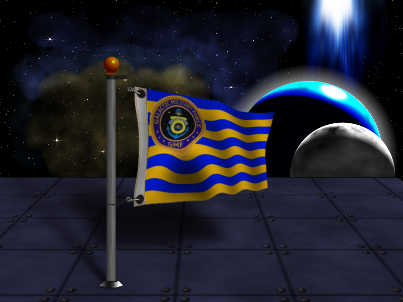
I may have to add another light source so the direction of the shadow behind the flag makes sense.
 One final thing that I have learned to do is to flatten the image, copy and past to a new image and then undo the flatten and save the original image in it's final stage. I save the .pdn files in a separate folder from the final .png.
Image Umbrella: Signatures, Avatars, Logos & Text
in The Pictorium
Posted
You're right about that other laser blast. I was trying to suggest different weapon types were hitting the hull. Instead, that blast just looks like a shadow, so I thought I could turn it into the shadow of whatever's attacking . . . but a better burn would likely make more sense. It's funny you showed me that flag tutorial. That's exactly what I used to give the panel a smashed in look. I'm not sure how to tweak it further to give a better busted in look. The key to the displacement map seems to be how much you blur the black and white parts on top of the greyscale map. Is that what you used on your curtains? I didn't think you could be that detailed and get such a subtle effect.