


RedJiggly
-
Posts
18 -
Joined
-
Last visited
Content Type
Events
Profiles
Forums
Blogs
Gallery
Downloads
Posts posted by RedJiggly
-
-
Oh yes, I love the sepia ones.
I think that effect works better with the squares than with circles. (looks better to me anyway.)
Although I'm not a huge fan of vertical sigs, I think those ones wouldn't look as good if they were done horizontally.
I think you're right. Thank you
 .
.New work, my outcome from the Transformersigtutorial(I don't remember the actual name...)

-
Nice tut, my outcome:
-
I've been drawing seriously with PDN since March of 2009. In an effort to keep myself accountable and pushing forward, here's an ongoing collection of my progress with paintdotnet.
All comments are welcome - even negative ones. Constructive criticism is even more welcome! I'm posting here to improve.
Day 1 - I salute alpha displacement:
Obviously, I also learned to salute water reflection, mandelbrot fractals, and just about everything else I could toss onto this monstrous thing.
Week 1 - bearing the moon:
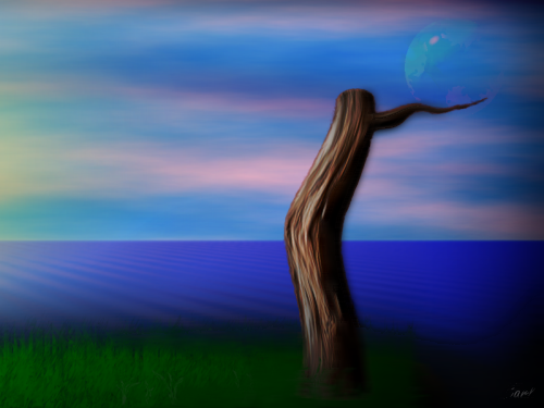
This was created following Ash's wood stems tutorial. Since I had the wood stem, I had to pack stuff around it...
Week 2 - Fried Eggs:
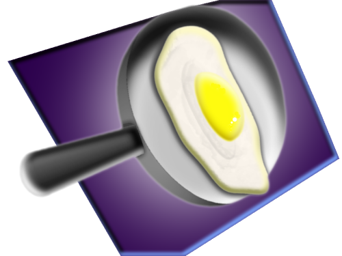
I learned how to use shape3d, Rotate, and Bevel. It's easiest for me if try to create something realistic. It seems to really help me to fully anticipate how an effect will render.
Week 3 - Waterfall:
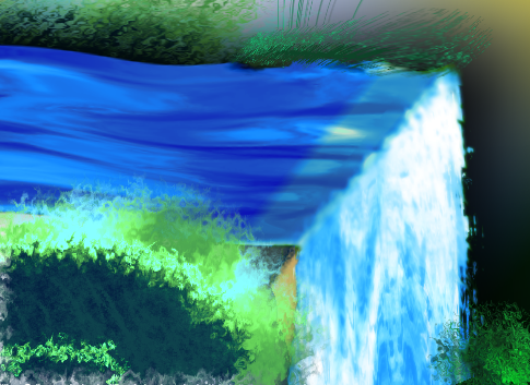
Using Dents and Jitter to simulate acrylic painting.
Week 3 - Feather:
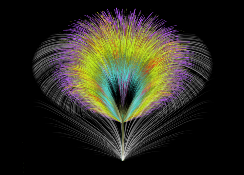
Making use of gradient bars, jitter, and inside-out.
Thanks for stopping by!
Well... I can see improvement 8) .
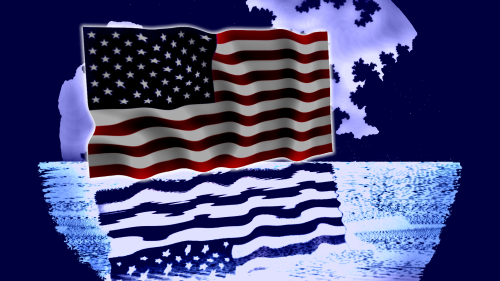
Day1: I don't think fractals and the stripes and stars fit together

Day2: This one is really nice, the grass, the wather and the moon are looking really awesome.
Week2: THe egg really looks realistic. THe background is not so good... I think the flat pieces on the up and down side of the border don't fit with the rest of the image. The purple color also. But overall, it looks nice 8)
Week3: The waterfall is flat, (you can see in the middle-down that the river isn't deeper than an milimeter) but the effect is nice, it looks pretty realistic, the bushes look great... Very good
Week4: It looks very great. I would have used some other colours(rainbow
 ) I think, but it looks great, and I have nothing to add furthermore.
Keep up the work :wink:
-
I found out some weird effect by using xor. Never tought Xor would make an nice picture someday
.
-


I got bored...
They really look nice
 . Well... exept the red one. I wouldnt want my desktop to be so white .
I really want to know how you made these.
-
I like the blooper sig :3
Thank you
.I made an new sig, featuring a Goomba
. It's not as good as the Bloopersig, whatsoever.
Please rate my sepia sigs, nobody did so far :o .
EDIT: btw, the complete back is made from this
:
-
A wallpaper I have made, thought it was kind of cool.

Also, that palm tree picture is amazing.
Wow, I really like it
. It looks a bit like the basic vista wallpaper, but then flashier, and I like the pixelthiny's =D. -

My second Sepia Sig.
-
I liked the effect so much, that I was going to make something like it again
 .
.So...


I know it is an bit :AntiAliasingOff: , but that comes from the blending mode/circles, I think...
 .
. -
I've improved myself a lot .
I made this for a guild:

and this one for a friend:

Well... It definitly looks like fire
. But: why you used green in the second one? :o, and the smoke in the first one has an bit too high opacity I think...But they defenitly look great
. You smudged this, am I right? -
Well... It's great. I wonder how you made itHey So this is a signature I made for a friend (Her nickname is on it).
I made this a while ago, but so far it's my best one yet.
Tell me what you think.
Thanks.
~Kack
. However, the water-reflection looks... unnatural, the waves are too small and choppy, and the sig has no border. But I like it 
-
Great tut
. I always wanted to know how to make these things. -

Hmm... not much to say about it, it's nice
(from the vector wallpapertutorial? :wink: )
This one is also good, but a bit of difference between the opacity of the lines in the middle would been great I think.
-
Very nice, colorful too.Blooper sig, (you know, the Squid like thing from Mario? )

This, I like the sig. But I hate those squid.
You're very good at colorful images, so how about trying to do a few with very little color. (Maybe sepia tone...)
Good idea, so I made something new. It's just an little experiment, but this is something in sepia:

Well.. actually, this is the real thing, before I used ctrl+shift+E

And I found out I could use some other nice colours to fill in, so

-
I can see an rising line, you are really becoming better. The older works are bad, the newer works are better, and the newest... are just really nice
.A few tips:
Think with the flow of the render.(so create an back wich has the same motion)
Also, text doesn't need to be horizontal, you can always use rotate/zoom to make the text also go an bit with the motion.
Just try some new stuff, and keep up the good work. :wink:
-
Hello evryone, I'm new to this forum, but I have used Paint.NET for a while now (a year I think), and posting my art on another forum(yeah, it's an Pokemonforum :o ), and I thought it would be a good time to finally become a member of this community, rather than only reading tutorials and stuff.
So, my work. I won't post my very old, ugly work,(because its just... ugly :o ) but this are one of my works made before:
Inspired by the Hexagonal Grid PowerPlant tutorial, Make some abstract with PDN and the Polished Spacescape tutorial, all thechniques I use much:
Polar Inversion Thechnique:

Hexagonwallplanetwallpaper

Christmas Snowflake-like sig

An banner for an pokemon radio website(Combee combination :o )

Wisdom sig

Blooper sig, (you know, the Squid like thing from Mario?
)Cool Big-art the hexagonplanet thingy no 2:

Wich I used to make my current Ava and sig from:


This is not all of my work, but just the good/newer part.(You don't need to rate anything older than the wisdom sig, the works before that are made a long time ago I think...
Anyhow, I'm glad to hear from you what you think that could be improved.
-
I've tried this tut, and I'm not going to upload my original outcome, because it almostly looks the same like the one in the tut itself
.I've been using the effect very frequently, and a few of this works:
Hexagonwallplanetwallpaper
Christmas Snowflake-like sig
An banner for an pokemon radio website(Combee combination :o )
Cool Big-art the hexagonplanet thingy no 2:
Wich I used to make my current Ava and sig from:
Note: this is my first post here, this works were earlier uploaded at another forum. But I was using the tuts from here :wink: .
 ) I think, but it looks great, and I have nothing to add furthermore.


 .
.
RedJiggly's work
in The Pictorium
Posted
Oh, and this I made a while ago, using Xor and Gradients.