


LumièreDuSoleil
-
Posts
55 -
Joined
-
Last visited
Posts posted by LumièreDuSoleil
-
-
With Ink 0.47, draw a small circle and convert it to a path. Grab the rightmost point and drag it further right into a teardrop shape. Select it, and hit Ctrl-C. This will be your "brush". Now either set your pen's patten to "From Clipboard" in the drop-down box at the top and start drawing or pick a preexisting path and add a "Pattern Along Path" path effect and hit the clipboard paste button. Then start experimenting with other brush shapes and effects.
-
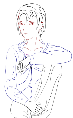
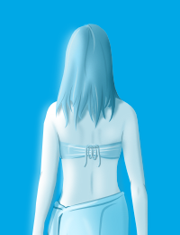
So now I'm trying to draw the entire character behind the eye . . . kinda. Her name is Rain (level 4 hairstyle metaphor, btw), and she has a whole long backstory. Shading and detailing will come tomorrow. Any critique while it's still relatively easy to edit?
-
Hmm, I like Kemaru's. Depth of field + desaturation are tasty, although the red should have been restricted to the ball.
-
-
Thanks folks.
That's awesome. Illustrator + PDN? My favorite is the top one, but if you think the shading will get in the way, I would use the 4th one on original post.Inkscape 0.47, the PDN of vector graphics.
-
Great! I made a few subtle changes. Look closely and see if you can spot them.

-
So I wanted a new personal, multipurpose logo. I had a vision of an eye:
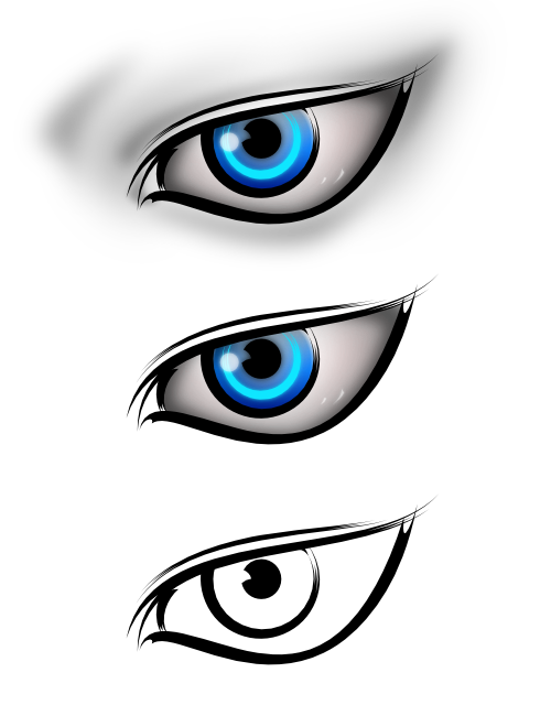


You can see that the skin-shading on the top version, although freaking gorgeous, might get in the way. The bottom is, in my opinion, interesting in its own way but a little to simple. The center scales well (the 4th center is about 16x16) but the shaded eye clashes with the flatness around it. One other option is too remove the farthest right and left sections of the skin shading and only shade lightly above and below the eye, which has its own appeal but doesn't hint so much at the rest of the face:

Any thoughts? Do you think the pointedness of the right side makes it look elegant, or alien?
-
Check this plugin: viewtopic.php?f=16&t=2178
-
The flowers were cut out by the text's alpha channel, and then use Overlay blending.
Hey, I looked at your portfolio and saw the GM logo you made.. it's way better than the one chosen. Do you use GM?Ayup. You too?
-
Inkscape mostly. But yes, 100% made by me.
-
Today we're going to channel a little bit of ThatGameCompany's logo coolness and make another attempt at the Adele/statue-style drawings. As a signature:

And 2x/4x res, because 450x130 is blasphemy against the amount of time I spent on this girl.
thoughts?
-
-
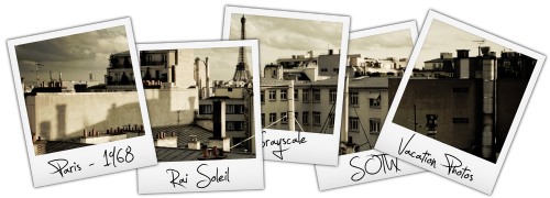
Here's the colored (original photo) version of Paris.
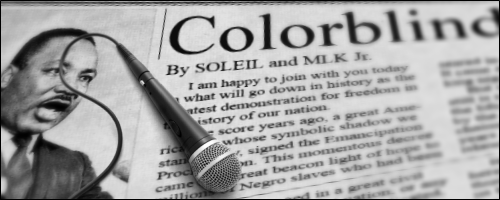
 On the MLK piece, either the microphone or the newspaper aren't tilted at the same angle. The newspaper goes down pretty steeply, but the microphone doesn't. Cool piece though.
Interesting thing, that. The plugin I used for putting the newspaper in perspective, dpy's Perspective, doesn't do it exactly right, so the perspective on the paper is different from left to right and top to bottom (the paper is steep at the top but seems flatter at the bottom), and it kinda messes with your head. The microphone looks pretty close to me, but I've got no way of measuring to make sure.
Love all your creations ... Great job ^_~Thanks!
---------
Anyone know of a Silicon Valley graphic design studio that would hire a freshman GD student? Especially for vector logo design and/or illustration?
-
BUMP it like the bumper cars. First, an experiment in newspaper backgrounds and depth of field, then I found my old Polaroid vector files and hand some Parisian fun. Both for SOTW 29.
Typical of me. I do some stuff, disappear for two months, then get bored and discover PDN got updated and go crazy for another week. You'll be hearing from me again ... sometime mid-February, at this rate.
-
Or maybe a little bit of polaroid style. Which is better?
Oh, photo: http://blog.yanidel.com/2009/05/03/focals/
-
I guess I'll enter a SOTW for once. This is more of an art sig than one I'd use on a forum. But it feels like it needs something . . . CC?
MLK pic from here: http://volcanicast.com/?p=217
Microphone from here: http://www.avistarentals.com/equipment_item.php?id=147
And I think I finally found the right combo of effects to create a newspaper background, too.
-

Haven't been here in a while, but I'd like to link to my recently updated online portfolio, w/ new name and logo. I'm also going to apply for a local job listing for an "Interactive Graphic Designer" with a web design company that seems to fit my skills + experience. If I get it, I'll be breaking into the graphics business for my first job. Also, I started college in September, and it's going great - Calculus, Composition, post-1865 US History, and Photoshop classes (don't worry, still loyal to PDN). And when college started, I was still 15. Straight up, yo.
-
@Skitzo: I started with imageshack, actually. I moved to photobucket because it had albums and wasn't blasted annoying to work with. But this is pretty bad; I had those planets crazy detailed, bumpmapped, with glowing atmosphere, now they look like I've just C/Ped them in.
@flip: Thanks. I love your sig, btw, I've been wanting to do some frosted glass of my own for a while.
oh, dude sorry,
i used imageshack just to upload photos, thats all,
but why didn't you save your after finishing it??
No, It's saved on my computer, I just can't put it up on Photobucket without getting that odd effect. For the sake of the argument, let's try Imageshack again.

Right . . . so it's not just Photobucket. That implies that it's a problem with my own computer, somehow. Oi.
-
@Skitzo: I started with imageshack, actually. I moved to photobucket because it had albums and wasn't blasted annoying to work with. But this is pretty bad; I had those planets crazy detailed, bumpmapped, with glowing atmosphere, now they look like I've just C/Ped them in.
@flip: Thanks. I love your sig, btw, I've been wanting to do some frosted glass of my own for a while.
-
So to continue my trend of one pic every month, here's a WIP.
Original is 3888x2592, from photo. Only about halfway done - still needs shadows and light effects.
Secondly, WTH is with Photobucket? Has anyone else had any problems with images suddenly becoming darkened (and some contrast loss) when you upload them? It's really annoying and seemingly random. Like this image, and my sig were suddenly made darker.
Perhaps I should change photosharing services, anyone have good suggestions?
-
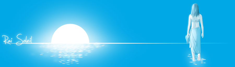
So. School's over, had some great ideas for an RPG. I'm also working on a completely new Soleil logo, sig, etc. I'll be taking a college class this summer too, called "Drawing and Composition I". In the meantime, motif circles FTW.

The five elements of the mind - passion (pyro, fire), logic (glaci, ice), integrity (terra, earth), creativity (aero, air/storm/lightning), and wisdom (aqua, water). Passion ignores logic, logic desensitizes integrity, integrity dampens creativity, creativity upsets wisdom, and wisdom diffuses passion.
Inkscape + PDN.
-
So. School's over, had some great ideas for an RPG. I'm also working on a completely new Soleil logo, sig, etc. I'll be taking a college class this summer too, called "Drawing and Composition I". In the meantime, motif circles FTW.
The five elements of the mind - passion (pyro, fire), logic (glaci, ice), integrity (terra, earth), creativity (aero, air/storm/lightning), and wisdom (aqua, water). Passion ignores logic, logic desensitizes integrity, integrity dampens creativity, creativity upsets wisdom, and wisdom diffuses passion.
Inkscape + PDN.
-
Thanks, both of you. I wouldn't have though people would like the trees so much.
Also, cruising the interwebs, found a neat ice tutorial:
http://www.digitalartsonline.co.uk/tuto ... ureid=1843
One of those times when I envy Photoshop. Perhaps I can recreate this on the text.
-
Oh my god, that is awesome :shock:
 Well done!
Thanks.
So here's the deal. I was toying with brushes and blending for a new sig and made this, which I think is pretty slick by itself.

But I don't think that's inspiring enough, and I'm low on creative juice ATM. One idea was this:

Which I like, but it seems to contradict the glassyness of the original. So I made this:

Which I like even more, but light glows don't work well with transparency. One last idea, which I thought of while writing this, is to make a icy/glass background and etch the floral glows into it like I did the text. But seriously, I need some ideas, something I haven't even thought of . . . so much more can be done with this, but for the life of me I can't figure out what. I'd like to keep with a floral/glass theme, though. Brush pack can be found >> here <<, but it's in ABR format. Use an ABR thumbnail exporter if you have it. I forget where I got the trees.

[SOTW Discussion] Talk inside...
in Discussion
Posted
Something I cooked up because it's the first thing I though of. That, by the way, is the official Internet Seal of Awesome.