


Krutch-it
-
Posts
28 -
Joined
-
Last visited
Posts posted by Krutch-it
-
-
It's been a long time since I've used Paint.NET, but I remember some way of making rays of light coming from the corner. I can't remember if it was a gradient, a plug-in, or something in the tutorial section that showed how to do it. Does anyone know what I'm talking about? I've used the search, but I can't seem to find anything on it.
-
Um.I have one problem: all of the gradients I have/install take up the whole selection. Like:

I can't get it to resize how I want, they a;ll just automatically take up the whole area. I've installed 3 different gradient packs/plugins.
Am I missing something, or is there a different plugin I need?
-
I'm still practicing to get the feel of everything right. I hope this comes closer than my previous attempts, lol:
EDIT::
v2, w/ border:
-
if that doesn't work just search Treason at Sea....by Kevin Max Smith!

K Max is the awesome. His solo career is far and above the best of the three former DCTalk members.

Lie. Toby Mac? He was in DC Talk and his stuff has sky-rocketed. Michael Tait and Kevin Max are [virtually] unheard of. And the last time I listened to K Max, he stunk, in my opinion. lol. How many CDs does he have?
-
-
Why does it say Jeff Bridges on it? Isn't he an actor?
Anyways, nice cd. is it 100% pdn? I'm kinda noob in pdn, so i cant tell lol. I like the logo, it's nice and sleek and simple, i think.
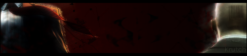
Here's a sig I did today..I'm trying to gt better at blending the sig into the bg...
-
I like the smoke vampire one. It looks neat.
EDIT:: I'd give criticism, but I'm new as well so my criticism wouldn't help much. you've done a efw things that I couldn't figure out if I tried, lol.
I also like the first one, though around the lips looks like you cut something out? or something..it just doesn't look "normal" (if you can call any of that normal
 )
) -
@Kemaru: Because when it was just white letters, I could barely see it and I thought blue would make it even more invisible since everything else is blue. I guess I could've made the font one size bigger, eh? And, I think all I did with bg was jitter a copied render of Altair over it and put it in a different layer mode (like difference or something). Lol. Thanks for the feedback
-
@ hyrule: metroid sig: did you use the metroid sig tut? I think i read that tut. and, it looks nice so far. There's something a bit off about it (maybe the "transition" of the guy to the fire/shot? where the 'fire' outline turns form gold to red?), but I'm sure you'll do fine
Post the end result when you've got it! And I like the Yoshi one! 'yoshi' seems a bit hard to read, but I love mario and anything related lol
Here's one of mine I made today:
I tried to keep the flow in mind and the I tried to focus the contrast on the focal point (Altair, hopefully
 ), so..tell me how I did please
 -
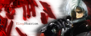
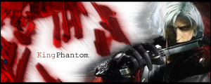
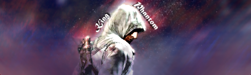
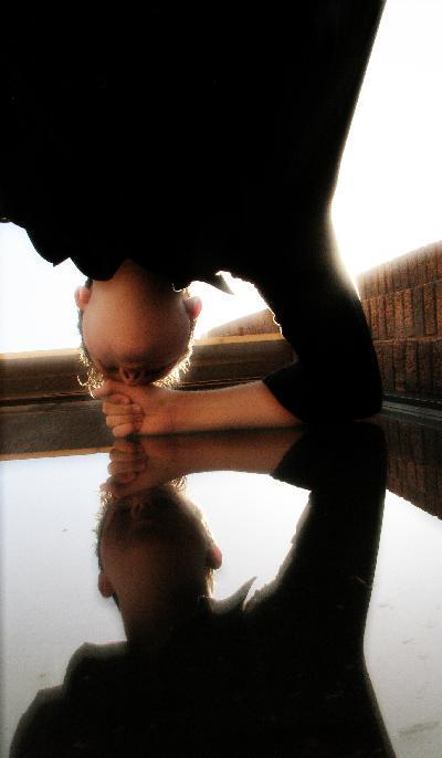
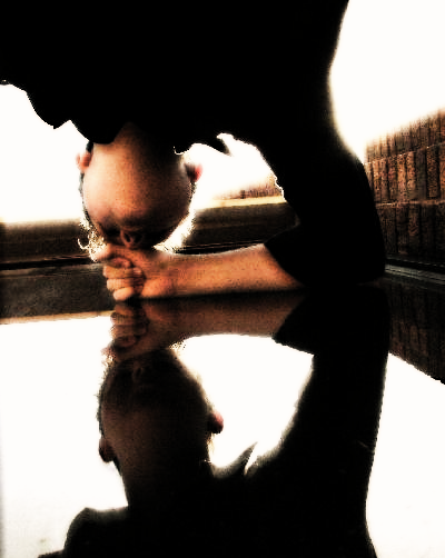
Well, here's my first attempt at a vertical sig.
[[iMAGE 1]] & [[iMAGE 2]]
Those are neat. I've never heard of vertical sigs before. It's neat, but there's too much room at the top, even though it kinda looks cool to me, I think others would find it annoying/distracting. Post the v3 you have of it
-
I was trying to do something that was different from my normal style (not sure if I even have yet, haha), but I don't really like it. The lightness at the bottom seems to offset it, but if I take it off it all looks empty.
I tried to find some way to make it look like something is floating around him (like an exploded ring of some kind?), kinda transparent, but I couldn't come up with anything good.
Help?
EDIT: Also, I was wanting to do something like clouds surrounding him, but not so overhwleming that it took over the whole thing, but I don't know how to do that without it being over the whole sig. Help with that would be good, too.
EDIT 2: I saved the pdn file, so I can change it all I want, heh.
-
60? that's too many.!
-
Oh, well..I don't know if i really want a focal point. I kinda like people to look at all of it.
Is that bad?
-
I like the picture that looks like two "planets" (or sphere's of something) colliding. I think that's awesome
This one:
http://i232.photobucket.com/albums/ee113/gabrielleger/custom%20made%20pics/explodingdesing.jpg
-
Yeah, I always have real trouble with font placement and such, because I never know where to put it. Lol.
By focal point, what do you mean? I.E. where is the focal point on the sig i just made?
-
Alright. due to the many comments saying that I could do better, I've attempted to do just that. Here's my next try. It has 27 layers (I read somewhere, the more layers the better lol). And I did any and everything I could think of, lol...tell me what you think...
-
I kinda like the first one better, lol. But, I'm a newb, so I dunno if you can take my word for it
-
Thanks for the input, guys
@LFC4EVER: I did use one of the tutorials for most of those sigs. I tried the frost glass+glaussian blur at different levels on many different layers, but it never came out like it did in the tut. And. I hate smudging. It doesn't seem to do anything except make things darker. And I don't want darker, I want smudge. O.o
@Boude: But isn't me getting an image the same as a render? ISn't a render just a cut-out of an image? I don't think I understand what you mean by "have a try yourself" ...
-
Here's one I made using like 4 stock images and blending them together..
-
Not real sure how "abstract" this is, but I couldn't find anywhere else to put it..I'm using these as my backgrounds for my website (and pages of) I'm currently making..
(sorry they're so big, I dunno how to thumbnail 'em)


-
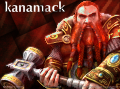
I made these for when I use the name Jagwire..
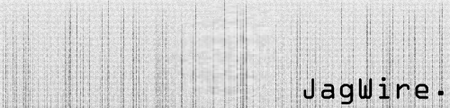

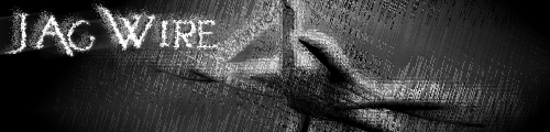
This is my WoW name, and my forum name for the guild I'm in..(this is also what my character actually looked like at the time..I think I've bought all new armor since then tho..)..I don't really like the sig. gonna make a new one soon, I hope.

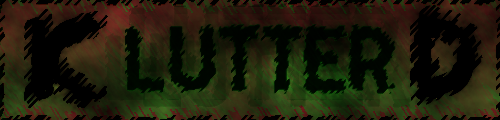
Here's one I made out of fun, was just experimenting(sp?)
I made this for someone..they liked it, but I hated it lol. Kinda ashamed to say I did it
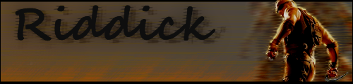
and here's a hitman sig I did..cause I love hitman..
And my latest sig/ava duo (the ones I currently use, as well):


-
Used this tut to make this cube:
Used a free .gif animator to make it appear to move. lol.
-
How do I download this? I unzipped it..but no custom brushes folder came up..
-
Nice brushes, maybe you could post a quick tutorial on how you made them?
Or on how to use them? I can't seem to use them. I unzipped them..but where do I extract them to? I tried the "right click/save image" thing..but all that did was put ti no my comp as a pic. lol.
Nevermind. found the tutorial. I didn't understand it. So..yeah. Nevermind. O.o I'll just use the regular ol' circle. lol.
Sun rays?
in Paint.NET Discussion and Questions
Posted
I believe so, yes! Thank you!