


PeterPawn
-
Posts
209 -
Joined
-
Last visited
Posts posted by PeterPawn
-
-
Working on a new theme. Except for the background image of Mt. Doom, everything else is PDN. The emphasis was on the making of the ring. That was the hardest part. Thanks to Oma for helping me. I will continue on perfecting future rings.

-
@Boude: Thanks for your comments. I'll play with it.
-
Thanks for your great remarks janettsue. I'm constantly experimenting with the color of gold, chrome and other metallic things. I also want to tackle water and Ash makes a great glass texture.
-
Peter - for the jelly button I followed the tut as normal then at the end I flattened the image, added a new layer, used radial gradient with the default black/white colours then inverted the colours and moved it down underneath the finished button. I think I then went back to the button which was now the top layer and played with the blending.
I have to say I did not expect the chrome ring to turn out the way it did. The idea was to brighten up the button in the middle - the ring was a nice bonus. I have not tried to re-create the effect again yet, I`ll have to give it another go and see what happens.
Helen - thanks for the ideas . I`ve never done a comet before, I might give it a go. I was also thinking of adding a spaceship/station orbiting the planet. Don`t know which one though. I`ll try a few out.
Glad you like the new sig.
Thanks Goonfella: I'm going to play with it today......
-
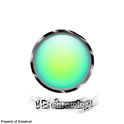
My effort at the jelly button. I added a radial gradient at the end to brighten things up a bit. I think it has certainly brightened the chrome ring around the outside. I tried putting different images in the centre but none really worked so I settled on some simple text.
I was thinking of making it smaller and using it for my av.

Goonfella: Could you help me. How did you use the radial gradient to make that chrome ring? I've been playing with it but can't get it to look like yours.
-
First abstract I've made that I'm happy with.

-
I've only been using PDN about six weeks. This image is the result of trying to figure out how to make the color of gold. Thanks to Oma for her very useful tips. I think I've finally got it. Suggestions please.
-
Communty Guide:
Smudging!
This thread will offer anyone and everyone to post their ways of using the Smudge plugin. If you have a trick you want to unleash to the community on your way to smudge something, then post so here. This is made for mini tutorials. Also, be sure to state what your method is best used for. Be sure to include screens!
I'll start..
------
TopHATslash
For render-sigs
- Use the Clone Stamp tool [Size: 30]to brush the edge of your render onto a new layer. -

-Gaussian Blur [12 px]-

-Now smudge. Smudge it to give it a flow. Since in this case, this Crysis render doesn't have a flow.. we will give a flow of wind rushing onto him. So a brush off and up type stroke.
Note: I usually just will stick to the default brushes that you start off with. Spray, Hard, Soft, etc.

Done! Hope you liked it.
-------
So now post your way, and get it onto this list!
Something I'm not getting. How do you "brush the edge of your render onto a new layer. -" ??
-
Yes... it does help... thanks...

-
I would like to know how you did the Heart Of Light...
-
I would like to hear about Ash's smudging technique. He's good at it.
-
Famous Names.


Click images for larger size.
-
@Oma: I really love your stuff. It's absolutely beautiful. Maybe it's because I'm a grandpa. I'll be visiting your galleries often.
-
D.A. Gotta tell ya... I really like the "Sunset" and especially the "Flight." Seems to me you have a good eye for design.
-
I like your stuff. Good Job. Indianapolis Colts is cool,,
-
Havent written any tuts yet, I will see whether I could do it the weekend if there are enough requests.
I have been very busy since school started today.

Thanks for the complements

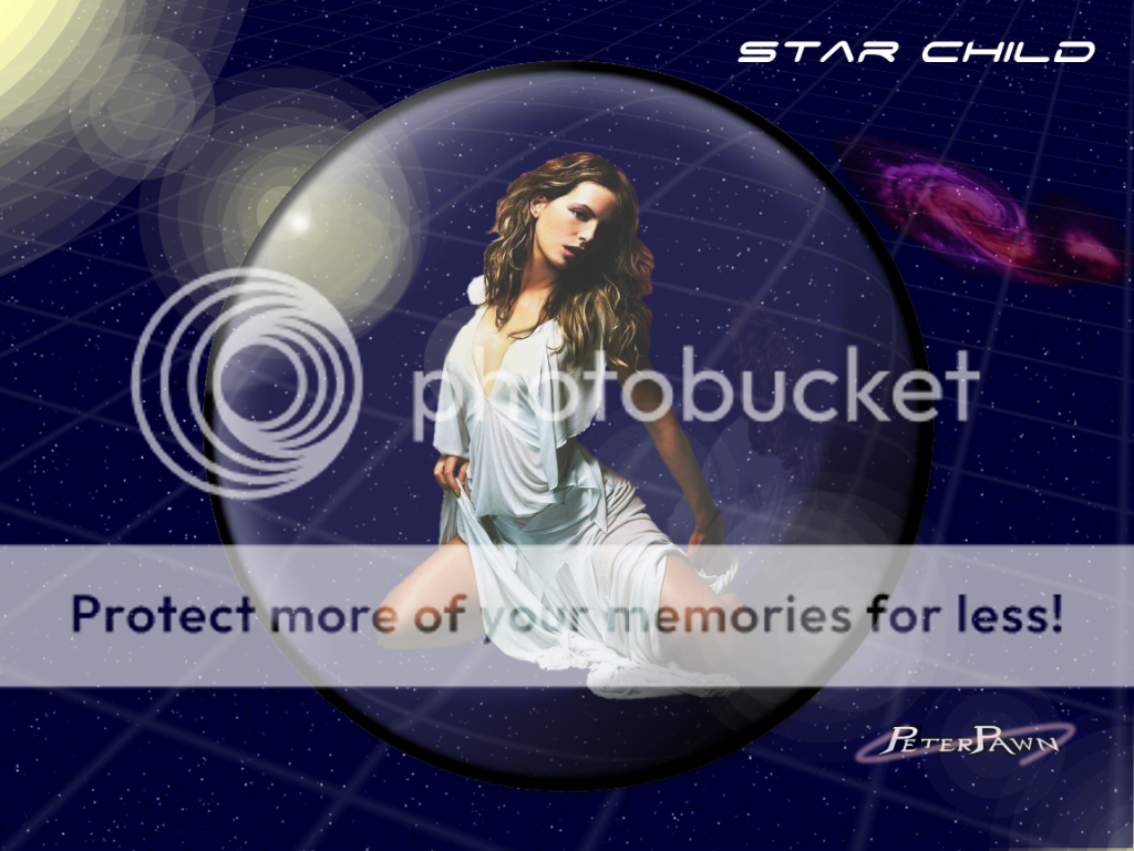
All right... here's my request for a sig. I want to know more about how you use Fyre. Great stuff.
-
Another one!

I discovered it while browsing my old folders.

Icefusion: Love your stuff. I found out about Fyre from your posts and I started playing with it and I love the results. I'll be checking your gallery regularly. Thanks for sharing..........
-
my try plus some extra stuff
salu: You're orb looks great. How did you get the metallic look to the outer ring?
-
Learned a lot about using PDN with this tutorial. Thanks.

-
Here's mine. I did not do the white gradient 9 times thing. Couldn't see the necessity of that. Still a very good tutorial, I learned a lot and I like the results.

-
Here's my two cents worth. Had a lot of fun with this. I'm a retired photographer and I will use this often.

-
If you added a sepia tone to all the pictures then it would like even more like a real filmstrip. Just a suggestion.
Thanks, I'll try it.
-
Tried to get the tube oblique dll and the link goes to the wrong place. Can anyone tell me where to get this dll?
It's now incorporated into Madjik's plugin pack, renamed to simply 'Oblique'.
I would advise you download and install the entire pack; some amazing plugins to play with.
-CJ
Thanks very much, and, you're right, lot's of effects to play with. Cool stuff.
-
Tried to get the tube oblique dll and the link goes to the wrong place. Can anyone tell me where to get this dll?


PeterPawn's Gallery
in The Pictorium
Posted
@survulus: I always save in png because the quality is better and intended transparent areas will show up as transparent. jpg file types will not handle transparent areas.
Also, I really like your SIG and thanks for your comments.