


cazaron
-
Posts
1,227 -
Joined
-
Last visited
Posts posted by cazaron
-
-
A number and critique are not the same thing.
many people, at least, most of the regular members provide critique in the rate the sig thread. I guess i'm just being a ranter though. sorry.
CSM:
wow, for no stocks, it's very good. all the textures and glassy themes are spot on. i'm not too sure about the circular panel, it's a bit weird, not exactly to my taste, the clock is one thing i'm opposed to, it's not one of my choices of styles. but, your dream OS, not mine.
on a technical note, font choice and colouring is spot on, very good job on the balancing of colours. perhaps the 'start button' could use the same glass treatment. Name is nice too.
It is very well done, and i look forward to seeing the next mockup.
-
guys, probably just me having a little rant, but if you want signature critique, can you do it in the rate the sig thread? can't we keep this thread for critiquing works that are actually in need of critique, not 'hey, i just pumped this out, what's wrong with it?'.
i would really like it if we could put this thread back to the way it was, no sigs, and just awesome art that could be in need of a fix, to see how advanced users would critique it, so you can improve the work.
Sigs go in the sig thread, that's what it was made for.
If i'm out of line, sorry, reprimand me.
Just my 2 cents.
(For those people who want to be clever, yes, i posted a sig several months ago to this thread, and kept it up. i'm sorry, i'm part of the same group, but my point still stands, i guess.)
-
You are a legend.
your art is awesome, you just give yourself no credit for it. seriously, your work is awesome.
that, and you are easily the world's coolest 11 year old.
-
anyone seen a break apart plugin like this though?
...what?
they may be referring to the add noise function... 'is that a plugin?'...
-
burn the witch!
very very well done, yy10. effects are stunning.
-
-
well, i shall comment on both, csm, to give you your third, and EE to give you your first.
CSM:
signature: solid effort. the only real drawback i can find is the shadow, frontcannon has addressed this already. also, just from personal preference, i dont like the colours, but that's just me.
realistic piece: texture, texture, texture. please. it just doesn't look right without it, but, as it's a WIP, you're doing brilliantly. perspective is off in almost everything, the table slopes from down to up... that shouldnt happen, if you're looking at it from the angle you are. the flowers need a little bit more work, texture, and i'd check if flowers really hang like that out of a vase... overall, though, you did quite well, and please keep up the WIP

Epic Epiphany:
it is brushed very well, first thing i noticed was the very dark area in the bottom left, there is nothing there, which, to me, took a bit away from the overall image, it was my first focal point... background is very well done, colours work well. the people, are also brushed well, the girl, firstly, and this is my main rant, doesn't look real enough. perhaps you did too good?
 lighting is perfect, and you have made very few (and those you have made are barely noticeable (look at the hair of the female, and you may see one very small flaw). nice touch on the man's eyes, colouring is flawless there, recoloured well.
 you have done a very good job. well done, and keep it up.
just have to ask, though... is that you?
-
its... amazing! very well done. i love the colouring. the background, the lighting, everything, incredible.
-
sig 1: choppy effects really take away from it all. the render is aliased, the frosted glass looks awful, and the text doesnt work with the sig. extremely little flow. i have to pretty much ditto what everyone else said about both the sigs... work bigger then scale down, and feather everything. seriously.
sig 2: essentially the same. i like the c4d use, but its the wrong colour, and it's really aliased too. feather it.
somebody, post the next image, and please dont let it be a sig. im begging you.
-
the way you did the planet was cool. that looks great. the forground star, to me, just looks... out of place? too big? distracting? unnecessary?
anyway, i do indeed like the method used for the planet, most impressed there
-
sad time. most of the links are broken, and i forget my password to my second account...
oh well.
ill try remember, or ill remove the links. shame, really.
-
*is also in adoration* seriously, sozo, it's briliiant! great colouring, depth, stars are done well, text is great, i love the new sig.
-
I'm a sucker for symmetric artwork.
So am i! i love flipping horizontal/vertical, layer blend, flip, blend, flip, blend to get it all symmetrical.
-
green: Dents, clouds, gaussian blur and light rays were the only 4 things used (and layer blends)
red: julia fractals and blurs.
blue: no idea
Thank you so much Helen! your kind words are so much appreciated!
-
some new treats for all of you, as i haven't uploaded anything recently.
Envious Moon (The Green), Flared From Within (The Red), Reaching Out (The Blue).
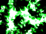
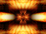

As per usual, it's clicky for full size
-
Why can I not install without an Internet connection?
I'm busting to try it out.
well how else are you going to download it...

-
well done rick indeed.
though i do have XP, so i dont notice all the prettiness put in to 3.5, i do notice all the speed increases and the other fixes, and i nod in agreement with everyone who has praised you thus far with 3.5. brilliant, rick, brilliant.
can't help asking... what's gonna be in 4.0? how are you going to beat 3.5?!
-
guys. RULES! its happening again, everyone is just trumping other's work. be patient, and if you want to post an image, wait your turn. maybe even critque someone elses, dont just "well nobody has posted in ages TRUMPED!" seriously, its annoying me. im sure david didnt want this to happen to this thread, and it almost happened before.
Guys. please. follow the rules. so, i think we should just start anew, with nexleffel's wallpaper, that has 2 ratings to go.
-
been working on any other pieces to show us?
-
wait. you sure you didnt do this on a canvas with paint...?
you did it on PDN?
woah. it looks truly like a real painting. *nominated for galleria*
-
wonderful job on both SIS and the atom.
Sozo In Space looks a lot better than the previous version, and the colours were done very well. nice job!
-
ah, lance. youll always be storm.shadow to me... lol.
anyway. just thought id drop in again and say, well done on the new additions (and the glassy addiction... lol)
-
ah! wonderful! it is looking much better! facial features are looking well. great job!
-
nellyphant! its so cute! i guess you might be getting kinda sick of us saying all the same things all the time (how awesome it is, masterpiece! etc.) but thats exactly what they are! well done. im looking forward to the additions to the horse (but when i looked at it for the first time, i thought it was going to be an alpaca or llama! lol. my eyes are terrible then...
 )
)


***ADVANCED CRITIQUE*** - Read Rules First
in The Pictorium
Posted
it does! well done!