


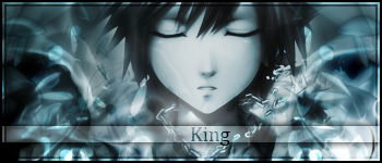
K_I_N_G
-
Posts
309 -
Joined
-
Last visited
Posts posted by K_I_N_G
-
-
Nice.
Enter:
-
Sfifer - 2
TheHowler - 0
-I.Think.We'd.Have.a lot.More.Sig.Comps.If.It.Was.Less.About.Explaining.What.You.Think.And.More.About.Beating.The.Other.Guy...
-
Chrisco: 3
Phantom: 1
#Winner: Chrisco
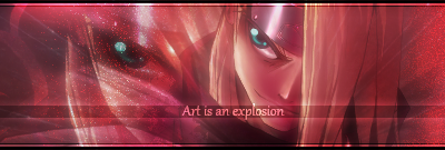
@Chrisco97, love that sig.
I'll enter with this. Sketchy, took forty layers when I finished. Maybe too much time on it hah.

-
A new desktop for my netbook. 1024 X 600 screen so I used the same dimensions. 100% PDN.

-
@Chaosportal, that is pretty sick man
 .
.@Kev, perhaps the colors are too contrasting but its a cool abstract.

-
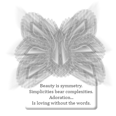
I may eventually. For now I added a wallpaper and a strange logo butterfly.
Both 100% PDN:
-
#Stone85: 3
#Cortez: 0
@Stone, nice lighting and great placement of the render. Maybe I'd add a bit more blending to the renders edges but the background fits nicely. Good job on the text.
@Cortez, I like the concept but it does seem excessively large. Make it smaller and blend the render with the background a little more and it'll be pretty nice. Good idea, just needs a few touches in my opinion.
-
Stone85: 3
Drgrit: 1
#Winner: Stone85
@Stone, could use a little less blurring around the edges but not a bad signature. Background seems empty with just the black.
@Drgrit, wasnt sure what was screenshot or PDN in your signature. Maybe add more depth, the lighting is alright. The random lines around the signature was a cool touch. Text and color scheme seem a bit off to me.
-
And I suppose I'll enter with my newest:
#paint dot mike: 0
#K_I_N_G: 0
-
#Stone85: 1
#Jake 0: 3
#Winner: Jake 0
@Stone85, I understand what you were going for but it could use some help getting there. The render only fits with the background from the tone of its shadow and the shadows along the edges of the signature. Shadows meaning the black space. The background is nice with its changes in tone, but the render could use some work blending into it.
@Jake 0, add a border and I love this signature.
-
I'll enter with my new one I suppose.
#pdnnoob: 0
#K_I_N_G: 0
-
#CSM725: 2
#ptuZ:1
@CSM725, Right hand bottom corner needs a bit of work around the edges. I might have used the white transparent lines in a different manner for the final product. Didn't notice anything particularly wrong with it, has a good flow and a nice foundation.
@ptuZ, has a nice background and the placement of the render was great. Text is a little edgy and could use some transparency or shine to it so it doesn't look pasted on there. The render needs a bit more blending into the background. The render could use some more work. Good concept.
-
Paint Dot Mike - 0
NOOBz - 3
#Winner: NOOBz
Shame on the both of you. lol, just playing. To each their own gentlemen.
@Paint Dot Mike, too much and not enough. Random and hectic, failure to blend or flow. Take a look at the tutorials section (theres actually a small part of my gallery with links to the best sig-tutorials -as I consider them to be anyway-).
@NOOBz, background doesnt quite seem to fit. Just small details here and there that make it generally seem like a rush-job. Nice job on the text however.
-
n d: 0
Mayor_McSteeze: 1
@n d, I could recreate the image exactly as you have it from scratch. Im sure many here can, and the signature just seems like you may want to return to the basics. Looks like it was done in a hurry without the final touches that make a signature a finished product. To me that just means it doesnt seem finished yet. But hope this wasn't discouraging, just mean that you should attempt a few of the tutorials on creating a signature and get an idea of what I mean by taking your time.
@Mayor_McSteeze, Nice. The borders and the blurred surroundings add a nice touch, the text is nicely done as well. (And yes I realize how short that is, but I cant tell whats stock image and whats a part of the manipulations. Which usually means theres little work done to it -in which I dont believe thats the case- or its simply done very well.)
-
that is an opinion... you could possibly run a pic over it and set it to glow... mess with some gradients and get a cool effect.
and you can always change the color
So lets just point out if your going to post a tutorial somebody's going to have a bad perspective of it. The statement was simply unnecessary because criticism is supposed to be appreciated, whether harsh *Such as you are a complete novice and I laugh at your attempts to create anything* or praising *Great job, I love your work!*.
The correct response is thank-you for your opinion, I'll look at it from that angle and strive to learn something more. Instead you played a defensive view, you can do this and this and this to change what you said is wrong about my work.
Just informing you, behaving in a professional manner will grant you more opportunities to learn. And end a lot of future arguments before they begin.
Hehe, its funny to be replying to a reply to a two-year old post.
-
Nice job cortez, although generally speaking I wouldn't know how to blend a car like that into that background.
*Edit.
-
Stupendous, signatures are generally all I like to make and yours are quite impressive. Wouldnt mind a tutorial on your method for producing them
 , could always use more.
 -
Give some to get some. General rule that will yield you results.
If you ask for an opinion, be kind enough to lend one.
If you ask a blatant question without much of anything else...*anybody else hear crickets?*.....
Look through the forums, take a look at the pictorium for ideas, or try the tutorials section to get you going and see where you end up. Do not create a thread like this again, as Im fairly certain I've seen dozens of these that simply dont get anywhere. Check out the forum rules before posting as well to avoid any embarrassment: The Rules. If you glance through there I'm sure you'll see this thread is already in violation of quite a few.
---
Welcome to the forums.
-
Appreciate the enthusiasm
 . My new best friend ya'll! Hehe, anywayz.
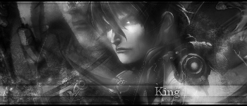
Im still working on building my techniques back up to speed, so heres a sig that took 36 layers and still didnt come out the way I wanted lol:
-
My current signature (as well as many others) use the effect described here. Appreciate the tutorial.
-
Great...I believe somebodys hacked my account. Nothing has changed on my system since yesterday when I logged in just fine, I dont even enter my username or password anymore as my computers security is very strong so I allow my browser to log me in. Now the password simply wont work. Looks like I wont be using my account anymore.
-King.
Hehe, security program stopped my password from being sent to the server. Looks like a waste of board space.
-
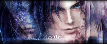
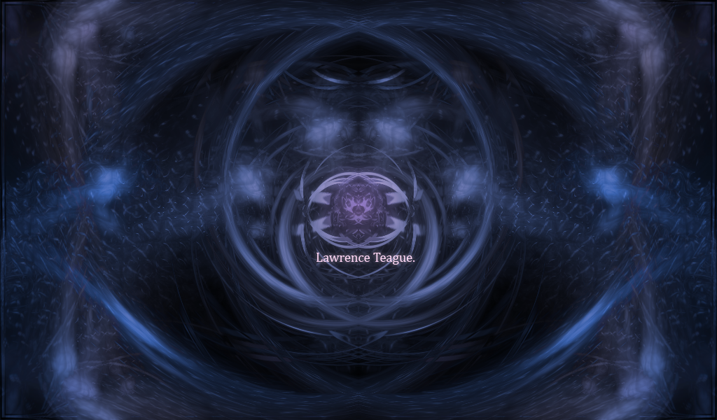
I think I'll enter with my current as well:
Very nice signature so I wouldnt expect to win, but its good to keep these threads moving
. -
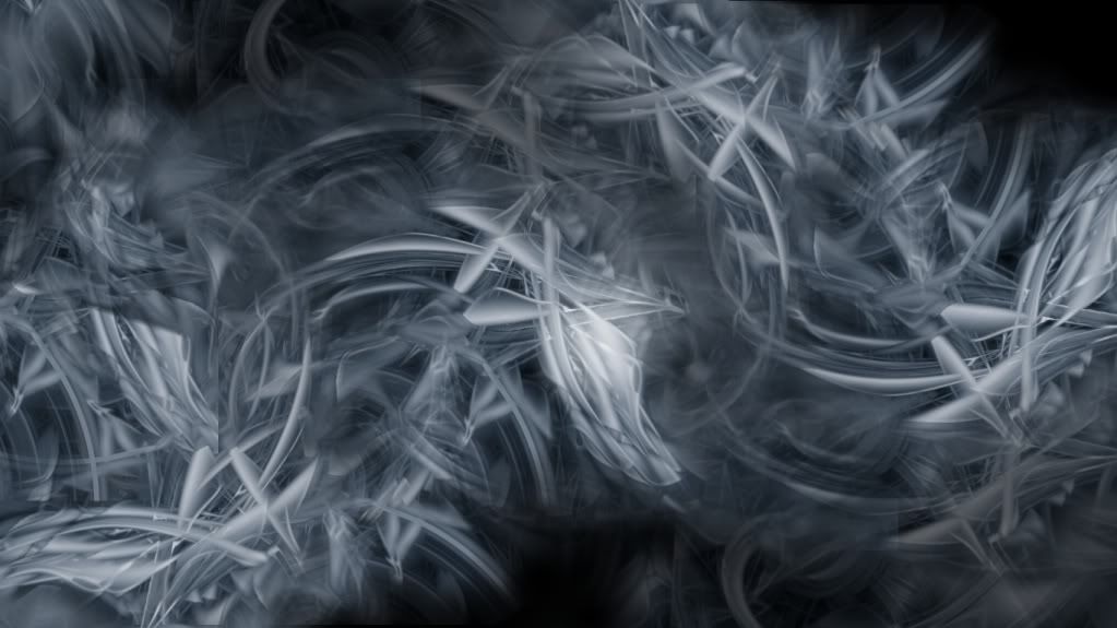
Appreciate it. I liked it myself, but I generally prefer a smoother approach.
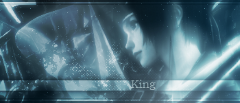
With that in mind, something a little softer on the eyes:
Still working on getting up to speed and all. Appreciate everybody that commented.
-
Perhaps you could edit your gallery to show the images rather than just hotlink to them. Less clicking and more likely to get responses. In the first post simply click edit and theres a button to insert an image (if you havnt done such a thing before, if your experienced just use the
tag).
 .
.
Sig Battles (ENTRIES/VOTING ONLY)
in The Archives
Posted
PDM:2
NN:3
#NN wins.
Rafroller: 0
Xzerizon: 1
Take the time to read the first post of this thread, it explains a lot.
Please.