


ChitoDog
-
Posts
135 -
Joined
-
Last visited
Posts posted by ChitoDog
-
-
I totally disagree about that. Some of the old ones are still the best.
I didn't mean that as in they're not any good. I meant that many text effect tuts on here are old, as in date started.
-
I'm not going to do your work or evgirls work for you that is what the search function is for, the only difference between this and the may tuts that show how to put an image inside text is the background she uses.
New users should be working through tuts rather than posting them

First of all, what automatically makes you think that someone who's new to these support forums are automatically noobs? New members can be a genius with Paint.Net for all you know. Maybe they just decided to share a nice little effect on here because they just felt like it. Like I said, and I still stand behind it, I don't see anything wrong with adding another "Simple" tutorial to these forums. They can use some new tutorials. The majority of them are pretty old/outdated if you ask me. Seriously though, what harm does it do? It's well written, easy to follow and well-organized. Damn, no wonder I don't see many new tutorials around here. People are afraid of negative feedback and/or having their topics closed for simply having a "similar" effect from other tutorials. So sad...
-
Sorry if I offend you but this tutorial is too simple and has been done many times before, check through the forum to make sure you are not repeating someone elses work first. Also as a new member I would suggest working your way through tutorials rather than writing them. Again no offense meant.
Too simple? Personally, I don't see anything wrong with posting a simple tutorial. There are a lot of newbies out there that would benefit from a simple tutorial like this. Second, I haven't seen a tutorial with this exact text effect. If it's been done many times before, can you provide us with the links to those tutorials that have the exact same text effect as this tutorial?
-
ventor1, there are a couple of questions concerning some of the steps I'd like to ask if I may. In step 7 you say:
7. Duplicate layer and do steps 3 to 8 again on this new layer.Isn't it rather "do steps 3 to 6 again on this new layer"?
In step 10 you say:
Select color balance under adjustments and set red to 40 and yellow to 40. Yous should have the below:I set my red to 40 and my yellow to 40 as well, but I got a purple instead of the golden-like color you have in the image below step 10. It's not until I move the yellow down to minus 100 when it starts getting that golden color. Perhaps I missed something in the previous steps, I'm not certain. Can you please verify this for me before I continue with the rest of the tut? Again, this could just be me missing something, I just want to be sure. Thanks in advance.
-
You're right, there are a lot of fire font tuts on here, but IMHO this is by far the best and most realistic fire text effect tut I've seen for Paint.Net. Awesome work and a +1 ventor1. I hope they don't delete/close it since it's much more different than the others I've seen on here. I'm going to go try this myself now. Thanks for sharing this ventor1.

-
I agree that jim should've at least sent you a PM about it, but you have to admit that this rewritten tut is better detailed/explained for newbies to understand. I'm sure he wasn't trying to be malicious about it.
-
-
Sorry for the noob question, but I'm a bit stuck on step 8 where it says "Invert the colors of the TextMask layer so it is white". How exactly do we do that? Thanks in advance.
-
None of the tuts that mountnman suggested seem to explain much and the thread where I got the Extract Color plugin doesn't explain how to use it either. I even went to this tut here, but it doesn't seem to make any sense. Several people in that thread have asked for help, but nobody seems to want to help them. My issue with that particular thread is that when I try to follow its instructions, I get nowhere near what they're trying to explain. For example, they suggest we open an image and use the Magic Wand (with tolerance at around 27%) and just click any part of an image and it's suppose to automatically choose the whole image (nothing more) and then we copy that image and proceed with the tut. However, every time I click any part of an image it only picks a very small amount of it (not the whole thing like the tut explains). Many people in that thread have somehow got it working, but they don't want to help those that don't understand it. So I guess my question is, can someone be kind enough to either explain that tut better than the original author did or know where I can find out how to use the Extract Color plugin? Thanks so much ahead of time.
-
It is in Toil's Effect pack, download the Zip file:
+1 Thanks for the plugin link yellowman.
-
+1 Thanks for the video tut yellowman. However, I was stuck halfway through the tut because I'm missing the 'Engrave/Emboss' plugin. I've looked for it in the help search, but can't seem to find that specific plugin or in which plugin pack it must have come in. Can you or anyone perhaps know where I can find it? Thanks in advance.
-
Taking nothing away from the tutorial, but there is a plugin which automates the Pleasantville tutorial: Extract Color
Thanks for the plugin link Ego, I'll d/l and try it out as well. +1
-
we call that the "pleasantville effect"
Thank you mountnman, that's exactly what I was looking for. +1 for your help.
-
I apologize, I should have been more clear or provided a sample image. I'm basically looking for a tut/plugin that can give us a similar effect as this image here:

The whole image was in color, but somehow you can pinpoint a certain image/s and keep the color while everything else becomes black and white.
-
I was wondering if anybody knew if there is either a tutorial or special plugin that can help us create a Color Splash Effect using PDN? Thanks in advance.
-
Would love to try this tut out. Any way you can fix the broken images NoNonsense? Thanks ahead of time.

-
Yes
Merge all rectangles down, so you have one layer of 5 rectangles in it, and in step 14 it says Duplicate this layer, that means the resulted layer "which has 5 rectangular in it should be duplicated",
Then in step 15 add a new layer in between those two layers of step 14.
Hope its clear
Ok cool! Yes, that's clear yellowman, thanks so much for your help. +1
-
Very nice outcome barbieq25.
I was wondering if you or someone else can help me out a bit here? You sort of lost me after step 12. After Where you say "Mirror left half over right". Are we then suppose to be on our own and make a new layer per rectangle then use the MIrror effect according to the rectangles' position? Then once we're done with our complete images of rectangles we go to step 13?But then again on step 13 you say "Merge all the rectangles down.", but then on step 15 you say "New layer between the two rectangle layers." Which two rectangle layers are we talking here? I thought we already merged all the layers down in step 13? Sorry for the noob questionss, I'm just a bit confused.
-
Thanks for your feedbacks, adel and barbieq25.
-
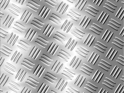
Ok so here's my first crack at the tut. Not as awesome as those some of you posted on here, but just thought I'd share my first real try at it. Towards the end I just started playing around with a few drop shadows, motion blurs and such to come up with the final results. I'm not too happy about the top portion, since it looks like it lacks more of a metal/chrome look, but I can just play around with that too. Thanks to adel for the great tutorial (sorry again for all the questions lol) and to Sfifer and Goonfella for their help in better understanding some steps.

-
Thanks so much Goonfella for your reply and help. I forgot that just because we have the latest version of PDN, doesn't mean we have the latest plug in version haha. I'll go and update it and try this tutorial from scratch once again. Hopefully I'll get it right this time.

-
First off, I want to apologize for all my questions. I haven't really been using PDN for some time now and I'm somewhat rusty.
 so please bare with me.
I could never really understand how to use the 'Alpha Mask'. On step 14, it says:
14- in the layer (text mask) : - select all Ctrl+A , copy Ctrl+c, deselect Ctrl+dI do that, but then it says to either 'delete it' or to 'uncheck that layer'. Ok, so let's say I go with the choice to 'deleted it'. Then on step 15 it says:
15- Go to Effects > Alpha mask : make you sure that (invert Mask and Paste frome clipboard) are checked.This is where the confusion for me starts because this is a screenshot of what the pop up mini window of the 'Alpha Mask' looks like:

As you can see, it has an empty field where I'm suppose to add a file to it. What file am I suppose to add in there and how do I go about doing that? Also in step 15 it mentions us to make sure that "Paste frome clipboard is selected". As you can see in the screenshot, there is no "Paste frome clipboard" to select.
Also in step 22 it says:
22- Add a metallize effectHow do we do that? Is that another plugin?
Can someone please help me better understand these steps before continuing? Again, sorry for the newbie questions but I kind of like this tut and I want to get it just right. Thanks ahead of time for your help. Most likely this won't be my last question.

-
i don't forget any step
With all due respect Adel, you actually did forget. You forgot to mention 'Clouds' in step 8 as Sfifer just pointed out.
Thanks Sfifer, now I can continue with this tut.
-
Nice end result Adel. However, I was trying to follow your tut, but you lost me at step 8. You say:
8- 8- with color :white and black , Effects >render> scale : 250, roughness :0,50 , Blend mode : OuverlySo I put my color palette at white (primary) and black (secondary), then I go to Effects >> Render >> but then that's where you lost me. I don't see anything that resembles 'Scale'. Any idea where that is or is that another plugin that you forgot to mention we need? Can you please clarify that step before I can continue? Thank you ahead of time.

 so please bare with me.
How to make the EvGirl signature/text/Whatever it is!
in Beginner Tutorials
Posted
Wow, it's amazing, and funny, how all you guys are making such a huge deal over one small tutorial. Whatever, I'm done. Mission accomplished for you guys I guess.